Friday, February 03, 2006
Please note that these are up every week (usually on Friday). I don't usually link to them, but sometimes I do. Today, I did. Here is this week's 20 Questions for You All for the 2/1 Comic Week.
Chats Should Be Good - Len Wein
I think Len Wein has been the centerpiece of about seventy urban legends that I have done so far, so it is nice to announce a Len Wein chat this Monday at Comic Book Resources.
Len Wein is known for creating (or co-creating) a number of notable comic characters, such as Swamp Thing, Wolverine, Storm, Nightcrawler, Colossus and Lucius Fox.
He is also known for notable runs on titles such as Justice League of America, The Amazing Spider-Man, The Incredible Hulk, Green Lantern, Detective Comics and the Fantastic Four.
However, what impresses me the most of Len Wein is Len Wein the editor. It was Len Wein the editor who brought Alan Moore to the American public, in the pages of Swamp Thing. To allow a new writer to come aboard a title Co-CREATED by him, and then to totally change the status quo of Swamp thing, takes a certain amount of intellectual freedom that impresses the heck out of me.
The fact that Wein followed this up by helping Moore and Dave Gibbons create one of comics' more acclaimed works, Watchmen, is yet another feather in Wein's cap.
Definitely a major figure in comic book history, and you can chat with him this Monday, February 6th at 5pm Pacific/8pm Eastern.
If you are already a member of CBR, then you just have to hit "Comic Chat," and then hit "vBChat Room Change" and choose to join the room marked "Len Wein Chat."
If you are NOT already a member of CBR, you just have have to register, which is no big deal, as it's free. Just click here to register.
I hope some of you make it! Should be a fun chat!
Thursday, February 02, 2006
A question ... and an answer! And then another question!
I haven't read Avengers Disassembled or House of M, so this might have been answered in one or the other of those epics, but ...
If Wanda has such power over all reality so that she can put Magneto in charge of everything and manipulate the basic genetic makeup of thousands of mutants so that they are no longer mutants, why didn't she just bring her kids back to life as so many other Marvel characters have come back to life and get on with it?
Her kids are dead, right? Man, my knowledge of Marvel history sucks.
And if you're longing for the good old days of the X-books, when Scott Lobdell was penning the classics, and you've been wondering where Mr. Lobdell is these days, wonder no longer! The other day I was watching Man Of The House - college cheerleaders! - and under the writing credits, whose name should I see but Mr. Lobdell's!
This brings up another question. I presume writing semi-okay schlocky comedic thrillers brings in more green than writing for comics, but isn't that a career downturn, from Marvel's flagship title to co-writing credit on semi-okay schlocky comedic thrillers?
Comic Book Urban Legends Revealed #36!
This is the thirty-sixth in a series of examinations of comic book urban legends and whether they are true or false. Click here for an archive of the previous thirty-five.
Let's begin!
COMIC URBAN LEGEND: Rob Liefeld once drew a book in landscape style without being asked, leading to the book having to be cut and paste to look like a normal comic book.
STATUS: True
Rob Liefeld's big break in comics came in the late 80s, when he was the penciller on the Hawk and Dove mini-series for DC. Written by Barbara and Karl Kesel, with inks by Kark Kesel, the mini-series became a really big hit for DC (and led to the Hawk and Dove ongoing series).
In any event, so it goes that in the last issue, Hawk and Dove are in a chaos dimension, and (someone linked me to this particular version of events on a messageboard, but I am afraid I have since lost the link, so if someone finds the link for me, I'll gladly credit it here)
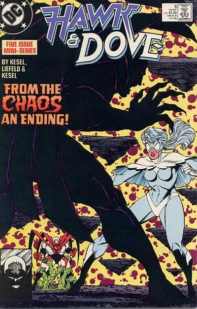
I asked Karl Kesel if this version of events was true, and here is Karl's answer:
COMIC URBAN LEGEND: Simon Bisley once drew a penis on Lobo's arm on a comic cover.
STATUS: Seemingly False
The background on this one is very straightforward...on the cover to 1992's Lobo's Back #2, artist Simon Bisley appears to have drawn what looks to be a penis on Lobo's left arm.
See for yourself...
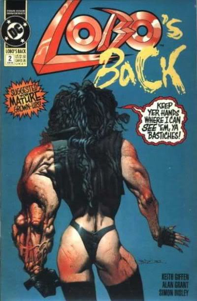
Wizard interviewed Bisley in 1994's #31, and asked him about the incident:
COMIC URBAN LEGEND: Batman and Superman began to team-up because of inflation
STATUS: True
It's amazing to note that Superman and Batman, who are probably the most famous superhero team-up pair, did not have a SINGLE team-up in the first THIRTEEN years of their shared existence (except, of course, when they appeared in the Justice Society of America together).
This was especially odd when you consider the fact that the heroes shared a magazine since 1941!!
World's Finest Comics made its debut in 1941 under a DIFFERENT title, World's BEST Comics.
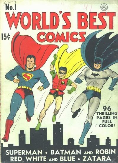
The very next issue marked a change to World's Finest Comics, and the comic was 100 pages for 15 cents!
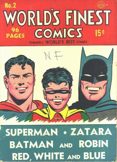
The format was a pile of stories starring a variety of heroes, but always one Superman story and one Batman story. The heroes never appeared TOGETHER, though, except for the covers - and the covers were often quite fun.
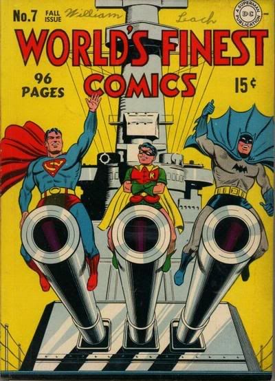
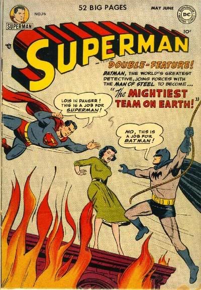
This was the standard until 1954, two years after Batman and Superman's first ever team-up, in the pages of Superman #76, where the heroes learned each other's secret identities (talk about an interesting FIRST team-up!!)...
In World's Finest #71, in 1954, Batman and Superman had the first of many team-ups.
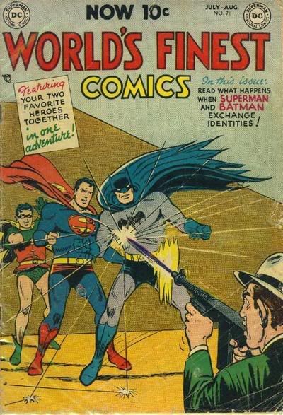
However, the reason WHY they teamed up was because of inflation!
Here's a good time to explain how comics used to deal with inflation back in the Golden Age. Rather than raise prices, what publishers did was to reduce the SIZE of the comic, in both size of the actual comic and amount of pages. For instance, World's Finest had 100 pages through #9, 92 pages through #12, 84 pages through #18, 76 pages through #54, and 68 pages through #70. In addition, the height and width of the comic slowly shrunk as well.
Well, with #71, the book made it's biggest jump, from 68 to 36 pages. At this point, the book did not have ROOM for both a Superman AND a Batman story, so instead, they decided to team the two heroes up, and that was the way the book continued (except for a short period in time where World's Finest became a Superman and ____ book) until the book finally ended right before John Byrne's Man of Steel revamp.
Thanks to Michelle Nolan's fine column for providing the page size information.
Well, that's it for this week, thanks for stopping by!
Feel free to drop off any urban legends you'd like to see featured!!
Let's begin!
COMIC URBAN LEGEND: Rob Liefeld once drew a book in landscape style without being asked, leading to the book having to be cut and paste to look like a normal comic book.
STATUS: True
Rob Liefeld's big break in comics came in the late 80s, when he was the penciller on the Hawk and Dove mini-series for DC. Written by Barbara and Karl Kesel, with inks by Kark Kesel, the mini-series became a really big hit for DC (and led to the Hawk and Dove ongoing series).
In any event, so it goes that in the last issue, Hawk and Dove are in a chaos dimension, and (someone linked me to this particular version of events on a messageboard, but I am afraid I have since lost the link, so if someone finds the link for me, I'll gladly credit it here)
Without consulting his editors, Rob drew all of this sequence in "landscape" (i.e. you would have had to turn the comic to read it). When asked by the baffled and shocked editor why he had done this, Rob said that's how it had been drawn the only other time this dimension had been shown.Here is the issue in question:
Inker Karl Kesel had to rotate all the panels and paste them together into a new flow as part of his inking job. The letter column to issue #5 contains an oblique reference to this incident, mentioning that Rob "showed something new to an editor who thought he'd seen everything".

I asked Karl Kesel if this version of events was true, and here is Karl's answer:
Yes, Rob did draw the entire Chaos Dimension sequence sideways or "landscape" style. He did this without consulting anyone. I'm sure Rob saw this as cool and different and exciting, but the editor, Mike Carlin, was not quite as thrilled. Personally, I'm not a huge fan of having to turn a comic sideways to read a story, especially not in the middle of an issue. It pulls you out of the story by calling far too much attention to itself. It can be done-- there was a great issue of the Moore/Bissett/Totleben SWAMP THING that actually had you turn the comic completely around as you read it that was an amazing use of the device; and John Byrne did a FANTASTIC FOUR story set in the Negative Zone where it worked well-- but generally I think it's best to avoid.Thanks for the info, Karl!
Anyway. By the time we reached the last issue of the mini-series, Rob's sights were clearly on other horizons. He had gotten later and later on deadlines, and more and more often forgot to drawn character's hands and feet. The Chaos Dimension sequence seemed to be the last straw for Carlin. As I remember it, Mike called me up to tell me that Rob had drawn the sequence sideways for no good reason, and that he (Carlin) was going to cut-and-paste it (using xeroxes) into a readable form and send those to me. Which he did. I lightboxed them onto DC paper and inked them.
By the way: Rob did NOT draw the dimension sideways because that's how it had been drawn the only other time it had been shown. THIS was the first time it had been shown-- Barbara and I created it for this story.
Mike Carlin once said of Rob: "He has it. He just doesn't have it yet." And I couldn't agree more. Rob is one of the most energetic and charming people I've ever met-- you can't help but like him-- and at the time of H&D his work showed great potential. But success came far too quickly and easily to him, and he never felt the need to develop that potential. Which is really too bad, because if he did I'm certain he would have left a very different mark on the industry. Not that things worked out that badly for him...
COMIC URBAN LEGEND: Simon Bisley once drew a penis on Lobo's arm on a comic cover.
STATUS: Seemingly False
The background on this one is very straightforward...on the cover to 1992's Lobo's Back #2, artist Simon Bisley appears to have drawn what looks to be a penis on Lobo's left arm.
See for yourself...

Wizard interviewed Bisley in 1994's #31, and asked him about the incident:
Wizard: So how did that penis get on Lobos arm?So, basically, it comes down to, do you believe Bisley? I personally do, but I can see folks choosing not to believe him.
Bisley: Well, this is funny, because it wasn't a penis. The editor, Dan Raspler, was really worried about it...but it wasn't a penis, it was just a fold in the elbow, on the back of the arm, and it just happened to look like a penis. That's funny, isn't it?
W: Was there a lot of flak over it?
B: No. What's the big deal about a penis? I mean, we've all got them.
W: And it was for mature readers.
B: Yeah, but I'm quite sure that even juveniles have got them. I know that's not the point. But it wasn't something that I was trying to sneak in there. It wasn't the juvenile in me trying to stir things up. It just looked like a penis.
COMIC URBAN LEGEND: Batman and Superman began to team-up because of inflation
STATUS: True
It's amazing to note that Superman and Batman, who are probably the most famous superhero team-up pair, did not have a SINGLE team-up in the first THIRTEEN years of their shared existence (except, of course, when they appeared in the Justice Society of America together).
This was especially odd when you consider the fact that the heroes shared a magazine since 1941!!
World's Finest Comics made its debut in 1941 under a DIFFERENT title, World's BEST Comics.

The very next issue marked a change to World's Finest Comics, and the comic was 100 pages for 15 cents!

The format was a pile of stories starring a variety of heroes, but always one Superman story and one Batman story. The heroes never appeared TOGETHER, though, except for the covers - and the covers were often quite fun.

This was the standard until 1954, two years after Batman and Superman's first ever team-up, in the pages of Superman #76, where the heroes learned each other's secret identities (talk about an interesting FIRST team-up!!)...

In World's Finest #71, in 1954, Batman and Superman had the first of many team-ups.

However, the reason WHY they teamed up was because of inflation!
Here's a good time to explain how comics used to deal with inflation back in the Golden Age. Rather than raise prices, what publishers did was to reduce the SIZE of the comic, in both size of the actual comic and amount of pages. For instance, World's Finest had 100 pages through #9, 92 pages through #12, 84 pages through #18, 76 pages through #54, and 68 pages through #70. In addition, the height and width of the comic slowly shrunk as well.
Well, with #71, the book made it's biggest jump, from 68 to 36 pages. At this point, the book did not have ROOM for both a Superman AND a Batman story, so instead, they decided to team the two heroes up, and that was the way the book continued (except for a short period in time where World's Finest became a Superman and ____ book) until the book finally ended right before John Byrne's Man of Steel revamp.
Thanks to Michelle Nolan's fine column for providing the page size information.
Well, that's it for this week, thanks for stopping by!
Feel free to drop off any urban legends you'd like to see featured!!
Taken Far Too Soon - R.I.P. Seth Fisher
I feel like I have just been punched in the gut, as I just finished reading the awesome last issue of Zeb Wells and Seth Fisher's Iron Man/Fantastic Four mini-series, and then I found out that Seth Fisher died last night. This is such stunning, awful news. It was only a few months ago that I was talking about how amazing his art is, and now he is gone. This is so terrible to hear. My condolences to his wife and his family and friends.
Wednesday, February 01, 2006
What I bought - 1 February 2006
What the hell is going on? The attitude of the publishers toward their comics-buying public really chaps my hide. Chaps my hide, I say! I'm so sick of writing for the trade. Does anyone even care about ongoing titles anymore? I bought eight floppies this week. FOUR were mini-series in the middle of the series, so I didn't read them. ONE was the final issue of a mini-series, so I read it. THREE were ongoing titles, and one was one that I only bought because I pre-ordered it and felt a responsibility to buy it. I've ranted about this before, but I just don't get it. Let's take Batman & the Monster Men, which I bought but didn't read. It's an excellent book, and I encourage you all to buy it. Let's say, when we all heard about it and our nipples got hard because it's Matt Wagner writing and drawing Batman, a character he was freakin' born to write and draw, we sat down and said, "Well, even though my nipples are hard because Matt Wagner is writing and drawing Batman, a character he was freakin' born to write and draw, I'm still going to wait for the trade because there might be nifty character sketches in the back or some such shit." So no one on the planet buys the individual issues. Does DC put the kibosh on the inevitable trade paperback? I don't know. I'm just wondering. I do know that I'm just tired of the six-issue arc. One of the beautiful things about comics is their never-ending serial nature. Again, I have ranted against this before, but long-running storylines are so nice when they reach fruition. I'm fucking sick of six-issue arcs! Grrrr.
So. What did I buy?
Beowulf #6 by Brian Augustyn and Attila Adorjany
$2.99, Speakeasy
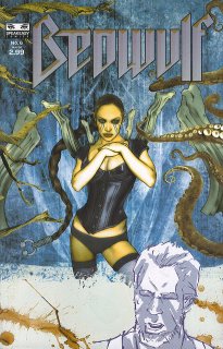

I only bought this because I ordered it a while ago. I wouldn't have otherwise, but I'm pretty sure my store ordered just the one copy, for little old me, so I would have felt bad if I left them on the hook for, what, the $1.50 it cost them to order it? I should have told them I wasn't buying their shoddy merchandise!
I mentioned this when the last issue of Beowulf came out. It's not a horrible book, and I liked the art on the first few issues, but Adorjany's does nothing for me - it's ugly and poorly executed and just not good. Sorry, Attila! This issue feels rushed, as if Augustyn was trying to wrap everything up - I don't know if Speakeasy's problems mean that Beowulf is done (the issue ends with "The End," so it could mean that, or it could mean that we've just finished up one six-issue arc, and you know how I feel about that), but it feels like Augustyn just threw a lot of stuff in there that doesn't really work and just quickly moves everything to its conclusion. Blah.
I'm pretty sure this is my last issue, because I don't think I've ordered another one. Yay, me! I saved three dollars!
Hard Time #3 by Steve Gerber, Mary Skrenes, Brian Hurtt, and Steve Bird
$2.50, DC
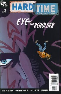

Is this so hard? Maybe Gerber and Skrenes are setting me up for a six-issue arc, but it doesn't feel like it. This is a busy comic, but we can keep up easily and the stories are compelling on their own, even though we can feel them slowly coalescing at some point in the future. Maybe this will kill the book - we need clearly defined six-issue arcs! the public cries - but I, for one, am appreciative. We begin with Ethan sending his energy being out to find the granddaughter of his cell-mate, with whom he shared a kiss, presumably in "Season One." The Khe-Chara tracks her down and overhears her talking to a friend, and Ethan thinks she's propositioning the guy. We know better (don't we?), but Ethan reacts like any teenager would, and decides she's not the one for him. Then, abruptly, the comic switches to Cindy and Cutter, who begin a fairly weird relationship, plus we find out what may be a reason why Ethan gets ill whenever Cutter is around. There's a lot going on.
Despite the various stories, we're never lost. Gerber and Skrenes give us a first page that recaps enough of what has come before so that we get into the story. There's absolutely no action in this book, but the plot moves forward, and whenever Cutter is on the scene, there's a sense of menace, because we're waiting for him to earn his reputation. The most disturbing scene happens at the end, when he pierces Cindy's ears, not because of what happens, but because of what we're anticipating. This tension is built very nicely by Gerber and Skrenes, and it's what makes Hard Time such a nice read. The writers are playing on our knowledge of prison clichés, and they're doing it well. They might fall into the trap of stereotypes eventually, but right now, they are keeping things fresh and new enough and they make Hard Time a very nice read. And the art is good, too - I know Cronin likes it, and that should be good enough for you, lemmings!
Supreme Power: Nighthawk #6 (of 6) by Daniel Way and Steve Dillon
$2.99, Marvel
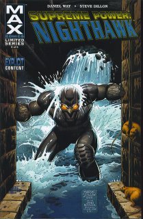

I really hope you all listened to me, people, and didn't buy this. My long national nightmare is over, because this series is. This is so bad I may not buy the new Squadron Supreme series when it comes out, even though Way isn't writing that. This may be the first thing by Way I've read. He's kind of a hot shot around Marvel, and I can't figure it out. This is a nasty piece of comic literature. Nothing to recommend it at all. Don't buy the trade! Or if you have more money than you know what to do with, buy it, shred it, and send it back to Marvel. Blech.
X-Factor #3 by Peter David, Ryan Sook, Dennis Calero, and Wade von Grawbadger
$2.99, Marvel
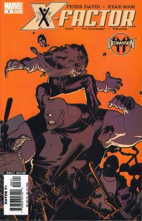

Another reason why ongoing titles are nice. Peter David gets it. Like I said last week, I get why some people don't like him, but he knows how to throw a lot of plotlines into one issue of a comic and keep them going for a long time - further than six issues, at least. In this book, we get Madrox and Siryn investigating the murder from last issue, which may have something to do with the rival company we saw last issue. Meanwhile, Rictor, Guido, and Rahne get caught up in a riot in Mutant Town, stemming out of the events of Decimation. Apparently "real" humans are beating up depowered mutants because they can now, and our friends in X-Factor don't take kindly to that. Meanwhile, an employee of Singularity, that same company that is messing with Madrox and Siryn, sends a guy into X-Factor's HQ to kill someone, but they get the wrong person. Layla Miller reveals a bit more about herself, and it's not all good. I was hoping David would do something with her, and he is, which is nice. And Monet strips while singing along to Right Said Fred.
There's a lot to like about X-Factor. It doesn't feel like everything is going to be wrapped up in four, five, or six issues, and even if it eventually is, I can deal with it because each issue adds important items to the overall book. That's why ongoing titles are so good, because they don't feel the pressure to wrap everything up. David might wrap up some of his plots next issue, but he might let them boil for a while.
So. Hard Time and X-Factor. Good books. Go buy them.
Mini-series I bought but didn't read.
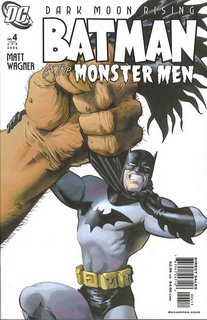
 Matt Wagner. Pretty art. Monsters. Cool.
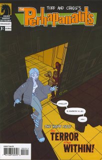
 Can you face "The Terror From Within"? Well, I certainly can't, so I'll wait until next issue when things might be less terrifying.
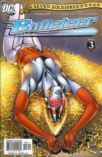
 I'm sure I'll like this, and all the other mini-series of this maxi-series. But I flipped through it and I saw, briefly: superheroes sitting around a table with "normal" folk, like they did it all the time; references to old-school heroes; a reference to a vast conspiracy; people in brightly-colored costumes talking tough. Sigh. Is it me, or is this all a little familiar?

 That's a cool cover. I like how the Wildstorm logo is slanted along with the title logo. Keen. You should buy this, you know. Chuck Dixon war comic. Purty Mahnke art. What's not to like?
Maybe I'll be less riled next week. Knowing me, maybe not.
So. What did I buy?
Beowulf #6 by Brian Augustyn and Attila Adorjany
$2.99, Speakeasy


I only bought this because I ordered it a while ago. I wouldn't have otherwise, but I'm pretty sure my store ordered just the one copy, for little old me, so I would have felt bad if I left them on the hook for, what, the $1.50 it cost them to order it? I should have told them I wasn't buying their shoddy merchandise!
I mentioned this when the last issue of Beowulf came out. It's not a horrible book, and I liked the art on the first few issues, but Adorjany's does nothing for me - it's ugly and poorly executed and just not good. Sorry, Attila! This issue feels rushed, as if Augustyn was trying to wrap everything up - I don't know if Speakeasy's problems mean that Beowulf is done (the issue ends with "The End," so it could mean that, or it could mean that we've just finished up one six-issue arc, and you know how I feel about that), but it feels like Augustyn just threw a lot of stuff in there that doesn't really work and just quickly moves everything to its conclusion. Blah.
I'm pretty sure this is my last issue, because I don't think I've ordered another one. Yay, me! I saved three dollars!
Hard Time #3 by Steve Gerber, Mary Skrenes, Brian Hurtt, and Steve Bird
$2.50, DC


Is this so hard? Maybe Gerber and Skrenes are setting me up for a six-issue arc, but it doesn't feel like it. This is a busy comic, but we can keep up easily and the stories are compelling on their own, even though we can feel them slowly coalescing at some point in the future. Maybe this will kill the book - we need clearly defined six-issue arcs! the public cries - but I, for one, am appreciative. We begin with Ethan sending his energy being out to find the granddaughter of his cell-mate, with whom he shared a kiss, presumably in "Season One." The Khe-Chara tracks her down and overhears her talking to a friend, and Ethan thinks she's propositioning the guy. We know better (don't we?), but Ethan reacts like any teenager would, and decides she's not the one for him. Then, abruptly, the comic switches to Cindy and Cutter, who begin a fairly weird relationship, plus we find out what may be a reason why Ethan gets ill whenever Cutter is around. There's a lot going on.
Despite the various stories, we're never lost. Gerber and Skrenes give us a first page that recaps enough of what has come before so that we get into the story. There's absolutely no action in this book, but the plot moves forward, and whenever Cutter is on the scene, there's a sense of menace, because we're waiting for him to earn his reputation. The most disturbing scene happens at the end, when he pierces Cindy's ears, not because of what happens, but because of what we're anticipating. This tension is built very nicely by Gerber and Skrenes, and it's what makes Hard Time such a nice read. The writers are playing on our knowledge of prison clichés, and they're doing it well. They might fall into the trap of stereotypes eventually, but right now, they are keeping things fresh and new enough and they make Hard Time a very nice read. And the art is good, too - I know Cronin likes it, and that should be good enough for you, lemmings!
Supreme Power: Nighthawk #6 (of 6) by Daniel Way and Steve Dillon
$2.99, Marvel


I really hope you all listened to me, people, and didn't buy this. My long national nightmare is over, because this series is. This is so bad I may not buy the new Squadron Supreme series when it comes out, even though Way isn't writing that. This may be the first thing by Way I've read. He's kind of a hot shot around Marvel, and I can't figure it out. This is a nasty piece of comic literature. Nothing to recommend it at all. Don't buy the trade! Or if you have more money than you know what to do with, buy it, shred it, and send it back to Marvel. Blech.
X-Factor #3 by Peter David, Ryan Sook, Dennis Calero, and Wade von Grawbadger
$2.99, Marvel


Another reason why ongoing titles are nice. Peter David gets it. Like I said last week, I get why some people don't like him, but he knows how to throw a lot of plotlines into one issue of a comic and keep them going for a long time - further than six issues, at least. In this book, we get Madrox and Siryn investigating the murder from last issue, which may have something to do with the rival company we saw last issue. Meanwhile, Rictor, Guido, and Rahne get caught up in a riot in Mutant Town, stemming out of the events of Decimation. Apparently "real" humans are beating up depowered mutants because they can now, and our friends in X-Factor don't take kindly to that. Meanwhile, an employee of Singularity, that same company that is messing with Madrox and Siryn, sends a guy into X-Factor's HQ to kill someone, but they get the wrong person. Layla Miller reveals a bit more about herself, and it's not all good. I was hoping David would do something with her, and he is, which is nice. And Monet strips while singing along to Right Said Fred.
There's a lot to like about X-Factor. It doesn't feel like everything is going to be wrapped up in four, five, or six issues, and even if it eventually is, I can deal with it because each issue adds important items to the overall book. That's why ongoing titles are so good, because they don't feel the pressure to wrap everything up. David might wrap up some of his plots next issue, but he might let them boil for a while.
So. Hard Time and X-Factor. Good books. Go buy them.
Mini-series I bought but didn't read.

 Matt Wagner. Pretty art. Monsters. Cool.
 Can you face "The Terror From Within"? Well, I certainly can't, so I'll wait until next issue when things might be less terrifying.
 I'm sure I'll like this, and all the other mini-series of this maxi-series. But I flipped through it and I saw, briefly: superheroes sitting around a table with "normal" folk, like they did it all the time; references to old-school heroes; a reference to a vast conspiracy; people in brightly-colored costumes talking tough. Sigh. Is it me, or is this all a little familiar?
 That's a cool cover. I like how the Wildstorm logo is slanted along with the title logo. Keen. You should buy this, you know. Chuck Dixon war comic. Purty Mahnke art. What's not to like?
Maybe I'll be less riled next week. Knowing me, maybe not.
This Comic Is Good - Fury: Peacemaker #1
I have long said (and this is not some brilliant observation, as it is plain to see) that Garth Ennis seems to try a lot harder with comics about war, as it seems to be something he takes seriously. Well, this was evident in Fury: Peacemaker, a book where Ennis makes good storytelling seem almost effortless. Darick Robertson provides very nice art to make this comic like a big glass of coolness.
The gist of the comic is that this is the time where Nick Fury becomes the man we all know from World War II. He enters this comic as a normal enough sergeant, and leaves as the genesis of NICK FURY.
How this is achieved is through a very clever, but basic, structure. Fury and his men are trapped at the Kasserine Pass, and as things go horribly wrong, we are treated to a series of flashbacks. The flashbacks are to the various preparations made for this very situation, and then we cut to see how these preparations pan out when in real life war situations. Well, things are a lot different in a combat zone, as you would expect. As I mentioned, it is an extremely simple structure, but impressively effective.
Darick Robertson does a good job depicting the mayhem, and I really like his design of slightly younger Fury, as a man who is still extremely tough, he just has yet to have an arena to EXERCISE this toughness, and there is a scene at the end with Fury and a German where we see Fury first realize that this War can BE that arena for men like Fury.
Ennis really does an effective job here, because he SETS UP the series while still filling it with plenty of awesome moments.
Very nicely done. I look forward to where he goes with this plot.
Comic Quotes Should Be Good for the 1/25 Comic Week
On the side of this blog are a lot of fine blogs where folks talk about comic books. Each week I pick out ten cool quotes about comics from those blogs during the past comic week. I cannot promise that my picks will be thorough, or even the best quotes. They are just quotes that made me laugh or smile or say, "Good line." Please note that the folks who write on this here blog (Comics Should Be Good) are excluded, as it strikes me as a bit too self-serving to quote any of them here. But be assured that I think they are all quite good!
Let's begin!
Shawn Hoke takes a look at Francois Vigneault's Friends (and at the end of the column, he even gives us a link to see more of Vigneault's work!),
David Campbell discusses what was perhaps Dan Abnett and Andy Lanning's coolest idea ever, the use of Ra'a Al Ghul as a villain in the Legion of Superheroes,
Another Kevin, Kevin Church, talks about how cool Godland is (and it is),
Let's begin!
Shawn Hoke takes a look at Francois Vigneault's Friends (and at the end of the column, he even gives us a link to see more of Vigneault's work!),
Issue one of Friends has a wonderful, organic feel to it when you hold it in your hands. The thick, brown cover has a thin layer of wood pasted to the front, and it’s on this wood that the title, “Speak Now or Forever,” is stamped in the style of an old wanted poster. This is one of the most interesting mini-comic covers I’ve seen in some time. Inside, the pages are a light butter color usually split into four equal sized panels. Vigneault’s art is warm and I enjoy the way he draws his faces. Sometimes your initial reaction to a comic can color the way you judge it, and this may be one of those times.Alex knocks our socks off with a nicely detailed examination (this quote is but a drop in the bucket) of Frank Quitely's art in All Star Superman #2,
Whether he purposefully left earlier faint pencil lines in some panels or not, they are often quite noticeable. This is especially noticeable when you look at the lettering; the ruled lines are often visible as though they weren’t fully erased. I wasn’t bothered by this at all, which is strange because I’ve probably complained about that on another mini-comic before. In this first issue of Friends, the faint pencil lines are almost like seeing through the skin of the story. It’s like you can see the bones, muscles and ligaments, and it adds to the organic nature of the book. The art feels rich and fully realized, but strangely the level of detail isn’t high. The panels feel textured rather than inked, if that makes any sense.
Page 8- Superman gives Lois flowers, and he's kinda shy about it, standing there like a little kid. Lois also seems a little shy, with her hands crossed in front of her, and her back straight, as if she's nervous. They're both like kids on a first date... and if you think about it, that's what this is.Johnny Bacardi reviews some comics, including Northwest Passage,
Page 9- Lois is back to being slightly annoyed and pensive. She doesn't believe that he's Clark kent, and is irritated that he's saying it. (Let's face it... whether she believes him or not is beside the point- she wanted to break that story, and now he's ruined it for her.)
Arms crossed, not looking at him, teasing him. She's questioning everything he says ("Kal Kent, Huh?")
Superman, on the other hand, is trying to show some pride in his home without letting his secret slip. Look at him there, as he looks at the floor when he lies to her about his health. His shoulders are drooped, he's leaning in the wall for support. He hates this lie.
The last panel is one more look of Total Sincerity from Big Blue. "The Dawn of the Age of Superheroes." You know he means it... that fortress really isn't for him- it's his gift to posterity. Total selflessness.
NORTHWEST PASSAGE #'s 1 & 2 (Oni Press)S/A: Scott Chantler This one completely slipped under my radar, despite a recommendation from my friend Mike Cary- it's early 60's Disney-esque adventure, starring fur trappers and Native Americans vs. villainous French soldiers set in the Canadian Northwest of 1755 and written with historical integrity, as well as action/adventure and drama, in mind...and while you'd think the Phil Foglio-by-way-of-Jason Bone cartoon-style art would undercut it, far from it- Chantler has a deft hand for drawing faces and body language, well capable of getting across heroic or villainous, simply by virtue of the way he poses someone or the type of line he uses. There's an assurance about his stuff which really gets the essence of his protagonists across. He doesn't scrimp on backgrounds, either- his woods and forts are all utterly convincing. This flags just a wee bit in the story department; all the characters are a bit broadly written, kinda predictable and not as fully developed as one would like, but heck- it's early in the series and I have a feeling that will be remedied soon. Nitpicking aside, this is shaping up as grand high adventure in a fairly novel setting, and I can't wait for the third volume. The second volume will be released soon, I understand. ADavid Welsh examines a rape storyline in Young Avengers,
Can anyone remember the last time a comics character actually reported a sexual assault to the authorities? I can’t. The protagonist in Dramacon didn’t. Sue Dibny never got the opportunity in Identity Crisis. And now it’s revealed that Kate Bishop can be added to Ragnell’s depressing list of characters who have been raped.Chris Sims explains to us the defining moment of Avengers #214,
I had switched over to trades on this title, but a friend suggested I pick up the special issue because it tied into things that have been on my mind a lot lately. I’m glad I did, because it’s an extremely well-written comic filled with nuanced observations about Allan Heinberg’s cast of young heroes. Kate’s sequence is good, too, particularly for the textured back-and-forth between Kate and former super-heroine Jessica Jones.
But I’m still left wondering if, well-written or not, comics need any more unreported rapes. Obviously, sexual assaults go unreported all the time in real life, no matter how much we all wish they didn’t. In this particular fictional context, though, it seems to be the default setting, and that makes me extremely uneasy.
In the story, Kate is assaulted by a stranger in the park. In the aftermath, she talks to a therapist about the crime and she learns self-defense, but she doesn’t inform the police or tell her family. While the crime isn’t her only motivating factor for becoming a costumed heroine (she also has her late mother’s example of social conscience, doing what one can with the means they have available), it’s significant.
“You can do your best to make sure that what happened to you ever happens to anyone else.”
Except that she didn’t, really, because she never tried to get the man who raped her off the streets.
The friend who recommended the special to me had to talk me down a bit. She pointed out that the apparent disconnect isn’t really implausible, given an adolescent’s sometimes abstract and developing concept of justice, especially in a world full of vigilantism, where the role models are often disguised and apparently unaccountable. And she noted that the crime isn’t Kate’s sole driver for what she does; she was already inclined to follow in her mother’s footsteps.
And wow, do I hope I’m not sounding like one of those twits who think young readers can’t handle anything challenging or complex, but it bothers me that there are so many instances of this. Sexual assault can be portrayed well in any medium, and Heinberg arguably does well with it here. It’s specific to Kate, and it’s portrayed with sensitivity. Even if they aren’t the choices I want Kate to make, they’re believable as her choices.
But why do writers never think to show a victim going through the justice system? Reporting the crime, getting support from their family, testifying against their attacker, and seeing the criminal punished?
Defining Moment - The scene where Ghost Rider abandons the kid falling off the water tower is big contender, but for sheer Badass Panelitude, it just doesn't get better than the scene where Ghost Rider talks trash to Thor, asking him what the heck kind of god he is that he won't let mortals worship him, prompting Thor to let loose with a bit of the ol' long-distance smoting. That's when the Ghost Rider puts his Master Plan™ into effect, outrunning Mjolnir on his motorcycle, then grabbing onto it as it soars back towards the Thunder God:The rocking makes up for Sims' horribly wrong take on Plastic Man #20, where he states
What happens next will echo throughout history as one of the most awesome moments in the history of Marvel Comics. Ladies and Gentlemen, I submit to you...
THE GHOST RIDER BIKE-KICKS THOR IN THE FACE.
Attention Readers: YOU HAVE NOW BEEN ROCKED.
Brian Cronin makes the claim that it's a "shame" that Kyle Baker's last issue of Plastic Man was a "mocking send-up of the DC Universe" rather than a straight-up fun comedy story, and that's--no offense--one of the most ridiculous criticisms I've ever read. Not because the issue's not great, which it is, and which is something Cronin and I could definitely agree on, but because spoofing the DCU is pretty much Plastic Man's stock-in-trade, going back to at least #8--twelve bi-monthly issues ago-- when Baker riffed on the nonsensical Joe Kelly JLA run, and continuing to my favorite moment of the series, #14's hilarious parody of Superman/Batman #13. I'm just saying, I don't expect the last issue of a series to do anything but what it's been doing for the past few years.I, of course, stand by my initial statement that Plastic Man #20 was unlike the typical Plastic Man issue. You, dear readers, must judge for yourselves!
David Campbell discusses what was perhaps Dan Abnett and Andy Lanning's coolest idea ever, the use of Ra'a Al Ghul as a villain in the Legion of Superheroes,
In a nutshell, the Legionnaires discover that the President of The United Federation of Planets is actually Ra’s al Ghul in disguise. The bastard is still alive hundreds of years into the future, no doubt due to the Lazarus Pit spa treatment he regularly receives. That, and a lot of water-rich foods and plenty of exercise and fresh air. The fact that he’s still alive kind of makes him the winner in the big Batman vs Ra’s contest, doesn’t it?Jog continues to assist me in saying what I basically feel about certain comics, but am too lazy to get around to saying, in this instance, he gives a good review to a comic I liked a bunch, Local #3,
Anyway, Ra’s has always been keen on remaking Earth and ushering in a new age of perfection, and in the future he’s found the means to do just that, and big time. He unleashes a destructive wave across the planet, “terrorforming” humans into creepy pure lifeforms.
Naturally, only The Legion and one plucky six-year old girl stand in his way. Sadly, the plucky girl gets crushed by a rhino on page two – so it’s up to The Legion!
I loved this story because it caught me by surprise. As a reader you knew something was fishy about the President, but when it’s finally revealed that he’s Ra’s al Ghul in holo disguise – somebody give me a F*@% Yeah! That’s just a great idea.
My favorite bit in the storyline (which spans numerous issues of The Legion) is the part where Ra’s captures Mon-El and inters him in a chamber bathed with red solar light that saps him of his Daxxamite powers. Mon-El has spent some time in the 20th century as the hero Valor in the DC series by the same name, so he knows what Ra’s is capable of, but he can’t warn his fellow Legionnaires. We get this great scene where Ra’s shows up to give Mon-El the typical “join me or die” speech:
Mon-El tells the villain to get bent, which may not be the best idea because Ra’s is packing some heat, Dirty Harry style. Weakened by the red solar rays, Mon-El’s invulnerable body is anything but… and Ra’s pops a cap in his ass!
That’s cold.
Does Mon-El die? YES. He totally dies! Oh, hang on. I just flipped through the comics again. No, he doesn’t die. My bad. Still, it makes for a great cliffhanger. Please note that I’m cheating a little and am including scans from other issues in the storyline, not just issue #6.
The whole damn thing is well executed and fun. The story is epic, fast-paced, and features a host of characters – just like the Legion stories I read as a kid. Every Legionnaire gets a chance to kick ass or gets a good line, and they’re all wearing chic superhero uniforms, just like in the good old days. They even slip a roll call page in issue #6 for the benefit of new readers. Check it out.
Olivier Copiel’s art is crisp and cute without being too cloying. I don’t know if that even makes sense. If memory serves Copiel left the book shortly after this storyline to draw Chuck Austen’s run on The Avengers, which proves that there is no God.
I’m a big fan of Copiel’s work, and with The Legion he is at the top of his game. It looks like he’s having fun. What comic book artist wouldn’t want to draw spaceships and sexy women and weird aliens and Science Police? It might be a lot of work, but if I were an artist I’d rather draw that stuff than twenty-two pages of Peter Parker and Mary Jane talking in a bedroom.
This is a nice issue. It seems that every new release in this series is determined to play around with a different approach to presentation - we had the repeating imagination structure of #1 and the long silent stretches of #2, and now we have a drifting mass of events floating from one member of a recently-disbanded musical quartet to the next, as all of them attempt to engage with a post-band life. And each of them illustrates a different facet of a frankly communal situation that all are submerged in, having returned to lovely Richmond, VA for a little settling down.The Pickytarian tells us something we should already know, Kevin Huizenga is awesome and we should all be reading Ganges,
Involuntary narration is provided by the band’s singer/guitarist, who spends way too much of his day talking on the phone with a music journalist, who largely seems intent on relating everything going on now to the band’s past. Why did you leave Virginia? How was your sound changed? What do you think of your fans’ reactions? Writer Brian Wood quite nicely handles the tenor of the interview, the journalist adopting an apologetic stance for tough questions, gently flattering the subject to get him back on track (“Happy birthday.”) - I’ve listened to the recordings of interviews like this. The singer/guitarist thus represents the inescapable presence of what’s gone on before, (literally) stuck dealing with his and his bandmates’ own past accomplishments.
Elsewhere (as the narration continues), we have the group’s bassist/vocalist, who’s attempting to restart a relationship that got shunted aside for the sake of her art. We have the drummer, who’s dealing with the economic side of things, hawking off his old works at inflated prices (nominal series protagonist Megan makes a cameo here, and it’s nice to see that artist Ryan Kelly still has her wearing her apartment key, as covered in issue #2). And we have the (non-singing) guitarist, who’s playing a solo set at a small club. All the while, the conversational narration continues, sometimes complimenting what we see, and sometimes contrasting with it. It’s ultimately clear that the realities of the breakup situation and the ephemeral qualities of recognition are so great, that the only truly lasting pleasure comes from the act of creation itself, and only one band member is ultimately glimpsed in what can be read as a state of unrestricted happiness.
It’s a good, low-key little story, possessed with authenticity of theme, and willing to allow its themes to simmer. The space-spanning narrative structure allows for some nice local color, and Kelly continues to do a good job with the atmosphere. For bonuses, there’s the expected essays, two pages of designs and roughs, a pair of pin-ups by Richmond-connected guest artists Chris Pitzer and Rob G., and two pages of the new ‘My Local’ feature, in which readers can send in pictures and words about their own surrounding environs. Still a nice package.
This morning I read a comic book that blew me away, one that was focused almost entirely on the internal life of its main character: Ganges #1 by Kevin Huizenga.Oh, just for the record, check out this piece where I talk about how awesome Kevin Huizenga is.
Huizenga tells the story of a relatively mundane day in the life of Glenn Ganges. Glenn goes to the library to pick up some books and CDs, which he brings home and enjoys while his wife Wendy does some animation work on her computer. That doesn't sound like much of a story, and if I were to add that Ganges accompanies his humdrum activities with ruminations on the nature of time, life, and love, you might be inclined to tune me out even further. I know I would flip through a book like that and put it back on the shelf; I've done just that, in fact, with Huizenga's Or Else any number of times. I see now why that was such a big mistake. It's not just because Huizenga's insights are engaging and interesting, it's because he is such a gifted cartoonist that he can weave them into an utterly enthralling narrative that wouldn't work in any other medium.
Along with his economical, engaging cartoony drawing and his knack for beat-perfect storytelling, Huizenga engages in a fair bit of formal experimentation in this book. In the first "chapter," for example, Glenn walks to the library, pondering the passage of time. Huizenga goes crazy with the interplay of panel borders, thought balloons, and narrative captions in this sequence. It isn't always intuitive to read, but it definitely forces the reader to consider the relation of the past to the present and the way that sequential comics represent these concepts. Another notable sequence comes at the end of the book, when a caffeinated Glenn lies in bed watching his wife sleep. He considers the billions of people throughout history who have done the exact same thing, thinking the exact same thoughts. In a quiet, beautiful sequence on a black background, Huizenga lays out a series of panels showing various people (including characters from earlier passages in the book, such as Native Americans and elderly Glenn and Wendy), silently admiring their sleeping lovers. It's not showy or saccharin-sweet; it's understated and sublime.
I'm not afraid to eat crow, and it's a good thing, because I have a steaming plateful in front of me. Consider me converted. Kevin Huizenga is one of the best cartoonists working today. Ganges #1 will be in stores tomorrow; fans of the comic medium would do themselves a major disservice by overlooking it.
Another Kevin, Kevin Church, talks about how cool Godland is (and it is),
Giving into the rest of the Morlock hordes, I finally picked up the first collection Hello, Cosmic this past week and gave it a read. Then, I gave it a reread. And another. Hot damn, it's good stuff.Sleestak has some fun snark about the most recent issue of Adventures of Superman,
It's rare that I find somebody actually applying Kirby's lessons to the form. Morrison does it very well, as I've pointed out previously, but for the most part there's very little in the superhero realm that applies his search for "the new" to the form. For the most part, the people writing superhero comics now are the spiritual children of writers like Roy Thomas, where creation is secondary to the sheer glee of getting to play with those favorite characters of youth.
Casey and Scioli, though, are tossing new concepts and story ideas at the reader left and right and while the art's outright aping of Jack vexed me at first, I realized that it was sort of essential to their version of the exercise. By using the Kirby art style, Scioli's giving the reader a familiar riff, a nagging sense of deja vu that informs and broadens the work beyond its script. Subtext in superhero comics art is rare enough and it's a genuine pleasure to watch Scioli break down and remix Kirby's familiar tropes in a new ways, something that guys like Bruce Timm and John Byrne fail to do when they're approaching his style.
To me, it feels like GØDLAND's creators are providing an indie rock version of the bombast that Kirby always made operatic. Short three-chord riffs that slam into your forehead and leave you punchdruck instead of a full symphony that presses your entire body down until you finally given in. A strange creature from another galaxy, a villainous drug fiend who's quite literally a skull in a jar, a despotic freak torturing America's Greatest Hero - these are all tossed into the the first trade's mix casually with only the barest of explanations given or needed. You'll catch up or you'll drown, fanboy. The book's not going to stop because you need a breather.
Excellent material that I'm looking forward to getting another dose of when the second trade comes out.
Adventures of Superman #911 Oops! I mean...#648. This Infinite Crisis tie-in didn't do much for me because it was basically filler*. It reminded me way too much of the black cover Spider-Man 9-11 issue and those interminable CoIE "Red Skies" issues of the Detroit Justice League when the writer had no direction or clue what to do with the team for 6 months. It was also odd to see Green Lantern sitting on his backside when every other hero in town was lifting collapsed brick walls off the citizens.Thanks, folks, for providing me with so many great quotes! See you next week!
Really, it read like someone's rejected script for Volume 3 of DC's 9-11. I kept expecting to see a scene with Lex Luthor shedding a tear to show up on a page.
Good thing there isn't a hell, or I'd be going there.
So I guess those Batman readers who couldn't get enough of the No Man's Land and War Games story arcs from a while back get another heaping helping with the upcoming Battle for Bludhaven opus I'll be ignoring.
Tuesday, January 31, 2006
This Chat Was Good - George Pratt
George Pratt had a really informative chat over at CBR awhile back, and the transcript just went out. Well worth taking a look at. I especially loved the bit about flying in the back of Herb Trimpe's bi-plane to use as reference for Pratt's Enemy Ace comic. Here is the link to the transcript!
Dealing From the Bottom of the Deck - " Rape as a Plot Device...or 'Brad Meltzer is a Big Fat Liar'"
I prefer not to regurgitate stuff I wrote in the past, but when I came across this discussion on David Welsh's blog, I felt like writing about the topic and realized that I would just be repeating, practically word for word, what I already said after Identity Crisis #7 came out. And since just posting a link would look pretty weird, I am instead reposting what I wrote after the release of Identity Crisis #7. Here ya go!
Here are a few quotes for you (emphasises mine)...
"We thought long and hard about the issue of rape in a comic book magazine. We make it about power, not sex. We show the devastating consequences." - Brad Meltzer
"Meltzer's wife worked in Washington on the issue of violence against women, it was an issue very close to home." - The writer of the article where the above quote came from
"It's all in the execution. I think it could've been done terribly, but I hope I'll do it well. The worst thing is it's about power, it's not about sex. If I come in and just say, 'Hey, guys, this is what I want to do, I just want to sell some comic books,' then I wouldn't want me to do it. It's about the consequences." - Brad Meltzer
"I'm quite sure he plotted the entire mini-series all at once, and that the rape was critical to the plot from the beginning - that it was a defining moment for the heroes who were present, and will be a crucial element going forward." - A defender of Meltzer's use of rape.
Well, Identity Crisis #7 came out today.
And guess what?
Spoilers, I suppose...but I'm not really gonna get much into the issue.
In any event, guess what?
The rape?
NOT IMPORTANT WHATSOEVER.
Consequences?
NONE.
Not only was the rape not important to the story, it was not even MENTIONED in any issue other than #2.
What a bloody joke.
Why does a smart guy like Meltzer just lie like that? Unless...do you folks think that Meltzer actually believes that he DID have consequences to the rape? Do you think that he really, honestly believes that he wasn't just using the rape as a plot device to get the heroes from Point A to Point B?
Do you think he really lacks that much self-awareness?
Here is a link to the original post, as you might be interested in reading the comments.
Monday, January 30, 2006
Comics from the future!
I got a couple of advance copies of indy comics, and I thought I'd share my impressions. One book doesn't seem to be on a release schedule, and the other one comes out this Wednesday! In case you want to check it out.
The first book is The Miscellaneous Adventures of Stykman by Jonnie Allan, published by a.k.a. Comics. Issue #1 hits the stands on Wednesday, and I doubt if you'll be able to find it many places, but you can always go to the web site and order it there.
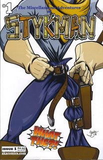

Stykman is a fun little book. Allan obviously has fun with the characters and the situation. Stykman is a wanna-be superhero who is, quite literally, made out of sticks We first see him with his sidekick, Al (presumably short for "alien, as he looks like something from The X-Files), playing Go Fish at home (it's that kind of book). A news report comes over the television explaining that the Jolly Roger, a pirate skeleton with a flying ship, has stolen an "ancient Aztec recipe for the gumdrop!" (Did I mention it's that kind of book?) The news warns potential superheroes to stay away, but Stykman's television is on the fritz a bit, so he doesn't quite catch that last part. One wonders if he would have stayed away anyway, as he seems to live in a bit of a fantasy world where he is desperately needed to save the day. He goes to the scene and, predictably, mayhem ensues. In the end, it's his sidekick that saves the day, but save the day he most definitely does!
There is nothing terribly original about this comic, but Allan's joie de vivre carries it along, and it's goofy fun. And, if you're going to rip something off, Cervantes isn't a bad choice. Because that's what Stykman is, basically - Don Quixote. Part of the fun of the book is Stykman's internal narration and how it clashes with the events depicted on the page. Just a random example (and I mean that, because I just opened a page and took the first thing I saw): when Stykman is confronted by Handsome Dan, Jolly Roger's henchman and someone who is much, much bigger than he is, he gets punched out. His narration reads: "Leave it to Dan to exploit my lack of vigilance. Negotiations went nowhere. Only one option left ... play possum." Lucky for him that he is unconscious!
Stykman is a gleeful book, with a hero who has a rope for a head, a pirate with scantily-clad women at his beck and call, a lawyer with a flaming head, an alien sidekick, and lots of mayhem. It's nothing that is going to change the world, but it's a lot of fun. The art is very crisp and vibrant and suitably goofy, and the story is shamelessly wacky. It's only 3 dollars, and I'm sure Allan would be more than happy to send you a copy. Why not?
The other book is Far-Fetchers by Brian Clopper:
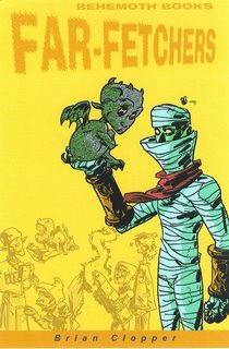

I haven't seen this solicited in Previews, which may be because it's not big enough. It's also possible it hasn't been solicited yet. I'm not sure - I feel kind of bad about not discussing this sooner, because Mr. Clopper sent this to me late last year and I haven't gotten around to reviewing it yet. It's another fun book, but not as goofy as Stykman. The basic premise is that creatures of imagination are seeping into the real world. It has a bit of a Fables vibe, but these creatures are "becoming" real and they're quite confused. Of course, the government steps in and creates an agency called the Far-Fetchers (nice play on words) to take care of these "figments" before they cause a panic. It's a nice conceit, and Clopper plays it relatively straight - the fun comes from the situation and the interplay between the characters. They consult works of children's literature for how to deal with the figments, and in the preview, they have to deal with an unusual monster that isn't exactly what it seems. After dispensing with that, they return to their headquarters, where they all have to deal with internal politics and a leader who has a hidden agenda. Clopper even manages to add some poignancy, as the Flying Mummy misses the love of his life, who is still trapped in the books. There's a hint of a larger story here, too, as the figments are all from the works of one author, who mysteriously disappeared when they starting entering the real world. It's an interesting read.
Clopper has done a nice job establishing this strange world and the dynamic between the characters. Even though they are bizarre and might seem like monsters, they all have insecurities and fears and, of course, they are trapped in a strange new world and have to adjust to that. Therefore, even though there is a true sense of fun throughout the book, Clopper hints at darker things to come - granted, it's not "dark" in the sense that recent DC books seem to think of "dark," but it has the potential for drama in the sense that it won't always be light-hearted. The characters look grotesque, which adds to the sense of wonder and weirdness, but Clopper offsets that with the idea that danger can and will show up.
I haven't mentioned the art, because I'm a story snob, but it's nicely cartoonish with a nice bizarre edge to it. I won't try to describe it, because I can show you some of it:
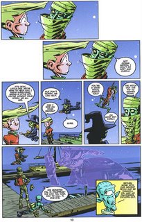
 It's neat.
There's a lot to like about Far-Fetchers. Like I said, I'm not sure if it's out yet - I doubt it, because the preview is uncolored and incomplete, but if you keep your eye out for it, I doubt if you will be disappointed.
The first book is The Miscellaneous Adventures of Stykman by Jonnie Allan, published by a.k.a. Comics. Issue #1 hits the stands on Wednesday, and I doubt if you'll be able to find it many places, but you can always go to the web site and order it there.


Stykman is a fun little book. Allan obviously has fun with the characters and the situation. Stykman is a wanna-be superhero who is, quite literally, made out of sticks We first see him with his sidekick, Al (presumably short for "alien, as he looks like something from The X-Files), playing Go Fish at home (it's that kind of book). A news report comes over the television explaining that the Jolly Roger, a pirate skeleton with a flying ship, has stolen an "ancient Aztec recipe for the gumdrop!" (Did I mention it's that kind of book?) The news warns potential superheroes to stay away, but Stykman's television is on the fritz a bit, so he doesn't quite catch that last part. One wonders if he would have stayed away anyway, as he seems to live in a bit of a fantasy world where he is desperately needed to save the day. He goes to the scene and, predictably, mayhem ensues. In the end, it's his sidekick that saves the day, but save the day he most definitely does!
There is nothing terribly original about this comic, but Allan's joie de vivre carries it along, and it's goofy fun. And, if you're going to rip something off, Cervantes isn't a bad choice. Because that's what Stykman is, basically - Don Quixote. Part of the fun of the book is Stykman's internal narration and how it clashes with the events depicted on the page. Just a random example (and I mean that, because I just opened a page and took the first thing I saw): when Stykman is confronted by Handsome Dan, Jolly Roger's henchman and someone who is much, much bigger than he is, he gets punched out. His narration reads: "Leave it to Dan to exploit my lack of vigilance. Negotiations went nowhere. Only one option left ... play possum." Lucky for him that he is unconscious!
Stykman is a gleeful book, with a hero who has a rope for a head, a pirate with scantily-clad women at his beck and call, a lawyer with a flaming head, an alien sidekick, and lots of mayhem. It's nothing that is going to change the world, but it's a lot of fun. The art is very crisp and vibrant and suitably goofy, and the story is shamelessly wacky. It's only 3 dollars, and I'm sure Allan would be more than happy to send you a copy. Why not?
The other book is Far-Fetchers by Brian Clopper:


I haven't seen this solicited in Previews, which may be because it's not big enough. It's also possible it hasn't been solicited yet. I'm not sure - I feel kind of bad about not discussing this sooner, because Mr. Clopper sent this to me late last year and I haven't gotten around to reviewing it yet. It's another fun book, but not as goofy as Stykman. The basic premise is that creatures of imagination are seeping into the real world. It has a bit of a Fables vibe, but these creatures are "becoming" real and they're quite confused. Of course, the government steps in and creates an agency called the Far-Fetchers (nice play on words) to take care of these "figments" before they cause a panic. It's a nice conceit, and Clopper plays it relatively straight - the fun comes from the situation and the interplay between the characters. They consult works of children's literature for how to deal with the figments, and in the preview, they have to deal with an unusual monster that isn't exactly what it seems. After dispensing with that, they return to their headquarters, where they all have to deal with internal politics and a leader who has a hidden agenda. Clopper even manages to add some poignancy, as the Flying Mummy misses the love of his life, who is still trapped in the books. There's a hint of a larger story here, too, as the figments are all from the works of one author, who mysteriously disappeared when they starting entering the real world. It's an interesting read.
Clopper has done a nice job establishing this strange world and the dynamic between the characters. Even though they are bizarre and might seem like monsters, they all have insecurities and fears and, of course, they are trapped in a strange new world and have to adjust to that. Therefore, even though there is a true sense of fun throughout the book, Clopper hints at darker things to come - granted, it's not "dark" in the sense that recent DC books seem to think of "dark," but it has the potential for drama in the sense that it won't always be light-hearted. The characters look grotesque, which adds to the sense of wonder and weirdness, but Clopper offsets that with the idea that danger can and will show up.
I haven't mentioned the art, because I'm a story snob, but it's nicely cartoonish with a nice bizarre edge to it. I won't try to describe it, because I can show you some of it:

 It's neat.
There's a lot to like about Far-Fetchers. Like I said, I'm not sure if it's out yet - I doubt it, because the preview is uncolored and incomplete, but if you keep your eye out for it, I doubt if you will be disappointed.
This Comic Was Good - JLA Classified #16
What do you get when you mix a solid superhero story with artwork from not one, but TWO comic art legends? You get a darn fine comic book. In particular, you get JLA Classified #16, a strong opening to the six-part "The Hypothetical Woman," by Gail Simone, with art by giants Jose Luis Garcia-Lopez and Klaus Janson.
First of all, take a look at these sample pages (click on the pictures to enlarge them)!
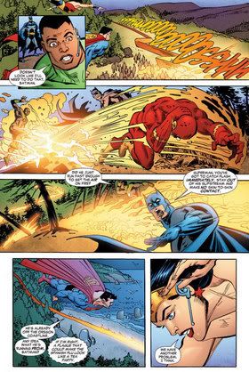
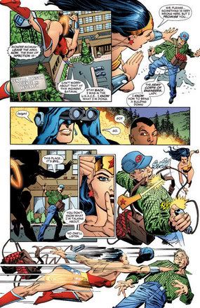
Isn't that amazing? Garcia-Lopez has not lost the touch at all, and Janson does his usual superb job on inks (although I would say that he also impressively seems to restrain his inks a TAD bit, perhaps in deference to the great Garcia-Lopez). So just based on the art, this comic would be interesting enough to read, just to see him draw all the Leaguers. Luckily, Simone gives us an interesting story, as well.
The comic opens with the Leaguers showing up to arrest a tyrant, General Tuzik, (the General gets to spout off some interesting lines about how the League operates like an army), only to be thwarted by international relations (what's great about this is the two-page spread on pages 2 and 3, where Garcia-Lopez depicts Tuzik calmly watching the League cut through his defenses - notice how he is clasping the envelope with the treaty allowing his escape...what a storyteller!!!).
You ever watch ER?
If so, there's a joke about how, often, when a topic is repeated on the show (and with a show as long-running as ER, topics are BOUND to be repeated), the positions taken by the doctors almost seem to be randomly drawn out of a hat. You know, like, "This time, Anthony Edwards is for Position X and George Clooney is for Position Y." Then, 3 years later, "Laura Innes is for Position X and Anthony Edwards is for Position Y." Well, there's a bit of the "pulling a name out of the hat" routine in this issue, as Simone needs a Leaguer to express outrage at the injustice of Tuzik escaping on what amounts to be a technicality, so Flash gets the short straw. Don't get me wrong, of the Leaguers available, he's probably the only one who COULD pull off the reaction, but it certainly is not born out some inherent aspect of Wally West's personality, but rather, simply out of the utilitarian purposes of needing a Leaguer to express Position X. As mentioned before, it is a common practice in fiction (particularly serialized fiction), but it still makes me smile a bit when I see it.
In any event, it is not like Wally's position is even all that shocking, more like a basic "letting tyrants get off on technicalities is bad." In fact, an interesting aspect of this comic is how little actual politics is involved in the story. This was a plot that could very easily become politicized, but Simone manages to deftly avoid any such happenstance, and it is quite impressive, really.
Upon his escape, Tuzik holds a meeting with all the OTHER tyrants out there who have not been overthrown yet, and suggests that, rather than each one of the other tyrants dealing with the Justice League on their own with whatever weapons they possess, the other tyrants give HIM all their weapons and research, and he will form ONE "Doomsday device," and attack the League with it, especially since, unlike the others, Tuzik has noting to lose - he does not mind being known as the "villain" of the piece.
The conclusion of the comic begins with the first manisfestation of Tuzik's mystery "weapon," the Hypothetical Woman that bears the title of this story arc. Whether Tuzik created her or found her, this "Hypothetical Woman" (and yes, that is a great name) can create seemingly impossible things, like (in this issue) a town that is plagued by a virus that is made up of microscopic Starros (leading to a line of dialogue, when Flash is infected, of "My god - he's full of Starro!!," which a pal of mine informs me is a reference to an obscure 80s Sci-Fi sequel to 2001: A Space Odyssey called 2010, which has the line, "My God! It's full of stars!," which is cool by me, as I am always cool with obscure references that do not interfere with the plot).
The issue ends with the League struggling with the Starro virus (which has infected the Flash, whose metabolism is forcing it to affect him quickly), as Tuzik admires his prize, and we, the reader, wait for what plot will come next.
Nice story idea.
Even nicer art.
Worth picking up.
First of all, take a look at these sample pages (click on the pictures to enlarge them)!


Isn't that amazing? Garcia-Lopez has not lost the touch at all, and Janson does his usual superb job on inks (although I would say that he also impressively seems to restrain his inks a TAD bit, perhaps in deference to the great Garcia-Lopez). So just based on the art, this comic would be interesting enough to read, just to see him draw all the Leaguers. Luckily, Simone gives us an interesting story, as well.
The comic opens with the Leaguers showing up to arrest a tyrant, General Tuzik, (the General gets to spout off some interesting lines about how the League operates like an army), only to be thwarted by international relations (what's great about this is the two-page spread on pages 2 and 3, where Garcia-Lopez depicts Tuzik calmly watching the League cut through his defenses - notice how he is clasping the envelope with the treaty allowing his escape...what a storyteller!!!).
You ever watch ER?
If so, there's a joke about how, often, when a topic is repeated on the show (and with a show as long-running as ER, topics are BOUND to be repeated), the positions taken by the doctors almost seem to be randomly drawn out of a hat. You know, like, "This time, Anthony Edwards is for Position X and George Clooney is for Position Y." Then, 3 years later, "Laura Innes is for Position X and Anthony Edwards is for Position Y." Well, there's a bit of the "pulling a name out of the hat" routine in this issue, as Simone needs a Leaguer to express outrage at the injustice of Tuzik escaping on what amounts to be a technicality, so Flash gets the short straw. Don't get me wrong, of the Leaguers available, he's probably the only one who COULD pull off the reaction, but it certainly is not born out some inherent aspect of Wally West's personality, but rather, simply out of the utilitarian purposes of needing a Leaguer to express Position X. As mentioned before, it is a common practice in fiction (particularly serialized fiction), but it still makes me smile a bit when I see it.
In any event, it is not like Wally's position is even all that shocking, more like a basic "letting tyrants get off on technicalities is bad." In fact, an interesting aspect of this comic is how little actual politics is involved in the story. This was a plot that could very easily become politicized, but Simone manages to deftly avoid any such happenstance, and it is quite impressive, really.
Upon his escape, Tuzik holds a meeting with all the OTHER tyrants out there who have not been overthrown yet, and suggests that, rather than each one of the other tyrants dealing with the Justice League on their own with whatever weapons they possess, the other tyrants give HIM all their weapons and research, and he will form ONE "Doomsday device," and attack the League with it, especially since, unlike the others, Tuzik has noting to lose - he does not mind being known as the "villain" of the piece.
The conclusion of the comic begins with the first manisfestation of Tuzik's mystery "weapon," the Hypothetical Woman that bears the title of this story arc. Whether Tuzik created her or found her, this "Hypothetical Woman" (and yes, that is a great name) can create seemingly impossible things, like (in this issue) a town that is plagued by a virus that is made up of microscopic Starros (leading to a line of dialogue, when Flash is infected, of "My god - he's full of Starro!!," which a pal of mine informs me is a reference to an obscure 80s Sci-Fi sequel to 2001: A Space Odyssey called 2010, which has the line, "My God! It's full of stars!," which is cool by me, as I am always cool with obscure references that do not interfere with the plot).
The issue ends with the League struggling with the Starro virus (which has infected the Flash, whose metabolism is forcing it to affect him quickly), as Tuzik admires his prize, and we, the reader, wait for what plot will come next.
Nice story idea.
Even nicer art.
Worth picking up.
This Comic Was Good - Nextwave #1
I think, coming into this comic, there were two groups of people who were interested in this comic book. The first are those folks who like to read fun comic books and/or comics written by Warren Ellis. The second are those folks who are interested in obscure Marvel heroes. For that first group, Nextwave #1 was a good, fun comic book. For the second group, let me state that I am one of the bigger fans of Monica Rambeau you are going to encounter - so I empathize with you folks - and I liked Nextwave #1.
One of the most impressive aspects of Nextwave is how, just through a series of captions, Ellis is able to mold our view of the comic as he sees fit. Through these captions, he is able to achieve the goal of establishing Nextwave as a wacky, fun book. The design work of Stuart Immonen is invaluable here, but I do not know if Immonen is responsible for some of ther design of the book's presentation, like the design of the caption boxes - which often serve as bold proclamations as to the book's intent.
Ellis is not afraid to be all over the place, making jokes in all sorts of different styles, and it is a refreshing piece of letting go, of not allowing oneself to be self-conscious. Ellis occasionally throws in a few shots at superheroes, you know, the sorta bitter ones, but they are covered up by the volume of the other jokes - the over the top stuff (A running away song?!? Priceless), the subversive stuff (Captain Fuck?) and the standard F-Troopisms that worked so well for Giffen and DeMatteis in Justice League (The "fleshy ones" exchange between Monica and Aaron, for one).
As far as personalities go, Ellis is treating 3/5th of the team as blank slates, with only Monica and Tabitha getting some measure of a nod to their past histories, and there, of course, Ellis does not put any REAL effort into it, besides the basic "Tabitha used to have a lot of codenames" and "Monica used to lead the Avengers." Still, as a Monica fan, while I, of course, noticed all the changes to her backstory, they were just silly ones, mainly for a gag. This is not like when Monica was stripped of her Avengers leadership for the sake of making Captain America look good. There was no maliciousness to Monica in this issue. Any change in her past or personality was done just for a gag. In fact, a close comparison would be Blue Beetle and Booster Gold. People nowadays think of them as the comic duo from Justice League, but neither character (ESPECIALLY Beetle) was considered comic relief UNTIL Justice League, and in fact, Giffen played pretty fast and loose with their personalities to fit them INTO the comic relief structure, but people seem to be okay with THOSE changes, so I don't see why the changes to Monica and Tabitha should be that significant.
Dirk Anger, and the agents of HATE (who are tied up with the Beyond Corporation) are good for a lot of laughs, my favorite being when Dirk tells them he has been director of HATE since before they were alive - except for one guy, maybe. Comic timing is a bitch in comic books, and Ellis pulled it off swimmingly.
With this and the recent (EXCELLENT) Fin Fang Four, Fin Fang Foom is on quite the comeback trail!!
Finally, besides Ellis' fun script (and dialogue), the other star of this comic is Stuart Immonen (with great respect to his inker, Wade Von Grawbadger, who manages to hang with Immonen even as Immonen tries drastically new styles). I do not think I can even come up with a word to describe his ability in this book to be cartoonish while extremely detailed. I think I will have to just make up a word. Scarmtistic.
There you go.
I just made up the word.
Stuart Immonen's ability to mix cartoonish art (Dirk Anger in most scenes) with an extreme devotion to detail (notice the detail in the engine that Elsa breaks later in the comic) is quite scarmtistic.
Nextwave #1 was a really cool book.
This Comic Was Not Good - X-Men: Deadly Genesis #3
I will cop to occasionally having a macabre sense of humor, so there was a scene in this comic that really made me laugh. I'll get to that later. Anyhow, as to the actual comic book....well, I have read this comic before. Many times, actually. And each time, it was awful. However, Ed Brubaker did not write those comics, and Ed Brubaker is a good comic book writer. Therefore, he is talented enough that he manages to raise the level of quality of this comic that, by all means, should have been terrible, and instead, made the comic just "not good."
First off, I wish to mention how impressed I was by Marc Silvestri's cover to the issue. I think it is probably the best cover I have seen from him in AGES.
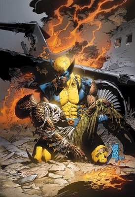
Granted, this scene does not appear in the comic, but still...that is a striking cover, I think.
ANYways, as for the comic itself, the killer to the story is the structure. The pace of Deadly Genesis is clearly slow, but that does not mean that it is BAD. In fact, Brubaker is currently writing a comic, Captain America, that has an equally glacial pace, plot-wise, but the differences between the two titles is dramatic, and it can basically be summed up by a single word - depth.
The structure of Captain America is similar to the TV show Lost, as the plot does not progress all that much, but through character interactions and flashbacks, we learn so much about the characters that they seem almost like real people to us. That is the effect that Brubaker has achieved with Captain America, giving even throwaway characters like Jack Monroe (who I liked a lot in Fabian Nicieza's Nomad series) deep emotional resonance with the reader. That depth is lacking in Deadly Genesis, and I think that is due to the structure of the series.
This issue #3 is basically the same exact structure of #2!!! A little kibitzing with the government at the mansion, a few segues with Vulcan and Cyclops and Marvel Girl, some scenes with the secret info Banshee was bringing back to the States, some secretive flashbacks - it's all here in #2 AND #3. And #2 at least had the benefit of having a death (even though it was presented fairly lacking in luster).
I have seen this same structure - this same lack of depth - many times. Essentially in every major X-Crossover of the past decade and a half. Occasionally, writers will manage to squeeze a little something interesting out of it (as Scott Lobdell did during the Generation Next storyline), but most of the time, it is a matter of "Here's an idea - work a series around it." Some writers totally botch it, and we get sad, sad comics like the Astonishing X-Men mini-series (A new X-Men team forms for no reason - and Wolverine is Death!!). When you have someone like Brubaker, he cannot just write hackwork, so instead, he still manages to infuse what little room he has to work with here with as much depth as possible - sadly, it is not a lot. So a slowly paced comic that repeats the same structure of the previous issue without any in depth characterizations? Not a good comic book.
In addition, we have Trevor Hairsine "drawing" the comic without actually DRAWING the comic. In #2, Mike Perkins handled it, in this issue, Scott Hanna and Nelson take over, and both do a fine job, I thought, but it is like having three comic issues drawn by four different artists - #1 by Hairsine, #2 by Perkins and #3 by Hanna and Nelson...and yet Hairsine is credited for all three. Anyhow, it is not a big deal, so long as the result is good art like this comic, and it WAS good art (although there was a funny bit early on where Beast's pants were not drawn, so the colorist had to just draw his pants onto his fur...funny stuff).
Finally, the thing that made me laugh? Last issue, Banshee collided with the X-Men's plane, the Blackbird, in an attempt to save a passenger flight (as the Blackbird was headed towards the passenger plane which Banshee was a passenger on, to prevent Banshee from sharing some info with the X-Men). He managed a feeble scream before the plane plowed right into him, still causing a collission that killed the passengers on the plane (What is this, a Debby Downer skit from SNL?). Anyhow, we got a big explosion, in which Banshee was presumed dead. However, this is comics - there's always a chance, right? Well, remember the episode of the Simpsons where the kill off Poochy? And then Krusty comes on to the screen to assure kids that he is really, really dead? There's a scene in this comic where Nightcrawler and Wolverine come across Banshee's corpse....it reminded me of the Simpsons episode and made me laugh. "SEE! He is really, really dead!"
Hey, I SAID it was macabre!!
First off, I wish to mention how impressed I was by Marc Silvestri's cover to the issue. I think it is probably the best cover I have seen from him in AGES.

Granted, this scene does not appear in the comic, but still...that is a striking cover, I think.
ANYways, as for the comic itself, the killer to the story is the structure. The pace of Deadly Genesis is clearly slow, but that does not mean that it is BAD. In fact, Brubaker is currently writing a comic, Captain America, that has an equally glacial pace, plot-wise, but the differences between the two titles is dramatic, and it can basically be summed up by a single word - depth.
The structure of Captain America is similar to the TV show Lost, as the plot does not progress all that much, but through character interactions and flashbacks, we learn so much about the characters that they seem almost like real people to us. That is the effect that Brubaker has achieved with Captain America, giving even throwaway characters like Jack Monroe (who I liked a lot in Fabian Nicieza's Nomad series) deep emotional resonance with the reader. That depth is lacking in Deadly Genesis, and I think that is due to the structure of the series.
This issue #3 is basically the same exact structure of #2!!! A little kibitzing with the government at the mansion, a few segues with Vulcan and Cyclops and Marvel Girl, some scenes with the secret info Banshee was bringing back to the States, some secretive flashbacks - it's all here in #2 AND #3. And #2 at least had the benefit of having a death (even though it was presented fairly lacking in luster).
I have seen this same structure - this same lack of depth - many times. Essentially in every major X-Crossover of the past decade and a half. Occasionally, writers will manage to squeeze a little something interesting out of it (as Scott Lobdell did during the Generation Next storyline), but most of the time, it is a matter of "Here's an idea - work a series around it." Some writers totally botch it, and we get sad, sad comics like the Astonishing X-Men mini-series (A new X-Men team forms for no reason - and Wolverine is Death!!). When you have someone like Brubaker, he cannot just write hackwork, so instead, he still manages to infuse what little room he has to work with here with as much depth as possible - sadly, it is not a lot. So a slowly paced comic that repeats the same structure of the previous issue without any in depth characterizations? Not a good comic book.
In addition, we have Trevor Hairsine "drawing" the comic without actually DRAWING the comic. In #2, Mike Perkins handled it, in this issue, Scott Hanna and Nelson take over, and both do a fine job, I thought, but it is like having three comic issues drawn by four different artists - #1 by Hairsine, #2 by Perkins and #3 by Hanna and Nelson...and yet Hairsine is credited for all three. Anyhow, it is not a big deal, so long as the result is good art like this comic, and it WAS good art (although there was a funny bit early on where Beast's pants were not drawn, so the colorist had to just draw his pants onto his fur...funny stuff).
Finally, the thing that made me laugh? Last issue, Banshee collided with the X-Men's plane, the Blackbird, in an attempt to save a passenger flight (as the Blackbird was headed towards the passenger plane which Banshee was a passenger on, to prevent Banshee from sharing some info with the X-Men). He managed a feeble scream before the plane plowed right into him, still causing a collission that killed the passengers on the plane (What is this, a Debby Downer skit from SNL?). Anyhow, we got a big explosion, in which Banshee was presumed dead. However, this is comics - there's always a chance, right? Well, remember the episode of the Simpsons where the kill off Poochy? And then Krusty comes on to the screen to assure kids that he is really, really dead? There's a scene in this comic where Nightcrawler and Wolverine come across Banshee's corpse....it reminded me of the Simpsons episode and made me laugh. "SEE! He is really, really dead!"
Hey, I SAID it was macabre!!
Sunday, January 29, 2006
This Comic Was Good - Godland #7
I do not know if I ever have mentioned it before (lord knows I seem to talk about it enough), but I have a real soft spot for comics that make Bob Dylan references. I loves me the Bob Dylan references. Well, Godland #7 had some heavy duty Dylan mentions, so even if it wasn't a good comic, it would still have a soft spot in my heart (I still remember fondly this Moench issue of Catwoman where Selina says, "If you ain't got nothing, you got nothing to lose," and that era of Catwoman was awwwwwwwwful). However, luckily, Godland #7 was good anyways.
While clearly the Jack Kirby influence is there in Tom Scioli's art, I often think that the more "Silver Age" feel to the book is the sheer quantity of story in each issue of Godland. Each issue generally has about five-six plots all going on at once, and Casey handles the transitions between them all quite well.
What I also like is that the "Recap Page" on the inside front cover is extremely limited in information. This is because Joe Casey doesn't need you to have paragraphs of info to pick up on what is going on in Godland. A basic description of the book (similar to those little descriptions Marvel used to do on the first pages of their comics in the 90s...you know, a little description and then "Stan Lee Presents...") and then a roll call. That's it, and then right into the story. It's a bold move that Casey backs up with his highly accessible story.
The hero of the book, Adam Archer, has cosmic powers, and Casey and Scioli make sure to ratchet up the cosmic "trippy" aspects of the books. The site of cosmic rain falling on New York is very striking. In addition, the way that Archer defeats the bad guys is interesting, as is the fallout of the event. Very "Ditko Spider-Man." Good stuff.
The highlight of the issue (and, in my opinion, the series so far) is the interaction between Archer's two biggest villains, Nickelhead and Basil Cronus. On their own, each villain is very interesting. Together, playing off each other, especially with Cronus just being a disembodied head carried around by Nickelhead? Brilliant.
And the fact that a scene is played out as Nickelhead sings along with "Subterranean Homesick Blues"?
That's just extra awesomeness.
Good issue.
