Judging (Image's March) Books By Their Covers
Hey, I figure I have to be an equal opportunity prejudger, and since Image's March Solicitations are up (they went up last week), let's make some prejudgements based just on the covers (as we all love to make prejudgements, don't we?).
Let's begin!
___________________________________________________
This is one of Rick Remender's first comic works as a writer...
It definitely does have that air of "Early work" about it, but it still looks cool.
John Heebink and Mike Manley do a good job.
___________________________________________________
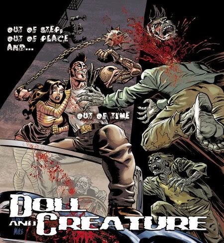
I have to tell you...
No matter how many times it is used, I still get a kick out of the fork claws gag!
___________________________________________________
This is a good Weiringo drawing....
...but would it really get you to pick up the book if you were not already into it?
I vote no.
Nice drawing, though.
___________________________________________________
Speaking of covers that would only appeal to you if you were already reading the comic...
___________________________________________________
I think we need a new rule.
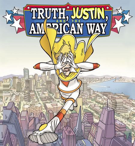
All comics should include the hero's name in the title, preferably in the form of a pun.
I'm thinking like, "Superman: Kal of Nature"
Peter David's Sachs and Violins was far ahead of its time in this regard.
___________________________________________________
C'mon!!
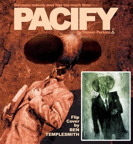
It's a dude with a giant fly's head!
You can't tell me that you are not even a LITTLE intrigued about what Steven Perkins could possibly have planned for this concept!
Always nice to have a Ben Templesmith cover!
___________________________________________________
Think about it....
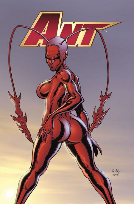
...before Mario Gully, I bet you never even CONSIDERED the idea of a person using their antennae to pleasure their own anus!!
A true visionary.
___________________________________________________
See, Jimmie Robinson isn't fooling around.
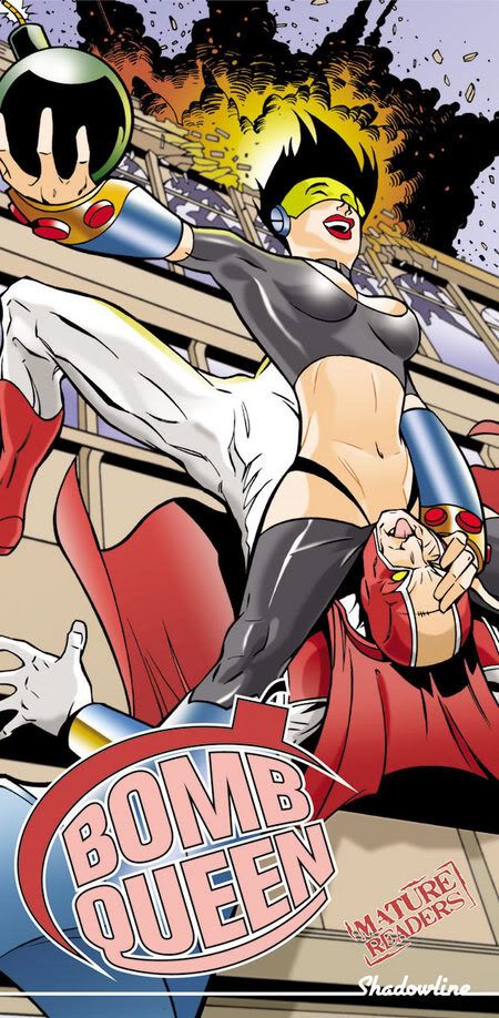
He goes straight to the point.
Gotta admire that.
___________________________________________________
You know how, to save money, movies make special effects happen at night, so the blurry sights disguises how the effects might be crummy.
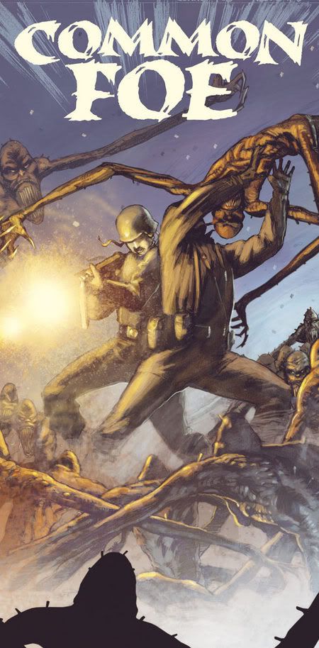
That is what this Jean-Jacquez Dzialowski cover for Common Foe reminds me of.
It's sorta grainy and sorta muddled, so you can't tell if the monsters are just drawn poorly.
Clever.
Kinda.
___________________________________________________
Dominique Lewis is not expecting much from us.
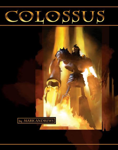
It's called Colossus, and there you have it...a Colossus.
No thought required!!
___________________________________________________
This is a fine Tom Scioli drawing...
However, it is not much of a dynamic drawing, is it? Especially when we have already had Basil Cronus on a cover...so this is not all that striking.
___________________________________________________
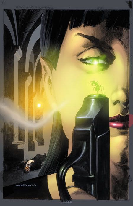
Is Cafu Brazilian for Oeming?
Nice cover, though.
___________________________________________________
Woah!
I dunno who is "responsible," but Ottley's art on this cover has a very "90s Marvel" feel to it, and I mean that in a bad sense.
___________________________________________________
I don't get it.
Is that the cover?
Or no?
It doesn't look like a cover, does it?
___________________________________________________
This Eric Nguyen cover looks rushed.
Still pretty nice.
___________________________________________________
This is a strong Paul Harmon cover.
___________________________________________________
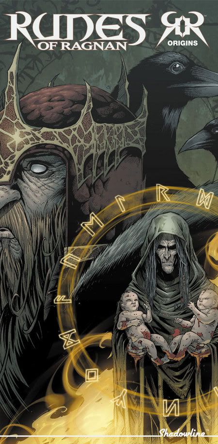
Pretty blah cover of Runes of Ragnan by Josh Meders and Jay Fotos.
___________________________________________________
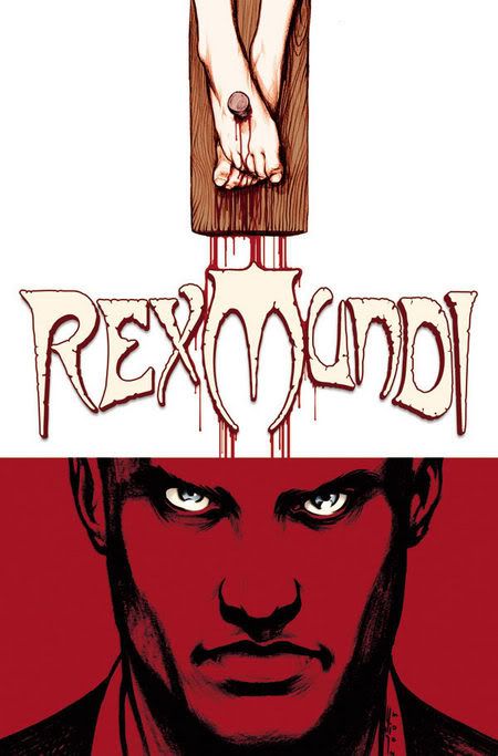
Interesting cover design by new Rex Mundi artist, Juan Ferreyra.
___________________________________________________
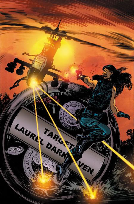
Here's what I don't get.
If you WANTED to keep doing Rising Stars comics, why END THE SERIES?!?!
Still, it means work for Brent Anderson, who I like a lot.
These are both good covers, especially as I have no interest in Laurel Darkhaven.
Issue #1
and Issue #2
___________________________________________________
It seems like Rodolfo Migliari REALLY likes to follow Alex Ross' influence!
He's even doing the whole "black background, somber looking drawings of goofy characters" routine that Ross does so well!
___________________________________________________
I have to admit...
This Pat Lee Cyberforce cover shows a lot more nuance and attention to detail and design than I expect from him normally.
Well, at least for the people in the foreground.
The background folks are exactly what I expect from him.
___________________________________________________
TOP FIVE COVERS!!
___________________________________________________
5. Hey, it's a dude named HECTORPLASM!
Someone got the pun in title memo I was mentioning earlier!
Still, he also got ahold of Cory Walker, so the cover is still cool.
___________________________________________________
4.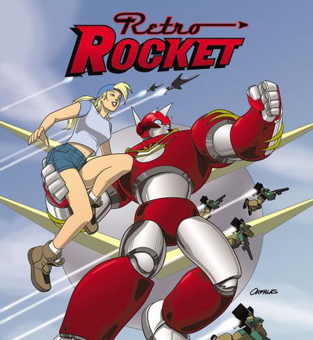
Jason Orfalas gets across the spirit of Retro Rocket quite well with this cover, while also being a cool image!
___________________________________________________
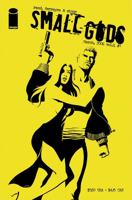
3. Clever cover design work by Juan Ferreyra, for what is apparently the last Small Gods storyline.
___________________________________________________
2. Tony Moore knows how to tell us what is going on in a comic just by a few simple drawings on a cover.
We know the hero is down, and we know WHY the hero is down (due to the viewfinders), but we also get a kickass drawing of the Earth.
Good stuff.
Worthy of one of those classic JLA covers. You know the ones. Stuff like "Because of YOU, Aquaman is gonna die!" or something like that.
Good stuff.
___________________________________________________
1. Generally, when you specifically point out the cover artist in the AD, you know you've got a find.
Man, do I love Mark Schultz.
___________________________________________________
Okay, that's it for me, folks!
Feel free to share YOUR prejudices!!
AND your top five choices!
Let's begin!
___________________________________________________
This is one of Rick Remender's first comic works as a writer...
It definitely does have that air of "Early work" about it, but it still looks cool.
John Heebink and Mike Manley do a good job.
___________________________________________________
I have to tell you...
No matter how many times it is used, I still get a kick out of the fork claws gag!
___________________________________________________
This is a good Weiringo drawing....
...but would it really get you to pick up the book if you were not already into it?
I vote no.
Nice drawing, though.
___________________________________________________
Speaking of covers that would only appeal to you if you were already reading the comic...
___________________________________________________
I think we need a new rule.
All comics should include the hero's name in the title, preferably in the form of a pun.
I'm thinking like, "Superman: Kal of Nature"
Peter David's Sachs and Violins was far ahead of its time in this regard.
___________________________________________________
C'mon!!
It's a dude with a giant fly's head!
You can't tell me that you are not even a LITTLE intrigued about what Steven Perkins could possibly have planned for this concept!
Always nice to have a Ben Templesmith cover!
___________________________________________________
Think about it....
...before Mario Gully, I bet you never even CONSIDERED the idea of a person using their antennae to pleasure their own anus!!
A true visionary.
___________________________________________________
See, Jimmie Robinson isn't fooling around.
He goes straight to the point.
Gotta admire that.
___________________________________________________
You know how, to save money, movies make special effects happen at night, so the blurry sights disguises how the effects might be crummy.
That is what this Jean-Jacquez Dzialowski cover for Common Foe reminds me of.
It's sorta grainy and sorta muddled, so you can't tell if the monsters are just drawn poorly.
Clever.
Kinda.
___________________________________________________
Dominique Lewis is not expecting much from us.
It's called Colossus, and there you have it...a Colossus.
No thought required!!
___________________________________________________
This is a fine Tom Scioli drawing...
However, it is not much of a dynamic drawing, is it? Especially when we have already had Basil Cronus on a cover...so this is not all that striking.
___________________________________________________
Is Cafu Brazilian for Oeming?
Nice cover, though.
___________________________________________________
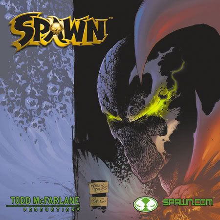
Woah!
I dunno who is "responsible," but Ottley's art on this cover has a very "90s Marvel" feel to it, and I mean that in a bad sense.
___________________________________________________
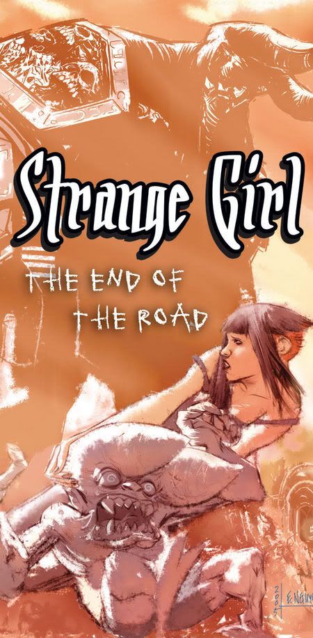
I don't get it.
Is that the cover?
Or no?
It doesn't look like a cover, does it?
___________________________________________________
This Eric Nguyen cover looks rushed.
Still pretty nice.
___________________________________________________
This is a strong Paul Harmon cover.
___________________________________________________
Pretty blah cover of Runes of Ragnan by Josh Meders and Jay Fotos.
___________________________________________________
Interesting cover design by new Rex Mundi artist, Juan Ferreyra.
___________________________________________________
Here's what I don't get.
If you WANTED to keep doing Rising Stars comics, why END THE SERIES?!?!
Still, it means work for Brent Anderson, who I like a lot.
These are both good covers, especially as I have no interest in Laurel Darkhaven.
Issue #1
and Issue #2
___________________________________________________
It seems like Rodolfo Migliari REALLY likes to follow Alex Ross' influence!
He's even doing the whole "black background, somber looking drawings of goofy characters" routine that Ross does so well!
___________________________________________________
I have to admit...
This Pat Lee Cyberforce cover shows a lot more nuance and attention to detail and design than I expect from him normally.
Well, at least for the people in the foreground.
The background folks are exactly what I expect from him.
___________________________________________________
TOP FIVE COVERS!!
___________________________________________________
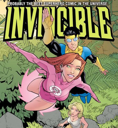
5. Hey, it's a dude named HECTORPLASM!
Someone got the pun in title memo I was mentioning earlier!
Still, he also got ahold of Cory Walker, so the cover is still cool.
___________________________________________________
4.
Jason Orfalas gets across the spirit of Retro Rocket quite well with this cover, while also being a cool image!
___________________________________________________
3. Clever cover design work by Juan Ferreyra, for what is apparently the last Small Gods storyline.
___________________________________________________
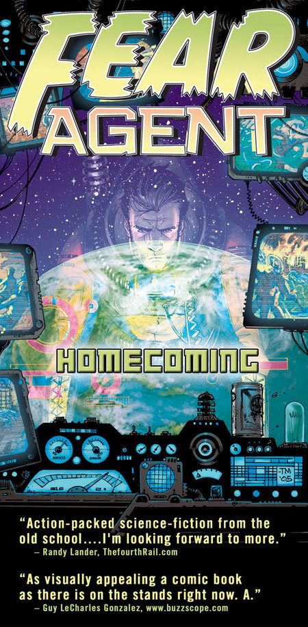
2. Tony Moore knows how to tell us what is going on in a comic just by a few simple drawings on a cover.
We know the hero is down, and we know WHY the hero is down (due to the viewfinders), but we also get a kickass drawing of the Earth.
Good stuff.
Worthy of one of those classic JLA covers. You know the ones. Stuff like "Because of YOU, Aquaman is gonna die!" or something like that.
Good stuff.
___________________________________________________
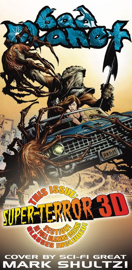
1. Generally, when you specifically point out the cover artist in the AD, you know you've got a find.
Man, do I love Mark Schultz.
___________________________________________________
Okay, that's it for me, folks!
Feel free to share YOUR prejudices!!
AND your top five choices!
posted by Brian Cronin at 12/27/2005 06:40:00 AM
![]()


9 Comments:
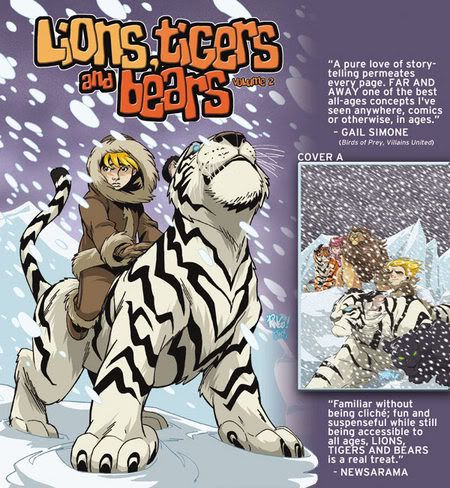
Isn't "Lions, Tigers, and Bears" aimed at the 6-10 year old crowd?
A kid riding a tiger in the snow. Yeah, that'd get my nephew interested.
Right. Tiger an kid is very "Narnia," too. So L, T, 'n B might gain a couple readers from that, too.
Really dig the "Rex Mundi" cover. That's my favorite of these.
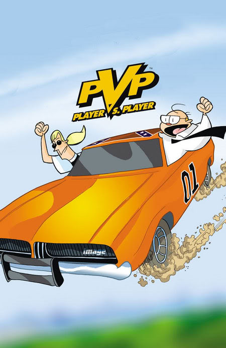
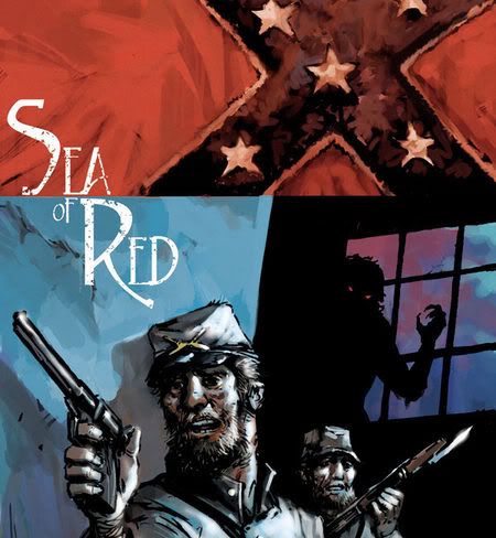
This was interesting, 'cause I don't buy any Image books 'cept for Sea of Red and Hawaiian Dick.
Andm judging just from the covers here I am completely sure I'll never buy P vs. P, Spawn or Ant. (Which was jes creepy, me not being a bug fetishist and all.)
.
.
.
If you WANTED to keep doing Rising Stars comics, why END THE SERIES?!?!
Umm... because the story was done?
I suppose DC should've just kept Sandman going with a new creative team instead of doing Sandman Presents minis and The Dreaming?
If the story's done, the story's done. Spinoffs and sequels are one thing, but continuing to add chapters to the book (by a different author, no less) would just be kinda silly.
All that talk about pun titles, and no one mentions that 'Pacify' could so easily have been 'Pacifly?'
Bottom of a crucifix shots always reminds me of those Lisner "Angry Christ" covers.. but I digress.
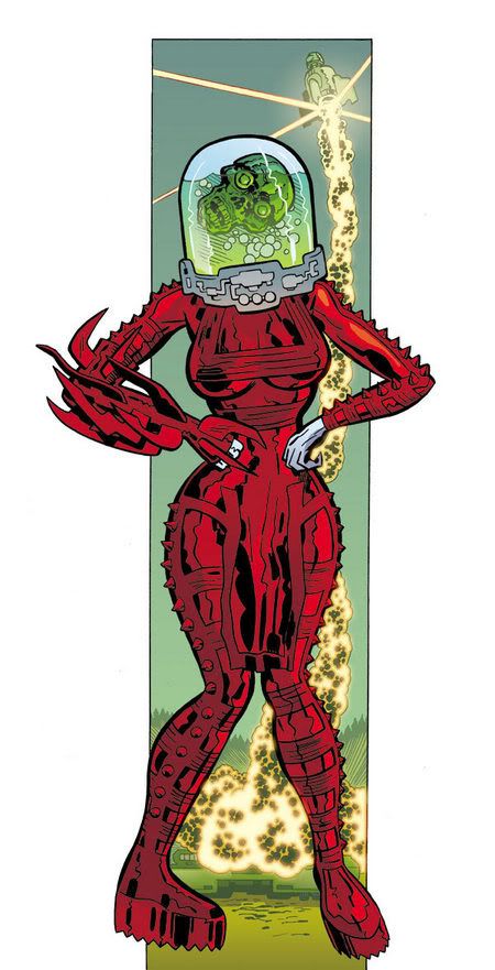
If furries dig fuzzy mammals drawn as nude women, what do we call people who spank it to ANT?
Exo's .. Invertabrries or something else?
Previous ads to LTB have compared it to the Narnia books.
Since the first Narnia movie is topping the Box Office world wide and a very close 2nd place in the US, I think it's safe to say that the target audience just may be prepped and hungry. :)
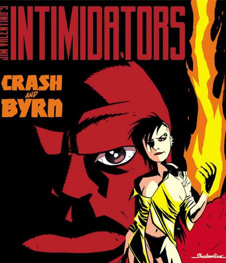
I'm just waiting to someone photoshop that Intimidators cover to change the title to Crash and Byrne
Is that a proper OMAC in that first cover?
Sorry for coming late to the show, but you can see the final version of that Hector Plasm cover here.
Post a Comment
<< Home