Saturday, April 22, 2006
I have really been enjoying Adam Beechen's run on Robin so far, with one notable exception - it deals with a plot point that I think is pretty lame, which is that Cassandra Cain, daughter of the assasins David Cain (the guy who framed Bruce Wayne for murder) and Lady Shiva, is now a villain herself. However lame I think this particular plot point is, though, I know that it is an editorially mandated event, not anything that Adam Beechen came up with (same with the move I actually DID like, which was to remove Greg Rucka's new daughter of Ra's Al Ghul from comics), so, when I judge whether Beechen is doing a good job on Robin, I am not going to give him demerits for the lame plot point.
Is it just me?
Am I the only one who buys comics and has access to a blog that DIDN'T like Desolation Jones #6 or Daredevil #84? The reviews are in:
For Desolation Jones: Here and here and here and here and here.
For Daredevil: Here and here and here.
I'm certainly not done with Daredevil, I'm just a little underwhelmed. Doesn't anyone else think the whole Frank Castle thing is stupid? Doesn't anyone else think that someone would figure out that the FBI Director wants them to kill each other? Doesn't anyone else wonder why these prisoners can just wander around with no supervision whatsoever (another part of the FBI Director's evil plan, I suppose)? No? Okay. I'm on board for the next three issues, but Brubaker better pull it together.
As for Desolation Jones, I'm sticking by my opinion that the last issue was shit. Someday I'll break it down further, but not now.
Am I insane? Should I just shut up and stand in line for the comic book goodness that Brubaker and Ellis are dishing out?
Friday, April 21, 2006
This Comic Was Good - Retro Rocket #1
This comic was released by Image Comics a couple of weeks ago. It is written by Tony Bedard, with art by Jason Orfalas. It is also probably one of the most misleading (but in a good way) covers that I have seen in a long while.
Look at that cover!
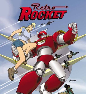
Doesn't that look like the most generic "mech" comic that you've ever seen?
However generic it may appear, Retro Rocket is surprisingly different than the rest, and was a very fun comic. It is filled with action, but is based in some really good characterizations that make the reader become quickly invested in the scenario in the comic.
Here's the plot summation - It is in the future, and America is defended by a group of soldiers who wear these gigantic suits of armor. Along with them on the mission, as the book begins, is a smaller suit of armor, who is there as an advisor. He is our hero - Retro. Retro gets involved in the mission, and after all is said in done, we learn Retro's secret - unlike the other men, Retro basically IS a robot! They just wear suits of armor, while Retro is a disembodied brain kept alive in a robot body for the past thirty years!! Isn't that a great character bit? He never ages, while the people around him get older, and the technology used by the other armors are improved.
So he is a fossil, a piece of history - who has nothing to do but work for the Army (after all, where else CAN he go? Who can keep him running?), but can never be "one of the team."
Meanwhile, in this issue, we meet his new mechanic, the lady on the cover, who is the niece of his original mechanic, who is retiring. Their relationship, I am sure, will be a big part of future issues.
Orfalas' art is good, very cartoony. It is very much like this is one of those CineManga comics, which make up a comic from stills of a cartoon show. It is a really weird effect, but it still looks good.
One problem I had was the way the soldiers treated Retro after he screwed up with a bomb in the comic - my concern is that no one ELSE knew what to do with the bomb, so why blame Retro? Especially as he saved one of the soldier's life earlier on! It seemed like a bit of a short cut by Bedard - he wanted the soldiers to look down on Retro, so they did.
Otherwise, this comic is a fun action book. Not setting the world on fire with creativity, but a well-done book with a great character (Retro, natch), nonetheless.
Look at that cover!

Doesn't that look like the most generic "mech" comic that you've ever seen?
However generic it may appear, Retro Rocket is surprisingly different than the rest, and was a very fun comic. It is filled with action, but is based in some really good characterizations that make the reader become quickly invested in the scenario in the comic.
Here's the plot summation - It is in the future, and America is defended by a group of soldiers who wear these gigantic suits of armor. Along with them on the mission, as the book begins, is a smaller suit of armor, who is there as an advisor. He is our hero - Retro. Retro gets involved in the mission, and after all is said in done, we learn Retro's secret - unlike the other men, Retro basically IS a robot! They just wear suits of armor, while Retro is a disembodied brain kept alive in a robot body for the past thirty years!! Isn't that a great character bit? He never ages, while the people around him get older, and the technology used by the other armors are improved.
So he is a fossil, a piece of history - who has nothing to do but work for the Army (after all, where else CAN he go? Who can keep him running?), but can never be "one of the team."
Meanwhile, in this issue, we meet his new mechanic, the lady on the cover, who is the niece of his original mechanic, who is retiring. Their relationship, I am sure, will be a big part of future issues.
Orfalas' art is good, very cartoony. It is very much like this is one of those CineManga comics, which make up a comic from stills of a cartoon show. It is a really weird effect, but it still looks good.
One problem I had was the way the soldiers treated Retro after he screwed up with a bomb in the comic - my concern is that no one ELSE knew what to do with the bomb, so why blame Retro? Especially as he saved one of the soldier's life earlier on! It seemed like a bit of a short cut by Bedard - he wanted the soldiers to look down on Retro, so they did.
Otherwise, this comic is a fun action book. Not setting the world on fire with creativity, but a well-done book with a great character (Retro, natch), nonetheless.
Thursday, April 20, 2006
Comic Book Urban Legends Revealed #47!
This is the forty-seventh in a series of examinations of comic book urban legends and whether they are true or false. Click here for an archive of the previous forty-six.
Let's begin!
COMIC URBAN LEGEND: Marty Nodell created the Pillsbury Doughboy.
STATUS: False
Martin Nodell is known to a lot of comics fans as the man who created the original Green Lantern, and that's true. But what's interesting is that he was not exactly intending to be IN comics.
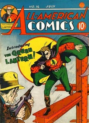
When Marty Nodell was first breaking into comics in the early 40s, breaking into comics was not his main goal. As he told Roy Thomas, in an interview in Alter Ego #5,
In 1965, the Leo Burnett agency was working for Pillsbury on an ad campaign.
Here's how Pillsbury describes the event (warning, the link is a pdf),

In 2004, Rudy Perz wrote into Nolan's Pop Culture Review about the topic,
COMIC URBAN LEGEND: New editions of Grant Morrison's Zenith tradepaperbacks were printed but are currently stuck in a London warehouse due to rights issues.
STATUS: True
Kelvin Green asked a few months back, "I'd love to know if the story about Grant Morrison's Zenith tpbs being printed and then left in a London warehouse due to rights issues is true."
Well, the story apparently IS true.
Zenith was a serialized superhero comic book story by Grant Morrison and Steve Yeowell (with designs by Brendan McCarthy) that ran in 2000 AD from the late 80s until the early 90s.
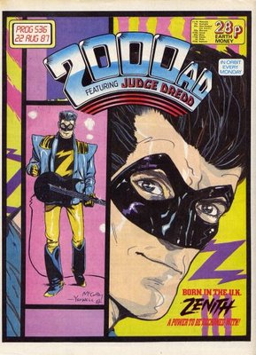
Zenith was a superhero who was also a pop star. There were a few collections of the stories published in the late 80s, but they are out of print now.
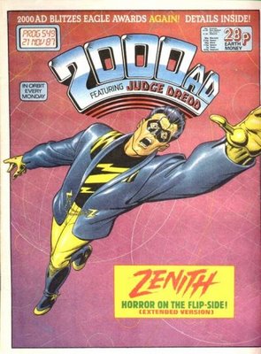
Recently, Titan Books began plans to release new editions of the stories, however, there was a snag in their plan.
According to an interview (I am afraid I do not know who conducted the interview) with Zenith artist, Steve Yeowell...

I know, I know...what can I say? I couldn't help it!!
COMIC URBAN LEGEND: Marty Pasko wrote a short prose story for Marvel Comics under the name "Kyle Christopher."
STATUS: True
Our own Greg Hatcher brought this up last year, over at Comic Book Resources, and I only bring it up now because Mr. Pasko just confirmed it today, so latebreaking Urban Legends get to supercede the legend I originally had in this spot!
Greg said
Well, that's it for this week, thanks for stopping by!
Feel free to drop off any urban legends you'd like to see featured!!
Let's begin!
COMIC URBAN LEGEND: Marty Nodell created the Pillsbury Doughboy.
STATUS: False
Martin Nodell is known to a lot of comics fans as the man who created the original Green Lantern, and that's true. But what's interesting is that he was not exactly intending to be IN comics.

When Marty Nodell was first breaking into comics in the early 40s, breaking into comics was not his main goal. As he told Roy Thomas, in an interview in Alter Ego #5,
Nodell: "Mart Dellon," to me, was a pseudonym for doing comics. Mayer told me, "You can have your name on it; I think that'll be fine." And he added Bill Finger's name, which was good. But I didn't know whether I would work in comics for any length of time - I thought maybe one year, maybe a little more. But in those days there were various people who were against comics, completely against children reading comics.Eventually, in the late 40s, Nodell got his wish, and began to work in advertising, ultimately ending up working for one of the pioneering ad agencies of the 20th Century, Leo Burnett's company in Chicago.
Thomas: Right. It didn't all start with Fredric Wertham in the late '40s and early '50s.
Nodell: Let's put it this way: If I were to work on comics at all, I would never have a chance to get into advertising.
Thomas: You felt there'd be a prejudice against you because you'd worked in comics?
Nodell: Yeah, and my main effort was to get into advertising.
In 1965, the Leo Burnett agency was working for Pillsbury on an ad campaign.
Here's how Pillsbury describes the event (warning, the link is a pdf),
In 1965 a small group at the Leo Burnett advertising agency sat around a table surrounded by cans of dough trying to create an advertising and marketing campaign for Pillsbury’s refrigerated dough account. Rudy Perz, a copywriter at the time, popped open one of the cans and envisioned an image of a doughboy popping out. The “spokescritter” was dubbed “Poppin’ Fresh,” personifying the product’s freshness and quality. Perz’s first inclination was to animate the Doughboy with illustration, but changed his mind after seeing the stop-action motion technique used in the credits of “The Dinah Shore Show,” which he liked better. The ad agency’s founder, Leo Burnett, thought the character was a great idea, as did Pillsbury.

In 2004, Rudy Perz wrote into Nolan's Pop Culture Review about the topic,
I'm a writer not an artist. After I thought of the concept of a "dough something" hopping out of a package of biscuits I sketched my thoughts which came up looking like Casper the Ghost. I discussed my sketch and concept with Milt Schaffer, a Leo Burnett animation expert and he came up with the design of the Doughboy which is still being used.In addition, Mr. Perz stated,
A few years ago, I got a phone call from a Palm Beach or West Palm Beach editor who said he was doing a story on Marty Nodell creating the Pillsbury Doughboy. I told him Marty was an artist in my group and had nothing to do with the concept or design. He may have done some storyboards but so did other artists in the group.So, I think we can say with confidence that Marty Nodell did not create the Pillsbury Doughboy.
COMIC URBAN LEGEND: New editions of Grant Morrison's Zenith tradepaperbacks were printed but are currently stuck in a London warehouse due to rights issues.
STATUS: True
Kelvin Green asked a few months back, "I'd love to know if the story about Grant Morrison's Zenith tpbs being printed and then left in a London warehouse due to rights issues is true."
Well, the story apparently IS true.
Zenith was a serialized superhero comic book story by Grant Morrison and Steve Yeowell (with designs by Brendan McCarthy) that ran in 2000 AD from the late 80s until the early 90s.

Zenith was a superhero who was also a pop star. There were a few collections of the stories published in the late 80s, but they are out of print now.

Recently, Titan Books began plans to release new editions of the stories, however, there was a snag in their plan.
According to an interview (I am afraid I do not know who conducted the interview) with Zenith artist, Steve Yeowell...
Q: There have been a heap of rumours concerning alleged Zenith collections sitting in a warehouse dues to copyright issues. Can you shed any light on this or is this just Internet nonsense?Let's all hope that the legalities (rumored to be an issue with whether Morrison ever actually signed over the copyright to the property) get settled so that everyone can enjoy a good work by two good comic creators, and all say "Zenith's back!"
A. There are indeed copies of a new edition of Zenith Phase One sitting in a warehouse that are waiting for legalities to be sorted out. A couple of dozen actually sneaked out into the market place when Titan, under the impression that everything was about to be resolved, sent some out for a signing. Funnily enough at Dreddcon I signed a copy someone had bought on Ebay. They are at the moment genuine collector's items and I myself have two that Titan sent me at the time (as I believe does Grant).

I know, I know...what can I say? I couldn't help it!!
COMIC URBAN LEGEND: Marty Pasko wrote a short prose story for Marvel Comics under the name "Kyle Christopher."
STATUS: True
Our own Greg Hatcher brought this up last year, over at Comic Book Resources, and I only bring it up now because Mr. Pasko just confirmed it today, so latebreaking Urban Legends get to supercede the legend I originally had in this spot!
Greg said
In the 70's, Marvel put out a series of original paperback novels from Pocket Books. I loved these books and had them all, then somehow lost them in a move, probably when I purged the collection when I went off to college. Anyway, these books were on the short-list of MUST REPLACE AT ANY COST items that I always have in my head when I'm shopping at shows. I have replaced them all except two of them, #8 and #9.And today, Mr. Pasko replied,
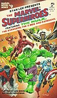
I finally nailed down #9 from an online dealer. Here it is:
Okay, now here's what had been bugging me. This particular volume was a collection of four short stories. The second one in the book was a Daredevil story and it was brilliant. I still think it's one of the best Daredevil things anyone's ever done, it predated Frank Miller's noir take by a couple of years and did it better -- well, I think so -- but since it was a prose one-off throwaway, no one saw it. The story was by "Kyle Cristopher" and I was certain it was a pen name, but I couldn't figure out WHOSE. For a while I thought it might have been Chris Claremont, but I couldn't quite convince myself of it -- if he was going to do a story in that book it would have been the X-Men story, it seemed to me, and I couldn't figure out why he'd use a pen name. But it had that FEEL, it was very angsty and character-driven.
Well, I just found out who "Kyle Christopher" was, and it was a guy I'd never have considered as even a long-shot suspect. Martin Pasko wrote it, and I guess it was because he didn't want DC to know he was moonlighting or something.
Anybody else know anything more about this?
Yeah, I Was Kyle Christopher. To answer your question about the pseudonym: When I was invited to contribute to the volume by my old friends Marv Wolfman and Len Wein, I believed I had an opportunity, from another prospective client, to establish myself as a writer of mainstream fiction. I didn't want the byline "Martin Pasko" to be associated with SF or fantasy which, at that time, were a "ghetto" out of which it was very difficult to climb once you were "typed" as a genre specialist. As it turned out, that other prospect fell though...while I was so pleased -- indeed, surprised -- with the way the Daredevil novella turned out, I submitted the ms. under my real name. Ironically enough, I was told that it was *Stan Lee* who vetoed using the "Martin Pasko" byline because he felt it was too closely associated with DC Comics. So the piece ended up running under my WGAw-registered pseudonym of "Kyle Christopher." I've always been proud of that job, and I thank you all for the recognition. But how the hell did you find out who wrote it?Pretty darn cool, no?
Well, that's it for this week, thanks for stopping by!
Feel free to drop off any urban legends you'd like to see featured!!
This Chat Was Good - Mike Carey
With the solicitation up for his first issue as writer of X-Men, now's a good time to link you to a nice chat Mike Carey did awhile back at Comic Book Resources. I was amazed at how many questions he answered. Check it out here.
What I bought - 19 April 2006
Yesterday was a strange comic-buying day. I was quite literally a super-corporate whore, and almost completely a Marvel zombie. Nothing even from Image! Weird. I'm going to lose all my street cred!
Plus, as usual, even the comics I liked pissed me off somehow. You knew it would happen!
Daredevil #84 by Ed Brubaker, Michael Lark, and Stefano Gaudiano
$2.99, Marvel

Reasons why the Marvel Universe is stupid, Part 87,847,839:
Ooh, look! We've captured Bullseye! (Presumably he has not escaped since they got him at the end of Bendis' run.) Where shall we put him?
Ooh, I know, I know! Let's put in a federal penitentiary where we're holding
a) Matt Murdock, who we all believe to be Daredevil and is therefore Bullseye's mortal enemy;
b) Wilson Fisk, who has employed Bullseye quite a lot in the past;
c) Hammerhead, who is apparently some kind of royal prisoner from the Middle Ages because his cell is like a small apartment;
d) The Owl, who's generally nutty;
e) Did I miss anyone?
What? You say there are plenty of federal prisons scattered throughout the country where we could stash all these people so they're not concentrated in one spot that is sure to explode with violence? We could put Bullseye in Guantanamo Bay so there'd be at least one criminal held there? (Sorry - liberal bias seeping through! Must ... control ...) Why the hell would we do any of those things? That's too damned logical!
Listen, I know we're just building toward the inevitable prison riot, when all this shit hits the fan. But sending Bullseye into the mix is just stupid. Yes, stupid. It strains my suspension of disbelief, which is already strained by the fact that Matt is in prison in the first place (I'm trying not to think about how stupid that is, and I'm willing to as long as the story is okay). And I wonder, wonder, wonder, wonder where Frank Castle will end up. Any guesses????
Since this is the third part of a six-issue arc, there's a lot of treading water, as we usually get in the third and fourth parts of a six-issue arc. I mean, sure, we get a few nice nuggets of plot progression, but nothing that couldn't have been handled in far fewer pages. I'm willing to ride out the first Brubaker arc and make my decision about keeping the title then, but so far, it's just kind of there. It's not a bad comic book by any means, but it's certainly not something that makes me shake my head in amazement. Maybe it will live up to the hype. We'll see.
Ex Machina Special #1 (of 2) by Brian K. Vaughan, Chris Sprouse, and Karl Story
$2.99, DC/Wildstorm
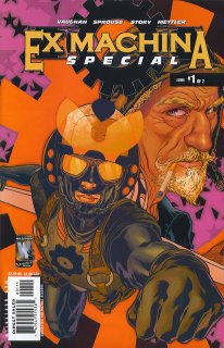
Um, why exactly isn't this part of the regular title? It costs the same. There are the same number of pages. What's a-going on?
I have a sneaking suspicion that this is a "special" simply so that Harris can claim he drew every issue of Ex Machina the "regular" title, which is so idiotic I can barely breathe. Listen, DC: guest pencillers are a fact of life. Harris has never been known as the quickest dude, so 19 straight issues out of him is pretty damned amazing, and we probably won't mind a guest artist. Sprouse is a fine fill-in, and he even makes the book look like Harris would! It's actually somewhat difficult to tell the difference in some places. So don't insult my intelligence by calling this a "special." It's a normal issue with a fill-in artist. The world won't come to an end if you admit it.
Other than that, this is a good issue. It's actually stapled together well, and the story, which is almost completely a flashback to Mitchell's superhero days, is interesting because it gives him an archenemy, which every good hero needs. The enemy is cool, too, because in the grand tradition of heroes, his enemy is kind of his dark side - a guy with similar abilities (he can talk to animals) but without Mitchell's morality. Mayhem ensues. Plus, Vaughan looks like he's going to tie it into Mitchell's job, which is the most interesting part of the book.
As usual, a good read. Even with a fill-in artist!
Nextwave #4 by Warren Ellis, Stuart Immonen, and Wade von Grawbadger
$2.99, Marvel
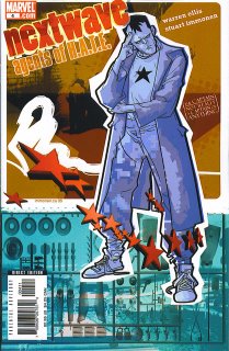
Warren Ellis has a bit of a multiple personality problem. After last week's utterly joyless offering, he gives us this, which isn't exactly full of joy, but at least it has fun with things. Our heroes fight a giant Transformer, for crying out loud! It's a quick read that offers nothing more than our heroes fighting the bad cop who has turned into a giant robot, plus a short origin of The Captain, but it's just what a lot of people want from a comic book. I don't get people who want all-out action in their comics but don't like this. Even if you think Ellis goes over the top (The Captain vomiting on the aliens who gave him his powers, for instance), it's still exactly what you want from a comic book: interesting heroes beating on interesting bad guys. And despite the vomiting on the aliens, it's still a fun book. Tabitha trying to see if Monica is unconscious by shouting that Captain America wants her back in the Avengers, for instance, is funny.
This is the Warren Ellis I like - not that Nextwave is the greatest book in the world, but, at the risk of pissing off fans of that thing he wrote last week, it's much better than that. It's harder to come up with this kind of story than one in which everyone dies for no reason.
Squadron Supreme #2 by J. Michael Straczynski, Gary Frank, and Jon Sibal
$2.99, Marvel
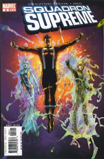
It's strange - after two absolutely horrible mini-series to set this up, one written by JMS himself, the first two issues of the new title give me hope. It's still going to be slow, I bet, and that will piss plenty of people off, but this is packed full of neat little info bites and actually has a plot, plus the art is typically gorgeous. For a book with a lot of characters, we get nice development: Zarda is acting weird but no one knows why, Emil Burbank has another secret, Kingsley speaks volumes without saying a word, Zarda and Mark Milton talk briefly about ruling the world (ooh - foreshadowing!), and General M'Butu is a nice threat because he can control minds - and at the end, he controls three of the most powerful members of our friendly Squadron! It's interesting to see JMS putting the Squadron into "real-world" situations - I know that's the point of the book, but it's still nice to see that he hasn't backed away from that - and I'm curious about how the internal tensions among the heroes will play out. I'm perfectly aware that this book angers a lot of people out there because of its pace, but it will, I think, turn out to be the kind of book we were all hoping Rising Stars would be.
X-Men #185 by Peter Milligan and Salvador Larroca
$2.99, Marvel
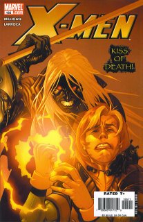
Boy, Rogue looks awful on that cover. I'm just saying.
Here's what I don't get: why isn't this book better? How can a writer like Peter Milligan be so middle-of-the-road? I can't blame the art, which is stunning, but the writing is just dull. It's certainly not horrible, just boring. Why?
I don't know enough about how Marvel works to know if it's Milligan toning it down because he feels he needs to or if the editors are reining him in. It's so frustrating to read the "good" Milligan and wonder what he would do if turned loose on a superhero title and then to actually read that superhero title. Should I blame Milligan?
I haven't looked at sales figures for the book, but I have to believe that it would sell well if the writer simply listed everything he had to eat that month while Larroca drew it. Marvel was willing to let Morrison go nuts on the book, so why don't they let Milligan go nuts? Does Milligan not have the cachet of Morrison? One reason, I think, that they don't allow Milligan to go nuts is because Milligan, more than Morrison or any other writer I can think of in mainstream comics, is obsessed with weird sex. That's not a bad thing in my book - he writes very thought-provoking stuff about sexual politics, and that's why his books are so good. Think about it: Shade - sex. The Extremist - sex. The Enigma - sex. The Minx - sex. Human Target - sex. Even this book has had a bit of that - not enough to make it a great comic, but the possibilities are certainly there in an almost incestuous organization like the X-Men.
Why did Marvel even give him this book if they're not going to let him be "Milligan"? Or, as I wondered above, is it just him pulling back? Did they make him write this so he could write goofy stuff like the Deadgirl mini-series (see below). The internal machinations at Marvel and DC, I'm sure, are very interesting.
Oh, the issue. Blah. Gambit is evil, so is Polaris, and it all comes to a head next month. I'll let you know then.
MINI-SERIES I BOUGHT BUT DID NOT READ.
X-Statix Presents: Deadgirl #4 (of 5) by Milligan, Nick Dragotta, and Mike Allred

I didn't even read this and I know it's better than X-Men. I opened the book totally at random and saw this line: "Maybe you gotta be more like the man your horse used to love." I have no idea to what it is referring (I can guess, looking at the rest of the page), but it's a better line than anything that is found in X-Men. And it's by the same person. Bizarre.
All in all, a pretty good week. Please forgive me for shilling for "The Man." I promise that next week I'll try to buy something that only 16 people in the country are buying!
Plus, as usual, even the comics I liked pissed me off somehow. You knew it would happen!
Daredevil #84 by Ed Brubaker, Michael Lark, and Stefano Gaudiano
$2.99, Marvel

Reasons why the Marvel Universe is stupid, Part 87,847,839:
Ooh, look! We've captured Bullseye! (Presumably he has not escaped since they got him at the end of Bendis' run.) Where shall we put him?
Ooh, I know, I know! Let's put in a federal penitentiary where we're holding
a) Matt Murdock, who we all believe to be Daredevil and is therefore Bullseye's mortal enemy;
b) Wilson Fisk, who has employed Bullseye quite a lot in the past;
c) Hammerhead, who is apparently some kind of royal prisoner from the Middle Ages because his cell is like a small apartment;
d) The Owl, who's generally nutty;
e) Did I miss anyone?
What? You say there are plenty of federal prisons scattered throughout the country where we could stash all these people so they're not concentrated in one spot that is sure to explode with violence? We could put Bullseye in Guantanamo Bay so there'd be at least one criminal held there? (Sorry - liberal bias seeping through! Must ... control ...) Why the hell would we do any of those things? That's too damned logical!
Listen, I know we're just building toward the inevitable prison riot, when all this shit hits the fan. But sending Bullseye into the mix is just stupid. Yes, stupid. It strains my suspension of disbelief, which is already strained by the fact that Matt is in prison in the first place (I'm trying not to think about how stupid that is, and I'm willing to as long as the story is okay). And I wonder, wonder, wonder, wonder where Frank Castle will end up. Any guesses????
Since this is the third part of a six-issue arc, there's a lot of treading water, as we usually get in the third and fourth parts of a six-issue arc. I mean, sure, we get a few nice nuggets of plot progression, but nothing that couldn't have been handled in far fewer pages. I'm willing to ride out the first Brubaker arc and make my decision about keeping the title then, but so far, it's just kind of there. It's not a bad comic book by any means, but it's certainly not something that makes me shake my head in amazement. Maybe it will live up to the hype. We'll see.
Ex Machina Special #1 (of 2) by Brian K. Vaughan, Chris Sprouse, and Karl Story
$2.99, DC/Wildstorm

Um, why exactly isn't this part of the regular title? It costs the same. There are the same number of pages. What's a-going on?
I have a sneaking suspicion that this is a "special" simply so that Harris can claim he drew every issue of Ex Machina the "regular" title, which is so idiotic I can barely breathe. Listen, DC: guest pencillers are a fact of life. Harris has never been known as the quickest dude, so 19 straight issues out of him is pretty damned amazing, and we probably won't mind a guest artist. Sprouse is a fine fill-in, and he even makes the book look like Harris would! It's actually somewhat difficult to tell the difference in some places. So don't insult my intelligence by calling this a "special." It's a normal issue with a fill-in artist. The world won't come to an end if you admit it.
Other than that, this is a good issue. It's actually stapled together well, and the story, which is almost completely a flashback to Mitchell's superhero days, is interesting because it gives him an archenemy, which every good hero needs. The enemy is cool, too, because in the grand tradition of heroes, his enemy is kind of his dark side - a guy with similar abilities (he can talk to animals) but without Mitchell's morality. Mayhem ensues. Plus, Vaughan looks like he's going to tie it into Mitchell's job, which is the most interesting part of the book.
As usual, a good read. Even with a fill-in artist!
Nextwave #4 by Warren Ellis, Stuart Immonen, and Wade von Grawbadger
$2.99, Marvel

Warren Ellis has a bit of a multiple personality problem. After last week's utterly joyless offering, he gives us this, which isn't exactly full of joy, but at least it has fun with things. Our heroes fight a giant Transformer, for crying out loud! It's a quick read that offers nothing more than our heroes fighting the bad cop who has turned into a giant robot, plus a short origin of The Captain, but it's just what a lot of people want from a comic book. I don't get people who want all-out action in their comics but don't like this. Even if you think Ellis goes over the top (The Captain vomiting on the aliens who gave him his powers, for instance), it's still exactly what you want from a comic book: interesting heroes beating on interesting bad guys. And despite the vomiting on the aliens, it's still a fun book. Tabitha trying to see if Monica is unconscious by shouting that Captain America wants her back in the Avengers, for instance, is funny.
This is the Warren Ellis I like - not that Nextwave is the greatest book in the world, but, at the risk of pissing off fans of that thing he wrote last week, it's much better than that. It's harder to come up with this kind of story than one in which everyone dies for no reason.
Squadron Supreme #2 by J. Michael Straczynski, Gary Frank, and Jon Sibal
$2.99, Marvel

It's strange - after two absolutely horrible mini-series to set this up, one written by JMS himself, the first two issues of the new title give me hope. It's still going to be slow, I bet, and that will piss plenty of people off, but this is packed full of neat little info bites and actually has a plot, plus the art is typically gorgeous. For a book with a lot of characters, we get nice development: Zarda is acting weird but no one knows why, Emil Burbank has another secret, Kingsley speaks volumes without saying a word, Zarda and Mark Milton talk briefly about ruling the world (ooh - foreshadowing!), and General M'Butu is a nice threat because he can control minds - and at the end, he controls three of the most powerful members of our friendly Squadron! It's interesting to see JMS putting the Squadron into "real-world" situations - I know that's the point of the book, but it's still nice to see that he hasn't backed away from that - and I'm curious about how the internal tensions among the heroes will play out. I'm perfectly aware that this book angers a lot of people out there because of its pace, but it will, I think, turn out to be the kind of book we were all hoping Rising Stars would be.
X-Men #185 by Peter Milligan and Salvador Larroca
$2.99, Marvel

Boy, Rogue looks awful on that cover. I'm just saying.
Here's what I don't get: why isn't this book better? How can a writer like Peter Milligan be so middle-of-the-road? I can't blame the art, which is stunning, but the writing is just dull. It's certainly not horrible, just boring. Why?
I don't know enough about how Marvel works to know if it's Milligan toning it down because he feels he needs to or if the editors are reining him in. It's so frustrating to read the "good" Milligan and wonder what he would do if turned loose on a superhero title and then to actually read that superhero title. Should I blame Milligan?
I haven't looked at sales figures for the book, but I have to believe that it would sell well if the writer simply listed everything he had to eat that month while Larroca drew it. Marvel was willing to let Morrison go nuts on the book, so why don't they let Milligan go nuts? Does Milligan not have the cachet of Morrison? One reason, I think, that they don't allow Milligan to go nuts is because Milligan, more than Morrison or any other writer I can think of in mainstream comics, is obsessed with weird sex. That's not a bad thing in my book - he writes very thought-provoking stuff about sexual politics, and that's why his books are so good. Think about it: Shade - sex. The Extremist - sex. The Enigma - sex. The Minx - sex. Human Target - sex. Even this book has had a bit of that - not enough to make it a great comic, but the possibilities are certainly there in an almost incestuous organization like the X-Men.
Why did Marvel even give him this book if they're not going to let him be "Milligan"? Or, as I wondered above, is it just him pulling back? Did they make him write this so he could write goofy stuff like the Deadgirl mini-series (see below). The internal machinations at Marvel and DC, I'm sure, are very interesting.
Oh, the issue. Blah. Gambit is evil, so is Polaris, and it all comes to a head next month. I'll let you know then.
MINI-SERIES I BOUGHT BUT DID NOT READ.
X-Statix Presents: Deadgirl #4 (of 5) by Milligan, Nick Dragotta, and Mike Allred

I didn't even read this and I know it's better than X-Men. I opened the book totally at random and saw this line: "Maybe you gotta be more like the man your horse used to love." I have no idea to what it is referring (I can guess, looking at the rest of the page), but it's a better line than anything that is found in X-Men. And it's by the same person. Bizarre.
All in all, a pretty good week. Please forgive me for shilling for "The Man." I promise that next week I'll try to buy something that only 16 people in the country are buying!
Daredevil Question!!
Why does it rule so much?
Seriously, though, what does Stefano Gaudiano do on Daredevil? Is he inking Lark, or is he pencilling? The credit is just "With Stefano Gaudiano."
Anyone know?
Seriously, though, what does Stefano Gaudiano do on Daredevil? Is he inking Lark, or is he pencilling? The credit is just "With Stefano Gaudiano."
Anyone know?
Wednesday, April 19, 2006
You Know What Comic Rules? Ed Brubaker's Daredevil
Just saying.
Heck, the ending scenario has been done, like, literally 587 times since Amazing Spider-Man #129, and yet it was still really cool.
Three cheers for Ed Brubaker's Daredevil!!!
Heck, the ending scenario has been done, like, literally 587 times since Amazing Spider-Man #129, and yet it was still really cool.
Three cheers for Ed Brubaker's Daredevil!!!
The Southwest Texas "Got A Magical Alien Bug Embedded In My Flesh" Blues: Blue Beetle #1
Blue Beetle #1
Written by Keith Giffen and John Rogers
Art by Cully Hamner
The last Blue Beetle was a fun guy. Essentially a comic nerd made good, Ted Kord was the dork of the DC Universe. His glory days as the buffoon of the Justice League were among my favorite in comics.

We all know what happened later: a fade from prominence, obsolescence, and finally the Old Yeller treatment.
What about the new guy? Same as the old guy, minus the unfortunate head trauma?

Well, he does look awful different.
The new series, written by Keith Giffen and John Rogers, art by Cully Hamner, is off to a good start. A preview of the first seven pages can be found here, in a Newsarama article.
Our hero is teenager Jaime Reyes of El Paso, Texas. He finds the long-lost scarab of the original Blue Beetle in a construction site while goofing with friends. The issue depicts his return from a jaunt in outer space, whereupon he is attacked by an enraged Green Lantern. Interwoven with the big super-fight is a series of flashbacks showing how Jaime became the Blue Beetle.
Giffen and Rogers work a tremendous amount into a short comic. We begin with a colorful superhero smash-up, then we meet our hero as a civilian and his friends, get a sense of the Reyes family, and run across all sorts of mysterious portents about the scarab. Aside from the Green Lantern, a peeved Guy Gardner, these characters are all new. To mash all of that into a single comic takes a lot of effort.
Rogers’s dialogue is witty and charming. He sketched the outlines of the characters and their relationships to one another in very little space, and they came across as believable people. Rogers has a fine blog where he discusses his regular career as a screenwriter. I'd say he employed that background to good effect in Blue Beetle.
The dialogue does betray a noticable sitcom rhythm in a few panels. Clever rejoinders felt a little fast and a little too clever in a few spots. It wasn't bad; it just felt like a sitcom. Also, there was a moment when a character’s background was hinted at through dialogue that rang strangely in my ear. Sad to say, it combined the subtlety of a falling anvil with an over-clever method of exposition and pulled me right out of the story for just a second.
Maybe it could have worked as written with a different panel layout. Hm.
The art, by Cully Hamner, is well done. He took a cartoonish approach, which is a plus. Rather than “comic book standard” appearance for everyone, the characters are distinct from one another in more than just hair color and clothing. They’re different shapes and sizes. Hamner also captures the flavor of El Paso, lending the book an unusual background.*
Worthy of note is the coloring. The color palette of the comic changes with the setting, like shifting keys in a song. Everday El Paso is almost entirely in shades of brown, creating a calm and muted feeling. The super-hero action scenes between the Beetle and a Green Lantern are in bold bright colors: black, green, blue. The story itself takes pains to contrast the everyday life of Jaime with the super-lunacy of the Blue Beetle. Reinforcing that through coloring was an excellent idea.
Issue number one did not end on a danger-packed cliffhanger. Instead, it left the reader with a handful of mysteries. The Green Lantern claimed the scarab gave off powerfully bad vibes. A mysterious woman made cryptic statements to Jaime and vanished. Weird writing appears in Jaime’s field of vision.
Thus, Blue Beetle’s appeal for issue #2 is twofold: the charm of regular kid Reyes and the riddle of the scarab. I’ll pick it up. I’m not certain that Beetle will be a classic for the ages, but it’s a well-made superhero book with promise. I’ll take it.
----------------------------
*The Lovely and Delightful Mrs. Jerkwater is from El Paso, and my in-laws still live there. As a result, I’ve been down there enough times to appreciate Hamner’s efforts to recreate its appearance. The Reyes house looks just like my in-laws’ house. Then again, about sixty percent of the houses in El Paso look like that.
Written by Keith Giffen and John Rogers
Art by Cully Hamner
The last Blue Beetle was a fun guy. Essentially a comic nerd made good, Ted Kord was the dork of the DC Universe. His glory days as the buffoon of the Justice League were among my favorite in comics.
We all know what happened later: a fade from prominence, obsolescence, and finally the Old Yeller treatment.
What about the new guy? Same as the old guy, minus the unfortunate head trauma?
Well, he does look awful different.
The new series, written by Keith Giffen and John Rogers, art by Cully Hamner, is off to a good start. A preview of the first seven pages can be found here, in a Newsarama article.
Our hero is teenager Jaime Reyes of El Paso, Texas. He finds the long-lost scarab of the original Blue Beetle in a construction site while goofing with friends. The issue depicts his return from a jaunt in outer space, whereupon he is attacked by an enraged Green Lantern. Interwoven with the big super-fight is a series of flashbacks showing how Jaime became the Blue Beetle.
Giffen and Rogers work a tremendous amount into a short comic. We begin with a colorful superhero smash-up, then we meet our hero as a civilian and his friends, get a sense of the Reyes family, and run across all sorts of mysterious portents about the scarab. Aside from the Green Lantern, a peeved Guy Gardner, these characters are all new. To mash all of that into a single comic takes a lot of effort.
Rogers’s dialogue is witty and charming. He sketched the outlines of the characters and their relationships to one another in very little space, and they came across as believable people. Rogers has a fine blog where he discusses his regular career as a screenwriter. I'd say he employed that background to good effect in Blue Beetle.
The dialogue does betray a noticable sitcom rhythm in a few panels. Clever rejoinders felt a little fast and a little too clever in a few spots. It wasn't bad; it just felt like a sitcom. Also, there was a moment when a character’s background was hinted at through dialogue that rang strangely in my ear. Sad to say, it combined the subtlety of a falling anvil with an over-clever method of exposition and pulled me right out of the story for just a second.
Maybe it could have worked as written with a different panel layout. Hm.
The art, by Cully Hamner, is well done. He took a cartoonish approach, which is a plus. Rather than “comic book standard” appearance for everyone, the characters are distinct from one another in more than just hair color and clothing. They’re different shapes and sizes. Hamner also captures the flavor of El Paso, lending the book an unusual background.*
Worthy of note is the coloring. The color palette of the comic changes with the setting, like shifting keys in a song. Everday El Paso is almost entirely in shades of brown, creating a calm and muted feeling. The super-hero action scenes between the Beetle and a Green Lantern are in bold bright colors: black, green, blue. The story itself takes pains to contrast the everyday life of Jaime with the super-lunacy of the Blue Beetle. Reinforcing that through coloring was an excellent idea.
Issue number one did not end on a danger-packed cliffhanger. Instead, it left the reader with a handful of mysteries. The Green Lantern claimed the scarab gave off powerfully bad vibes. A mysterious woman made cryptic statements to Jaime and vanished. Weird writing appears in Jaime’s field of vision.
Thus, Blue Beetle’s appeal for issue #2 is twofold: the charm of regular kid Reyes and the riddle of the scarab. I’ll pick it up. I’m not certain that Beetle will be a classic for the ages, but it’s a well-made superhero book with promise. I’ll take it.
----------------------------
*The Lovely and Delightful Mrs. Jerkwater is from El Paso, and my in-laws still live there. As a result, I’ve been down there enough times to appreciate Hamner’s efforts to recreate its appearance. The Reyes house looks just like my in-laws’ house. Then again, about sixty percent of the houses in El Paso look like that.
Tuesday, April 18, 2006
Judging (Marvel's July) Books By Their Covers
Marvel's July Solicitations are up, so let's make some prejudgements based just on the covers (as we all love to make prejudgements, don't we?).
Let's begin!
___________________________________________________
I didn't expect him to duplicate the strong cover effort from last month...
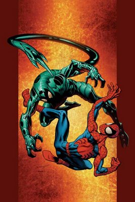
but damn, couldn't he have at least TRIED?
___________________________________________________
"this is the explosive climax to the amazing series of events that go back to Mark Millar's first issue"?!?!
NOO!!!
HOW CAN WE GO THAT FAR BACK!!
It is too much!!
12 ISSUES IS TOO FAR BACK FOR ME TO REMEMBER, EVEN FOR AN EXPLOSIVE CLIMAX!!!
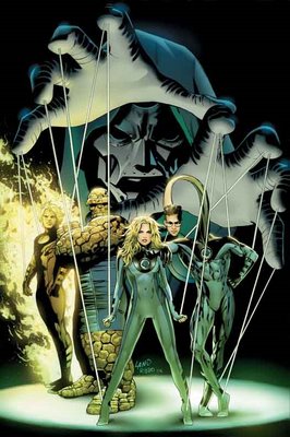
Pretty pedestrian cover, too.
___________________________________________________
Ugh. Tom Raney appears to be doing the "washed" look with his pencils.
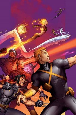
I do not approve.
___________________________________________________
CIVIL WAR COVERS!!
___________________________________________________
Man, Steve McNiven makes being annoyed at Civil War difficult, because he's so talented.
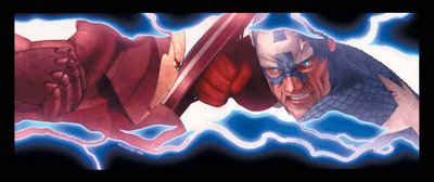
Great cover, although this scene better damn well appear in the issue!
Luckily, Michael Turner is there to make it easy to make fun of Civil War.
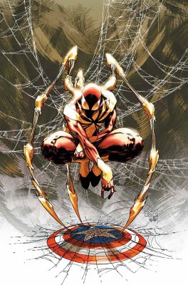
Although, isn't it funny to see a costume design that is actually BENEATH Turner?
___________________________________________________
Due to the ugly trade dress, Civil War covers are automatically disqualified from Top Five consideration, but if not, this Juan Doe cover for Civil War X-Men would be a top contender.
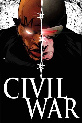
Very strong cover image.
___________________________________________________
Wow.
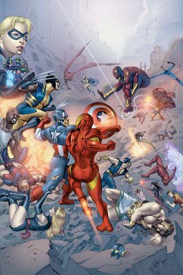
I think this is one of the best arguments against photoshop comics. This Civil War Daily Bugle comic looks less like a cohesive drawing and more like a photo collage.
___________________________________________________
Is it just me, or does Cheung's art for this Young Avengers/Runaways mini-series cover...
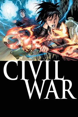
look a bit regressive? It looks more like his X-Force style than his post-Scion stuff, no?
I bet Rich Watson can tell me (completely obscure reference I should not have made, sorry, folks)!!
___________________________________________________
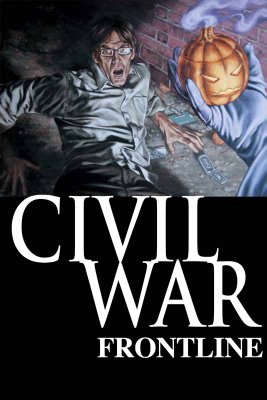
I like John Watson's work a lot, but this Civil War Frontline cover is a bit goofy looking.
___________________________________________________
Man, wasn't Waid and Garney's Captain America awesome? The book is in capable hands at the moment, but I bet Waid and Garney could do something ELSE cool.
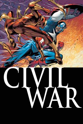
Oh, by the by, the solicit for this issue? "When one of the War's leaders comes to recruit Spidey for his troops..." Which one could it be?!!? I love a mystery!!!
___________________________________________________
I am pleased that they are allowing the Black Panther/Storm wedding to be without the yucky trade dress.
Nice cover, except the dress.
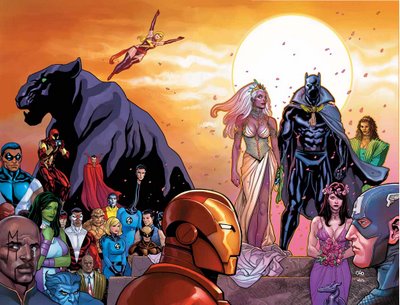
Luckily, Michal Turner is chipping in on a variant cover.
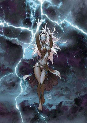
Yep, nothing says "wedding issue" more than a half-naked lady in the rain!
Turner - All class.
___________________________________________________
You know what Civil War needs more of?
People standing with their arms folded!!
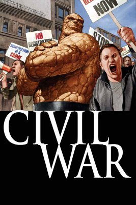
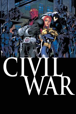
Oh.
Never mind.
___________________________________________________
Ryan Sook is a really, really good artist.
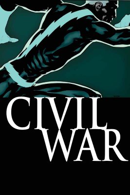
Nice cover (except, of course, the silly trade dress).
___________________________________________________
Man, what an awful Cable/Deadpool cover by Roberto Campus!!
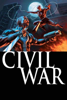
Is Deadpool glowing?
That is barely recognizable as Deadpool!
And the Daredevil ain't that good, either.
___________________________________________________
I like Leinil Francis Yu's art a lot.

That being said, this New Avengers cover is kinda lame.
___________________________________________________
Ooooh...now Nitro has Wolverine!!
Remember when Justice League International did that with Lobo and Guy Gardner?
That was cool.

This is less so.
No giraffe neck, though!!
___________________________________________________
I really admire the way Friendly Neighborhood Spider-Man lately has tried to avoid the crossover crunch, and stand on its own.
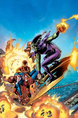
Also, nice cover by 'Ringo.
___________________________________________________
Man, that is one creepy looking cover.
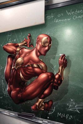
Clayton Crain's work scares me.
And I don't want to know where he got the photo basis for this cover from!!
___________________________________________________
Pretty low-key last issue of Last Planet Standing.

___________________________________________________
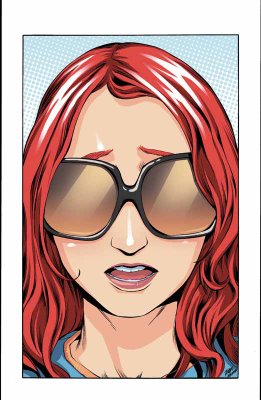
Wow, that is probably the most boring Mary Jane cover I've seen yet.
___________________________________________________
This is a very nice cover as both a last issue AND a 100th issue.
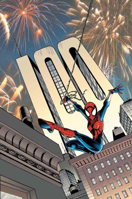
There's no mention in the solicits of Sal Buscema, though. I hope he's still on board.
___________________________________________________
ANNIHILATION COVERS - NOW INTERLOCKING!!!
It's funny, though, THESE covers are interlocking, but since most of Gabriele Dell'Otto's covers have looked basically the same ANYways, this is not exactly osmething new.
I don't like the new Nova costume...

I like how somber Ronan looks...

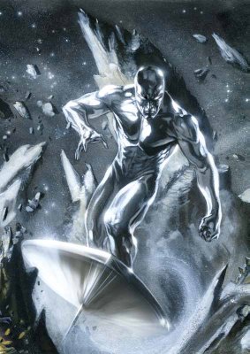
Nice Silver Surfer...
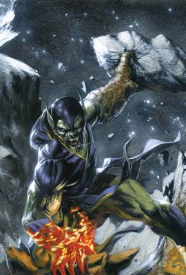
Best Super Skrull I've seen from Dell'Otto yet!!
___________________________________________________
HA!
I love it!

The grim and gritty Power Pack!
Classic idea!
___________________________________________________
Very weird poses.
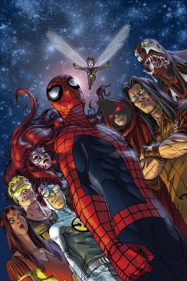
But since I love obscure Marvel characters, I'm down!!!
___________________________________________________
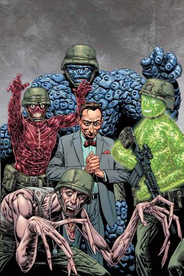
Pretty decent Fantastic Four: First Family cover by Chris Weston...
___________________________________________________
Nice drawing by John Romita Jr. (as usual)...

however, it's not exactly a striking cover.
___________________________________________________
The same thing can be said for this Tex Ghost Rider cover.
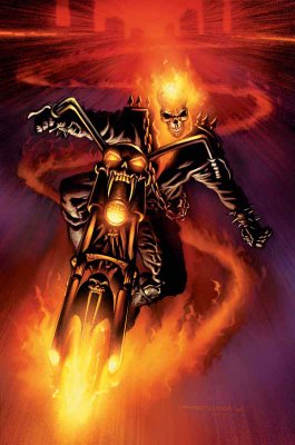
Then again, Tex at least has the benefit of following Clayton Crain, which will make people be happier to see his cover.
___________________________________________________
Iron...
Maniac.
Iron Maniac.
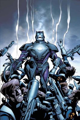
This is what I love about Kirkman. It's just SO stupid that he manages to sell it!
___________________________________________________
MARVEL ADVENTURES COVERS!!
___________________________________________________
Wow, this Marvel Adventures Fantastic Four looks like the most generic cover ever!

___________________________________________________
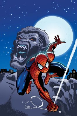
Oops...I spoke too soon!!!
___________________________________________________
I like Aaron Lopresti's art...

but not that Giant-Girl costume.
___________________________________________________
There's scary.
And then there's unintentionally scary.
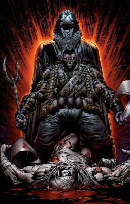
This cover nicely pulls off both.
___________________________________________________
First disappointing cover for Frank Cho (well, outside of his absurd #1 cover).

Too bad, I was really impressed with his last two covers.
___________________________________________________
Tsk tsk.
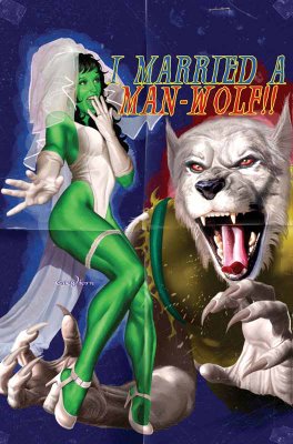
One of the few times that the cheesecake cover motif WORKS, and Horn has to blow it by putting a picture of a wolf on the cover and then pretending that he is drawing a werewolf.
Poor form, Mr. Horn, poor form.
___________________________________________________
Gary Frank is an AWEsome artist.
However, look at this Squadron Supreme cover...
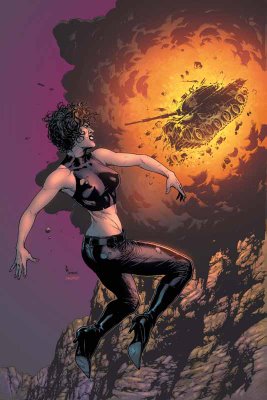
DAMN, his Squadron Suprem covers are boring!
___________________________________________________
Luckily, his Fury Peacemaker cover, while still being fairly static...
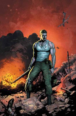
has enough attitude to pull the cover off.
___________________________________________________
COOL WRAPAROUND COVERS BY NEW X-MEN CREATIVE TEAMS!!
___________________________________________________
First, Billy Tan on Uncanny X-Men...

Next, Chris Bachalo on X-Men...

I would have put both of them in the Top Five, except that they really only REALLY impress me because my expectations were lowered so much...so not enough for top five!!
___________________________________________________
Seriously, New Excalibur has got to quit with these covers.
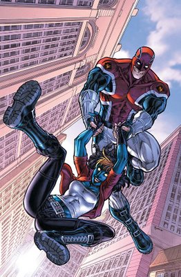
It's like they're in a Mentos commercial, the way everyone is so freakishly giddy.
___________________________________________________
This is an impressive Storm cover by Mayhew.

___________________________________________________
I like Paul Pelletier.
This is a nice drawing.

A bit subdued for a cover, though.
___________________________________________________
You can debate the merits of Paco Medina's pencils (which seem to tighten and loosen from issue to issue)...
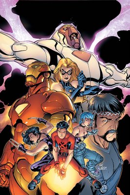
but you have to admire his cover design sense.
___________________________________________________
What an odd decision by Quesada...
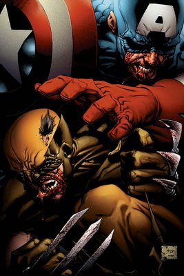
it's like he's trying to draw them like Sin City.
Weird.
___________________________________________________
Another colorform cover by Bradstreet!

Detach - move - apply.
___________________________________________________
I like the idea behind the Halo cover.
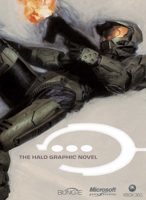
You don't need a fancy cover, just slapping "Halo" on the cover is probably enough to sell the comic.
___________________________________________________
Pretty good Jack Kirby cover.

I dunno about the concept, though.
___________________________________________________
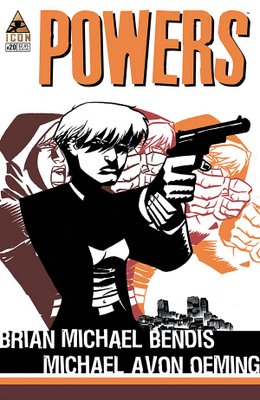
Nice cover design by Oeming.
___________________________________________________
HONORABLE MENTIONS (really nice month for covers, so there's a lot of them)!!!
___________________________________________________
ERIC POWELL COVERS!
He is awesome.
These covers for Marvel's Western one-shots are awesome.

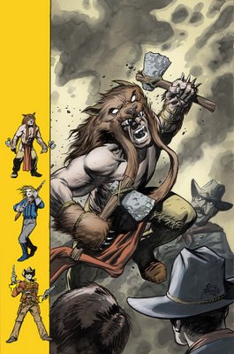
A lighter month, both easy top five - but once I kept out one, I couldn't decide which one to keep, so BOTH became honorable mentions!
___________________________________________________
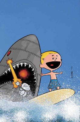
What a perfect encapsulation of the fun that is Franklin Richards, Son of a Genius!!
___________________________________________________
This reminds me of the super-sweet Dave Gibbons cover for this month's Action Comics.
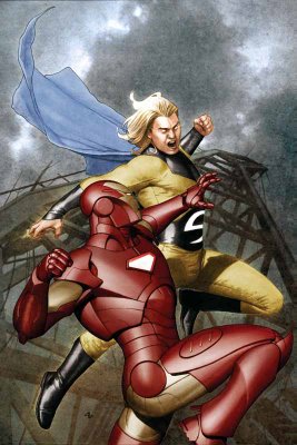
Great job by Granov.
___________________________________________________
Off month for Nextwave.

I expect greatness every month!
___________________________________________________
This coloring book incentive would be a guaranteed top five...
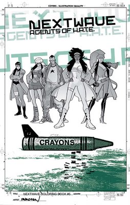
except it looks just like a black and white version of the original cover!!
What gives?!?!
___________________________________________________
MAN, do I loves me some Marcos Martin.
I can't wait until he draws Doctor Strange!!
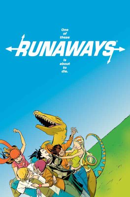
However, this cover is a bit too weird for me to make top five. I still dig it a lot!
___________________________________________________
It was SUPER close between the two Ladronn covers (heck, all the top six titles I could be convinced to mix around)...but since this on is a bit more of a static cover, I put this one (for the Handbook) in the honorable mentions.
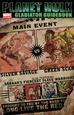
Great cover, though.
Ladronn rules.
___________________________________________________
TOP FIVE COVERS!!
___________________________________________________
5. Claire Wendling is an excellent artist.
This is a great cover for X-Men Fairy Tales.
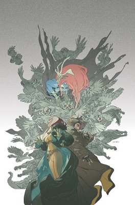
Last month, it was Kyle Baker, this month it is Claire Wendling!
Who's going to draw a cover next?!?! H. R. Giger?!?!
___________________________________________________
4. How freakin' badass is this Ladronn Hulk cover?!?
It's like it's leaping off of the page!
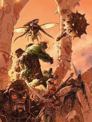
Amazing.
___________________________________________________
3. Steve Epting has delivered some really strong covers for this arc.
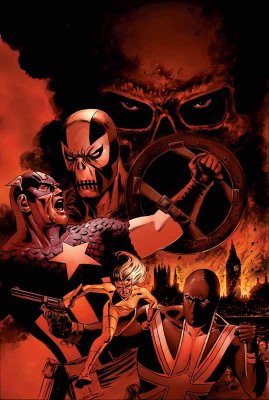
This might be a little high, but I feel bad for excluding him from the top five in the past.
Still, great cover, no?
___________________________________________________
2. David Mack is a design genius.

An amazing cover.
___________________________________________________
1. Finally, Richard Corben's covers for House of Horror: Edgar Allen Poe have been awesome, but for this cover...
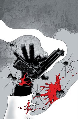
he amps it up a notch!
What an amazing design, and he pulls off the design flawlessly.
What a great artist Corben is.
___________________________________________________
Well, that's it for this month!
Feel free to weigh in with your prejudices (and your top five covers)!
Let's begin!
___________________________________________________
I didn't expect him to duplicate the strong cover effort from last month...

but damn, couldn't he have at least TRIED?
___________________________________________________
"this is the explosive climax to the amazing series of events that go back to Mark Millar's first issue"?!?!
NOO!!!
HOW CAN WE GO THAT FAR BACK!!
It is too much!!
12 ISSUES IS TOO FAR BACK FOR ME TO REMEMBER, EVEN FOR AN EXPLOSIVE CLIMAX!!!

Pretty pedestrian cover, too.
___________________________________________________
Ugh. Tom Raney appears to be doing the "washed" look with his pencils.

I do not approve.
___________________________________________________
CIVIL WAR COVERS!!
___________________________________________________
Man, Steve McNiven makes being annoyed at Civil War difficult, because he's so talented.

Great cover, although this scene better damn well appear in the issue!
Luckily, Michael Turner is there to make it easy to make fun of Civil War.

Although, isn't it funny to see a costume design that is actually BENEATH Turner?
___________________________________________________
Due to the ugly trade dress, Civil War covers are automatically disqualified from Top Five consideration, but if not, this Juan Doe cover for Civil War X-Men would be a top contender.

Very strong cover image.
___________________________________________________
Wow.

I think this is one of the best arguments against photoshop comics. This Civil War Daily Bugle comic looks less like a cohesive drawing and more like a photo collage.
___________________________________________________
Is it just me, or does Cheung's art for this Young Avengers/Runaways mini-series cover...

look a bit regressive? It looks more like his X-Force style than his post-Scion stuff, no?
I bet Rich Watson can tell me (completely obscure reference I should not have made, sorry, folks)!!
___________________________________________________
I like John Watson's work a lot, but this Civil War Frontline cover is a bit goofy looking.

___________________________________________________
Man, wasn't Waid and Garney's Captain America awesome? The book is in capable hands at the moment, but I bet Waid and Garney could do something ELSE cool.

Oh, by the by, the solicit for this issue? "When one of the War's leaders comes to recruit Spidey for his troops..." Which one could it be?!!? I love a mystery!!!
___________________________________________________
I am pleased that they are allowing the Black Panther/Storm wedding to be without the yucky trade dress.
Nice cover, except the dress.

Luckily, Michal Turner is chipping in on a variant cover.

Yep, nothing says "wedding issue" more than a half-naked lady in the rain!
Turner - All class.
___________________________________________________
You know what Civil War needs more of?
People standing with their arms folded!!


Oh.
Never mind.
___________________________________________________
Ryan Sook is a really, really good artist.

Nice cover (except, of course, the silly trade dress).
___________________________________________________
Man, what an awful Cable/Deadpool cover by Roberto Campus!!

Is Deadpool glowing?
That is barely recognizable as Deadpool!
And the Daredevil ain't that good, either.
___________________________________________________
I like Leinil Francis Yu's art a lot.

That being said, this New Avengers cover is kinda lame.
___________________________________________________
Ooooh...now Nitro has Wolverine!!
Remember when Justice League International did that with Lobo and Guy Gardner?
That was cool.

This is less so.
No giraffe neck, though!!
___________________________________________________
I really admire the way Friendly Neighborhood Spider-Man lately has tried to avoid the crossover crunch, and stand on its own.

Also, nice cover by 'Ringo.
___________________________________________________
Man, that is one creepy looking cover.

Clayton Crain's work scares me.
And I don't want to know where he got the photo basis for this cover from!!
___________________________________________________
Pretty low-key last issue of Last Planet Standing.

___________________________________________________
Wow, that is probably the most boring Mary Jane cover I've seen yet.

___________________________________________________
This is a very nice cover as both a last issue AND a 100th issue.

There's no mention in the solicits of Sal Buscema, though. I hope he's still on board.
___________________________________________________
ANNIHILATION COVERS - NOW INTERLOCKING!!!
It's funny, though, THESE covers are interlocking, but since most of Gabriele Dell'Otto's covers have looked basically the same ANYways, this is not exactly osmething new.
I don't like the new Nova costume...

I like how somber Ronan looks...

Nice Silver Surfer...

Best Super Skrull I've seen from Dell'Otto yet!!

___________________________________________________
HA!
I love it!

The grim and gritty Power Pack!
Classic idea!
___________________________________________________
Very weird poses.

But since I love obscure Marvel characters, I'm down!!!
___________________________________________________
Pretty decent Fantastic Four: First Family cover by Chris Weston...

___________________________________________________
Nice drawing by John Romita Jr. (as usual)...

however, it's not exactly a striking cover.
___________________________________________________
The same thing can be said for this Tex Ghost Rider cover.

Then again, Tex at least has the benefit of following Clayton Crain, which will make people be happier to see his cover.
___________________________________________________
Iron...
Maniac.
Iron Maniac.

This is what I love about Kirkman. It's just SO stupid that he manages to sell it!
___________________________________________________
MARVEL ADVENTURES COVERS!!
___________________________________________________
Wow, this Marvel Adventures Fantastic Four looks like the most generic cover ever!

___________________________________________________
Oops...I spoke too soon!!!

___________________________________________________
I like Aaron Lopresti's art...

but not that Giant-Girl costume.
___________________________________________________
There's scary.
And then there's unintentionally scary.

This cover nicely pulls off both.
___________________________________________________
First disappointing cover for Frank Cho (well, outside of his absurd #1 cover).

Too bad, I was really impressed with his last two covers.
___________________________________________________
Tsk tsk.

One of the few times that the cheesecake cover motif WORKS, and Horn has to blow it by putting a picture of a wolf on the cover and then pretending that he is drawing a werewolf.
Poor form, Mr. Horn, poor form.
___________________________________________________
Gary Frank is an AWEsome artist.
However, look at this Squadron Supreme cover...

DAMN, his Squadron Suprem covers are boring!
___________________________________________________
Luckily, his Fury Peacemaker cover, while still being fairly static...

has enough attitude to pull the cover off.
___________________________________________________
COOL WRAPAROUND COVERS BY NEW X-MEN CREATIVE TEAMS!!
___________________________________________________
First, Billy Tan on Uncanny X-Men...

Next, Chris Bachalo on X-Men...

I would have put both of them in the Top Five, except that they really only REALLY impress me because my expectations were lowered so much...so not enough for top five!!
___________________________________________________
Seriously, New Excalibur has got to quit with these covers.

It's like they're in a Mentos commercial, the way everyone is so freakishly giddy.
___________________________________________________
This is an impressive Storm cover by Mayhew.

___________________________________________________
I like Paul Pelletier.
This is a nice drawing.

A bit subdued for a cover, though.
___________________________________________________
You can debate the merits of Paco Medina's pencils (which seem to tighten and loosen from issue to issue)...

but you have to admire his cover design sense.
___________________________________________________
What an odd decision by Quesada...

it's like he's trying to draw them like Sin City.
Weird.
___________________________________________________
Another colorform cover by Bradstreet!

Detach - move - apply.
___________________________________________________
I like the idea behind the Halo cover.

You don't need a fancy cover, just slapping "Halo" on the cover is probably enough to sell the comic.
___________________________________________________
Pretty good Jack Kirby cover.

I dunno about the concept, though.
___________________________________________________
Nice cover design by Oeming.

___________________________________________________
HONORABLE MENTIONS (really nice month for covers, so there's a lot of them)!!!
___________________________________________________
ERIC POWELL COVERS!
He is awesome.
These covers for Marvel's Western one-shots are awesome.


A lighter month, both easy top five - but once I kept out one, I couldn't decide which one to keep, so BOTH became honorable mentions!
___________________________________________________
What a perfect encapsulation of the fun that is Franklin Richards, Son of a Genius!!

___________________________________________________
This reminds me of the super-sweet Dave Gibbons cover for this month's Action Comics.

Great job by Granov.
___________________________________________________
Off month for Nextwave.

I expect greatness every month!
___________________________________________________
This coloring book incentive would be a guaranteed top five...

except it looks just like a black and white version of the original cover!!
What gives?!?!
___________________________________________________
MAN, do I loves me some Marcos Martin.
I can't wait until he draws Doctor Strange!!

However, this cover is a bit too weird for me to make top five. I still dig it a lot!
___________________________________________________
It was SUPER close between the two Ladronn covers (heck, all the top six titles I could be convinced to mix around)...but since this on is a bit more of a static cover, I put this one (for the Handbook) in the honorable mentions.

Great cover, though.
Ladronn rules.
___________________________________________________
TOP FIVE COVERS!!
___________________________________________________
5. Claire Wendling is an excellent artist.
This is a great cover for X-Men Fairy Tales.

Last month, it was Kyle Baker, this month it is Claire Wendling!
Who's going to draw a cover next?!?! H. R. Giger?!?!
___________________________________________________
4. How freakin' badass is this Ladronn Hulk cover?!?
It's like it's leaping off of the page!

Amazing.
___________________________________________________
3. Steve Epting has delivered some really strong covers for this arc.

This might be a little high, but I feel bad for excluding him from the top five in the past.
Still, great cover, no?
___________________________________________________
2. David Mack is a design genius.

An amazing cover.
___________________________________________________
1. Finally, Richard Corben's covers for House of Horror: Edgar Allen Poe have been awesome, but for this cover...

he amps it up a notch!
What an amazing design, and he pulls off the design flawlessly.
What a great artist Corben is.
___________________________________________________
Well, that's it for this month!
Feel free to weigh in with your prejudices (and your top five covers)!
