Judging (Marvel's July) Books By Their Covers
Marvel's July Solicitations are up, so let's make some prejudgements based just on the covers (as we all love to make prejudgements, don't we?).
Let's begin!
___________________________________________________
I didn't expect him to duplicate the strong cover effort from last month...
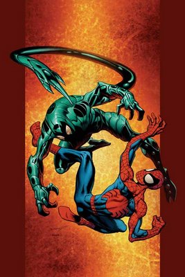
but damn, couldn't he have at least TRIED?
___________________________________________________
"this is the explosive climax to the amazing series of events that go back to Mark Millar's first issue"?!?!
NOO!!!
HOW CAN WE GO THAT FAR BACK!!
It is too much!!
12 ISSUES IS TOO FAR BACK FOR ME TO REMEMBER, EVEN FOR AN EXPLOSIVE CLIMAX!!!
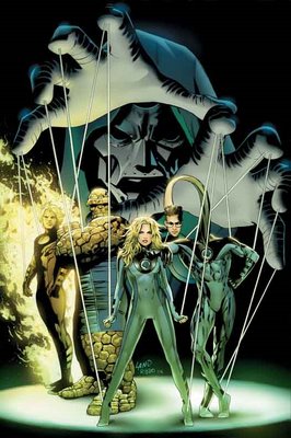
Pretty pedestrian cover, too.
___________________________________________________
Ugh. Tom Raney appears to be doing the "washed" look with his pencils.
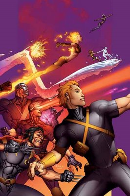
I do not approve.
___________________________________________________
CIVIL WAR COVERS!!
___________________________________________________
Man, Steve McNiven makes being annoyed at Civil War difficult, because he's so talented.
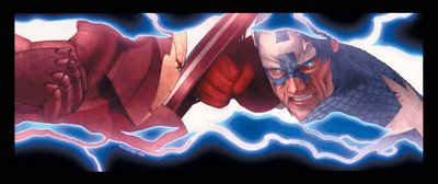
Great cover, although this scene better damn well appear in the issue!
Luckily, Michael Turner is there to make it easy to make fun of Civil War.
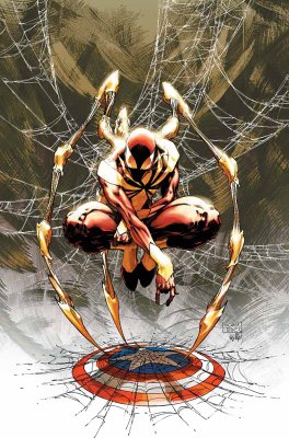
Although, isn't it funny to see a costume design that is actually BENEATH Turner?
___________________________________________________
Due to the ugly trade dress, Civil War covers are automatically disqualified from Top Five consideration, but if not, this Juan Doe cover for Civil War X-Men would be a top contender.
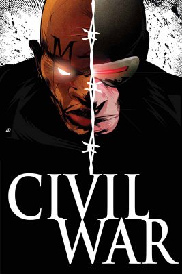
Very strong cover image.
___________________________________________________
Wow.
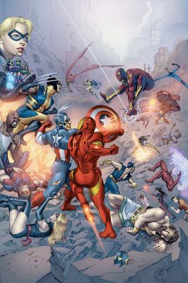
I think this is one of the best arguments against photoshop comics. This Civil War Daily Bugle comic looks less like a cohesive drawing and more like a photo collage.
___________________________________________________
Is it just me, or does Cheung's art for this Young Avengers/Runaways mini-series cover...
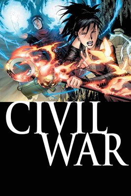
look a bit regressive? It looks more like his X-Force style than his post-Scion stuff, no?
I bet Rich Watson can tell me (completely obscure reference I should not have made, sorry, folks)!!
___________________________________________________
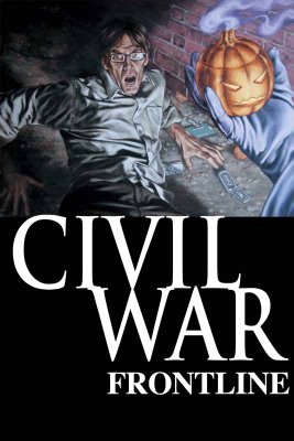
I like John Watson's work a lot, but this Civil War Frontline cover is a bit goofy looking.
___________________________________________________
Man, wasn't Waid and Garney's Captain America awesome? The book is in capable hands at the moment, but I bet Waid and Garney could do something ELSE cool.
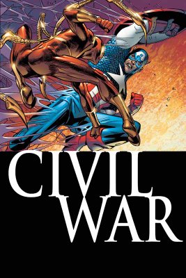
Oh, by the by, the solicit for this issue? "When one of the War's leaders comes to recruit Spidey for his troops..." Which one could it be?!!? I love a mystery!!!
___________________________________________________
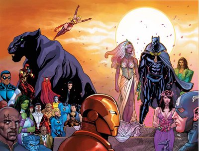
I am pleased that they are allowing the Black Panther/Storm wedding to be without the yucky trade dress.
Nice cover, except the dress.
Luckily, Michal Turner is chipping in on a variant cover.
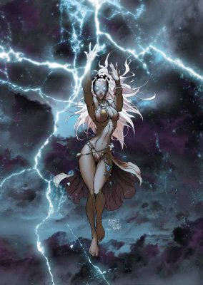
Yep, nothing says "wedding issue" more than a half-naked lady in the rain!
Turner - All class.
___________________________________________________
You know what Civil War needs more of?
People standing with their arms folded!!
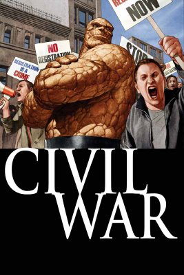
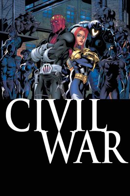
Oh.
Never mind.
___________________________________________________
Ryan Sook is a really, really good artist.
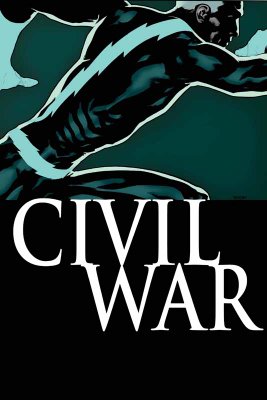
Nice cover (except, of course, the silly trade dress).
___________________________________________________
Man, what an awful Cable/Deadpool cover by Roberto Campus!!
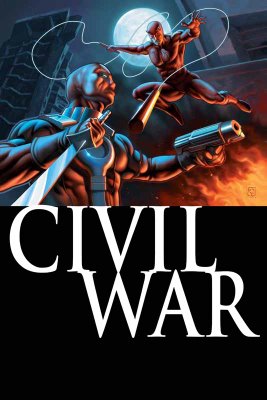
Is Deadpool glowing?
That is barely recognizable as Deadpool!
And the Daredevil ain't that good, either.
___________________________________________________
I like Leinil Francis Yu's art a lot.

That being said, this New Avengers cover is kinda lame.
___________________________________________________
Ooooh...now Nitro has Wolverine!!
Remember when Justice League International did that with Lobo and Guy Gardner?
That was cool.

This is less so.
No giraffe neck, though!!
___________________________________________________
I really admire the way Friendly Neighborhood Spider-Man lately has tried to avoid the crossover crunch, and stand on its own.
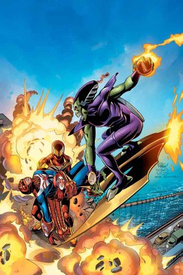
Also, nice cover by 'Ringo.
___________________________________________________
Man, that is one creepy looking cover.
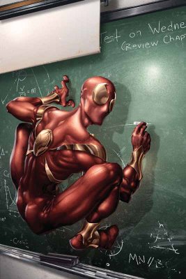
Clayton Crain's work scares me.
And I don't want to know where he got the photo basis for this cover from!!
___________________________________________________
Pretty low-key last issue of Last Planet Standing.

___________________________________________________
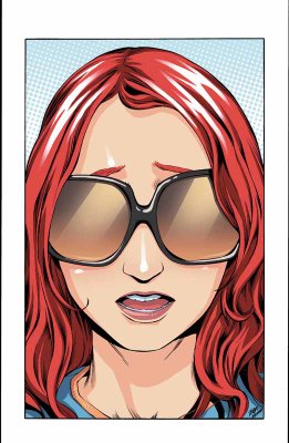
Wow, that is probably the most boring Mary Jane cover I've seen yet.
___________________________________________________
This is a very nice cover as both a last issue AND a 100th issue.
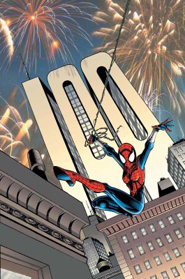
There's no mention in the solicits of Sal Buscema, though. I hope he's still on board.
___________________________________________________
ANNIHILATION COVERS - NOW INTERLOCKING!!!
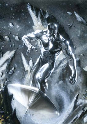
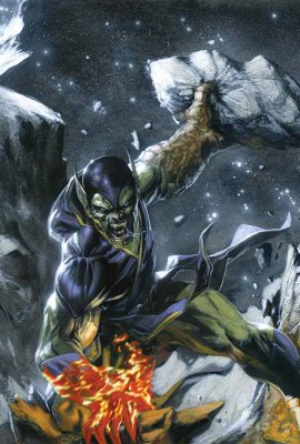
It's funny, though, THESE covers are interlocking, but since most of Gabriele Dell'Otto's covers have looked basically the same ANYways, this is not exactly osmething new.
I don't like the new Nova costume...

I like how somber Ronan looks...

Nice Silver Surfer...
Best Super Skrull I've seen from Dell'Otto yet!!
___________________________________________________
HA!
I love it!

The grim and gritty Power Pack!
Classic idea!
___________________________________________________
Very weird poses.
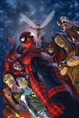
But since I love obscure Marvel characters, I'm down!!!
___________________________________________________
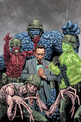
Pretty decent Fantastic Four: First Family cover by Chris Weston...
___________________________________________________
Nice drawing by John Romita Jr. (as usual)...

however, it's not exactly a striking cover.
___________________________________________________
The same thing can be said for this Tex Ghost Rider cover.
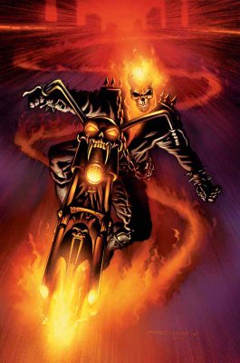
Then again, Tex at least has the benefit of following Clayton Crain, which will make people be happier to see his cover.
___________________________________________________
Iron...
Maniac.
Iron Maniac.
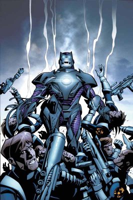
This is what I love about Kirkman. It's just SO stupid that he manages to sell it!
___________________________________________________
MARVEL ADVENTURES COVERS!!
___________________________________________________
Wow, this Marvel Adventures Fantastic Four looks like the most generic cover ever!

___________________________________________________
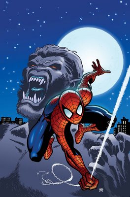
Oops...I spoke too soon!!!
___________________________________________________
I like Aaron Lopresti's art...

but not that Giant-Girl costume.
___________________________________________________
There's scary.
And then there's unintentionally scary.
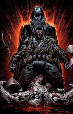
This cover nicely pulls off both.
___________________________________________________
First disappointing cover for Frank Cho (well, outside of his absurd #1 cover).

Too bad, I was really impressed with his last two covers.
___________________________________________________
Tsk tsk.
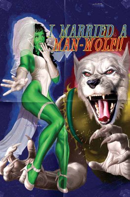
One of the few times that the cheesecake cover motif WORKS, and Horn has to blow it by putting a picture of a wolf on the cover and then pretending that he is drawing a werewolf.
Poor form, Mr. Horn, poor form.
___________________________________________________
Gary Frank is an AWEsome artist.
However, look at this Squadron Supreme cover...
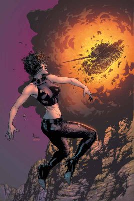
DAMN, his Squadron Suprem covers are boring!
___________________________________________________
Luckily, his Fury Peacemaker cover, while still being fairly static...
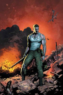
has enough attitude to pull the cover off.
___________________________________________________
COOL WRAPAROUND COVERS BY NEW X-MEN CREATIVE TEAMS!!
___________________________________________________
First, Billy Tan on Uncanny X-Men...

Next, Chris Bachalo on X-Men...

I would have put both of them in the Top Five, except that they really only REALLY impress me because my expectations were lowered so much...so not enough for top five!!
___________________________________________________
Seriously, New Excalibur has got to quit with these covers.
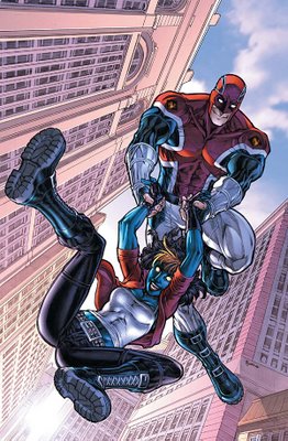
It's like they're in a Mentos commercial, the way everyone is so freakishly giddy.
___________________________________________________
This is an impressive Storm cover by Mayhew.

___________________________________________________
I like Paul Pelletier.
This is a nice drawing.

A bit subdued for a cover, though.
___________________________________________________
You can debate the merits of Paco Medina's pencils (which seem to tighten and loosen from issue to issue)...
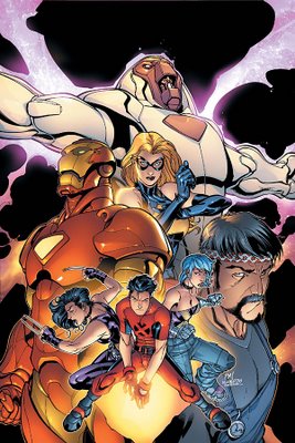
but you have to admire his cover design sense.
___________________________________________________
What an odd decision by Quesada...
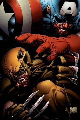
it's like he's trying to draw them like Sin City.
Weird.
___________________________________________________
Another colorform cover by Bradstreet!

Detach - move - apply.
___________________________________________________
I like the idea behind the Halo cover.
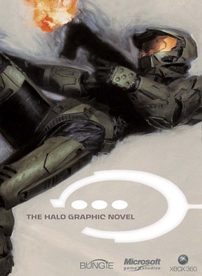
You don't need a fancy cover, just slapping "Halo" on the cover is probably enough to sell the comic.
___________________________________________________
Pretty good Jack Kirby cover.

I dunno about the concept, though.
___________________________________________________
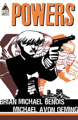
Nice cover design by Oeming.
___________________________________________________
HONORABLE MENTIONS (really nice month for covers, so there's a lot of them)!!!
___________________________________________________
ERIC POWELL COVERS!
He is awesome.
These covers for Marvel's Western one-shots are awesome.

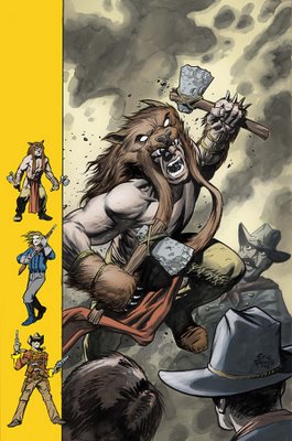
A lighter month, both easy top five - but once I kept out one, I couldn't decide which one to keep, so BOTH became honorable mentions!
___________________________________________________
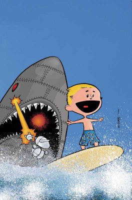
What a perfect encapsulation of the fun that is Franklin Richards, Son of a Genius!!
___________________________________________________
This reminds me of the super-sweet Dave Gibbons cover for this month's Action Comics.
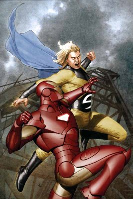
Great job by Granov.
___________________________________________________
Off month for Nextwave.

I expect greatness every month!
___________________________________________________
This coloring book incentive would be a guaranteed top five...
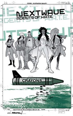
except it looks just like a black and white version of the original cover!!
What gives?!?!
___________________________________________________
MAN, do I loves me some Marcos Martin.
I can't wait until he draws Doctor Strange!!
However, this cover is a bit too weird for me to make top five. I still dig it a lot!
___________________________________________________
It was SUPER close between the two Ladronn covers (heck, all the top six titles I could be convinced to mix around)...but since this on is a bit more of a static cover, I put this one (for the Handbook) in the honorable mentions.
Great cover, though.
Ladronn rules.
___________________________________________________
TOP FIVE COVERS!!
___________________________________________________
5. Claire Wendling is an excellent artist.
This is a great cover for X-Men Fairy Tales.
Last month, it was Kyle Baker, this month it is Claire Wendling!
Who's going to draw a cover next?!?! H. R. Giger?!?!
___________________________________________________
4. How freakin' badass is this Ladronn Hulk cover?!?
It's like it's leaping off of the page!
Amazing.
___________________________________________________
3. Steve Epting has delivered some really strong covers for this arc.
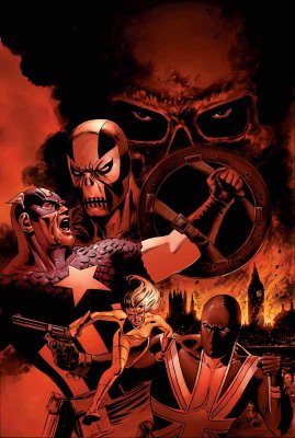
This might be a little high, but I feel bad for excluding him from the top five in the past.
Still, great cover, no?
___________________________________________________
2. David Mack is a design genius.

An amazing cover.
___________________________________________________
1. Finally, Richard Corben's covers for House of Horror: Edgar Allen Poe have been awesome, but for this cover...
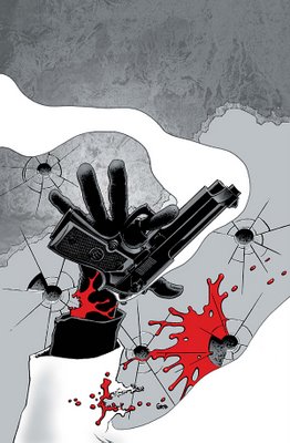
he amps it up a notch!
What an amazing design, and he pulls off the design flawlessly.
What a great artist Corben is.
___________________________________________________
Well, that's it for this month!
Feel free to weigh in with your prejudices (and your top five covers)!
Let's begin!
___________________________________________________
I didn't expect him to duplicate the strong cover effort from last month...

but damn, couldn't he have at least TRIED?
___________________________________________________
"this is the explosive climax to the amazing series of events that go back to Mark Millar's first issue"?!?!
NOO!!!
HOW CAN WE GO THAT FAR BACK!!
It is too much!!
12 ISSUES IS TOO FAR BACK FOR ME TO REMEMBER, EVEN FOR AN EXPLOSIVE CLIMAX!!!

Pretty pedestrian cover, too.
___________________________________________________
Ugh. Tom Raney appears to be doing the "washed" look with his pencils.

I do not approve.
___________________________________________________
CIVIL WAR COVERS!!
___________________________________________________
Man, Steve McNiven makes being annoyed at Civil War difficult, because he's so talented.

Great cover, although this scene better damn well appear in the issue!
Luckily, Michael Turner is there to make it easy to make fun of Civil War.

Although, isn't it funny to see a costume design that is actually BENEATH Turner?
___________________________________________________
Due to the ugly trade dress, Civil War covers are automatically disqualified from Top Five consideration, but if not, this Juan Doe cover for Civil War X-Men would be a top contender.

Very strong cover image.
___________________________________________________
Wow.

I think this is one of the best arguments against photoshop comics. This Civil War Daily Bugle comic looks less like a cohesive drawing and more like a photo collage.
___________________________________________________
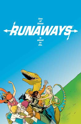
Is it just me, or does Cheung's art for this Young Avengers/Runaways mini-series cover...

look a bit regressive? It looks more like his X-Force style than his post-Scion stuff, no?
I bet Rich Watson can tell me (completely obscure reference I should not have made, sorry, folks)!!
___________________________________________________
I like John Watson's work a lot, but this Civil War Frontline cover is a bit goofy looking.

___________________________________________________
Man, wasn't Waid and Garney's Captain America awesome? The book is in capable hands at the moment, but I bet Waid and Garney could do something ELSE cool.

Oh, by the by, the solicit for this issue? "When one of the War's leaders comes to recruit Spidey for his troops..." Which one could it be?!!? I love a mystery!!!
___________________________________________________
I am pleased that they are allowing the Black Panther/Storm wedding to be without the yucky trade dress.
Nice cover, except the dress.

Luckily, Michal Turner is chipping in on a variant cover.

Yep, nothing says "wedding issue" more than a half-naked lady in the rain!
Turner - All class.
___________________________________________________
You know what Civil War needs more of?
People standing with their arms folded!!


Oh.
Never mind.
___________________________________________________
Ryan Sook is a really, really good artist.

Nice cover (except, of course, the silly trade dress).
___________________________________________________
Man, what an awful Cable/Deadpool cover by Roberto Campus!!

Is Deadpool glowing?
That is barely recognizable as Deadpool!
And the Daredevil ain't that good, either.
___________________________________________________
I like Leinil Francis Yu's art a lot.

That being said, this New Avengers cover is kinda lame.
___________________________________________________
Ooooh...now Nitro has Wolverine!!
Remember when Justice League International did that with Lobo and Guy Gardner?
That was cool.

This is less so.
No giraffe neck, though!!
___________________________________________________
I really admire the way Friendly Neighborhood Spider-Man lately has tried to avoid the crossover crunch, and stand on its own.

Also, nice cover by 'Ringo.
___________________________________________________
Man, that is one creepy looking cover.

Clayton Crain's work scares me.
And I don't want to know where he got the photo basis for this cover from!!
___________________________________________________
Pretty low-key last issue of Last Planet Standing.

___________________________________________________
Wow, that is probably the most boring Mary Jane cover I've seen yet.

___________________________________________________
This is a very nice cover as both a last issue AND a 100th issue.

There's no mention in the solicits of Sal Buscema, though. I hope he's still on board.
___________________________________________________
ANNIHILATION COVERS - NOW INTERLOCKING!!!
It's funny, though, THESE covers are interlocking, but since most of Gabriele Dell'Otto's covers have looked basically the same ANYways, this is not exactly osmething new.
I don't like the new Nova costume...

I like how somber Ronan looks...

Nice Silver Surfer...

Best Super Skrull I've seen from Dell'Otto yet!!

___________________________________________________
HA!
I love it!

The grim and gritty Power Pack!
Classic idea!
___________________________________________________
Very weird poses.

But since I love obscure Marvel characters, I'm down!!!
___________________________________________________
Pretty decent Fantastic Four: First Family cover by Chris Weston...

___________________________________________________
Nice drawing by John Romita Jr. (as usual)...

however, it's not exactly a striking cover.
___________________________________________________
The same thing can be said for this Tex Ghost Rider cover.

Then again, Tex at least has the benefit of following Clayton Crain, which will make people be happier to see his cover.
___________________________________________________
Iron...
Maniac.
Iron Maniac.

This is what I love about Kirkman. It's just SO stupid that he manages to sell it!
___________________________________________________
MARVEL ADVENTURES COVERS!!
___________________________________________________
Wow, this Marvel Adventures Fantastic Four looks like the most generic cover ever!

___________________________________________________
Oops...I spoke too soon!!!

___________________________________________________
I like Aaron Lopresti's art...

but not that Giant-Girl costume.
___________________________________________________
There's scary.
And then there's unintentionally scary.

This cover nicely pulls off both.
___________________________________________________
First disappointing cover for Frank Cho (well, outside of his absurd #1 cover).

Too bad, I was really impressed with his last two covers.
___________________________________________________
Tsk tsk.

One of the few times that the cheesecake cover motif WORKS, and Horn has to blow it by putting a picture of a wolf on the cover and then pretending that he is drawing a werewolf.
Poor form, Mr. Horn, poor form.
___________________________________________________
Gary Frank is an AWEsome artist.
However, look at this Squadron Supreme cover...

DAMN, his Squadron Suprem covers are boring!
___________________________________________________
Luckily, his Fury Peacemaker cover, while still being fairly static...

has enough attitude to pull the cover off.
___________________________________________________
COOL WRAPAROUND COVERS BY NEW X-MEN CREATIVE TEAMS!!
___________________________________________________
First, Billy Tan on Uncanny X-Men...

Next, Chris Bachalo on X-Men...

I would have put both of them in the Top Five, except that they really only REALLY impress me because my expectations were lowered so much...so not enough for top five!!
___________________________________________________
Seriously, New Excalibur has got to quit with these covers.

It's like they're in a Mentos commercial, the way everyone is so freakishly giddy.
___________________________________________________
This is an impressive Storm cover by Mayhew.

___________________________________________________
I like Paul Pelletier.
This is a nice drawing.

A bit subdued for a cover, though.
___________________________________________________
You can debate the merits of Paco Medina's pencils (which seem to tighten and loosen from issue to issue)...

but you have to admire his cover design sense.
___________________________________________________
What an odd decision by Quesada...

it's like he's trying to draw them like Sin City.
Weird.
___________________________________________________
Another colorform cover by Bradstreet!

Detach - move - apply.
___________________________________________________
I like the idea behind the Halo cover.

You don't need a fancy cover, just slapping "Halo" on the cover is probably enough to sell the comic.
___________________________________________________
Pretty good Jack Kirby cover.

I dunno about the concept, though.
___________________________________________________
Nice cover design by Oeming.

___________________________________________________
HONORABLE MENTIONS (really nice month for covers, so there's a lot of them)!!!
___________________________________________________
ERIC POWELL COVERS!
He is awesome.
These covers for Marvel's Western one-shots are awesome.


A lighter month, both easy top five - but once I kept out one, I couldn't decide which one to keep, so BOTH became honorable mentions!
___________________________________________________
What a perfect encapsulation of the fun that is Franklin Richards, Son of a Genius!!

___________________________________________________
This reminds me of the super-sweet Dave Gibbons cover for this month's Action Comics.

Great job by Granov.
___________________________________________________
Off month for Nextwave.

I expect greatness every month!
___________________________________________________
This coloring book incentive would be a guaranteed top five...

except it looks just like a black and white version of the original cover!!
What gives?!?!
___________________________________________________
MAN, do I loves me some Marcos Martin.
I can't wait until he draws Doctor Strange!!

However, this cover is a bit too weird for me to make top five. I still dig it a lot!
___________________________________________________
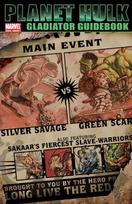
It was SUPER close between the two Ladronn covers (heck, all the top six titles I could be convinced to mix around)...but since this on is a bit more of a static cover, I put this one (for the Handbook) in the honorable mentions.

Great cover, though.
Ladronn rules.
___________________________________________________
TOP FIVE COVERS!!
___________________________________________________
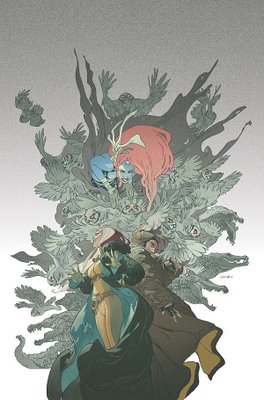
5. Claire Wendling is an excellent artist.
This is a great cover for X-Men Fairy Tales.

Last month, it was Kyle Baker, this month it is Claire Wendling!
Who's going to draw a cover next?!?! H. R. Giger?!?!
___________________________________________________
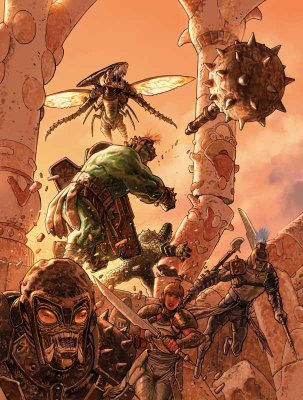
4. How freakin' badass is this Ladronn Hulk cover?!?
It's like it's leaping off of the page!

Amazing.
___________________________________________________
3. Steve Epting has delivered some really strong covers for this arc.

This might be a little high, but I feel bad for excluding him from the top five in the past.
Still, great cover, no?
___________________________________________________
2. David Mack is a design genius.

An amazing cover.
___________________________________________________
1. Finally, Richard Corben's covers for House of Horror: Edgar Allen Poe have been awesome, but for this cover...

he amps it up a notch!
What an amazing design, and he pulls off the design flawlessly.
What a great artist Corben is.
___________________________________________________
Well, that's it for this month!
Feel free to weigh in with your prejudices (and your top five covers)!


18 Comments:
I have to agree about the new Nova costume. Too much jagged metal crap (which is the macho version of frilly lace). But, it does fit with the (absurd) new direction Marvel seems to be taking him in. And hey, being in Annihilation means he dodges the Civil War bullet.
Man, is that the best Bagley can do with Ultimate Scorpion? He looks like the Fabulous Frogman.
That Daily Bugle cover is bad. Why is Luke Cage holding Wolverine's ankle? Is Ms. Marvel supposed to be floating on her back?
Lord, I hate Greg Land.
Oddly, that Michael Turner Spider-Man cover is not that terrible.
Look's like Nicieza's using some of old characters in Thunderbolts. I see Pretty Persuasions and that water guy from Force of Nature.
Super-Skrull looks like a vampire, but at the same time is pretty bad ass.
THE HOOD! AWESOME!
I hate Greg Horn too, though not as much as Greg Land.
I nominate Wolverine: Origins as the Homoerotic Cover of the Month. A beefy, drooling Captain America on top of a beefy, drooling Wolverine? Even in the throes of passion, Cap is reaching out to stroke Wolverine's head with his freakishly huge hand. It's almost romantic.
That's not the Scorpion! The Scorpion is a sexy Goth girl with Cootie-Palm! GOD, I wish they'd stop changing characters to suit some sort of quasi-post-dated fashion statement!
It's terrible, I know, but I've been waiting ages to see a Cameron Stewart Spider-Man cover, and I'm kind of...disappointed. Here's his Mary Jane, though, which is lovely: very Terry Moore!
Is Ultimate Wolverine short now? BOO and HISS, Marvel! You'll be giving him a shitty costume, next!
ShittIER.
Don't you wish that Captain America and Iron Man would just KISS and get it over with? I WISH I KNEW HOW TO QUIT YOU, CLANKY!
("Clanky" (C) Warren Ellis)
Is it "Spider-Man's Ass" month AGAIN?
The Daily Bugle cover is action-figure-tastic.
Beyond sounds horrid, and it features the crap version of Venom. Seriously: that head is almost bad enough to draw my attention away from the webs on Spidey's costume.
See how Marventures Cap has lost his scales? I love the scales, even if some artists who try to draw the scales fail to draw the scales.
Is Ms. Marvel giving Galactus a lapdance? His eyes are rolled back in his head like Kyle McLachlan in Showgirls, or something. And she is Hellalizabeth Berkley.
I hate Captain Britain's costume SO. MUCH. Have these people never seen a Union Flag?! Or even a Jack?! I hate it almost as much as I hate...ecch..."Lionheart." SHE'S CAPTAIN BRITAIN TOO. Or possibly TWO.
You know what I really hate? When they colour Iceman to look transparent, when he's not. Specifically Ultimate Iceman, who is covered in ice, but I hate the literalism of Neoclassic Iceman, as well.
Ths may not strictly be relevant.
//\Oo/\\
Galactus? That's Nimrod, a pink Sentinel from the future. Nimrod not the best name Claremont ever came up with.
I should note that Runaways cover makes me very sad. Thank god Molly is safe -- I can't imagine Marvel killing off a cheerful 11-year-old.
Nimrod not the best name Claremont ever came up with.
It's a name appropriated by future-Sentinels to strike fear into the hearts of subjugated humanity. The Sentientinels chose names that resonated with all the darkest human emotions, such as "Git," "Dill-Weed" and "Urkel."
...I don't even know who that IS.
//\Oo/\\
Kudos to Michael for the insight "jagged metal crap (which is the macho version of frilly lace)" -- brilliant! I'll be stealing this observation and passing it off as my own at every opportunity.
hahaha, that Cho Black Panther cover with the crying Bishop is hilarious.
Nimrod was a "mighty hunter" in the book of Genesis. Supposedly he set himself in opposition to god and helped found Babel, the prototypical civilization in opposition to God.
Which has NOTHING to do with mutant-hunting sentinels from the future, so yeah...why did Claremont pick that name?
"Kudos to Michael for the insight "jagged metal crap (which is the macho version of frilly lace)" -- brilliant! I'll be stealing this observation and passing it off as my own at every opportunity."
I better see some royalty action off that.
I go the idea that it was because he was upposed to be the ultimate mutant hunter.
I guess Claremont missed the whole Nimrod = idiot meme that had already been around for a few years at that time. It is a bit bizarre to go back to the old Nimrod = hunter slang.
Raymond
Gabriele's drawings are wonderful but I need to say one gets bored of them easily.
Over here in Germany they bombarded us with them. Dell'Otto covers, dell'Otto prints, dell'Otto artbooks ... bit too much for my taste.
I love his sketches though. Had a glimp at his portfolio one year and was stunned.
"I love his sketches though. Had a glimp at his portfolio one year and was stunned."
I have no trouble believing that!
I bet his sketches are amazing!
Honestly, who looked at Nova's costume and said "You know what this is missing? Pointy bits."?
I want to see a story where Nova cocks his head to the side for whatever reason and accidentally stabs himself in the eardrum, forcing him to fix the new costume.
Wait, no I don't.
nike air force 1
yeezy shoes
michael kors outlet store
air force ones
michael kors outlet
longchamp
yeezy boost
adidas store
patriots jerseys
michael kors outlet online
ray ban sunglasses
ugg boots
nike air force 1
toms shoes
michael kors handbags
jordan 4
nike free run
true religion outlet
miami heat jersey
coach outlet
zzzzz2018.4.28
christian louboutin shoes
miami heat jersey
colts jerseys
tods shoes
coach outlet
giants jersey
coach outlet online
nike outlet
true religion outlet
ray ban eyeglasses
0802jejeair jordan pas cher grossiste Pendant new balance basket bleu femme que je naviguais au moyen d'Internet, j'ai trouvé que vous trouverez une vente nike air max 1 femme noir et blanc de liquidation finale, où ils voient de new balance femme blanche et bleu nombreux accessoires pour chiens. Athena Nike vient à Air Jordan 2 soldes exister avec le but d'exprimer les ambitions nike femme air max 1 essential beige rose gris d'Athènes pour vaincre Sparte et devient la capacité de la planète. nike homme air huarache gris daim
Post a Comment
<< Home