CSBG Roundtable: All-Star Superman #1
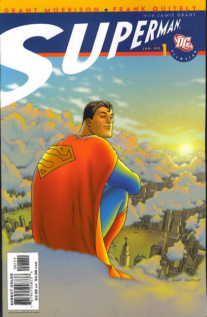
All-Star Superman #1Written by Grant Morrison
Art by Frank Quitely
One of the biggest comics in years, Morrison and Quitely’s
All-Star Superman hit the comic shops this week, and in recognition of it, we at
Comics Should Be Good (specifically, Marionette, Greg, Pol, Harvey, Bill, Brian and Brad) thought we’d do a second roundtable. Why not discuss the six hundred pound gorilla of comics? It's a big deal, and we can't ignore it.

Our first roundtable, reviewing Oni’s Local #1, can be found here.
So…the hyped new Superman book...is it any good?
-----------------------------
Marionette
All Star Superman #1
The cover: nice Superman moment, horrible logo.
I am sadly unimpressed.
As the first issue of a new Superman title there's some reason for reminding us of his origin, and encapsulating it in one page of 4 panels and eight words is elegant. Unfortunately this is the high spot of the comic as things begin to go downhill from here and we find Superman flying across the face of the Sun to rescue a kind of bathyscape which seems to be suffering from engine failure even before one of the occupants starts mutating into a human bomb.
We are told that the temperature is 6000 degrees fahrenheit, and yet nobody on board the bathyscape appears to suffer any ill effect from Superman opening the door to haul out bomb boy. Perhaps I am judging too harshly. Maybe they had an airlock built that could handle the incredible change in heat and pressure, in case someone felt the need to take a spacewalk on the surface of the Sun, which could also cool Superman down from that 6000 degrees he's been flying through so he doesn't fry everyone in the spaceship just by being in the same room.
Cut to Lois Lane doing very Lois Laney type things and I assume, Cat Grant, who is never named but is introduced contemplating the hunk who is washing the windows, and that's typical of the level of characterization you get for everyone. Perry White gives some pep talk about breaking a big story to bring down Lex Luthor, although by his own admission such exposes seem to reflect worse on The Planet than they do on Luthor. I have to say at this point I was confused as to which version of Luthor we were getting here. The information we are given is that he is believed reformed, which implies that he was thought bad at one point, but is this silver age Luthor? Ex-president mad as a fish Luthor? Creepy schoolgirl-stalker battlesuit Luthor? It's never clear, although the absurd plot Perry talks about sounds more like the work of Luthor from the Christopher Reeve movies.
Cut to Luthor who appears to be working for the government now. Or at least that's what they think, the fools.
Back to Supes, who now pulls bomb boy out of the unfried bathyscape and drops him into the Sun. See it doesn't actually count as killing the guy as he was planning to explode anyway. Or something.
We then get a very confusing scene break where we go from not yet introduced chum Doc Quintum speaking in the Bathyscape near the Sun, to Doc Quintum speaking in an entirely different spherically shaped object on a barren landscape that might be the Moon but isn't.
It transpires that Luthor is so, so clever that not only has he got a global real estate scam running under the eyes of the military, which was sadly dependent on the slight of hand of subverting a member of the Sun-going space probe team and turning them into a human bomb, that nobody noticed until the last second either, but luckily this was only a side-plot in case Superman didn't catch on and go save the space probe and thereby fly far too close to the Sun and doom him to death by psuedoscientific gobbledygook.
Having forecast Superman's death, Renaissance geneticist and space pilot Quintum shows him around the facility and Superman is enthusiastic about his building a race of genetically engineered superbeings. "Smart thinking," says Supes, having forgotten that one of these superbeings had just been turned into a weapon by Luthor, and having no qualms about any ethical problems the project raises. Quintum then goes on to explain how even though the physics of this universe allows ordinary people to go sun surfing, it doesn't allow giants to exist under Earth gravity. No Giant apes in this world, oh no. But I couldn't find the point where he explained why he felt the need to fly to the Sun in the middle of all this enterprise.
Back at the Daily Planet Perry is grouchy and Clark is clumsy. It's all so formulaic that by the time Clark rips his shirt open you are wondering if you are getting "Lois & Clark" flashbacks.
Artist Frank Quitely too, has something odd going on. Superman is drawn grotesquely blocky while Luthor is so thin and delicate that he appears to have some wasting disease. The backgrounds are often quite sparse, but now and then he throws in a bit of visual business that just confuses the action rather than underlining it.
All in all, it's one of those comics that makes less sense the more times you read it.
-----------------------------
Greg Burgas
Well, someone didn't like it ...
Paul might disagree with you.
I liked it more than Marionette did, but definitely not as much as Paul did. How's that for wishy-washy? The problems with it are the same ones Marionette brought up - I love her last line - "one of those comics that makes less sense the more times you read it." Too true, too true. I don't think that's really the point, however - if we accept that the sun can
give a man superpowers, we're ready to accept a whole lot about the universe that we know is crap. So that doesn't bother me all that much.
I'm a little confused about what this issue is supposed to be doing. If it's an "Ultimate" Superman, it does a lousy job introducing the character. Yes, we all know who Superman is, but a little backstory wouldn't hurt. If it's "regular" Superman, it makes no sense. Yes, I'm being all fanboy and nerdish, worrying about where this Superman fits into continuity, but the companies have created this culture, so if they're going away from it now, a press release would be nice.
My biggest concern with Morrison is which Morrison are we going to get. If we get the Morrison who wrote Animal Man, Doom Patrol, JLA, X-Men, Seaguy, and We3, then I'll be happy. If we get the Morrison who wrote Invisibles and The Filth, we might be in trouble. The difference between the two is that the first Morrison always makes sure the mad ideas are in service to the human relationships, while the second Morrison simply throws stuff on the the wall and doesn't care what sticks, and screw the characters! That Morrison annoys me. I have a feeling that we will get the first Morrison with this, but you never know. If this becomes a "look how cool my 2000s take on 1950s Superman can be because I can use words like 'yoctosphere' and 'nanonauts' " then I think it will grow stale quickly. The most interesting thing in the book is that Luthor is getting older and Superman isn't. That's what will push the book forward, at least for a while.
Quitely's art? You either love it or hate it. I like it, so it's no big thing that it's weird-looking.
Onward! Who's next?
---------------------------------
Marionette
Greg wrote: I love [Marionette’s] last line - "one of those comics that makes less sense the more times you read it." Too true, too true. I don't think that's really the point, however - if we accept that the sun can givea man superpowers, we're ready to accept a whole lot about the universe that we know is crap. So that doesn't bother me all that much.
That was one of the problems, though. Solar powered super saturation giving Superman entirely new powers is fine, but giants over 10 feet tall are impossible on Earth. Seems to be a bit overly picky about which bits of comic-book physics are allowed here, and it's not like it makes any difference to the story. It's just showing off how clever Grant is to know how the inverse square law applies to living beings.
Greg also wrote: Quitely's art? You either love it or hate it. I like it, so it's no big thing that it's weird-looking.
It's not that it's weird looking. I really like Quitely's art. The problem here was panels like the one where Luthor is arrested and there are all these other people in the panel that is otherwise a brown fog, so they don't come across as background characters (there being no background) but they are not part of the action. And then when Clark and Lois are crossing the street a car muffler appears behind them in the road for no apparent reason. It's just distracting.
--------------------
Pól Rua
I must be missing something.
Frankly, I thought All-Star Superman #1 was a neat quarter of a Superman story. Overall, quite nifty, a daring rescue against impossible odds, some rather more down-to-earth newspaper shenanigans with the supporting cast flowing quite nicely into the (re)introduction of the villain of the piece, which leads nicely into the McGuffin on a cosmic (Superman is dying!) and human (I need to get my affairs in order) level.
Neat.
That's about it. Up front, I'm not a huge Superman fan. Since his inception in 1938, he's been through so many revamps, relaunches, retcons, reimaginings, reenvisionings, power changes, costume changes and status quo changes that he's pretty much had all his interesting pointy edges shorn off.
And that's pretty much the problem with this one. It's like porridge without the lumps. You swallow it. It's momentarily filling, but there's no texture to it.
This makes it very difficult to read. I mean, sure it's a polished, well-crafted piece of work, but it's so smooth, it's nearly frictionless... and as such, it slides away from the eye as though it's not even there. Eminently disposable and forgettable.
Sure there are a couple of little hooks that catch my attention: Jimmy Olsen doffing rocketpack and helmet with mentions of a “super watch” grabbed my imagination, some of Luthor's villainous dialogue was pleasantly arch, and Quitely's depiction of Clark as an ungainly cornfed lummox rather than a weedy milquetoast made a great deal of sense to me. The McGuffin itself - a kind of solar “super cancer” - was also pretty nifty, but the main story just passed me by... “oh yeah, more of the same... yup... seen this, done that... nothing to see here.”
Now, maybe this is because I'm one of those EVIL comic nerds who nitpicks everything on the Interwibbly (duh!) and that if I was a ten-year old kid, this would blow my mind, but I doubt it. Because as much as a ten year old would be put off by the endless minutiae of that ol' devil Continuity, he (or she) is going to be equally irked by leaden nonsense like “See, I just remembered something. I'm a genetically modified suicide bomb in human form. Death. Courtesy of Lex Luthor!”
Who the fuck says that?
And then we have Leo Quintum. An all-new character created for this series who is, let's be honest, an utterly superfluous excuse for Morrison to use his latest collection of four-dollar words culled from Fortean Times and New Scientist. Apoptosis, Grant, really? Anaerobic meganthropes with liquid nitrogen for blood. Fascinating! Not to mention all those nanonauts in the infinitesimal yoctosphere...
Been there. Done that. Have the Kirby Dots to prove it.
Why couldn't this be done with Professor Hamilton and STAR Labs? Because then we wouldn't have a pseudoscience-talking, rainbow-coated Grant Morrison Mary-Sue to show us all how FAS-cinating it all is.
Frankly, all the Quintum stuff is utterly superfluous, by introducing us into his little slave-driven chocolate factory full of nano-oompas and meganthropic-loompas, it does nothing but make the bits where the guy in the blue suit flies into the sun to rescue people look just a little mundane by comparison.
I mean, why should we give a crap about some overblown circus strongman when Willy Wonka's making Space-Giants on the Moon?!
hrm.
A neat Superman story. Provided all you want is bells, whistles and some pretty pictures.
-------------------------
Harvey Jerkwater
Short review: this book kicks ass.
Longer review: Let me begin by quoting Pól Rua’s less laudatory review: "A neat Superman story. Provided all you want is bells, whistles and some pretty pictures."
Well, yeah, but that’s what I like: a neat story with cool stuff to look at.
Superman, like most superheroes, is a pop confection. Sure, he can bear a lot of symbolic weight, but it’s better that he stay light.
The book is a piece of fluff, but it’s well-constructed fluff. Which is a lot harder to do than you’d think, and a rare commodity in the world o’ comics. It’s fast-paced, loaded with cool images, introduces a cast of characters with economy, and it has a great approach to Superman’s character: The Confident Man. He’s not cocky, he’s not depressed, he’s not arrogant. Why would he be? To quote Morrison himself:
”He wouldn't puff out his chest or posture heroically, he would be totally chilled. If nothing can hurt you, you can afford to be cool. A man like Superman would never have to tense against the cold; never have to flinch in the face of a blow. He would be completely laid back, un-tense.”
Righteous.
The story has enough going on that it felt like a complete read, it set up future complications, and it had Jimmy Olsen casually setting down a jet pack on Lois’s desk without comment. I love all of that.
Not to pick on Pól, but he also wrote something that caught my attention: "[A character says] 'See, I just remembered something. I'm a genetically modified suicide bomb in human form. Death. Courtesy of Lex Luthor!' Who the fuck says that?"
Okay, the human bomb guy delivers this bit of dialogue on page four.
Page eight shows Lex Luthor “vocally directing a weapon” by saying out loud, “I’m approaching critical mass,” then “Fusion will occur in thirty seconds.”
On page nine, we go back to the solar station and see the human bomb, who says, ”I’m approaching critical mass. Fusion will occur in thirty seconds.”
Morrison showed us that Luthor was telling the dude what to say, but the comic doesn’t beat you over the head with that revelation. Damn, I love that. (And I think that Luthor would indeed say dialogue as ridiculous as that, especially out of the mouth of his own suicide bomber.)
Morrison’s comics tend to be filled with throwaway bits of fun and wee connections that he keeps in the background, like the falling muffler and Jimmy’s jetpack. The added depth and sense of texture this approach provides makes me a happy, happy comic fan. His Seven Soldiers of Victory series of miniseries is loaded with interlocking details and throwaway bits of coolness, and it’s a freakin’ riot.
Plus, the last page of the issue had a damn fine cliffhanger, and not a cliffhanger I expected to see. Better still, it made complete sense in the story. Schweet.
The art is excellent. Panel layouts were well deployed to convey mood, Superman looked...right, and the Crazy Crap on the Moon was keen.
So yeah, I dug this first issue like mad. What comes next?
Morrison described the first year of the title thusly:
The first issue ”Faster…” starts with Superman attempting to rescue the first manned spaced mission to the sun! An overdose of solar radiation triggers a fatal chain reaction in his cell structure, P.R.O.J.E.C.T. specialists race to create a new Superman and...well, you'll have to wait and see.
The Fortress appears in issue #2, stuffed with a ton of new toys and gets haunted by the bandaged ghost of the Unknown Superman of 4500 AD. The Kandorians finally get out of that bottle. Superman gets a new power. Clark Kent winds up sharing a prison cell with Lex Luthor in issue #5. The Bizarro Cube Earth invades our world in an epic 2-part adventure (no 'decompression' here!) and we're recasting the Bizarros as a frightening, unstoppable zombie-plague style menace. Bizarro Jor-El and the Bizarro JLA turn up in the second part of that story too. What else? We meet Earth's replacement Superman and Clark Kent takes on a new superhero identity...Ten of the 12 issues are complete short stories in 22 pages, so lots of stuff happens. And it all links together as a maxi-arc or whatever they call them these days, entitled 'The 12 Labors of Superman'.
Oh...my...
So...tasty...
I love my comics big, loud, and weird. All-Star Superman looks like it’ll be all three in elephant-sized doses.
Giggety!
-----------------
Bill Reed
Doomed planet. Desperate scientists. Last hope. Kindly couple. Grant Morrison. Frank Quitely. Jamie Grant. Clark Kent. Lois Lane. Lex Luthor. DC Comics. All-Star Superman.
We all know Superman. He’s just this guy, you know? Unfortunately, in recent years (or decades), the spark that Superman once had has been missing. Okay, we all loved him as a kid (at least, I think I did. I could be wrong. I have a cape), but we’ve lost track of him. He was lost to us.
Baby, Superman’s back.
The greatest creative team in comics, Grant Morrison and Frank Quitely (the crazy Scots who brought you Flex Mentallo, JLA: Earth 2, New X-Men, We3, and the latest Robbie Williams album, as well as a few other odds and ends) have resurrected Superman. Oh, sure, DC puts out Superman comics all the time, but they’re not, y’know, good. This one is.

Basically, DC gave them free reign to tell their big Superman story. You’ve already heard the plot and the future plans from my compatriots below. I don’t need to repeat anything. What I will say is that this single issue is the best Superman comic in years. Okay, the first couple issues of Birthright were really cool, and I personally liked the whole Superman Blue thing, but they’re not as good as this. No sir and/or madam.
In what I affectionately refer to as ASS, Superman is the best big brother you’ll ever have. Cool. Unflappable. Kickass. That kinda thing. This is the kind of Superman who presses 200 quintillion tons with ease and hangs out with Willy Wonka and has DNA that reads like Bach and is so fast that he saves people off-panel. (Check out the bit where he saves Bandit from We3, or a close facsimile thereof.)
Clark Kent is neat, too. If Superman is played by Bruce Campbell (I mean, look at that chin), Clark is played by John C. Reilly. Clark is big and burly and very much a klutzy farmboy, and drawn perfectly by Quitely. Not since Christopher Reeve’s portrayal of Superman have we seen such a difference between Clark and Supes (just check out the last page, as he “transforms”). I especially like Clark using his faux bumbling to save people.
Of course, we also get to see the rest of Superman’s cast. Grant (or George, as his friends call him) gives us the whole gang. Let’s look at the Daily Planet kids first. We’ve got Lois Lane, of course, who seems to be modeled after Rhona Mitra. She’s so confident that she writes the headlines before they happen. Then, in one panel (one! panel!) and a couple lines of dialogue, Morrison writes the best Jimmy Olsen since Jack Kirby. This is the kid who’s cool enough to be Superman’s best pal, so much so that he gets away with hideous sweaters, because he’s got a jetpack and Super-Watch. There’s also Perry White, the best and most honest editor there is, as well as Cat Grant and even Steve Lombard (who reminds me of Uncle Rico). Yep, the gang’s all here.
Let’s not forget Lex Luthor, however. After all, if we did, he’d kill us with a genetically-engineered suicide bomber. This Lex is an amalgamation of every version that’s ever appeared: evil businessman, mad scientist, Gene Hackman. This is the Lex who has schemes within schemes and crazy sci-fi weapons and the like. Lex reminds me of Stewie Griffin, by way of Cassandra Nova.
So, yes, it’s Quitely, so we know the art’s beautiful (yeah, shut up, you in the back). It clearly looks like Frank's influenced by the classic Supes artists, like Wayne Boring. The dialogue is sharp and, well, Morrisonian. The plot? No, my friend; it is not just bells and whistles! I can tell the entire run’s being set up: Bizarros, mad science, Prof. Quintum and his gang… it’s all leading somewhere. I can’t wait for it to get there. I have a feeling this will be the best superhero comic of all time. I hope I’m proven right.
Remember, kids: “Only nothing is impossible!”

----------------------
Bill Reed
Marionette wrote: It's not that it's weird looking. I really like Quitely's art. The problem here was panels like the one where Luthor is arrested and there are all these other people in the panel that is otherwise a brown fog, so they don't come across as background characters (there being no background) but they are not part of the action. And then when Clark and Lois are crossing the street a car muffler appears behind them in the road for no apparent reason. It's just distracting.
The muffler actually fell from the hovering monorail (which, yes, looks like a marquee instead). You can see Clark eyeing it in the first panel on that page. So, by being clumsy, Clark saves the guy from getting crushed to death. I thought that was a little touch of awesome.
--------------------
Marionette
Bill Reed wrote: The muffler actually fell from the hovering monorail (which, yes,
looks like a marquee instead). You can see Clark eyeing it in the first panel on that page. So, by being clumsy, Clark saves the guy from getting crushed to death. I thought that was a little touch of awesome.
That's a monorail?
Okay, I see where it works now. It's a monorail that runs about eight feet off the ground with no visible means of support (does it even qualify as a monorail since it doesn't have a rail to mono?) that can turn at right angles and uses what looks like car exhaust systems. I thought that was just some kind of building frontage, since it seemed to be running news headlines on it. So yes, it would have been a nice bit of visual business if I had spotted this odd, low-flying, gas engined train for what it was in the first panel.
--------------------
Brad Curran
I think that first page was all the backstory we needed. One of the things I love about Morrison's superhero work is that he jumps headfirst in to the story. All we need to know about Superman is on the first page, and it's the same thing for Luthor, Lois, and Perry in their short appearences. I'm glad this isn't like the Ultimate comics, because even though I enjoyed the first year or so of Ultimate Spider-Man and Ultimates, I like that this is less a ground floor retelling of the Superman mythos than an accessible Superman story that isn't hamstrung by continuity.
I enjoyed this issue quite a bit. I have high expectations when Morrison and Quitely collaborate, given that their issues on New X-Men helped get me interested in comics again, and they were met. I wasn't as orgasmically enraptured by it as the Listen To Us gang, but this was the Superman comic I've been wanting to read since I became interested in the character via the Warner Brothers cartoon, and is making a bid to rival that show and Alan Moore's Supreme as my favorite use of the character (yeah, Supreme was an analogue. It still counts in my book).
It had the big ideas you expect from Morrison and the elegant, dynamic storytelling you always get from Quitely. I think having him reveal his identity to Lois on the last page was a little quick, even given Morrison's use of "super compressed" storytelling as of late, but it makes in the context of the ongoing storyline. Next to the origin recap, I think Clark's entrance at the Planet was my favorite part of the issue. Love how Quitely rendered that. Overall, I was very satisfied with this issue and am really looking forward to seeing where it goes from here.
--------------------
Brian Cronin
Remember the old Hostess Cakes ads?
C'mon, we all remember them.
Remember the effect that the Hostess Cakes had on everyone?
All Star Superman is like fluffy bits of heaven coming down and becoming personified as Hostess Cakes, but only as the Hostess Cakes of those ads, not the actual Hostess Cakes.
THAT is how amazing All Star Superman is.
Did it make sense that people would freak out that much for those little cakes?
Of course not.
That is because some measure of greatness derives not from the combination of chocolate, flour and creamed filling. No, the special quality of those Hostess Cakes was "comic book magic." THAT is what made those cakes so damned appealing.
All Star Superman sparkles with comic book magic.
Yeah, I could point out how there were a multitude of scenes that, had any ONE of the scenes appeared in this week's Green Arrow, Green Lantern, X-Men, X-Men: Deadly Genesis, etc. would have been THE best scene in this week's Green Arrow, Green Lantern, X-Men, X-Men: Deadly Genesis, etc.
I could mention how pleased I am that DC has allowed Morrison to not have to write this comic in the DCU, as brilliant scenes like "I always write the headlines ahead of time" would never have been allowed to appear in the "real" DCU. In the "real" DCU, you would have someone editor tell Quitely that his monorails do not make sense, or tell Morrison that Jimmy Olsen doesn't HAVE a super watch, but rather, he is homeless that month (or maybe Jimmy has stolen Clark's job and is mocking him or something). So thanks for that DC.
I could mention a lot of stuff, but at the end of the day, the total package makes as much sense as all those people willing to go to jail for a couple of 50 cent sweets.
But at the end of the day, the comic IS as good as those cakes.
And that's pretty damn good.
-----------
There you have it. Roundtable #2! Hoo-wah!Read More


