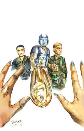
Division Shadow #1 - Judging a Book by its Cover
I would not dream to suggest that one could honestly figure out if a comic is bad or good strictly based on its cover. However, at the same time, I DO feel as though one can tell about the basic sensibilities of a book by its cover, and I think you can tell whether these sensibilities are appealing to you or not. I feel that this is very much the case in the situation of Division Shadow #1, a self-published comic (check out their website here) that came out recently (and who sent me this here review copy). I will show you the cover, and I think you can decide if it will appeal to you.
Your snap decision now being made, I will address the book itself. Writer Patrick Meaney describes the title as being "designed to blend the character based storytelling style traditionally associated with independent comics with the blockbuster action and 'big budget' settings traditionally associated with 'mainstream' comics." That is an interesting point (By the way, do you know a comic that is "big budget" and character driven? Street Angel. Just always like to take an opportunity to plug that book...hehe), but at the same time, would it be nice, then, to have a comic that combined all the aspects of Gone With the Wind, Star Wars and The Princess Bride? I don't think so, and that is because of one major problem - a matter of cohesion (or lack thereof).
And it's there that Division Shadow has its biggest problem.
In Division Shadow, there are three separate stories (by three separate artists) that will all (apparently) tie together at the end. However, the "main" story is about a government agency called Division Shadow which attacks a cult, kills most of the members, and takes captive a very special baby, for what purposes, we will soon learn.
This is the most interesting of the three stories, and the art is the most impressive on this end as well (I believe it is Nicolas Colacetti). The other two stories have decent art (I believe these are the ones drawn by Carlos Devizia and Marcelo Carmona and Shawn Decker), but the Colacitti pieces have a more accomplished feel to them (and they do not have the T&A aspects present in, I believe, the Devizia and Carmona's story). Colacetti has a good sequential art sense. He tells a story well.
However, the thing is, in the baby story ALONE, we have a character who has a "cinematic memory" (meaning that he remembers every aspect of his life), we have a government conspiracy, we have this weird baby, we have an agent becoming fascinated with the lone cult member that they left alive, and we have an agent's dysfunctional home life.
And that is in ONE story.
The comic is attempting to intertwine TWO other stories on top of this one!
Why, exactly, do we NEED the other two stories?
This one story has plenty of twists and turns, and it really makes the attempt to add some Invisibles-esque stuff (like in one story) and global intrigue (the other story) to the mix in ADDITION just seem to be silly.
Instead of trying to be Gone With the Princess Bride Wars, I think Division Shadow would be a much stronger book if Meaney just devoted his efforts to the one story, and developed it well, rather than shortchanging that story with the other two, which are not as good.
Before you try to do three stories, just do one story WELL first.
posted by Brian Cronin at 11/18/2005 06:49:00 AM
![]()


5 Comments:
Just think how more awesome the comic industry would be if every cover had at least as much phallic imagery as this one does.
Judging by the cover alone: it is an interesting image entirely defeated by the artist's inability to successfuly execute it. The immediate impression is of two hands framing three figures and a blobby thing with a face in the middle.
By the time you've worked out what it is supposed to mean, it's lost any impact. The figures on each side appear entirely disinterested in the situation and so fail to contriubute in any way. The gun is nowhere near prominent enough - in fact it is hard to read as a gun at all. And the bullet is at the wrong angle to have been fired from it, not to mention it seems to have inflated on the way, as it is far too large.
The thumb on the left overlaps the bullet, meaning it must be further away, and yet it is longer than the finger and almost as wide. That's one big bullet.
So no, I would not judge this book highly based on its cover.
The shell casing is still attached to the bullet. So the gun must not have fired, but rather thrown the unfired bullet forward. That would explain the off-angle on the bullet; it's flying only as fast as a rubber band could shoot it, and it's tumbling a bit.
Plus, it's Cobra Commander doing the shooting. So you know he'll miss.
I disagree that Street Angel is character-driven. Think back to the issues--they're all plot-driven. Rescue the mayor's daughter? Deal with an Irishman from space? Helping out the old hero Afrodesiac? Plot, plot, plot.
The characterizations in the book are well done, yeah, but it's hardly a character-driven book.
That's not a complaint, mind you, just an observation.
Hmm, that bullet looks a little small. Maybe a torpedo would have been better. You know, to get the point across.
And that's what I mean. If you see that cover and think "inability to execute the story," then that colors your entire perception of the comic, and I do not think that you will enjoy the book.
And yes, how much like a Cobra Viper does the one guy look?
Post a Comment
<< Home