Judging (DC's February) Books By Their Covers
DC's February Solicitations are up, so now is as good a time as any for us to make prejudgements based just on the covers (as we all love to make prejudgements, don't we? And DC's covers are at least detailed enough that we CAN make prejudgements based on them!).
Let's begin!
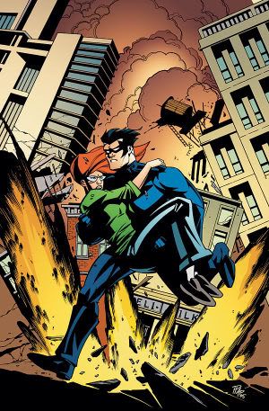
Jock makes it so simple to describe his covers. I just have to say, "Will Jock ever NOT draw a cool looking cover?"
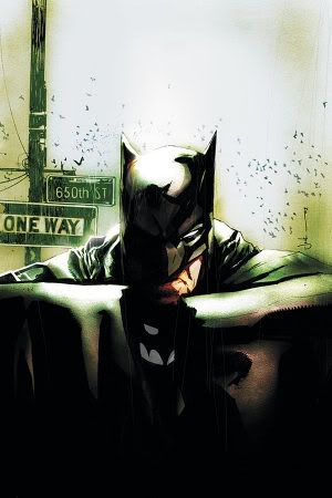
Of course, it tells us nothing about the plot of Batman #650...but still. Nice cover.
___________________________________________________
I love Paul Pope's work. You love Paul Pope's work.
But I don't think this works great as a cover, except if the goal is to orient new readers right away into Pope's style, which I guess makes some sense.
___________________________________________________
I dig Cliff Chiang's work...
but this is getting a bit too sparse on the detail.
___________________________________________________
See, this is the problem with Tim Sale...
It is nice enough when he begins, but when he gives you five straight covers which are pretty similar, you just want to move on.
___________________________________________________
Not Hester's wheelhouse, but he did well with it anyways...
___________________________________________________
McDaniel should just not draw colorful characters...
Look how WEIRD it looks! Remember how weird his Superman run looked?
___________________________________________________
Strong cover for a final issue.
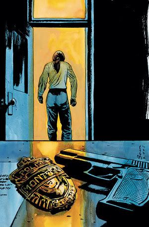
By the by, no way does Montoya really leave the force, because that's what happened to Bullock, and he's "scum."
___________________________________________________
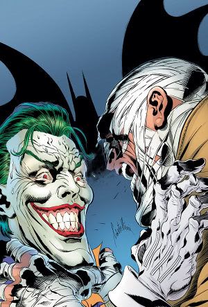
HOLY CRAP!
A GOOD cover for Journey into Knight by Pat Lee?!?!?!
STOP THE PRESSES!!
___________________________________________________
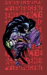
Fitting last issue cover for Gotham Knights.
Again with the Hush. Should have realized earlier that NO ONE CARES ABOUT HUSH!!
___________________________________________________
It is the 200th issue of Legends of the Dark Knight.
And to commemorate?
A BART SEARS COVER?!?!?
Whose idea was THAT?
___________________________________________________
It's covers like this that remind us of how much skill that Hughes possesses...
I'd much prefer it if he coupled his skill with a style like this, rather than concentrating on "realistic" art with "big boobies."
___________________________________________________
Very cool cover idea.
I don't know if he actually pulled it off, but great idea.
___________________________________________________
This is a weird cover...
It is like Reis is trying for a better style (which I admire), but not exactly pulling it off.
___________________________________________________
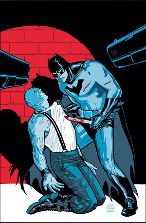
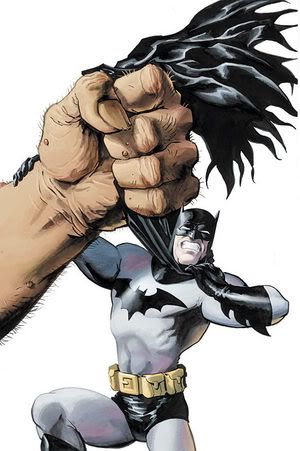
OUCH.
And I don't mean the punch.
___________________________________________________
Nothing wrong with this cover, per se...
but the idea of doing a collection of Daily Planet stories (almost ALL of them from the Silver Age) and then using as the cover a cover Nowlan did for a stupid "Event" comic from the late 90s?
Just doesn't compute.
___________________________________________________
TWO GOOD PEREZ COVERS
First, Infinite Crisis...
and now JSA...
Nothing outstanding about either, but they are both good, solid covers.
___________________________________________________
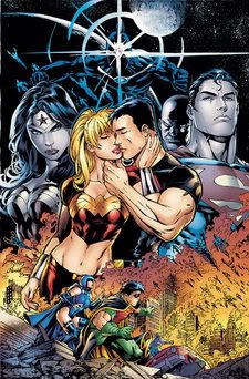
Remember when a cover like this would mean that mind control was definitely involved (I mean, it probably IS in this issue, just saying it used to be a given)?
___________________________________________________
Ooooh...not Eaglesham's best work.
___________________________________________________
Not a bad drawing, but does this cover make you want to buy the comic?
___________________________________________________
Jesus Saiz trying out a new style as well this month.
I don't think it works.
___________________________________________________
Brian Bolland can do covers like this with his eyes closed.
___________________________________________________
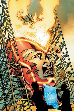
"We can do it. We can rebuild. We can suck BIGGER!"
___________________________________________________
Fine, normal cover.
Nothing fancy, but gets the job done, I think.
___________________________________________________
Good Acuña cover.
He is a keeper.
___________________________________________________
Dave Gibbons should draw more often.
Strong cover.
___________________________________________________
Varieties on a theme!
Part 1
Part 2

What a weird coincidence.
___________________________________________________
Scott Hampton is a good choice, I think.
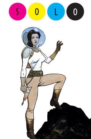
Who would you like to see doing a SOLO?
___________________________________________________
They sure aren't letting up on the interior artists.
Now a Chaykin cover?!?
___________________________________________________
Well, that's....something.
___________________________________________________
Not a bad cover.
Still a bit stiff.
___________________________________________________
I like this style better for Saiz.
But not exactly the most "stuff going on" of covers, is it?
___________________________________________________
Really good cover.
But waaay too similar to #1's cover. I get that that is the IDEA, but still, I'd prefer something different.
___________________________________________________
ON TO 52 FOR JONES!
He will surely do a good job there, too.
___________________________________________________
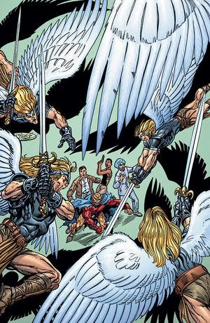
SEVEN SOLDIERS COVERS!!!!
Cool...
Weird...
Both covers that stand out, at least.
___________________________________________________
Please, Benes!
No more!
___________________________________________________
What is it about this cover that seems so wrong to me?
The perspective? The size of the figures? I dunno...but it looks weird to me.
___________________________________________________
Okay, I will admit. This doesn't look that bad.
Doesn't look that GREAT, but doesn't look bad. I hope the interiors will follow suit.
___________________________________________________
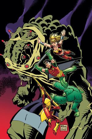
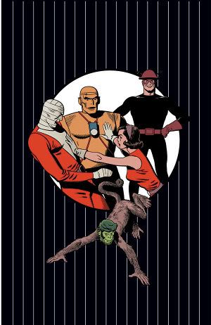
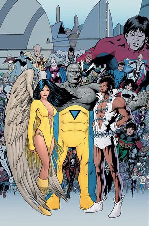
Hehe...the Doom Patrol.
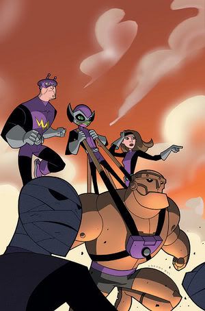
So dorky looking, but COOL!
___________________________________________________
This cover by Harris seems a bit rushed...
Nice idea, though.
__________________________________________________
This is a strong Jones cover.
Nice design work by him.
___________________________________________________
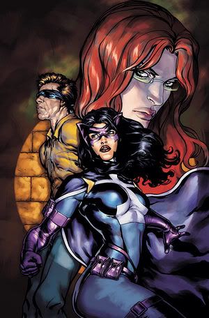
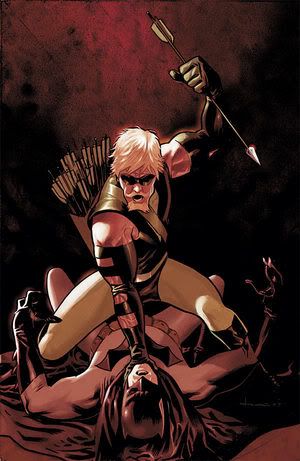
This Green Arrow cover missed the top five only because, well, how would you really know it was a Green Arrow cover? The little arrows?
___________________________________________________
How weird is it that Tony Moore is doing TWO books about exterminators?
Also, which Bond is cooler - James or Philip?
___________________________________________________
I think the repeated motifs work for these covers...
___________________________________________________
Eric Powell was such a great choice to do Swamp Thing covers.
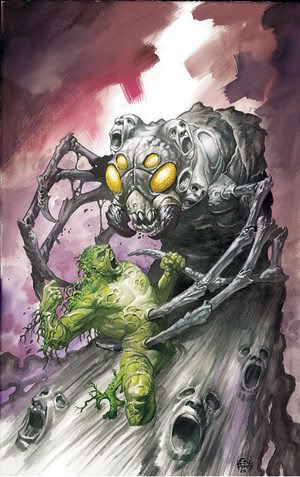
Really nice cover here.
___________________________________________________
Strong cover from Jean...
However, for a time, I could depend on him stunning me each month with his insanely clever cover designs. Now? Not so much.
___________________________________________________
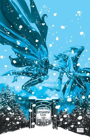
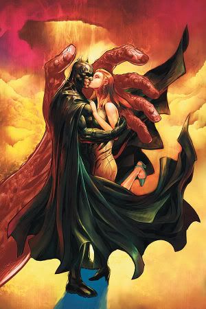
Ahhh...the Pieta.
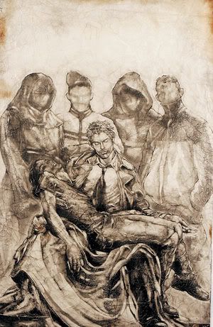
Go to cover homage.
___________________________________________________
MY TOP FIVE COVERS OF THE MONTH!!
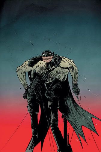
5. Another winner for Matt Wagner...
Slightly down from issue #2, which I think has been the highlight of the Monster Men covers so far, or else I'd have this higher in the top five.
___________________________________________________
4. For Bill Reed.
Bolland is awesome, no?
___________________________________________________
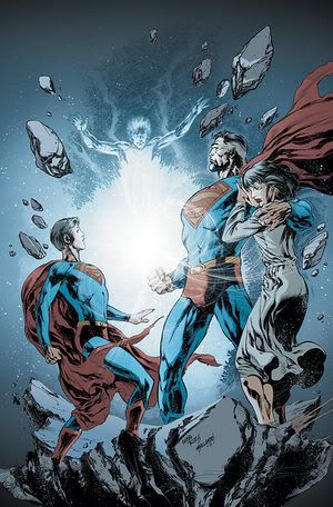
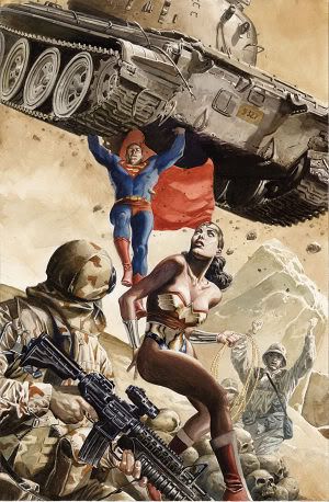
3. Mark Schultz wrote Man of Steel for about 25 issues.
He did not draw a single issue.
Now, about five years since he LEFT the book, he gives us this...
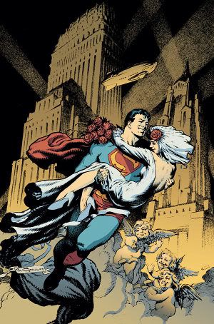
I think it was worth the wait.
___________________________________________________
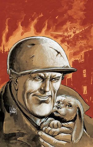
2. When certain stuff comes into his wheelhouse, Tommy Lee Edwards is just dynamite.
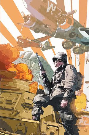
War comics are RIGHT in his wheelhouse.
___________________________________________________
1. Superhero fans, you can thank Grant Morrison for giving us Simone Bianchi.
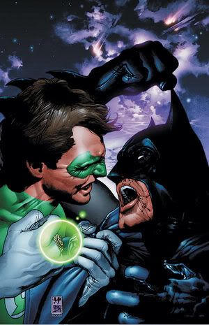
Wow!
Number one, even if it continues the silly "Batman and Lanterns don't get along" nonsense.
___________________________________________________
Okay, that's it for me, folks!
Feel free to share YOUR prejudices!!
AND your top five choices!
Let's begin!
Jock makes it so simple to describe his covers. I just have to say, "Will Jock ever NOT draw a cool looking cover?"
Of course, it tells us nothing about the plot of Batman #650...but still. Nice cover.
___________________________________________________
I love Paul Pope's work. You love Paul Pope's work.
But I don't think this works great as a cover, except if the goal is to orient new readers right away into Pope's style, which I guess makes some sense.
___________________________________________________
I dig Cliff Chiang's work...
but this is getting a bit too sparse on the detail.
___________________________________________________
See, this is the problem with Tim Sale...
It is nice enough when he begins, but when he gives you five straight covers which are pretty similar, you just want to move on.
___________________________________________________
Not Hester's wheelhouse, but he did well with it anyways...
___________________________________________________
McDaniel should just not draw colorful characters...
Look how WEIRD it looks! Remember how weird his Superman run looked?
___________________________________________________
Strong cover for a final issue.
By the by, no way does Montoya really leave the force, because that's what happened to Bullock, and he's "scum."
___________________________________________________
HOLY CRAP!
A GOOD cover for Journey into Knight by Pat Lee?!?!?!
STOP THE PRESSES!!
___________________________________________________
Fitting last issue cover for Gotham Knights.
Again with the Hush. Should have realized earlier that NO ONE CARES ABOUT HUSH!!
___________________________________________________
It is the 200th issue of Legends of the Dark Knight.
And to commemorate?
A BART SEARS COVER?!?!?
Whose idea was THAT?
___________________________________________________
It's covers like this that remind us of how much skill that Hughes possesses...
I'd much prefer it if he coupled his skill with a style like this, rather than concentrating on "realistic" art with "big boobies."
___________________________________________________
Very cool cover idea.
I don't know if he actually pulled it off, but great idea.
___________________________________________________
This is a weird cover...
It is like Reis is trying for a better style (which I admire), but not exactly pulling it off.
___________________________________________________
OUCH.
And I don't mean the punch.
___________________________________________________
Nothing wrong with this cover, per se...
but the idea of doing a collection of Daily Planet stories (almost ALL of them from the Silver Age) and then using as the cover a cover Nowlan did for a stupid "Event" comic from the late 90s?
Just doesn't compute.
___________________________________________________
TWO GOOD PEREZ COVERS
First, Infinite Crisis...
and now JSA...
Nothing outstanding about either, but they are both good, solid covers.
___________________________________________________
Remember when a cover like this would mean that mind control was definitely involved (I mean, it probably IS in this issue, just saying it used to be a given)?
___________________________________________________
Ooooh...not Eaglesham's best work.
___________________________________________________
Not a bad drawing, but does this cover make you want to buy the comic?
___________________________________________________
Jesus Saiz trying out a new style as well this month.
I don't think it works.
___________________________________________________
Brian Bolland can do covers like this with his eyes closed.
___________________________________________________
"We can do it. We can rebuild. We can suck BIGGER!"
___________________________________________________
Fine, normal cover.
Nothing fancy, but gets the job done, I think.
___________________________________________________
Good Acuña cover.
He is a keeper.
___________________________________________________
Dave Gibbons should draw more often.
Strong cover.
___________________________________________________
Varieties on a theme!
Part 1
Part 2
What a weird coincidence.
___________________________________________________
Scott Hampton is a good choice, I think.
Who would you like to see doing a SOLO?
___________________________________________________
They sure aren't letting up on the interior artists.
Now a Chaykin cover?!?
___________________________________________________
Well, that's....something.
___________________________________________________
Not a bad cover.
Still a bit stiff.
___________________________________________________
I like this style better for Saiz.
But not exactly the most "stuff going on" of covers, is it?
___________________________________________________
Really good cover.
But waaay too similar to #1's cover. I get that that is the IDEA, but still, I'd prefer something different.
___________________________________________________
ON TO 52 FOR JONES!
He will surely do a good job there, too.
___________________________________________________
SEVEN SOLDIERS COVERS!!!!
Cool...
Weird...
Both covers that stand out, at least.
___________________________________________________
Please, Benes!
No more!
___________________________________________________
What is it about this cover that seems so wrong to me?
The perspective? The size of the figures? I dunno...but it looks weird to me.
___________________________________________________
Okay, I will admit. This doesn't look that bad.
Doesn't look that GREAT, but doesn't look bad. I hope the interiors will follow suit.
___________________________________________________
Hehe...the Doom Patrol.
So dorky looking, but COOL!
___________________________________________________
This cover by Harris seems a bit rushed...
Nice idea, though.
__________________________________________________
This is a strong Jones cover.
Nice design work by him.
___________________________________________________
This Green Arrow cover missed the top five only because, well, how would you really know it was a Green Arrow cover? The little arrows?
___________________________________________________
How weird is it that Tony Moore is doing TWO books about exterminators?
Also, which Bond is cooler - James or Philip?
___________________________________________________
I think the repeated motifs work for these covers...
___________________________________________________
Eric Powell was such a great choice to do Swamp Thing covers.
Really nice cover here.
___________________________________________________
Strong cover from Jean...
However, for a time, I could depend on him stunning me each month with his insanely clever cover designs. Now? Not so much.
___________________________________________________
Ahhh...the Pieta.
Go to cover homage.
___________________________________________________
MY TOP FIVE COVERS OF THE MONTH!!
5. Another winner for Matt Wagner...
Slightly down from issue #2, which I think has been the highlight of the Monster Men covers so far, or else I'd have this higher in the top five.
___________________________________________________
4. For Bill Reed.
Bolland is awesome, no?
___________________________________________________
3. Mark Schultz wrote Man of Steel for about 25 issues.
He did not draw a single issue.
Now, about five years since he LEFT the book, he gives us this...
I think it was worth the wait.
___________________________________________________
2. When certain stuff comes into his wheelhouse, Tommy Lee Edwards is just dynamite.
War comics are RIGHT in his wheelhouse.
___________________________________________________
1. Superhero fans, you can thank Grant Morrison for giving us Simone Bianchi.
Wow!
Number one, even if it continues the silly "Batman and Lanterns don't get along" nonsense.
___________________________________________________
Okay, that's it for me, folks!
Feel free to share YOUR prejudices!!
AND your top five choices!
posted by Brian Cronin at 11/14/2005 07:02:00 PM
![]()


18 Comments:
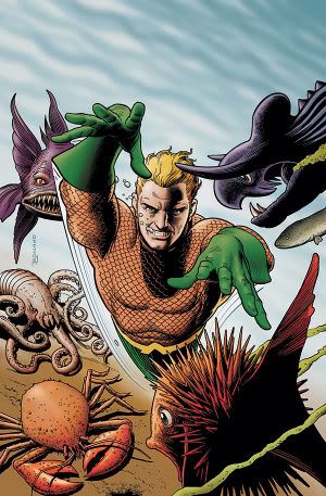
Re: Aquaman.
Thank you.
Love, Bill.
PS: So are the gloves back for Arthur, now?
PPS: What, no Space Cabbie cover in the top five? Heathen.
Which J. Bond? 'Cause Phil's cooler than all but Connery.
You're way too hard on Jean, Brian.
First of all, there will be a big "GREEN ARROW" letting you know it's a Green Arrow cover. Second of all, that other design is great and the art is gorgeous...certainly much better than your #1 choice, which really surprises me...it's a standard concept, not executed well enough to be the best cover of the month, though it is a good cover.
my top five...
1. Paul Pope's batman thingy
2. james jean green arrow
3. matt wagner's batman thingy
4. james jean fables
5. Bolland aquaman
Wow, these posts are hard on my poor dialup connection.
I think my favourite is the Gotham Knights one, if only because the Joker looks just like Tony Blair in that pic, and I think it's pretty cool that they've decided to draw the Joker to look like a dangerous maniac...
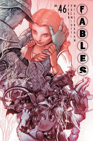
Actually, my favourite is either the Teen Titans Go! Doom Patrol cover, or the Fables one.
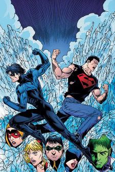
The Superman in that Ivan Reis cover has a bit of "Liefeld Chest" going on, don't you think? As for the Nightwing/Superboy cover, I think it's because they've drawn Nightwing with too much of a twist in his back considering his costume. It looks like his torso has been put on back-to-front.
What's going on with that Alex Ross Authority cover? I haven't read the title since DC killed it the first time, but who's the girl in the leather jacket (is it Jenny Quantum? And if so, why is she a teenager noe?), and why has the Doctor's costume been blandified?
Has anyone noticed that Matt Wagner can't seem to ever seem to properly center Batman's head? It's always too far to one side or the other. Sometimes it's even above the pectoral muscle.
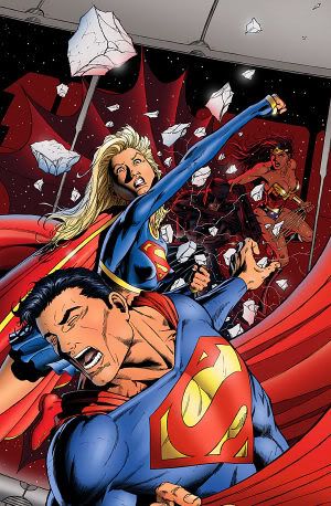
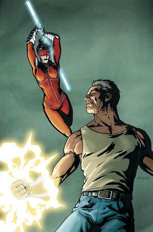
That Supergirl punching Superman cover makes no sense. Did she hit him? Because if so, he'd be going in the other direction. If not, why's he whincing?
"Who would you like to see doing a SOLO?"
Kelley Jones! Or Tom Mandrake. Both creepy horror-types I haven't seen in ages.
Morts, Supergirl is punching Superman that way because Supergirl is Just Too Extreem.
What's up with the coloring on that JSA Classified cover? Is Wildcat *ever* drawn with that light a blue shade?
I think my favorite might be Perez' JSA cover. It's a nice drawing, but it also sells itself - "I don't know what the heck might be going on in this story, but I'm intrigued."
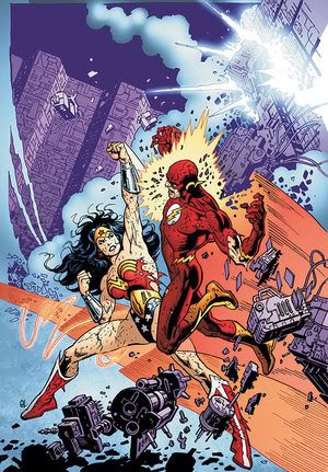
The Flash Vs. Wonder Woman cover you mention is part of a new Gail Simone JLA Classified arc. No mind control or inter-League tensions for once - Flash is infected with some sort of virus and Wonder Woman has to stop him before his metabolism burns out. Or something. The preview pages were interesting but a bit unclear.
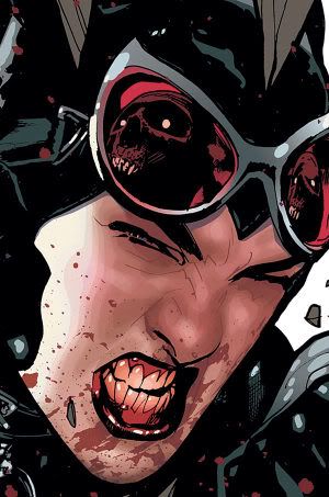
I also would tend to rank that Catwoman cover above the Aquaman one but that's probably just my character preference shining through (bloody teeth are cooler than goggle-eyed fish in my book any day of the week). I agree, nice change of pace from Hughes.
DUDE where was the was the War Crimes Trade cover by James Jean??!?!
the story was ass but i want that cover as a poster NOW!
Jean doing the covers for the War Games trades is just too depressing for me to repeat.
In addition, who here thought Loveless was a notable cover? I didn't think it was notable enough to mention here, but I'll put it up if people think it was good.
Where the Hell is Space Cabbie?
I love him and I barely know his name.
That Capt. Atom/Authority cover is actually by JG Jones.
Thanks, Gardner!
No wonder the design work was so impressive!
I'm disappointed in you Brian. Don't EVER accuse Alex Ross of doing a cover that good. Does anyone look pallid, overweight, 50 years old and bloated on that cover?
For shame.
My top five are
Bolland's Doom Patrol
Hampton's Solo
The cartoon Doom Patrol (I'm assuming this is from Teen Titans Go!)
Jean's Green Arrow
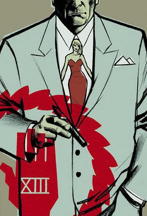
The one with the lady-tie. Is that 100 Bullets?
I really think that the Bats vs. Lantern one is pretty attrocious. I kind of want to punch it, but I'm afraid to touch it.
And the Aquaman cover is almost perfect, but I feel like it's cluttered up with fish.
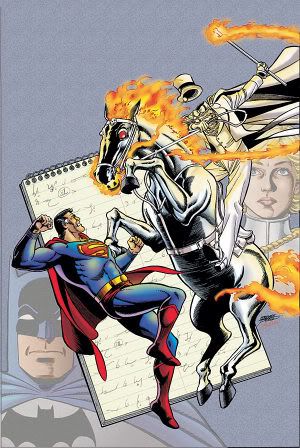
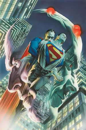
Oh, and what's up with that Superman cover by Ross? Is Clark getting sodomized by Bizarro?
"I'm disappointed in you Brian. Don't EVER accuse Alex Ross of doing a cover that good. Does anyone look pallid, overweight, 50 years old and bloated on that cover?
For shame."
I WAS pretty surprised that the design work was so good...hehe.
By the by, Ross DID do a good job on the Justice #3 cover, with Martian Manhunter.
Post a Comment
<< Home