Judging (Marvel's August) Books By Their Covers
Marvel's August Solicitations are up, so let's make some prejudgements based just on the covers (as we all love to make prejudgements, don't we?).
Let's begin!
___________________________________________________
Good lord, man, that's some misshapen anatomy!

Sadly enough, it's not even the worst depiction of character builds on a cover this month.
___________________________________________________
Stuart Immonen AND Frazer Irving?

Where do I sign up?
The Immonen cover, however, was just slightly too bland.
___________________________________________________
Also, the bloom sure seems to have come off Pasqual Ferry's rose, eh?

For a time, I was all, "How could DC let him go?!?"
His projects for Marvel, though, have made it a good deal less shocking.
I still dig his work, though! Just like I did pre-Adam Strange. There just isn't the same "WOAH" effect anymore.
___________________________________________________
Well...

that's SOMEthing.
Can't say it isn't that.
___________________________________________________
Am I the only one who gets a kick out of Mark Brooks' current job assignment?
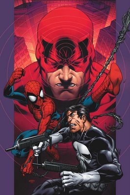
Essentially, he is just the "Ultimate Spider-Man Annual" artist.
Or at least that has been what "special projects" have turned out for Brooks - two Ultimate Spider-Man Annuals.
I'd like to see him try something else.
___________________________________________________
Very nice Salvador Larocca cover for the Ultimate X-Men Annual.

It's to the point and packs a lot of zest.
___________________________________________________
Compare that to Tom Raney's bland, lifeless cover for the regular Ultimate X-Men.

Did he really think he was achieving "movement" with this cover?!?
Seems more like Wolverine and Cyclops "Vogue"ing.
___________________________________________________
CIVIL WAR COVERS!
___________________________________________________
This is just toooo unfair.
The pro-registration side has Wonder Man, Tigra AND Hank Pym on it!
Who could ever side against such a collection of superhero titans?!?!

Sorta belies the whole "fair and balanced" thing when one side is basically represented by the freakin' West Coast Avengers!
Very nice drawing by McNiven, though.
___________________________________________________
This reminds me of when Denny Crane led everyone in reciting the National Anthem.
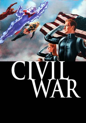
It was creepy there, too (at least Boston Legal was intentionally so).
___________________________________________________
WAIT...Spider-Man ends up siding AGAINST Iron Man!?!?
Why is this cover the first I've heard of this?!!?

Oh.
Right.
Never mind.
___________________________________________________
Pretty nifty Amanda Conner cover for Cable & Deadpool.
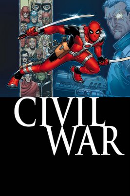
At least the drawings of the heroes.
Deadpool looks a bit like a colorform.
___________________________________________________
Wow.
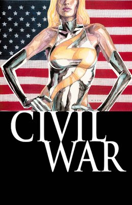
That MAY be the worst thing I've ever seen David Mack draw (I reserve the right to remember some awful project I'm sure he did during the 90s, where everyone was required to do at least ONE dreadful project).
___________________________________________________
I can honestly tell you that I have no idea WHAT the hell is going on on this X-Men: Civil War cover.

And I think Juan Doe is awesome normally.
___________________________________________________
So, do you think this cover will be the truth, and it'll be Sue and Reed along with Ororo and T'Challa?

And why does Ben look so...odd on this cover? Almost like a crocodile.
___________________________________________________
Sadly, I think you could photostat this Thunderbolts cover from a page from Avengers/Thunderbolts, that's how similar it looks to the work Grummett did there.
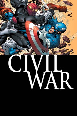
Live a little!!
___________________________________________________
You have to give Tucci credit...

he knows how to use shading and light to make things seem more prominent. He presents his work well.
___________________________________________________
What is Wolverine trying to achieve on this cover, exactly?
Is he trying to STAB Namor?

That seems odd.
What would happen if he DID?
I bet he would feel sad.
___________________________________________________
Coipel does a GREAT job with Jessica Drew's indecisiveness regarding Civil War on this New Avengers cover.

I can't iamgine how hard it must be to draw a FEELING and make it the centerpiece of a cover like that.
Good, good work.
___________________________________________________
Fairly generic Jim Cheung cover for Runaways/Young Avengers.

Not bad, though.
___________________________________________________
This is the first Ladronn Hulk cover that I've been less than thrilled with.
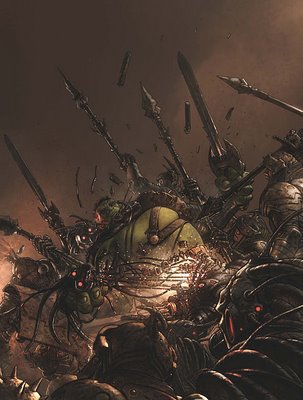
Seems a bit too muddy.
___________________________________________________
ANNIHILATION COVERS!
___________________________________________________
Man, Dell'Otto is a lot cooler looking when he has to mix things up a bit, as he does with the first issue cover for the Annhilation mini-series.

___________________________________________________
However, Andrea DiVito draws the tie-in "Guide to Annihilation" cover like it's a boring dinner party.

Way too bland.
___________________________________________________
Okay, now Angel Medina has ALSO showed...

no one can make the new costume look good.
___________________________________________________
I love how FUN the Friendly Neighborhood Spider-Man covers are!!

I keep expecting to see the Fonz show up!
___________________________________________________
I don't think this is a great Venom cover for Beyond #2.

However, maybe Scott Kolins is on to something, as I keep coming back to it, in a sort of a "gawking at a trainwreck" type of thing.
___________________________________________________
I like that Linsner made Wolverine shorter than Black Cat.

Nice touch.
That is all.
___________________________________________________
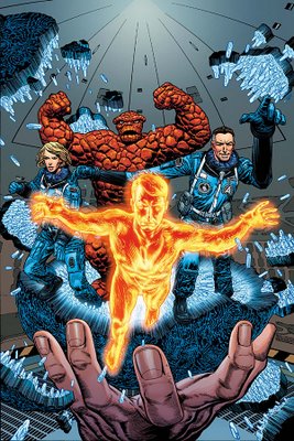
Man, only Chris Weston can make a guy walking around on fire seem mundane.
___________________________________________________
Mark Texeira's Ghost Rider cover at least delivers what most people expect from a Ghost Rider comic book.

___________________________________________________
Man, Hester really falls apart with this Marvel Team-Up cover.

It looks almost kinda painful.
And we've SEEN him draw Wolverine well before, so I don't know what the deal is.
___________________________________________________
Speaking of painful, THIS is the winner for weirdest builds of characters - Moon Knight #5.

Unless, of course, that's the Incredible Hulk under Taskmaster's costume.
Maybe that's Doc Samson under Moon Knight's costume.
It might be some sort of new-age therapy.
___________________________________________________
Very nice Paolo Rivera cover for Mythos Hulk.
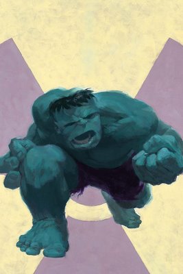
I look forward to seeing Jenkins' take on a character he's so familiar with.
___________________________________________________
Bah!
I miss Marcos Martin on Runaways covers!!

Jo Chen is okay, too.
___________________________________________________
Gotta give it up to Greg Horn!
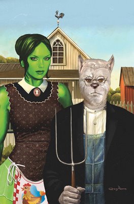
Still not thrilled with the drawing, but it sure is a clever idea!!
___________________________________________________
Did Gary Frank do the covers for the Nighthawk mini-series, or did Steve Dillon do them?

If so, Frank is looking like Steve Dillon these days.
It's odd.
___________________________________________________
Gotta give Mike Mayhew credit.

Cheesecake art has its place in the world, and poster books are one of those places.
He is quite good at it.
___________________________________________________
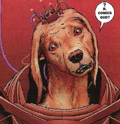
That is one weird group.

___________________________________________________
I love Marvel Westerns!
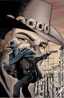
I think this would be cooler if it was Eric Powell PENCILLING the cover, though, rather than inking Marshall Rogers.
Still, Englehart and Rogers!!!
___________________________________________________
UH OH!
A Marvel Adventures: Spider-Man cover by...CAMERON STEWART!!

The collection is almost complete!!
DC, clutch Doug Mahnke and JH Williams to your heart and never let them go!!!
___________________________________________________
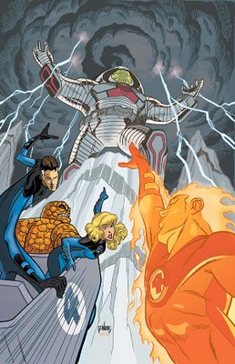
Decent David Williams action shot for this Marvel Adventures: Fantastic Four cover.
___________________________________________________
Nice, dramatic pose by Aaron Lopresti for this Marvel Adventures: Avengers cover.

___________________________________________________
Strong John Cassaday cover for Astonishing X-Men.

Surprising that this hasn't been used more often as a cover design.
___________________________________________________
I love Bill Sienkiewicz, and I applaud the use of him on the cover of X-Men: Fairy Tales...
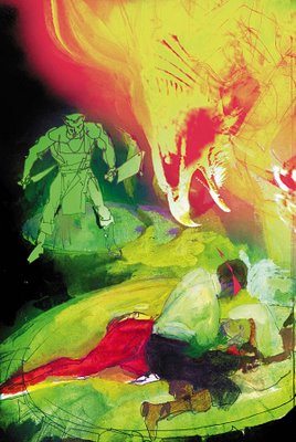
but I think he dropped the ball a bit.
A bit TOO abstract.
___________________________________________________
Now THAT is a hilarious cover!!

Well done, Paul Pelletier (and Tony Bedard for the idea of an Exiles team made up of all Wolverines).
___________________________________________________
Nice Paco Medina cover for New X-Men.

___________________________________________________
I enjoy seeing less of a "Barney and friends"-style cover of New Excalibur from Michael Ryan.
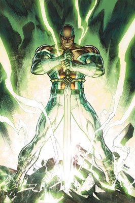
Good work.
___________________________________________________
I think John Watson is great.

And this is a nice painting.
But I don't think it is dramatic enough for a cover.
___________________________________________________
Holy crap, Bianchi!!!

That is just WEIRD!!!
___________________________________________________
Interesting cover layout from Sook for X-Factor.

I don't know if I love it, but I love his willingness to try new things.
___________________________________________________
I like Tim Bradstreet's backgrounds, at least!

Clever silhouette use!
___________________________________________________
Strong Jack Kirby cover.

I wonder if this bounty hunter book will be any good?
___________________________________________________
HONORABLE MENTIONS!
___________________________________________________
I'm sorry, but I can't help it...
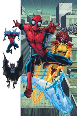
this looks like it could be fun!
___________________________________________________
Just SLIGHTLY too hokey for the top five.

Still, very nice cover.
___________________________________________________
Very nice Adi Granov cover for Iron Man.
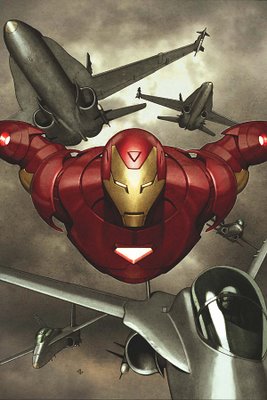
Just outside of the top five.
___________________________________________________
TOP FIVE!!
___________________________________________________
5. Very strong cover design by Tomm Coker for Agents of Atlas #1.

Anyone know what Coker is up to these days?
I enjoy his work.
___________________________________________________
4. Good Trevor Hairsine cover for Black Panther.
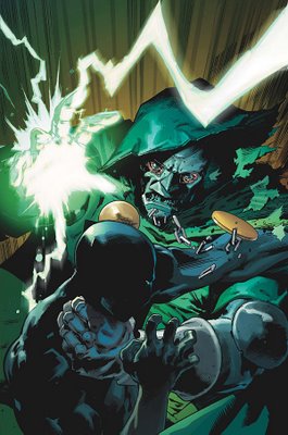
Panther v. Doom is a nice matchup, and the cover demonstrates that.
___________________________________________________
3. Very dynamic Captain America cover...

even if we WEREN'T all comic geeks and understood the symbolism of the cover.
___________________________________________________
2. A large round of applause for Rick Berry's redesign of Sersi for Gaiman's Eternals.

Excellent work!
___________________________________________________
1. Finally, an amazing job by Chris Bachalo.

Best cover I've seen from him in years.
Such striking character design.
And yes, kudos to Carey, for putting Bobby (a person people keep rumoring is gay) with a character who can become a man. Clever job, there.
___________________________________________________
Well, that's it for this month!
Feel free to weigh in with your prejudices (and your top five covers)!
Let's begin!
___________________________________________________
Good lord, man, that's some misshapen anatomy!

Sadly enough, it's not even the worst depiction of character builds on a cover this month.
___________________________________________________
Stuart Immonen AND Frazer Irving?

Where do I sign up?
The Immonen cover, however, was just slightly too bland.
___________________________________________________
Also, the bloom sure seems to have come off Pasqual Ferry's rose, eh?

For a time, I was all, "How could DC let him go?!?"
His projects for Marvel, though, have made it a good deal less shocking.
I still dig his work, though! Just like I did pre-Adam Strange. There just isn't the same "WOAH" effect anymore.
___________________________________________________
Well...

that's SOMEthing.
Can't say it isn't that.
___________________________________________________
Am I the only one who gets a kick out of Mark Brooks' current job assignment?

Essentially, he is just the "Ultimate Spider-Man Annual" artist.
Or at least that has been what "special projects" have turned out for Brooks - two Ultimate Spider-Man Annuals.
I'd like to see him try something else.
___________________________________________________
Very nice Salvador Larocca cover for the Ultimate X-Men Annual.

It's to the point and packs a lot of zest.
___________________________________________________
Compare that to Tom Raney's bland, lifeless cover for the regular Ultimate X-Men.

Did he really think he was achieving "movement" with this cover?!?
Seems more like Wolverine and Cyclops "Vogue"ing.
___________________________________________________
CIVIL WAR COVERS!
___________________________________________________
This is just toooo unfair.
The pro-registration side has Wonder Man, Tigra AND Hank Pym on it!
Who could ever side against such a collection of superhero titans?!?!

Sorta belies the whole "fair and balanced" thing when one side is basically represented by the freakin' West Coast Avengers!
Very nice drawing by McNiven, though.
___________________________________________________
This reminds me of when Denny Crane led everyone in reciting the National Anthem.

It was creepy there, too (at least Boston Legal was intentionally so).
___________________________________________________
WAIT...Spider-Man ends up siding AGAINST Iron Man!?!?
Why is this cover the first I've heard of this?!!?

Oh.
Right.
Never mind.
___________________________________________________
Pretty nifty Amanda Conner cover for Cable & Deadpool.

At least the drawings of the heroes.
Deadpool looks a bit like a colorform.
___________________________________________________
Wow.

That MAY be the worst thing I've ever seen David Mack draw (I reserve the right to remember some awful project I'm sure he did during the 90s, where everyone was required to do at least ONE dreadful project).
___________________________________________________
I can honestly tell you that I have no idea WHAT the hell is going on on this X-Men: Civil War cover.

And I think Juan Doe is awesome normally.
___________________________________________________
So, do you think this cover will be the truth, and it'll be Sue and Reed along with Ororo and T'Challa?

And why does Ben look so...odd on this cover? Almost like a crocodile.
___________________________________________________
Sadly, I think you could photostat this Thunderbolts cover from a page from Avengers/Thunderbolts, that's how similar it looks to the work Grummett did there.

Live a little!!
___________________________________________________
You have to give Tucci credit...

he knows how to use shading and light to make things seem more prominent. He presents his work well.
___________________________________________________
What is Wolverine trying to achieve on this cover, exactly?
Is he trying to STAB Namor?

That seems odd.
What would happen if he DID?
I bet he would feel sad.
___________________________________________________
Coipel does a GREAT job with Jessica Drew's indecisiveness regarding Civil War on this New Avengers cover.

I can't iamgine how hard it must be to draw a FEELING and make it the centerpiece of a cover like that.
Good, good work.
___________________________________________________
Fairly generic Jim Cheung cover for Runaways/Young Avengers.

Not bad, though.
___________________________________________________
This is the first Ladronn Hulk cover that I've been less than thrilled with.

Seems a bit too muddy.
___________________________________________________
ANNIHILATION COVERS!
___________________________________________________
Man, Dell'Otto is a lot cooler looking when he has to mix things up a bit, as he does with the first issue cover for the Annhilation mini-series.

___________________________________________________
However, Andrea DiVito draws the tie-in "Guide to Annihilation" cover like it's a boring dinner party.

Way too bland.
___________________________________________________
Okay, now Angel Medina has ALSO showed...

no one can make the new costume look good.
___________________________________________________
I love how FUN the Friendly Neighborhood Spider-Man covers are!!

I keep expecting to see the Fonz show up!
___________________________________________________
I don't think this is a great Venom cover for Beyond #2.

However, maybe Scott Kolins is on to something, as I keep coming back to it, in a sort of a "gawking at a trainwreck" type of thing.
___________________________________________________
I like that Linsner made Wolverine shorter than Black Cat.

Nice touch.
That is all.
___________________________________________________
Man, only Chris Weston can make a guy walking around on fire seem mundane.

___________________________________________________
Mark Texeira's Ghost Rider cover at least delivers what most people expect from a Ghost Rider comic book.

___________________________________________________
Man, Hester really falls apart with this Marvel Team-Up cover.

It looks almost kinda painful.
And we've SEEN him draw Wolverine well before, so I don't know what the deal is.
___________________________________________________
Speaking of painful, THIS is the winner for weirdest builds of characters - Moon Knight #5.

Unless, of course, that's the Incredible Hulk under Taskmaster's costume.
Maybe that's Doc Samson under Moon Knight's costume.
It might be some sort of new-age therapy.
___________________________________________________
Very nice Paolo Rivera cover for Mythos Hulk.

I look forward to seeing Jenkins' take on a character he's so familiar with.
___________________________________________________
Bah!
I miss Marcos Martin on Runaways covers!!

Jo Chen is okay, too.
___________________________________________________
Gotta give it up to Greg Horn!

Still not thrilled with the drawing, but it sure is a clever idea!!
___________________________________________________
Did Gary Frank do the covers for the Nighthawk mini-series, or did Steve Dillon do them?

If so, Frank is looking like Steve Dillon these days.
It's odd.
___________________________________________________
Gotta give Mike Mayhew credit.

Cheesecake art has its place in the world, and poster books are one of those places.
He is quite good at it.
___________________________________________________
That is one weird group.

___________________________________________________
I love Marvel Westerns!

I think this would be cooler if it was Eric Powell PENCILLING the cover, though, rather than inking Marshall Rogers.
Still, Englehart and Rogers!!!
___________________________________________________
UH OH!
A Marvel Adventures: Spider-Man cover by...CAMERON STEWART!!

The collection is almost complete!!
DC, clutch Doug Mahnke and JH Williams to your heart and never let them go!!!
___________________________________________________
Decent David Williams action shot for this Marvel Adventures: Fantastic Four cover.

___________________________________________________
Nice, dramatic pose by Aaron Lopresti for this Marvel Adventures: Avengers cover.

___________________________________________________
Strong John Cassaday cover for Astonishing X-Men.

Surprising that this hasn't been used more often as a cover design.
___________________________________________________
I love Bill Sienkiewicz, and I applaud the use of him on the cover of X-Men: Fairy Tales...

but I think he dropped the ball a bit.
A bit TOO abstract.
___________________________________________________
Now THAT is a hilarious cover!!

Well done, Paul Pelletier (and Tony Bedard for the idea of an Exiles team made up of all Wolverines).
___________________________________________________
Nice Paco Medina cover for New X-Men.

___________________________________________________
I enjoy seeing less of a "Barney and friends"-style cover of New Excalibur from Michael Ryan.

Good work.
___________________________________________________
I think John Watson is great.

And this is a nice painting.
But I don't think it is dramatic enough for a cover.
___________________________________________________
Holy crap, Bianchi!!!

That is just WEIRD!!!
___________________________________________________
Interesting cover layout from Sook for X-Factor.

I don't know if I love it, but I love his willingness to try new things.
___________________________________________________
I like Tim Bradstreet's backgrounds, at least!

Clever silhouette use!
___________________________________________________
Strong Jack Kirby cover.

I wonder if this bounty hunter book will be any good?
___________________________________________________
HONORABLE MENTIONS!
___________________________________________________
I'm sorry, but I can't help it...

this looks like it could be fun!
___________________________________________________
Just SLIGHTLY too hokey for the top five.

Still, very nice cover.
___________________________________________________
Very nice Adi Granov cover for Iron Man.

Just outside of the top five.
___________________________________________________
TOP FIVE!!
___________________________________________________
5. Very strong cover design by Tomm Coker for Agents of Atlas #1.

Anyone know what Coker is up to these days?
I enjoy his work.
___________________________________________________
4. Good Trevor Hairsine cover for Black Panther.

Panther v. Doom is a nice matchup, and the cover demonstrates that.
___________________________________________________
3. Very dynamic Captain America cover...

even if we WEREN'T all comic geeks and understood the symbolism of the cover.
___________________________________________________
2. A large round of applause for Rick Berry's redesign of Sersi for Gaiman's Eternals.

Excellent work!
___________________________________________________
1. Finally, an amazing job by Chris Bachalo.

Best cover I've seen from him in years.
Such striking character design.
And yes, kudos to Carey, for putting Bobby (a person people keep rumoring is gay) with a character who can become a man. Clever job, there.
___________________________________________________
Well, that's it for this month!
Feel free to weigh in with your prejudices (and your top five covers)!


29 Comments:
On Mark Brooks - he has been doing New X-Men as well, you know. :) When it comes out... (I think it's been slipping, it's hard to tell as it's been rather too Dark And Depressing to stick in the mind).
1. Putting Cameron Stewart and Amanda Conner on the covers, but not the story pages of a Spider-Man comic is both CRUEL and TEASING, Marvel!
2. Mark Brooks reminds me of Tom Lyle, but with better anatomy skills. That said, he, like Takeshi Miyazawa, insists on drawing a single web-spoke down the lower half of Spidey's face. GGAAHH!!
3. I concede that in the grand scheme of things, with war, famine, and reality television plaguing us from all sides, that may not mean much to anyone.
4. But still: it's like not hyphenating "Spider-Man." Knock it off!
5. Why is there a Thing in the New Mutants comic? (not calling it New X-Men, sorry) Is he like Thunderstrike and USAgent? Is he called, I dunno, "The Doo-dad?" "The Geegaw?" "The Whatchamacallit?"
6. Did you see the preview of the Linsner book the other day? Spider-Man talking to Black Cat's arse, or possibly staring up it?
Classy.
//\Oo/\\
Most of those covers are decent, at least, but- a poor Bill Sienkiewicz cover and a bad David Mack cover? Wow.
i thought stewart was exclusive? Is the year over already?...and he hasn't put anything out since the guardian...huh.
Iceman makes the X-men
That Chris Weston Fantastic Four cover makes Human Torch look like Adam Archer from Godland.
Random question: where's Next Wave this month? Is it cancelled?
I think that Del'Otto Annihilation cover it the cat's pajamas. Really neat, and it's the first time in...ever, I guess, that Galactus looked terrifying.
I also enjoy the Bianchi Wolverine, but it needs more color.
And that Mack cover sucks all kinds of balls.
Oh, and for the record, I actually like the Cap/Falcon cover, even if Cap does look like Judge Dredd.
#3 - I don't get it.
Nice to see Kirby producing work even twelve years after his death. There's a guy you can rely on.
I really don't like those Eternals covers at all. Where's JRjr?
Cameron Stewart's going to be doing a Vertigo series sometime soon, so Marvel hasn't stolen him.
Kinda sad, but I won't be buying any Marvel comics in August. No Nextwave, no me! That's how I roll.
What the heck is going on with the Things, er, lower anatomy?
I know the new Nova costume is ugly, but it wasn't clear just how ugly it really was until that Annihilation special cover. You know, where it's not painted and shiny and glowing and silhouetted. Holy Odin, that's horrendous.
even if we WEREN'T all comic geeks and understood the symbolism of the cover. <---------------------------------- I don't understand the symbolism of the cover...
farzio
" On Mark Brooks - he has been doing New X-Men as well, you know. :)"
He was taken off New X-Men for scheduling reasons, with Marvel choosing to have him do "special projects," which apparently just means, well, just drawing Ultimate Spider-Man Annuals!
The Cap cover is an homage to how Bucky died originally and Cap was put into suspended animation.
Cap fell off a rocket and was frozen in the water below, while Bucky stayed on the rocket, which exploded.
My favorite thing about the team of Wolverines is li'l Wolvie's frilly shirt.
You know the other Wolvies are going to be treating James like a pussy.
Random question: where's Next Wave this month? Is it cancelled?
I believe I read somewhere that Immonen took the month off to do the UFF Annual.
My understanding for Taskmaster's outfit was that the old costume is what he wears most of the time (when he's running classes at his schools). And that the new one is what he wears on his personal to-stay-in-shape missions and whatnot.
is wlverine wearing eyeliner?
Just asking do you know who Mysterio is I know his first name, I just forgot his last name.
And the Spider-man armor suit is looking awesome, of course thats just my opinion. They should be coming out with an avengers movie though bet that will be epic!
michael kors bags
pittsburgh steelers jersey
nike trainers
ugg outlet
valentino outlet
ferragamo outlet
ugg boots
nhl jerseys
jerseys wholesale
christian louboutin sale
cartier bracelet
harden shoes
nike air max
james harden shoes
air jordan
yeezy shoes
lebron james shoes
michael kors outlet
adidas outlet
basketball shoes
adidas eqt
curry 3
cheap nhl jerseys
christian louboutin shoes
calvin klein outlet
vibram fivefingers
converse outlet
air max
longchamp
kobe shoes
0802jejeHall, Kenny New Balance 574 pas cher Tran et Jay-Z air jordan future for basketball pour en identifier nike homme bleu marine quelques-uns. Le couteau américain nike pas cher a paris USMC KA-BAR chaussures nike pas cher livraison gratuite Fighting / Utility chaussures nike roshe run mesh est devenu parmi nike air max 90 leather femme les couteaux les plus new balance femme beige gold populaires en air jordan future low femme pas cher usage.
nike shoes for men
ugg boots clearance
basketball shoes
ugg boots
nhl jerseys wholesale
polo ralph lauren outlet
pandora jewelry outlet
coach factory outlet
tory burch outlet
kate spade outlet online
www0820
it’s really a nice and useful piece of information. I’m happy that you simply shared this helpful information with us. Please keep us informed like this. Thank you for sharing. 한국야동
Also do visit may web page check this link 야설
It’s really a cool and useful piece of info. I’m glad that you shared this useful info with us. Please keep us informed like this. Thanks for sharing. 야동
Also do visit may web page check this link 국산야동
I delight in, cause I found just what I was looking for. You have ended my four day long hunt! God Bless you man. Have a great day. 국산야동
Also do visit may web page check this link 한국야동
Great offer the previous results outstanding vital necessary info right here
Post a Comment
<< Home