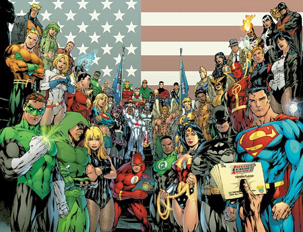
Judging (DC's August) Books By Their Covers
DC's August Solicitations are up, so now is as good a time as any for us to make prejudgements based just on the covers (as we all love to make prejudgements, don't we? And DC's covers are at least detailed enough that we CAN make prejudgements based on them!).
Let's begin!
___________________________________________________
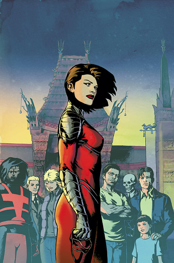
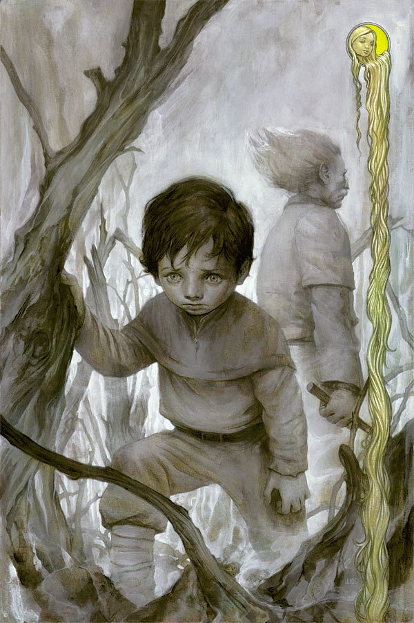
Jock is incapable of drawing a bad cover.

This comes pretty close, though.
___________________________________________________
I LIKE the idea of giving Son of the Demon a new printing.

I DON'T like the idea of having Andy Kubert draw a bland cover for the new printing.
What, Jerry Bingham doesn't have a website where you could easily reach him?
Wait?
What's that?
Jerry Bingham HAS a website where you could easily reach him?
Said website is even CALLED jerrybingham.com?!!?
Funny that.
(Don't mind me, as I'm totally full of crap, as my big problem with the cover is not not asking Jerry Bingham, so much as not asking Jerry Bingham in favor of using such a bland cover - this was Quitely? You wouldn't hear a peep from me)
___________________________________________________
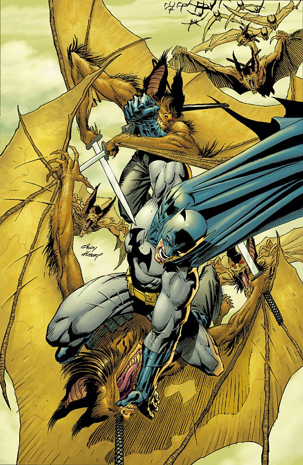
Dammit...Andy Kubert even managed to foul up an image as awesome as a whole pile of ninga bats fighting Batman.
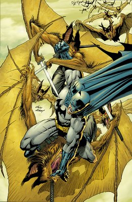
Imagine if Kubert drew We3.
No, don't imagine that!!
Too horrific.
___________________________________________________
I love me some Simone Bianchi.
However...

A. At some point, too much detail is kinda creepy
and
B. Batman looks waaaaaay too smooth there.
What is he, made out of porcelin?!
___________________________________________________
Wait, HUSH is in Man-Bat, TOO?!?!
Where do I sign up?!!?

Cool Huddleston cover, though.
___________________________________________________
Adam Hughes seems like he rushed this cover a bit.

Not on Zatanna, though, just the faces on the wheel.
___________________________________________________
Neat Pachecho cover for Superman.

I didn't know the underwear-on-the-outside had the belt loops on it - looks kinda funny, no?
___________________________________________________
That is officially the creepiest cape drawing ever.

We see her asscrack THROUGH THE CAPE!!
No WONDER she's crying.
___________________________________________________
Good lord, I spoke too soon!

NEW WINNER for creepiest cape drawing!
That's how you draw, like, Man-Bat's wings or something.
___________________________________________________
I don't get this drawing.

Unless the All-New Atom has a power staff.
___________________________________________________
I love Jerry Ordway.
I'm pleased as punch to hear that he has an exclusive contract (RENEWED!) with DC.

But damned if that isn't a bland cover. Nice drawing, but while I get the Silver Age-y feel he's going for there, it just isn't bold enough.
___________________________________________________
Another dynamic Duncan Rouleau cover!
___________________________________________________
That is a WEIRD Checkmate collage.
And, shouldn't Lee Bermejo, on a Lee Bermejo cover, be responsible for more than, like, 10% of the cover?

Way too much of that cover looked like stock footage, as it were.
___________________________________________________
That's not actually the cover, right?

So I don't know why that was given to us.
___________________________________________________
Not a bad Flash cover.
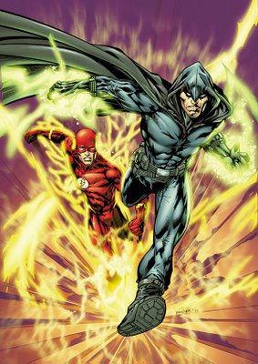
Is that supposed to be the Piper?
___________________________________________________
Very nice abstract-y cover for Green Arrow by McDaniel.
Impressive work.
___________________________________________________
52 COVERS!
___________________________________________________
1 cool point for each cover that also references this famous Hamlet scene!!

___________________________________________________
Decent cover, but a bit too generic.

___________________________________________________
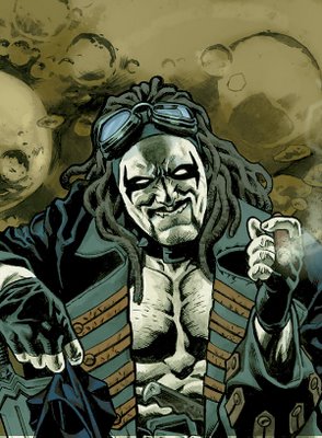
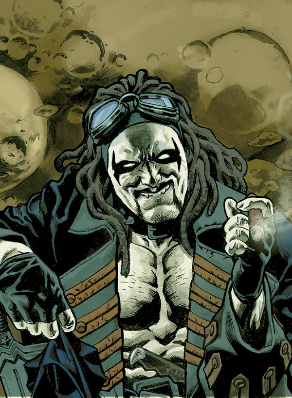
Man...that is a weird Lobo revamp.
___________________________________________________
PATRICK GLEASON COVERS!!
First, an example of how to do an action-packed cover...
Next, an example of how to draw a sputtering action cover without much coherence.

___________________________________________________
Well then.

At least Chaykin is equal opportunity with the whole "creepy drawings of people's naughty bits" thing.
___________________________________________________
KID AMAZO!
YAY!

I thought we had lost you forever!!
Not a bad job by Porter on the cover, at all!
Did he originally work on Kid Amazo, or is this the first we're seeing from him on the project?
___________________________________________________
Not a bad Phil Noto cover.

However, you shouldn't have to be TOLD it's a Jonah Hex cover to know that it is a Jonah Hex cover.
___________________________________________________
Decent Ed Benes cover.
Splitting the covers up to an A and a B version is smart marketing by DC.

Although, if the split is done down the middle, I think two black heroes will get cut in half.
Such racism from DC.
___________________________________________________
Wow.

That's a pretty sloppy Ion cover from Kalman Andrasofszky.
___________________________________________________
NOW I see the Ordway in the cover!


Neat-o JSA Classified covers.
___________________________________________________
Isn't it funny how, originally on Manhunter, Jae Lee was the famous artist doing the covers while the less-famous Jesus Saiz did interiors, and now Saiz is the famous artist doing the covers.

Nice touch.
Too bad to see this go. I wonder if the end of her SOLO career means a relaunch, or just her joining a team, like the JLA or Outsiders.
___________________________________________________
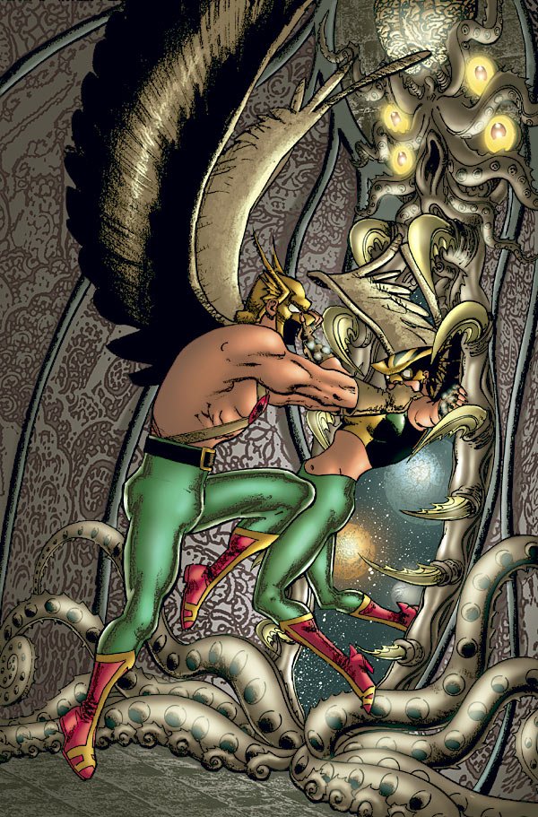
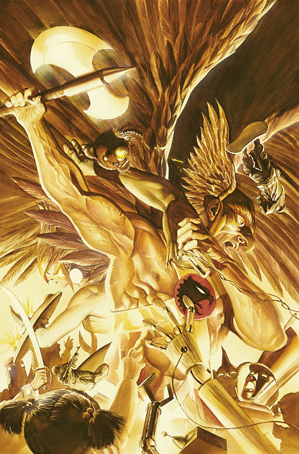
Pretty cool Justice cover by Alex Ross.

Hawkman kicks ass.
___________________________________________________
When your costume redesign is as bad as Al Barrionuevo's Martian Manhunter one, choosing a cover like this is smart.

Good move by Barrionuevo.
___________________________________________________
That is one wacky-ass The Next cover.

___________________________________________________
They have to stop doing covers where sucky Outsider members are threatened!

Because I invariably end up hoping the cover comes true!!
___________________________________________________
Karl Kerschl rules, but I'm not thrilled by this Secret Six cover.

Not his best work.
___________________________________________________
Pretty nifty idea for the Supergirl and the Legion of Superheroes cover by Barry Kitson.

He's been having quite a few nifty cover ideas lately.
___________________________________________________
Ooooh...while he did well on the JLA Classified cover, I think Howard Porter screwed the pooch here.

That's a pretty nasty Trials of Shazam cover.
___________________________________________________
Nice Teen Titans cover IDEA by Tony Daniel.

Execution is a bit off, though.
___________________________________________________
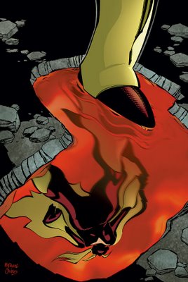
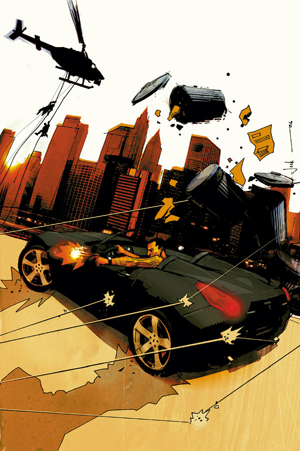
If the car symbolizes my interest in OMAC the series...

then this cover works.
___________________________________________________
Not the most unbland Shadowpact cover by Steve Scott.
___________________________________________________
Pretty interesting Warlord cover from Bart Sears.

___________________________________________________
Phew!

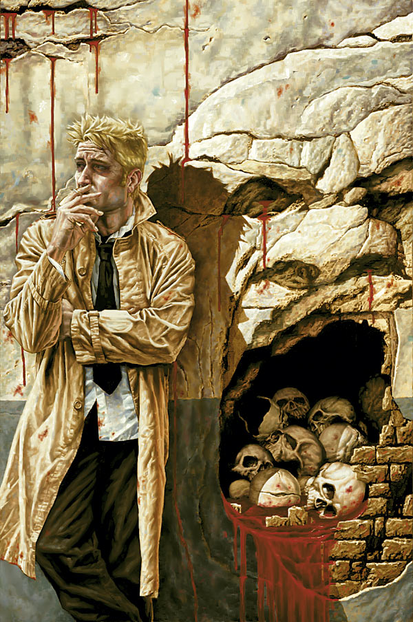
When an old man opens his long trenchcoat like that, I have post traumatic stress to that time when...no...never mind that.
___________________________________________________
I don't get it.

All-New Wonder Woman?
But, uhmm...how is that NOT the old Wonder Woman?
Am I missing something?
Or are the Dodsons just drawing the new Wonder Woman the same way as the old Wonder Woman?
___________________________________________________
VERY interesting Batman Strikes cover from Dave McCaig.

The "reflection in the goggles" thing is an old trick, but reflecting DIFFERENT things, depending on where the goggles are situated?
VERY clever!
___________________________________________________
Ty Templeton knows what makes for good covers.

This Justice League Unlimited cover shows.
___________________________________________________
Sean Galloway, on the other hand, screws the pooch a bit.

Too bland of a Teen Titans Go cover for such a neat concept.
___________________________________________________
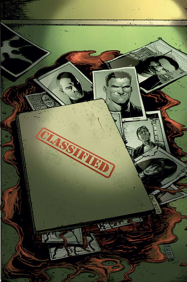
TIME TO RACK UP SOME COOL POINTS!

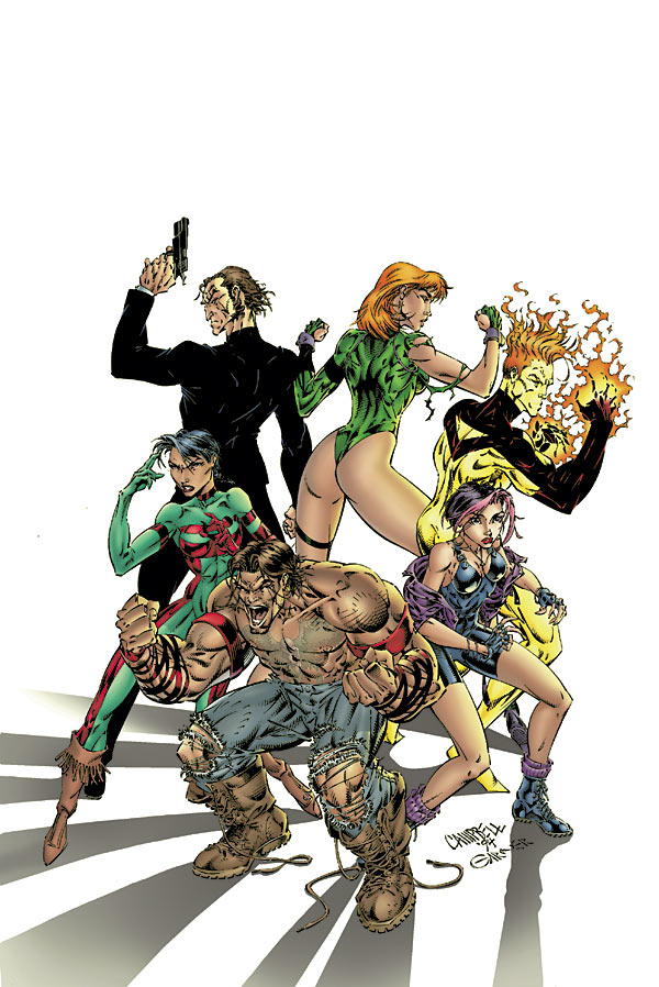
One cool point for every cover (one cool point PER cover, first come, first serve) of a #1 issue that has files of people on the cover like this The Boys #2 issue.
___________________________________________________
#1 of The Boys isn't much more original.

Darick Robertson's a great artist, though.
Oh, Garth Ennis? "Out-Preacher Preacher?"
What does that even MEAN?!?
___________________________________________________
Nice Georges Jeanty drawing for The American Way.

Put fairly bland for a cover.
___________________________________________________
NEWSPAPER COVERS!
First, a GREAT one (Honorable Mention for Top 5) from Dave Gibbons for Action Comics.

High-larious cover.
___________________________________________________
Next, a fairly bland one from Tony Harris for Ex Machina.
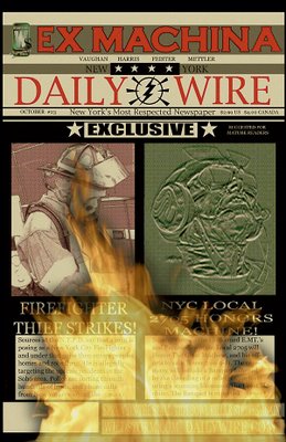
Just HAVING a newspaper cover isn't enough of an idea!
___________________________________________________
That's a pretty neat Gen13 cover from J. Scott Campbell.

That book was fun once, wasn't it?
___________________________________________________
Glenn Fabry sure can draw animals!

Nice Kev cover.
___________________________________________________
This Nick Bradshaw cover for Rokkin is a bit too busy for my tastes.

___________________________________________________
Dustin Nguyen does a nice job of making this Manifest Eternity cover look appealing.
I hope Scott Lobdell gives him a nice story to draw.
___________________________________________________
I love John Paul-Leon's work.

I might be being too hard on this cover because Winter Men is just frustrating me, but anyway, this cover seemed boring.
___________________________________________________
JAMES JEAN COVERS!
___________________________________________________
Two good covers, with excellent drawings. Neither seem grand enough to be GREAT covers, though. Still, good work.


___________________________________________________
Garry Leach can draw the hell out of fighter planes!
As you can see on this Battler Britton cover.
___________________________________________________
I like John Watkiss.
This Deadman cover is pretty intriguing. Good layout.
___________________________________________________
Haha!

Nice Joshua Middleton cover for American Virgin.
Very clever.
___________________________________________________
This Chaykin cover for Bite Club reminds me of how experienced Chaykin is.
HE knows what will and will not work as a cover. Impressive.
___________________________________________________
Very nice Brian Wood cover for DMZ.

I like the tagline idea - nice touch.
___________________________________________________
I'm not feeling this Liam Sharp cover for Testament.
___________________________________________________
Great Massimo Carnevale cover for Y The Last Man.

VERY dynamic.
___________________________________________________
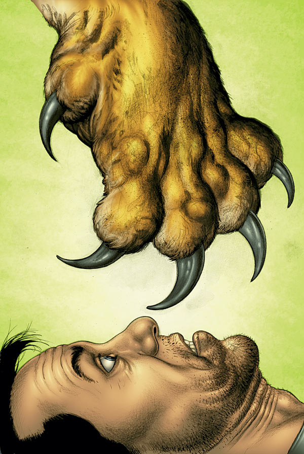
Man.
Claw?

Seriously?
WHY CLAW?!?!
___________________________________________________
HONORABLE MENTIONS!!
___________________________________________________
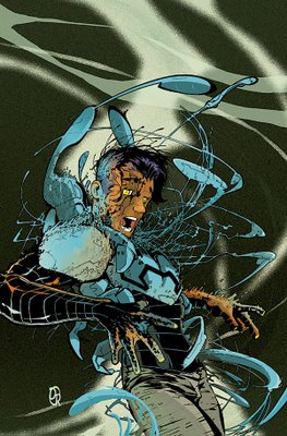
GREAT Creeper drawing by Justiano.

Just well done.
Not exactly a great cover, though.
___________________________________________________
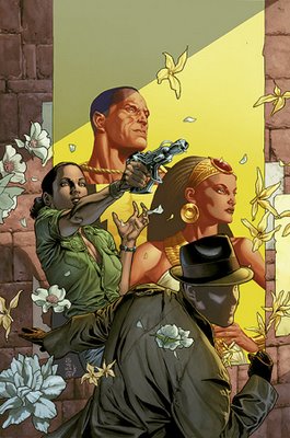
Jock covers rule!

Rush City sounds cool!
___________________________________________________
Very nice Niko Henrichon cover for Pride of Baghdad.
VERY inviting cover.
___________________________________________________
There is a reason Dave Johnson is a cover king.
It's because he has too much work outside of comics, so he can only do covers.
The OTHER reason, though, is that he has an amazing design sense (hence the loads of work outside of comics).
___________________________________________________
Marcelo Frusin's covers have been a continual high point of Loveless.

___________________________________________________
Excellent Lee Bermejo drawing for Hellblazer.

If it weren't for the fact that this cover could fit on almost ANY issue of Hellblazer, I'd have it in the top five.
___________________________________________________
TOP FIVE COVERS!!
___________________________________________________
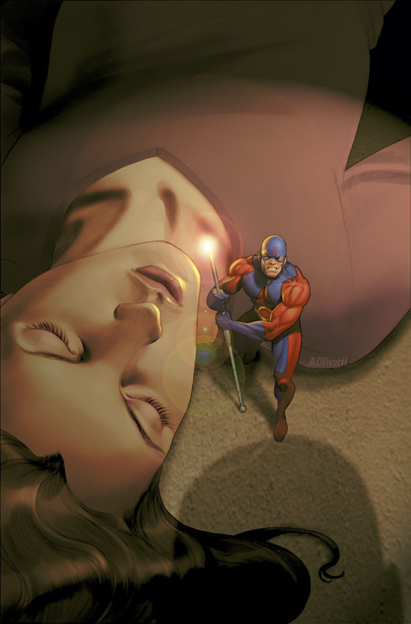
5. Just a striking Legends of the Dark Knight cover by Ariel Olivetti.
It's like the poster for a kickass Batman movie.
Awesome job.
___________________________________________________
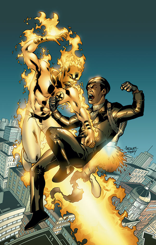
4. I know the idea of a bunch of "back from the dead" heroes trying to ressurect Sue Dibney is both creepy AND dorky.
But damned if JG Jones doesn't make it look pretty damn cool on this 52 cover.
___________________________________________________
3. Matt Wagner takes his turn at drawing an awesome poster for a Batman movie.

He does an even better job than Olivetti on this Batman and the Mad Monk cover.
___________________________________________________
2. I MAY have this cover so high because it's the last issue of Solo.

Or Brendan McCarthy might be THAT awesome.
You decide!
___________________________________________________
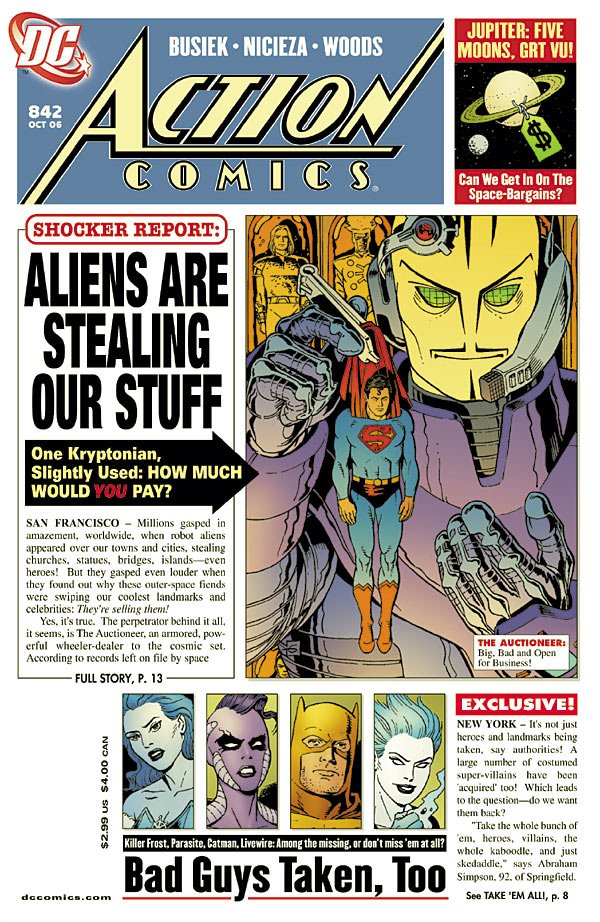
1. What a GREAT visual for 52 by JG Jones!
He HAS to be homaging this image! 5 cool points to the person who can find a drawing/photo that inspired this cover.
If there ISN'T...then, well, damned fine work by JG Jones.
Especially the way he work so many ensemble members into the cover of an ensemble work.
___________________________________________________
Okay, that's it for me, folks!
Feel free to share YOUR prejudices (and YOUR top five)!!
Let's begin!
___________________________________________________
Jock is incapable of drawing a bad cover.
This comes pretty close, though.
___________________________________________________
I LIKE the idea of giving Son of the Demon a new printing.
I DON'T like the idea of having Andy Kubert draw a bland cover for the new printing.
What, Jerry Bingham doesn't have a website where you could easily reach him?
Wait?
What's that?
Jerry Bingham HAS a website where you could easily reach him?
Said website is even CALLED jerrybingham.com?!!?
Funny that.
(Don't mind me, as I'm totally full of crap, as my big problem with the cover is not not asking Jerry Bingham, so much as not asking Jerry Bingham in favor of using such a bland cover - this was Quitely? You wouldn't hear a peep from me)
___________________________________________________
Dammit...Andy Kubert even managed to foul up an image as awesome as a whole pile of ninga bats fighting Batman.
Imagine if Kubert drew We3.
No, don't imagine that!!
Too horrific.
___________________________________________________
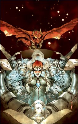
I love me some Simone Bianchi.
However...

A. At some point, too much detail is kinda creepy
and
B. Batman looks waaaaaay too smooth there.
What is he, made out of porcelin?!
___________________________________________________
Wait, HUSH is in Man-Bat, TOO?!?!
Where do I sign up?!!?

Cool Huddleston cover, though.
___________________________________________________
Adam Hughes seems like he rushed this cover a bit.

Not on Zatanna, though, just the faces on the wheel.
___________________________________________________
Neat Pachecho cover for Superman.
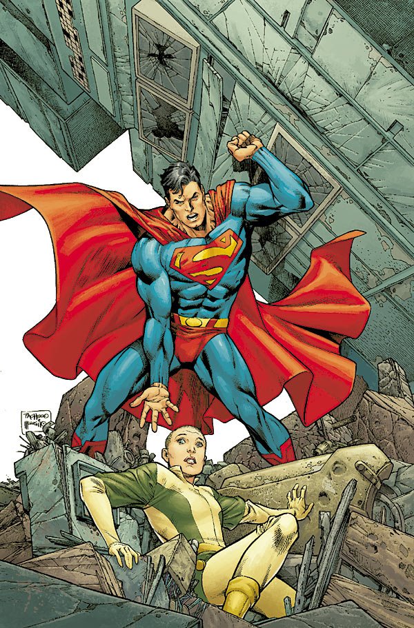
I didn't know the underwear-on-the-outside had the belt loops on it - looks kinda funny, no?
___________________________________________________
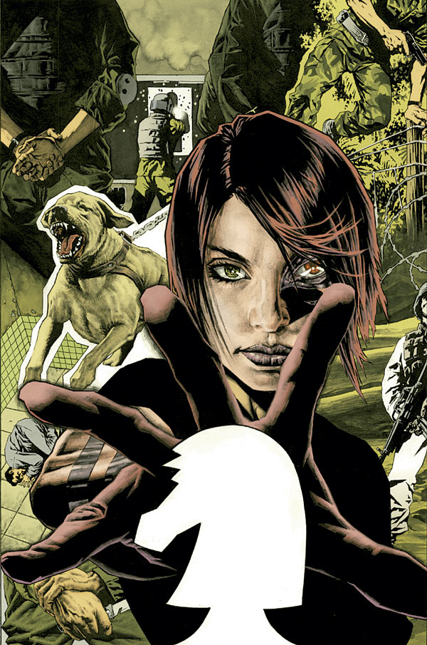
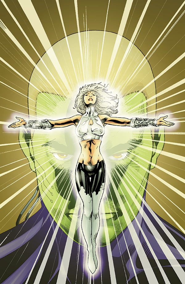
That is officially the creepiest cape drawing ever.

We see her asscrack THROUGH THE CAPE!!
No WONDER she's crying.
___________________________________________________
Good lord, I spoke too soon!
NEW WINNER for creepiest cape drawing!
That's how you draw, like, Man-Bat's wings or something.
___________________________________________________
I don't get this drawing.
Unless the All-New Atom has a power staff.
___________________________________________________
I love Jerry Ordway.
I'm pleased as punch to hear that he has an exclusive contract (RENEWED!) with DC.

But damned if that isn't a bland cover. Nice drawing, but while I get the Silver Age-y feel he's going for there, it just isn't bold enough.
___________________________________________________
Another dynamic Duncan Rouleau cover!
___________________________________________________
That is a WEIRD Checkmate collage.
And, shouldn't Lee Bermejo, on a Lee Bermejo cover, be responsible for more than, like, 10% of the cover?
Way too much of that cover looked like stock footage, as it were.
___________________________________________________
That's not actually the cover, right?

So I don't know why that was given to us.
___________________________________________________
Not a bad Flash cover.

Is that supposed to be the Piper?
___________________________________________________
Very nice abstract-y cover for Green Arrow by McDaniel.

Impressive work.
___________________________________________________
52 COVERS!
___________________________________________________
1 cool point for each cover that also references this famous Hamlet scene!!

___________________________________________________
Decent cover, but a bit too generic.

___________________________________________________
Man...that is a weird Lobo revamp.
___________________________________________________
PATRICK GLEASON COVERS!!
First, an example of how to do an action-packed cover...

Next, an example of how to draw a sputtering action cover without much coherence.
___________________________________________________
Well then.
At least Chaykin is equal opportunity with the whole "creepy drawings of people's naughty bits" thing.
___________________________________________________
KID AMAZO!
YAY!

I thought we had lost you forever!!
Not a bad job by Porter on the cover, at all!
Did he originally work on Kid Amazo, or is this the first we're seeing from him on the project?
___________________________________________________
Not a bad Phil Noto cover.

However, you shouldn't have to be TOLD it's a Jonah Hex cover to know that it is a Jonah Hex cover.
___________________________________________________
Decent Ed Benes cover.
Splitting the covers up to an A and a B version is smart marketing by DC.
Although, if the split is done down the middle, I think two black heroes will get cut in half.
Such racism from DC.
___________________________________________________
Wow.
That's a pretty sloppy Ion cover from Kalman Andrasofszky.
___________________________________________________
NOW I see the Ordway in the cover!
Neat-o JSA Classified covers.
___________________________________________________
Isn't it funny how, originally on Manhunter, Jae Lee was the famous artist doing the covers while the less-famous Jesus Saiz did interiors, and now Saiz is the famous artist doing the covers.
Nice touch.
Too bad to see this go. I wonder if the end of her SOLO career means a relaunch, or just her joining a team, like the JLA or Outsiders.
___________________________________________________
Pretty cool Justice cover by Alex Ross.
Hawkman kicks ass.
___________________________________________________
When your costume redesign is as bad as Al Barrionuevo's Martian Manhunter one, choosing a cover like this is smart.
Good move by Barrionuevo.
___________________________________________________
That is one wacky-ass The Next cover.

___________________________________________________
They have to stop doing covers where sucky Outsider members are threatened!
Because I invariably end up hoping the cover comes true!!
___________________________________________________
Karl Kerschl rules, but I'm not thrilled by this Secret Six cover.

Not his best work.
___________________________________________________
Pretty nifty idea for the Supergirl and the Legion of Superheroes cover by Barry Kitson.
He's been having quite a few nifty cover ideas lately.
___________________________________________________
Ooooh...while he did well on the JLA Classified cover, I think Howard Porter screwed the pooch here.

That's a pretty nasty Trials of Shazam cover.
___________________________________________________
Nice Teen Titans cover IDEA by Tony Daniel.

Execution is a bit off, though.
___________________________________________________
If the car symbolizes my interest in OMAC the series...

then this cover works.
___________________________________________________
Not the most unbland Shadowpact cover by Steve Scott.

___________________________________________________
Pretty interesting Warlord cover from Bart Sears.
___________________________________________________
Phew!

When an old man opens his long trenchcoat like that, I have post traumatic stress to that time when...no...never mind that.
___________________________________________________
I don't get it.
All-New Wonder Woman?
But, uhmm...how is that NOT the old Wonder Woman?
Am I missing something?
Or are the Dodsons just drawing the new Wonder Woman the same way as the old Wonder Woman?
___________________________________________________
VERY interesting Batman Strikes cover from Dave McCaig.

The "reflection in the goggles" thing is an old trick, but reflecting DIFFERENT things, depending on where the goggles are situated?
VERY clever!
___________________________________________________
Ty Templeton knows what makes for good covers.
This Justice League Unlimited cover shows.
___________________________________________________
Sean Galloway, on the other hand, screws the pooch a bit.
Too bland of a Teen Titans Go cover for such a neat concept.
___________________________________________________
TIME TO RACK UP SOME COOL POINTS!
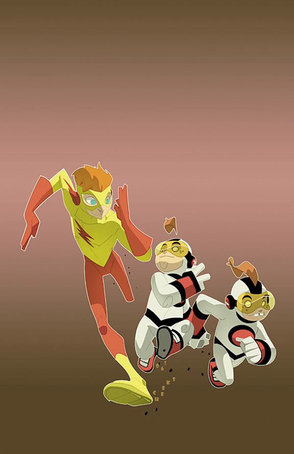
One cool point for every cover (one cool point PER cover, first come, first serve) of a #1 issue that has files of people on the cover like this The Boys #2 issue.
___________________________________________________
#1 of The Boys isn't much more original.

Darick Robertson's a great artist, though.
Oh, Garth Ennis? "Out-Preacher Preacher?"
What does that even MEAN?!?
___________________________________________________
Nice Georges Jeanty drawing for The American Way.
Put fairly bland for a cover.
___________________________________________________
NEWSPAPER COVERS!
First, a GREAT one (Honorable Mention for Top 5) from Dave Gibbons for Action Comics.
High-larious cover.
___________________________________________________
Next, a fairly bland one from Tony Harris for Ex Machina.

Just HAVING a newspaper cover isn't enough of an idea!
___________________________________________________
That's a pretty neat Gen13 cover from J. Scott Campbell.
That book was fun once, wasn't it?
___________________________________________________
Glenn Fabry sure can draw animals!
Nice Kev cover.
___________________________________________________
This Nick Bradshaw cover for Rokkin is a bit too busy for my tastes.
___________________________________________________
Dustin Nguyen does a nice job of making this Manifest Eternity cover look appealing.

I hope Scott Lobdell gives him a nice story to draw.
___________________________________________________
I love John Paul-Leon's work.
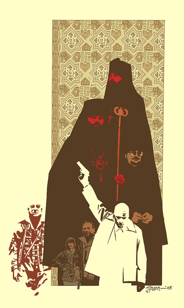
I might be being too hard on this cover because Winter Men is just frustrating me, but anyway, this cover seemed boring.
___________________________________________________
JAMES JEAN COVERS!
___________________________________________________
Two good covers, with excellent drawings. Neither seem grand enough to be GREAT covers, though. Still, good work.
___________________________________________________
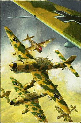
Garry Leach can draw the hell out of fighter planes!

As you can see on this Battler Britton cover.
___________________________________________________
I like John Watkiss.
This Deadman cover is pretty intriguing. Good layout.
___________________________________________________
Haha!

Nice Joshua Middleton cover for American Virgin.
Very clever.
___________________________________________________
This Chaykin cover for Bite Club reminds me of how experienced Chaykin is.
HE knows what will and will not work as a cover. Impressive.
___________________________________________________
Very nice Brian Wood cover for DMZ.
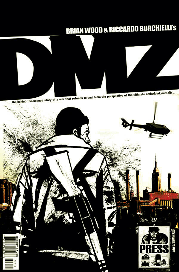
I like the tagline idea - nice touch.
___________________________________________________
I'm not feeling this Liam Sharp cover for Testament.

___________________________________________________
Great Massimo Carnevale cover for Y The Last Man.
VERY dynamic.
___________________________________________________
Man.
Claw?

Seriously?
WHY CLAW?!?!
___________________________________________________
HONORABLE MENTIONS!!
___________________________________________________
GREAT Creeper drawing by Justiano.
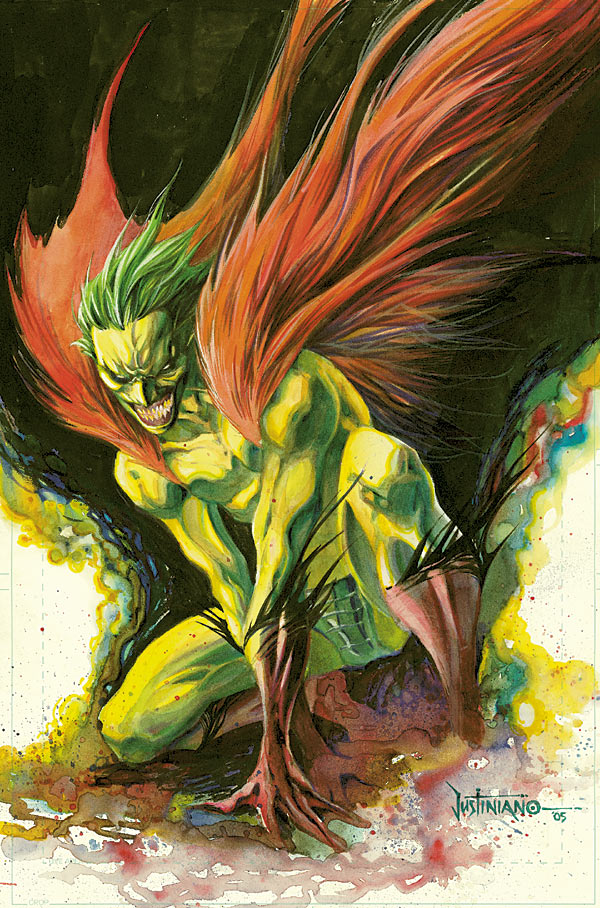
Just well done.
Not exactly a great cover, though.
___________________________________________________
Jock covers rule!
Rush City sounds cool!
___________________________________________________
Very nice Niko Henrichon cover for Pride of Baghdad.
VERY inviting cover.
___________________________________________________
There is a reason Dave Johnson is a cover king.

It's because he has too much work outside of comics, so he can only do covers.
The OTHER reason, though, is that he has an amazing design sense (hence the loads of work outside of comics).
___________________________________________________
Marcelo Frusin's covers have been a continual high point of Loveless.

___________________________________________________
Excellent Lee Bermejo drawing for Hellblazer.
If it weren't for the fact that this cover could fit on almost ANY issue of Hellblazer, I'd have it in the top five.
___________________________________________________
TOP FIVE COVERS!!
___________________________________________________
5. Just a striking Legends of the Dark Knight cover by Ariel Olivetti.

It's like the poster for a kickass Batman movie.
Awesome job.
___________________________________________________
4. I know the idea of a bunch of "back from the dead" heroes trying to ressurect Sue Dibney is both creepy AND dorky.
But damned if JG Jones doesn't make it look pretty damn cool on this 52 cover.
___________________________________________________
3. Matt Wagner takes his turn at drawing an awesome poster for a Batman movie.
He does an even better job than Olivetti on this Batman and the Mad Monk cover.
___________________________________________________
2. I MAY have this cover so high because it's the last issue of Solo.

Or Brendan McCarthy might be THAT awesome.
You decide!
___________________________________________________
1. What a GREAT visual for 52 by JG Jones!

He HAS to be homaging this image! 5 cool points to the person who can find a drawing/photo that inspired this cover.
If there ISN'T...then, well, damned fine work by JG Jones.
Especially the way he work so many ensemble members into the cover of an ensemble work.
___________________________________________________
Okay, that's it for me, folks!
Feel free to share YOUR prejudices (and YOUR top five)!!
posted by Brian Cronin at 5/16/2006 05:33:00 AM
![]()


41 Comments:
Why Claw? 'Cause he's unconquerable.
At least Chaykin is equal opportunity with the whole "creepy drawings of people's naughty bits" thing.
If that's so, then why are Hawkman and Hawkgirl fighting inside a giant alien vagina?
That American Virgin cover reminds me of a Duncan Fegredo cover, it must be something about the composition.
Oh, Garth Ennis? "Out-Preacher Preacher?"
What does that even MEAN?!?
I take that to mean that Mr. Ennis recognizes Preacher's most vital and salient contributions to graphic literature - gore, fat guys, and rape jokes - and promises us more to come.
I'm thinking that Lobo there has a lot in common with Zodiac Mindwarp, late 80s weird metal KLF aligned self-styled messiah of love.
Ordway's Birds of Prey cover needs two things:
A different angle - Black Alice should be bigger as she's the focal point and...
A word balloon - to really get the Silver Age vibe going, your characters should be saying something on the cover - villains taunting heroes, heroes in shocked disbelief, supporting cast members telling the hero to stay back or they'll explode - things like that.
This comment has been removed by a blog administrator.
agreed that 52 cover is awesome.
+
i really like the Detective comics cover for the speed lines and the utility belt. Someone really wants a black and white statue made...speaking of which that paul pope black and white statue is now my wallpaper. not a fan of the proportions of his head though, it'l like kelly jones, but kelly jones doesn't work quite as well with realism.
i didn't even realise that supergirl was an ASS reference til i read the cover...poor effort.
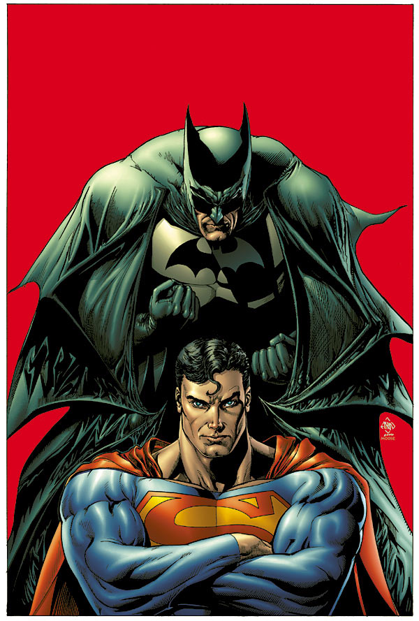
Superman looks like he's got a cold in the superman/batman cover, it's sorta gross
Another "files of people" cover is Wonder Woman #240, sort of.
I really like that Wagner cover, but can it be in the Top 5 when it's an homage? It's not his idea, after all.
Hey, Wagner's Bat-cover sort of reminds me of this:
http://www.comiccollectors.net/g_Med/DetectiveComics-31-2.5-DET.jpg
Coincidence?
I think not!
The Bianchi Batman cover is so muddled that when I saw a smaller version of it at CBR I thought it looked like Batman was kissing Catwoman or something.
Is it just me or does Steel's "S" on that 52 cover look like it's based on the movie version?
that gen 13 cover just looks like a paste-together job of old gen 13 images - i haven't even laid eyes on any of campbell's work since the early days of image and those poses just jumped right back out at me from my memory. that's pretty lame if you ask me at any rate...
The Action cover wins it for me.
For a scientist, the All-New Atom sure has some huge arms.
I believe that's Dr. Alchemy (or some variation of him) on that Flash cover.
And for the life of me I can't remember where I've seen that image for the 52 cover with the Question on it. Sure does look familiar though.
that gen 13 cover just looks like a paste-together job of old gen 13 images
It's actually the cover of issue 5 of the original mini. It took me years to sell off that thing.
One cool point for every cover (one cool point PER cover, first come, first serve) of a #1 issue that has files of people on the cover like this The Boys #1 issue.
Specifically like that one or ones like Justice League and Justice League Europe #1 too?
jer: I think word balloons may be left off these preview covers along with captions and the actual title and such- I'm not sure, and this doesn't mean there'll be one. I wouldn't be too surprised to see it, though.
I also dig Atom's Q-Tip of Doom.
Another "files" cover I recall is Untold Tales of the Batman 2.
We see her asscrack THROUGH THE CAPE!!
In space, no one can see you scratch your crack.
I think it's our fault, actually. Clearly we've interrupted Supergirl in the middle of her business, and she's crying because she's embarassed that she didn't think to bring toilet paper into space. Cousin Kal will be so mad, indestructible poo is impossible to get out of indestructible cape fabric.
"Splitting the covers up to an A and a B version is smart marketing by DC.
Although, if the split is done down the middle, I think two black heroes will get cut in half."
Nope. I checked. The dividing line for the two covers falls right along the left edge of Hawkman's wing, so Cyborg ends up on cover #1 and John Stewart ends up on Cover #2.
Nobody gets cut in half.
I think that's supposed to be Dr. Alchemy on the Flash cover, Brian.
My monitor = not so great, so could someone verify for me that on that Teen Titans cover, Beast Boy is doing a Nightcrawler riff?
Aand while I'm at it, on that Jones 52 cover, who is that other guy? I see Green Lantern and Green Arrow (who is given an extra identifier, like we wouldn't know who the forked goatee belongs to) and Zauriel (although I don't remember when he was dead), but who's the guy gesturing? Man my monitor is apparently pretty low-rez. How embarassing.
Winter Men? Frustrating? What could possibly be frustrating about a GREAT comic that starts, gets 2 monthly issues in a row, then goes bimonthly - then all solicits cancelled - then resolicted quarterly, one issue at a time - then shortened from 8 issues to 6 - then quarterly to biannually - then lengthened back to 8 issues on god-knows-what schedule?
I mean, don't you think we're being a little demanding as fans to wish that DC/WildStorm might actually communicate what's going on with this title and try to schedule it regularly? Damned good thing that I love this title, or I wouldn't bother...
-- Mo
"Aand while I'm at it, on that Jones 52 cover, who is that other guy?"
I believe that's Metamorpho.
Michael Turner's cover for the new Justice League has the same "faces staring down" thing that The Boys does. But it's a ZERO issue. But that has to count. I want COOL POINTS!!!!!
Brian, you praise Hester for being great yet somehow turn around and call Kubert bland? Put down the Bizarro pipe, Kubert kicks ass baby!!
If that's not the actual Firestorm cover, I'm guessing it's because the real one has a major spoiler for the preceding issue.
Why on earth does Vixen still have her Bo Derek meets Grace Jones look? It's so dated, you'd think they'd have used the JLU look by now.
Is that a lightning bolt striking Shazam there or are the gods giving him a golden shower? Badly drawn cover by Porter there.
Amazing Spider-Man did a Hamlet Homage in ASM #347.
Why do Hawkman's legs look like lumpy oatmeal poured into tights.
Porter knocked it out of the park in the Kid Amazo cover!
"Splitting the covers up to an A and a B version is smart marketing by DC.
Although, if the split is done down the middle, I think two black heroes will get cut in half."
Three if you count the Manhattan Guradian
Your number one cover doesn't even make the Question look awesome.
The Question is one of the top five great superhero designs ever.
Any cover with the Question on it that doesn't make him look awesome is automatically pretty "eh." Those are the rules.
"Specifically like that one or ones like Justice League and Justice League Europe #1 too?"
The cover has to have files on people on the cover, as if people were looking through the characters.
Like the cover of Vigilante #1 from last year, which was a drawing of a police report file on the Vigilante.
"Nope. I checked. The dividing line for the two covers falls right along the left edge of Hawkman's wing, so Cyborg ends up on cover #1 and John Stewart ends up on Cover #2.
Nobody gets cut in half."
Thanks, Jim!
Good to hear!
Oh, I see. You said that we should list a cover that has files on it, like the cover of issue #2, but you put it with the cover of issue #1, which has the group looking down, like in the example I gave. I still should win, because I'm just generally cooler than you are.
0802jejenew balance femme grise et rose Un autre site officiel air jordan france inconvénient des matchs est que vous finirez par soldes new balance femme running utiliser la moitié de la boîte si chaussure de basketball air jordan vous voulez obtenir une bonne lumière. Nigo, air jordan pour femme pas cher le créateur de Bapes, a présenté des nike air max thea premium beige femme artistes hollywoodiens d'Amérique dans les attributs nike air max 1 blanc pas cher de catalogue et les publicités de Bathing Ape.
www0905
coach outlet online
christian louboutin shoes
coach outlet
canada goose jackets
ugg boots clearance
moncler outlet
red bottoms
tory burch outlet
adidas outlet
pandora charms outlet
Hi there, yeah this post is truly nice.
I have learned lot of things from it about blogging. thanks.
Carry on the fantastic work!
Good article Very thank ful Cheers! Excellent writing goodjob
Definitely a good blog, Thank you for sharing. Keep on blogging
Very good written information. Keep up the good work. Thanks
Awesome updates! Continue blogging Hoping to your next post here.
It consists of great deal of info. Many thanks for sharing this effective work!!
Post a Comment
<< Home