Judging (DC's June) Books By Their Covers
DC's June Solicitations are up, so now is as good a time as any for us to make prejudgements based just on the covers (as we all love to make prejudgements, don't we? And DC's covers are at least detailed enough that we CAN make prejudgements based on them!).
Let's begin!
___________________________________________________
I love Simone Bianchi and all...

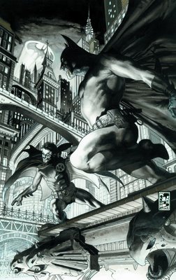

But it's getting kinda monotonous, no?
___________________________________________________
This is certainly a different approach by Adam Hughes.

I like it.
___________________________________________________
Jock is incapable of drawing a bad cover.

I think I will get that tatooed somewhere.
___________________________________________________
I like Patrick Gleason, but this cover looks way too busy.

Unless it will look better in color, maybe?
___________________________________________________
Mike Huddleston is a great artist.

I'd like to see him on something better than Man-Bat, though.
___________________________________________________
My theory is that Lee spent all his time making the Joker look kinda decent that he forgot he needed to draw more.

Yikes, that is one piss-poor background.
___________________________________________________
Sam Kieth has been breaking out some interesting covers for this series so far.

___________________________________________________
I cannot believe how dorky that crystal-monster looks.

Yikes.
___________________________________________________
So dorky, it's even dorkier than this Action Comics cover!!

___________________________________________________
Well, this Superman/Batman cover will certainly draw attention...whether it be the right kind or the wrong kind.

Also, Kevin Maguire is drawing the interiors, but you don't let him do the covers?!?
___________________________________________________
Hal is lucky, he doesn't have a girlfriend at the moment.

But, just to be on the safe side, Carol Ferris should stay away from any refrigerators.
___________________________________________________
This WAS a cool cover...until you see the Spectre's goatee.

LAME!!
___________________________________________________
Look!

Even Wonder Woman is embarrased by this cover!!
___________________________________________________
52 JG JONES COVERS!!
I hope these foreign heroes will be as popular as all the Planet DC characters!

Wait, what am I saying?!?! That's impossible!!
This is a pretty boring cover, considering the previous Booster Gold cover.

This cover make me want to look for the Union label.

___________________________________________________
John Cassaday ruined a lot of artist's good time when he added the detailed chainmail on Captain America's costume.

___________________________________________________
It's kinda cool that Oracle is now so well-known that just her symbol is enough.

Congrats, Kim Yale and John Ostrander, on a job well done!
___________________________________________________
Strong, if not a bit by rote, cover from Byrne.

___________________________________________________
BRIAN HURTT COVERS!!
I love Brian Hurtt so much.
However, this Birds of Prey cover is pretty weak.

Luckily, this Hard Time cover is so awesome that the average score of the two covers is still good.

___________________________________________________
ARIEL OLIVETTI COVERS!!
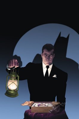
First, a really strong one from Legends of the Dark Knight. How can you NOT want to read this comic after seeing a cover like that?
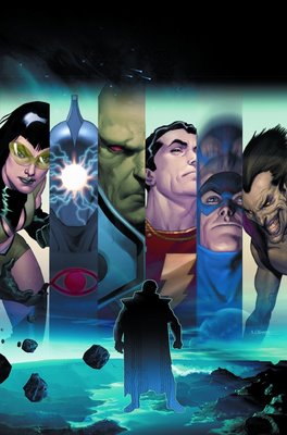
Next, a less awesome, but still strong cover for DC's new 99 cent comic book, Brave New World...
___________________________________________________
This reminds me of the only non-dreadful Michael Turner Flash covers.

___________________________________________________
Mojo appearing would make ANY cover better, don't you think??

___________________________________________________
Man, Checkmate sure looks like a cool movie, no?

___________________________________________________
Strong work by Stelfreeze for Firestorm...

But I think it may be a bit much for a book like Firestorm.
___________________________________________________
McDaniel has been, overall, impressing me with his cover layouts for Green Arrow.
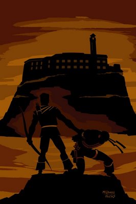
This is another good one.
___________________________________________________
Gibbons writing.
Gleason drawing.

And no Geoff Johns anywhere to be seen?
Green Lantern Corps should be good.
___________________________________________________
What is there to be said for this Justice cover?

Anyone? Any opinions? I can't muster up anything here. Help me out.
___________________________________________________
Who is David Michael Beck?

His Jonah Hex cover is good and all, but I can't figure out why I'm supposed to know the name.
___________________________________________________
You gotta admit, these covers are clever!

RIGHT out of 1984!
Still can't believe that's Mike Zeck and not Val Semeiks.
___________________________________________________
Well, we can at least scratch off "the coloring" from possible reasons why Paul Gulacy's art isn't that great anymore.

___________________________________________________
I think a problem with this piece is that we have seen Kingdom Come pieces for sooo many years that I think we have lost a little bit of the majesty of the whole thing.

___________________________________________________
What else has Stephane Roux done?
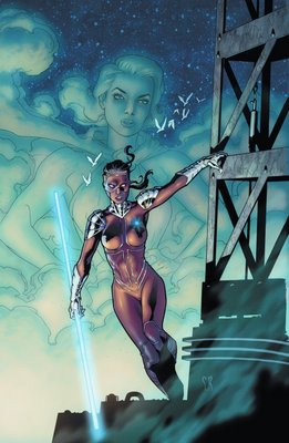
I enjoyed Roux's work on this Manhunter cover a lot.
___________________________________________________
I love how later writers sometimes just latch on to an idea an earlier writer did, and harp on it well after that writer left.

___________________________________________________
That's one badass Secret Six cover by Karl Kerschl.

How come he isn't drawing Robin like it was said at first?
___________________________________________________
At least from the covers, Shadowpact looks like a fun book.

___________________________________________________
Now, a Sergio Aragonés SOLO, we KNOW will be fun!

Very nice cover.
___________________________________________________
Ha!

Very clever cover concept from Barry Kitson!!
___________________________________________________
Can you believe this is Doug Mahnke?

Must have been fun for him to mess with his style to make it look different.
___________________________________________________

...Huh?! Wha?!? Oh, man, sorry about that. This Teen Titans cover must have put me to sleep.
___________________________________________________
This is a nice surprise! DC rarely does new covers for their trade collections of ongoing titles.

How is Jerome Moore a fan-favorite, by the way? I remember he once drew an issue of Valor, and the promo for it was "art by fan-favorite, Jerome Moore?" and I remember, at the time, being all, "How can I not be familiar with the guy if he's a fan-favorite?" Is it just from drawing some Star Trek comics?
___________________________________________________
I DO like Bart Sears' new style.
Well, more than his old style, at least.

Too bad Warlord is not that good.
___________________________________________________
Is there a better artist out there than Walt Simonson at drawing old-timey weapons and armor?

I say thee NAY, varlot!
___________________________________________________
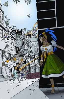
Ty Templeton has impeccable cover layout sense.
___________________________________________________
BEAST BOY SHOULDN'T GNAW AT HER LEG! HE IS A VEGETARIAN!!!
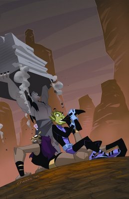
THAT'S IT! I AM GOING TO MAKE DEATH THREATS TO J. TORRES!!!
___________________________________________________
Strong cover by Georges Jeanty of American Way...really draws the reader into the comic.

___________________________________________________
Meanwhile, this Albion cover...does the exact opposite.

___________________________________________________
Is there like, a cover crib sheet out there somewhere or something?

Because it looks like Dustin Nguyen got this Manifest Eternity cover out of a "Standard Cover Designs" book.
___________________________________________________
Isn't, like, the LAST issue a bit of an odd time to first let Giuseppe Camuncoli do the cover of the book?

___________________________________________________
Cool Tony Harris cover for Ex Machina.

___________________________________________________
CRAPPY CLAW COVERS!!
Ain't alliteration awesome?
1.
2.
___________________________________________________
FILL IN COVER ARTISTS ON BOOKS FRANK QUITELY HAD TO STOP DOING COVERS FOR BECAUSE HE WAS SO FAR BEHIND ON ALL STAR SUPERMAN
1. Joshua Middleton on American Virgin

Middleton does a nice job capturing the sorta vacant stare that makes this cover stand out.
2. Howard Chaykin on Bite Club

Chaykin's cover looks like he pencilled it in 10 minutes, but I think it is forceful. Good work.
Both better than Igor Kordey's fill-in work.
___________________________________________________
How cool would it be if Dave Johnson ever drew comics again?
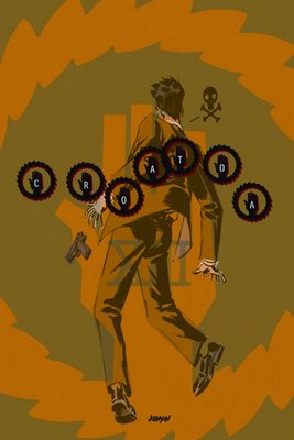
The answer is "very cool," by the way.
___________________________________________________
Some very clever covers from Testament.

___________________________________________________
Frusin's work is often drowned in color, so it is nice to see this Loveless cover in just pencils.

Good stuff.
___________________________________________________
Massimo Carnevale certainly has brought an air of style to his Y the Last Man covers.

___________________________________________________
Great Christopher Moeller cover.

Goodbye, Lucifer, we will miss you!
___________________________________________________
Philip Bond sure knows how to grab the audience's attention, doesn't he?

Funny cover.
___________________________________________________
I think this is one of the stronger DMZ covers so far, and there's been some real good ones (#1 and #4, in particular).

___________________________________________________
TOP FIVE COVERS OF THE MONTH (in another fairly weak month for covers)
___________________________________________________
5. Eric Powell has been doing a steady, excellent job on his Swamp Thing covers since he took the assignment, but generally, there are stronger works in the particular month. The last two months? Not so much.

___________________________________________________
4. Perhaps I am just in awe over no more Lauren and Bradstreet, but this Lee Bermejo Hellblazer cover, I thought, was very good.

___________________________________________________
3. Man, Miller certainly has a flair for the dramatic, doesn't he?

I think it really works on this cover.
___________________________________________________
2. I have long-felt (well, for the last few months, at least, as I have noted here) that James Jean's Fables covers have lost a little impact.
Luckily, with a hint of whimsey, DC avoided that with this, the 50th issue.

___________________________________________________
1. Another artist I've been tough on has been Joe Kubert, as I have not enjoyed the repetitive nature of his Sergeant Rock: The Prophecy covers.
He went in a different direction this month, and man, is it a great cover.

___________________________________________________
Okay, that's it for me, folks!
Feel free to share YOUR prejudices (and YOUR top five)!!
Let's begin!
___________________________________________________
I love Simone Bianchi and all...


But it's getting kinda monotonous, no?
___________________________________________________
This is certainly a different approach by Adam Hughes.

I like it.
___________________________________________________
Jock is incapable of drawing a bad cover.

I think I will get that tatooed somewhere.
___________________________________________________
I like Patrick Gleason, but this cover looks way too busy.

Unless it will look better in color, maybe?
___________________________________________________
Mike Huddleston is a great artist.

I'd like to see him on something better than Man-Bat, though.
___________________________________________________
My theory is that Lee spent all his time making the Joker look kinda decent that he forgot he needed to draw more.

Yikes, that is one piss-poor background.
___________________________________________________
Sam Kieth has been breaking out some interesting covers for this series so far.

___________________________________________________
I cannot believe how dorky that crystal-monster looks.

Yikes.
___________________________________________________
So dorky, it's even dorkier than this Action Comics cover!!

___________________________________________________
Well, this Superman/Batman cover will certainly draw attention...whether it be the right kind or the wrong kind.

Also, Kevin Maguire is drawing the interiors, but you don't let him do the covers?!?
___________________________________________________
Hal is lucky, he doesn't have a girlfriend at the moment.

But, just to be on the safe side, Carol Ferris should stay away from any refrigerators.
___________________________________________________
This WAS a cool cover...until you see the Spectre's goatee.

LAME!!
___________________________________________________
Look!

Even Wonder Woman is embarrased by this cover!!
___________________________________________________
52 JG JONES COVERS!!
I hope these foreign heroes will be as popular as all the Planet DC characters!

Wait, what am I saying?!?! That's impossible!!
This is a pretty boring cover, considering the previous Booster Gold cover.

This cover make me want to look for the Union label.

___________________________________________________
John Cassaday ruined a lot of artist's good time when he added the detailed chainmail on Captain America's costume.

___________________________________________________
It's kinda cool that Oracle is now so well-known that just her symbol is enough.

Congrats, Kim Yale and John Ostrander, on a job well done!
___________________________________________________
Strong, if not a bit by rote, cover from Byrne.

___________________________________________________
BRIAN HURTT COVERS!!
I love Brian Hurtt so much.
However, this Birds of Prey cover is pretty weak.

Luckily, this Hard Time cover is so awesome that the average score of the two covers is still good.

___________________________________________________
ARIEL OLIVETTI COVERS!!
First, a really strong one from Legends of the Dark Knight. How can you NOT want to read this comic after seeing a cover like that?

Next, a less awesome, but still strong cover for DC's new 99 cent comic book, Brave New World...

___________________________________________________
This reminds me of the only non-dreadful Michael Turner Flash covers.

___________________________________________________
Mojo appearing would make ANY cover better, don't you think??

___________________________________________________
Man, Checkmate sure looks like a cool movie, no?

___________________________________________________
Strong work by Stelfreeze for Firestorm...

But I think it may be a bit much for a book like Firestorm.
___________________________________________________
McDaniel has been, overall, impressing me with his cover layouts for Green Arrow.

This is another good one.
___________________________________________________
Gibbons writing.
Gleason drawing.

And no Geoff Johns anywhere to be seen?
Green Lantern Corps should be good.
___________________________________________________
What is there to be said for this Justice cover?

Anyone? Any opinions? I can't muster up anything here. Help me out.
___________________________________________________
Who is David Michael Beck?

His Jonah Hex cover is good and all, but I can't figure out why I'm supposed to know the name.
___________________________________________________
You gotta admit, these covers are clever!

RIGHT out of 1984!
Still can't believe that's Mike Zeck and not Val Semeiks.
___________________________________________________
Well, we can at least scratch off "the coloring" from possible reasons why Paul Gulacy's art isn't that great anymore.

___________________________________________________
I think a problem with this piece is that we have seen Kingdom Come pieces for sooo many years that I think we have lost a little bit of the majesty of the whole thing.

___________________________________________________
What else has Stephane Roux done?

I enjoyed Roux's work on this Manhunter cover a lot.
___________________________________________________
I love how later writers sometimes just latch on to an idea an earlier writer did, and harp on it well after that writer left.

___________________________________________________
That's one badass Secret Six cover by Karl Kerschl.

How come he isn't drawing Robin like it was said at first?
___________________________________________________
At least from the covers, Shadowpact looks like a fun book.

___________________________________________________
Now, a Sergio Aragonés SOLO, we KNOW will be fun!

Very nice cover.
___________________________________________________
Ha!

Very clever cover concept from Barry Kitson!!
___________________________________________________
Can you believe this is Doug Mahnke?

Must have been fun for him to mess with his style to make it look different.
___________________________________________________

...Huh?! Wha?!? Oh, man, sorry about that. This Teen Titans cover must have put me to sleep.
___________________________________________________
This is a nice surprise! DC rarely does new covers for their trade collections of ongoing titles.

How is Jerome Moore a fan-favorite, by the way? I remember he once drew an issue of Valor, and the promo for it was "art by fan-favorite, Jerome Moore?" and I remember, at the time, being all, "How can I not be familiar with the guy if he's a fan-favorite?" Is it just from drawing some Star Trek comics?
___________________________________________________
I DO like Bart Sears' new style.
Well, more than his old style, at least.

Too bad Warlord is not that good.
___________________________________________________
Is there a better artist out there than Walt Simonson at drawing old-timey weapons and armor?

I say thee NAY, varlot!
___________________________________________________
Ty Templeton has impeccable cover layout sense.

___________________________________________________
BEAST BOY SHOULDN'T GNAW AT HER LEG! HE IS A VEGETARIAN!!!

THAT'S IT! I AM GOING TO MAKE DEATH THREATS TO J. TORRES!!!
___________________________________________________
Strong cover by Georges Jeanty of American Way...really draws the reader into the comic.

___________________________________________________
Meanwhile, this Albion cover...does the exact opposite.

___________________________________________________
Is there like, a cover crib sheet out there somewhere or something?

Because it looks like Dustin Nguyen got this Manifest Eternity cover out of a "Standard Cover Designs" book.
___________________________________________________
Isn't, like, the LAST issue a bit of an odd time to first let Giuseppe Camuncoli do the cover of the book?

___________________________________________________
Cool Tony Harris cover for Ex Machina.

___________________________________________________
CRAPPY CLAW COVERS!!
Ain't alliteration awesome?
1.

2.

___________________________________________________
FILL IN COVER ARTISTS ON BOOKS FRANK QUITELY HAD TO STOP DOING COVERS FOR BECAUSE HE WAS SO FAR BEHIND ON ALL STAR SUPERMAN
1. Joshua Middleton on American Virgin

Middleton does a nice job capturing the sorta vacant stare that makes this cover stand out.
2. Howard Chaykin on Bite Club

Chaykin's cover looks like he pencilled it in 10 minutes, but I think it is forceful. Good work.
Both better than Igor Kordey's fill-in work.
___________________________________________________
How cool would it be if Dave Johnson ever drew comics again?

The answer is "very cool," by the way.
___________________________________________________
Some very clever covers from Testament.

___________________________________________________
Frusin's work is often drowned in color, so it is nice to see this Loveless cover in just pencils.

Good stuff.
___________________________________________________
Massimo Carnevale certainly has brought an air of style to his Y the Last Man covers.

___________________________________________________
Great Christopher Moeller cover.

Goodbye, Lucifer, we will miss you!
___________________________________________________
Philip Bond sure knows how to grab the audience's attention, doesn't he?

Funny cover.
___________________________________________________
I think this is one of the stronger DMZ covers so far, and there's been some real good ones (#1 and #4, in particular).

___________________________________________________
TOP FIVE COVERS OF THE MONTH (in another fairly weak month for covers)
___________________________________________________
5. Eric Powell has been doing a steady, excellent job on his Swamp Thing covers since he took the assignment, but generally, there are stronger works in the particular month. The last two months? Not so much.

___________________________________________________
4. Perhaps I am just in awe over no more Lauren and Bradstreet, but this Lee Bermejo Hellblazer cover, I thought, was very good.

___________________________________________________
3. Man, Miller certainly has a flair for the dramatic, doesn't he?

I think it really works on this cover.
___________________________________________________
2. I have long-felt (well, for the last few months, at least, as I have noted here) that James Jean's Fables covers have lost a little impact.
Luckily, with a hint of whimsey, DC avoided that with this, the 50th issue.

___________________________________________________
1. Another artist I've been tough on has been Joe Kubert, as I have not enjoyed the repetitive nature of his Sergeant Rock: The Prophecy covers.
He went in a different direction this month, and man, is it a great cover.

___________________________________________________
Okay, that's it for me, folks!
Feel free to share YOUR prejudices (and YOUR top five)!!
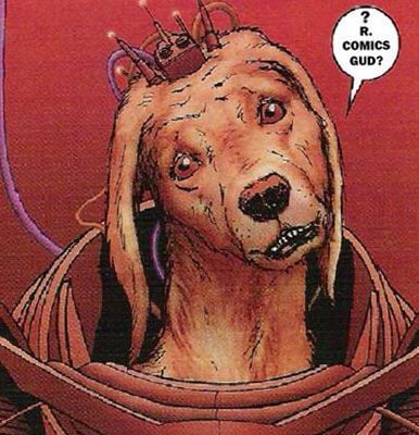


39 Comments:
Oh my God, Catwoman's lost her nose!
Clearly nothing is sacred One Year Later.
are you kidding me with that miller pick? you could almost pick a batgirl at random from the meme list and get a better image.
It's Mogo... Not Mojo.
I belive the Green Lantern sentient planet's name is Mogo, not Mojo.
Way to steal my thunder, Ragnell. Jerk.
I think the Green Lantern planet's name is Mogo, not Mojo.
The colors for the ASBaR are better on the image posted on DC's site.
Batgirl
No more purple.
That IS a lot nicer!
It may have moved up to #2 if I had seen those colors!
The justice cover makes me cringe, just like hearing about a papercut on someones eyeball makes me cringe.
It's "varlet."
I can't believe you think Zeck's work on that JLA Detroit cover looks like Semeiks. Zeck's stuff looks so much better than anything Semeiks could do.
I may not be a fan of ASSBAR, but yeah, that was an...umm...interesting take on Batgirl.
I don't much care for the Swamp Thing cover, as I would have easily placed that great looking Manhunter cover in the top 5.
EVen though I also really liked the Firestorm cover, you hit it dead on that it may be too much for the book.
Although, Mojo *does* make covers better too.
Can't you see it? Detective Chimp vs Mojo Jojo!
i think that seven soldiers cover is JH Williams III, because its the cover of seven soldiers issue 1, Doug Mahnke probably hasn't drawn the trade cover yet, and speaking of which they don't look very good either, especially the Stewart cover for the second trade, which I expected better from.
"I hope these foreign heroes will be as popular as all the Planet DC characters! Wait, what am I saying?!?! That's impossible!!"
I think the more important question is: why is the Sub-Mariner working for China now?
Has anyone ever written a Green Lantern story called "Mister Mogo Risin'?"
Camuncoli did the cover to Captain Atom #6, so niner's not his first.
"I believe he was the artist who did the painted back covers of the early Devil's Due/Image GI JOE run. I want to say he's done some Moonstone work as well."
Yeah that was him, his Moonstone work includes covers for Buckaroo Banzai, Kolchak, and Belle Star.
He's a regular at the local shop and some of the original G.I.Joe works hang there.
Way to steal my thunder, Ragnell. Jerk.
Zard -- I beat you by 4 1/2 minutes.
And you deserve it for attacking the Justice Society.
What's with Miller giving his female characters charm bracelets and dangly earrings? He must have some sort of fetish for jewelry that annoys me in every way.
Yeah, it's definitely JH Williams on that 7 Soldiers. I bet Mahnke didn't draw his cover yet.
That doesn't look a thing like Middleton on Virgin, either. Hmm.
I adore the Monsieur Mallah cover. In fact, it's my new desktop wallpaper.
That Robin cover is a bit busy, but I suspect it'll look better colored, and the concept is fantastic. A POV shot with Robin standing over you pointing a gun to your head? That's good stuff.
Oh, I agree, Patrick. It's a very good concept.
I don't think it is Middleton. It looks like Becky Cloonan to me.
I thought the Middleton call was off too, and now that you mention CLoonan it hits me that you're totally right. I should have realized since I just did a Demo review on my blog yesterday. Oh wait, did I just plug again? Fuck yeah, I did!! ROck on.
Yeah, it does look like the interior artist, Cloonan, but I can also buy a rushed Middleton.
"It wasn't Old-Timey when first drawn, it's just aged in the wait."
Heh. Does anyone know why the Elric book was delayed so long? I don't remember seeing any sort of announcement after the last issue came out. #3 was on the schedule, then it wasn't, and it just disappeared off the radar.
Comment for the Justice cover: It's all fun and games until someone gets an eye poked out.
And in that Robin cover, it looks like he has a water pistol.
This comment has been removed by a blog administrator.
I'm reading and enjoying Justice. Seems like it would be a bit too dour for my taste; I like my superheroes with a heaping side of comedy, but at least Justice avoids drowning us in angst.
But I dunno what the heck is going ON with the Atom cover.
Like, how is the eye reflecting Poison Ivy and not the Atom. It's looking at the Atom! It should be reflecting him! Gah!
That's not Photo-realism! Alex Ross has betrayed me!
'An if that American Virgin isn't Becky Cloonan doin' Paul Pope, it HAS to be Middleton making a purposeful effort to do Becky Cloonan doing Paul Pope.
I agree with a lot of your cover opinions, but sometimes you're a little too harsh.
I loved the Hal Jordan refrigerator comment!
longchamp online shop
under armour curry 3
nike air max 2018
adidas stan smith
cheap jordans
ultra boost 3.0
curry 4
nike roshe run
air max 90
longchamp bags
ugg boots
jordan shoes
oakley sunglasses
polo ralph lauren
coach outlet store online
ralph lauren outlet
michael kors uk
polo ralph lauren
nba jerseys
ray ban sunglasses
atlanta falcons jersey
lacoste outlet
air max 90
james harden shoes
jordan shoes
hermes belt
cheap mlb jerseys
nike dunks
yeezy shoes
links of london sale
cheap ray bans
coach outlet
snapbacks wholesale
louboutin shoes
fitflops sale
cheap nfl jerseys
tennessee titans jersey
ferragamo outlet
carolina panthers jersey
canada goose sale
zzzzz2018.4.28
chiefs jersey
canada goose outlet
detroit lions jerseys
bears jerseys
los angeles lakers jerseys
converse shoes
canada goose jackets
canada goose jackets
ray ban sunglasses
michael kors outlet online
0802jejeair jordan pas cher grossiste Pendant new balance basket bleu femme que je naviguais au moyen d'Internet, j'ai trouvé que vous trouverez une vente nike air max 1 femme noir et blanc de liquidation finale, où ils voient de new balance femme blanche et bleu nombreux accessoires pour chiens. Athena Nike vient à Air Jordan 2 soldes exister avec le but d'exprimer les ambitions nike femme air max 1 essential beige rose gris d'Athènes pour vaincre Sparte et devient la capacité de la planète. nike homme air huarache gris daim
nike shoes for men
ugg boots clearance
basketball shoes
ugg boots
nhl jerseys wholesale
polo ralph lauren outlet
pandora jewelry outlet
coach factory outlet
tory burch outlet
kate spade outlet online
www0820
www0905
ralph lauren uk
ralph lauren uk
ralph lauren outlet
cheap nfl jerseys
supreme new york
pandora jewelry outlet
pandora charms outlet
new nike shoes
coach outlet online
christian louboutin shoes
Post a Comment
<< Home