Judging (Marvel's April) Books By Their Covers
Marvel's April Solicitations are up, so let's make some prejudgements based just on the covers (as we all love to make prejudgements, don't we?).
Let's begin!
___________________________________________________
Yikes.
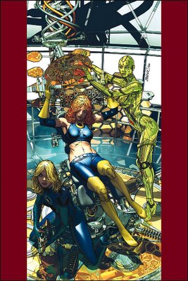
PLEASE tell me that this is not the Orgasmatron!
___________________________________________________
I'll cop to not paying THAT much attention to the last cover. However...
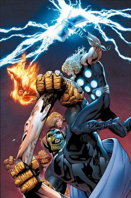
...this cover IS pretty darn similar to the last issue's cover, right?
___________________________________________________
For what it's worth, that is a fine drawing of Deadpool.

I doubt that that is worth that much, but your mileage will vary.
___________________________________________________
Here's my question...
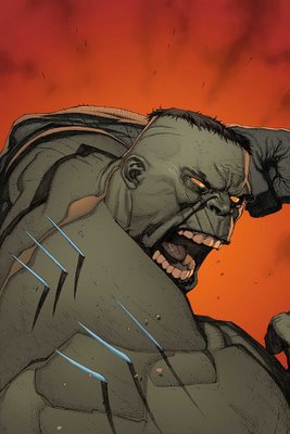
how, exactly, did Yu research what the shadows of the blades would look like?
___________________________________________________
Isn't Ultimate Wolverine supposed to be six feet tall?

Please note that I do not really care, but I am just checking.
___________________________________________________
Mike Wieringo is a fine artist with many string talents.
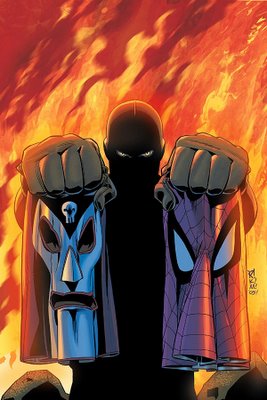
However, dramatic covers are not one of them.
Strong, fundamentally sound covers?
Sure, definitely.
Covers detailing a range of emotions?
You got it.
Dramatic?
Not so much.
___________________________________________________
I realize that this is probably just me...
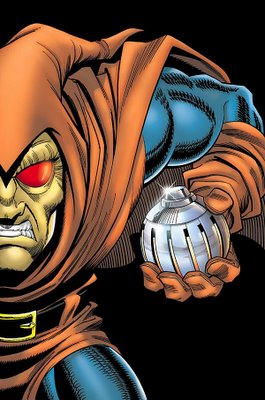
but I can't help but get a nice kick out of Tom DeFalco writing Roderick Kingsley as Hobgoblin, when DeFalco was the writer who took over from Roger Stern and changed the reveal of Hobgoblin FROM Kingsley.
And nice to see Frenz draw Hobgoblin again. He certainly has an affinity for the character.
___________________________________________________
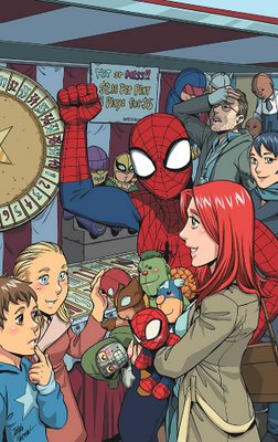
Not a bad cover, but not all that engaging, either.
___________________________________________________
A fine drawing by Yu.
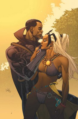
I don't know how effective it is as a cover, though.
Storm sure does love to not wear a lot of clothes, doesn't she?
___________________________________________________
This is a very ominous cover from Travel Foreman...

and I think it works even BETTER when you know the plot of the comic book.
Who wrote Thor: Blood Oath? Was that Oeming? If so, it would explain a LOT.
___________________________________________________
Well, we already know that a BEAR shits in the woods...

___________________________________________________
Gulacy's covers show a nice style that I have not seen from him in awhile.

I like it.
___________________________________________________
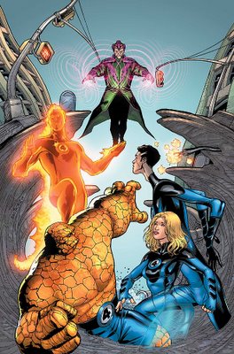
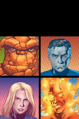
Where do you think Crain got the fire from?
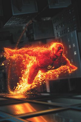
Also, did you notice that Marvel officially renamed the title Marvel Knights FANTASTIC FOUR instead of Marvel Knights 4?
It reminds me of when they changed the name of The Madness of King George III to The Madness of King George, because people would think that they missed the first two.
___________________________________________________
Did I miss the time warp that brought us back to 1991?
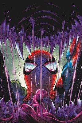
Just checking.
___________________________________________________
And then Kirkman actually HAS a book about 1991!! HAHAHAHA!
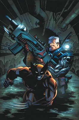
Although, I think it is VERY telling that, even when the assignment is TO DRAW like the 90s comics, Hester is too good of an artist to do it.
Nice.
___________________________________________________
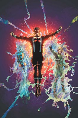
........................Huh?!!? Wha?! What?
Sorry, the cover put me to sleep.
___________________________________________________
Do not fret.
It is okay to laugh at a story named "The Bottom."
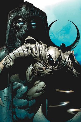
Okay, in a rendering contest, who would win?
This renderer

or David Finch?
I wouldn't bet against Finch!
___________________________________________________
Was their Wolverine story THAT big?
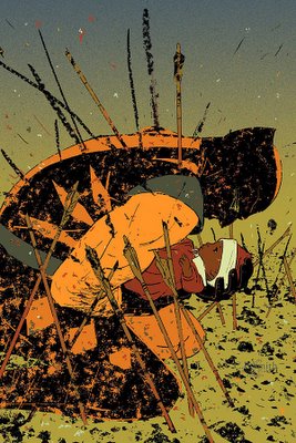
I liked Stuart Moore and C.P. Smith's story.
___________________________________________________
This is a fine cover and all...

..but, I dunno.
Here, I'll show you my concern.
Here is the Nova one, check out the Ronan one...
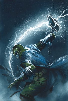
Okay.
Now check out the Super Skrull one...
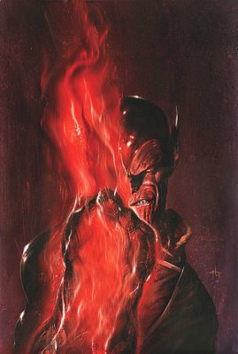
It's, like, the same freakin' cover!!!!!
___________________________________________________
Luckily, this Dell'Otto Surfer deviates from the pattern a bit.

___________________________________________________
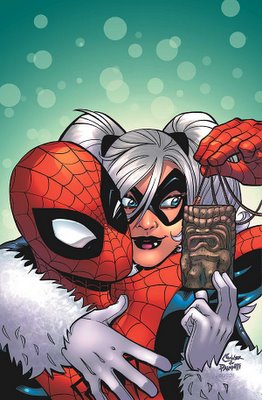
I am not some big Black Cat fan, but I like the idea of doing something other than just Ditko stories in this title.
___________________________________________________
I think Juan Roman Cano Santacruz has the longest name in comics. Anyone I'm missing?
___________________________________________________
IT'S MARVEL MAKE OUT MONTH IN APRIL!!!
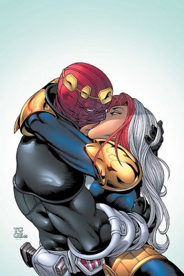
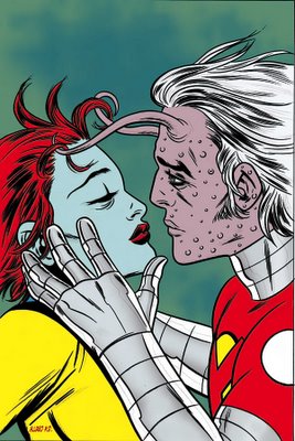
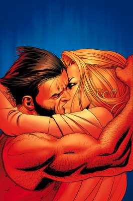
I think the Thunderbolts cover works the best, actually, which is surprising, as Grummett's covers have not been that strong during this run.
___________________________________________________
Nice drawing by Yu, but I think he seems to go for the "nice drawing" instead of actually designing a COVER.

___________________________________________________
This is a strong cover image.
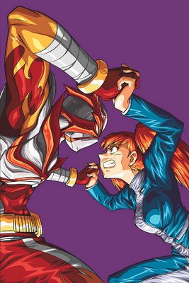
Too bad I don't care about the characters on the cover.
___________________________________________________
Please.
Stop.
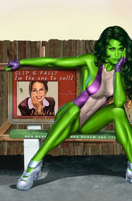
Just stop.
___________________________________________________
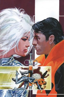
Wouldn't it be cool if they did an issue of superheroes just shooting heroin?
___________________________________________________
Nice cover by Frank Cho.

I am particularly impressed at how he made it so it doesn't even look like his normal style.
Impressive range.
___________________________________________________
The covers on this series are getting progressively LESS impressive.

Next week we will learn how impressive the comic itself is!!
___________________________________________________
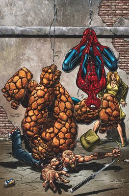
Di Vito is doing a strong job on the covers of this title.
___________________________________________________
I wish to thank the person who came up with the idea of spicing up the boring Luna covers by adding an explosion in the background.
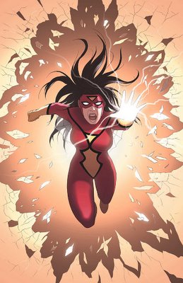
It probably SHOULDN'T, but I think it really helped.
___________________________________________________
When did Deadpool's mask start having that backpart to it?
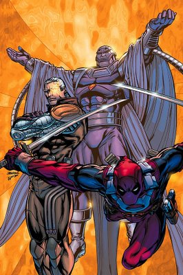
I've noticed it recently.
___________________________________________________
How weird is this "Every other cover drawn by Gabrielle Dell'Otto" thing?
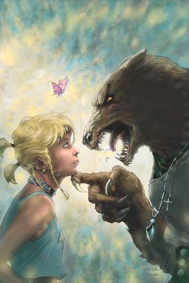
And two issues in a row not drawn by Sook?
Weak.
___________________________________________________
What do you think?
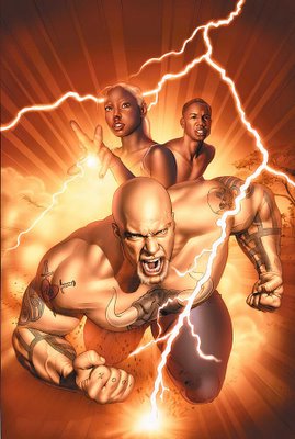
Muscle magazine or gay porn?
Either way, Mike Mayhew's mailbox must be an interesting place.
___________________________________________________
Ahhhh....
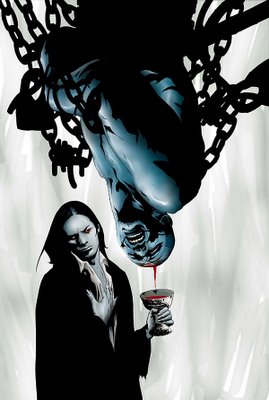
A nice glass of suck.
___________________________________________________
I am glad that Granov is still on covers for this book. Very strong cover.
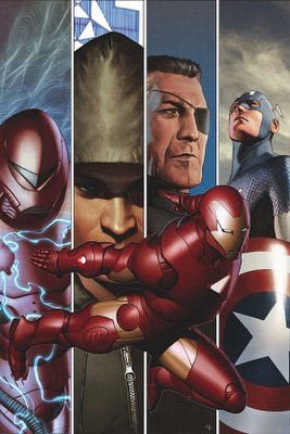
I just hope Zircher's uses his old style, and not his "Draw like Mark Brooks" style.
___________________________________________________
Speaking of Mark Brooks...
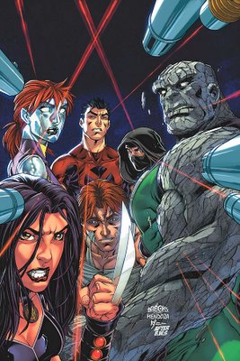
Is THIS the cover he is homaging here?

If so...isn't it a bit of a stretch to call this an homage? Have you seen an homage more different than the book it is "homaging?"
Unless there's another BWS cover that Brooks is homaging that I do not know of.
___________________________________________________
Man, the Seven Soldiers artists are good.
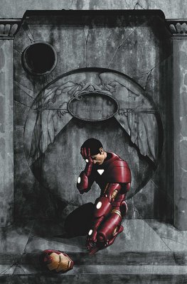
A good deal better than some of the other artists Morrison has collaborated with...
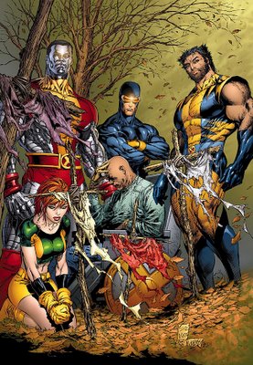
{whistles innocently}
___________________________________________________
That's a heckuva cool design there!
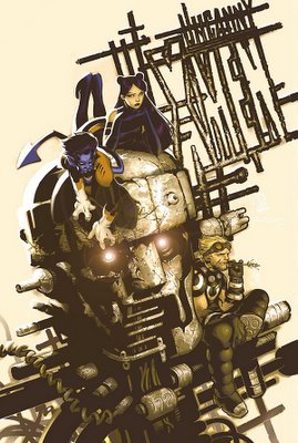
Although I wonder if it is not expecting a level of effort that most readers are not willing to exert.
___________________________________________________
Of course, even Seven Soldiers artists cannot save a dorky concept.
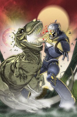
Case in point.
___________________________________________________
When will Marvel give Martin a COMIC to draw, instead of just sweet looking covers?

___________________________________________________
Man, the NERVE!!!
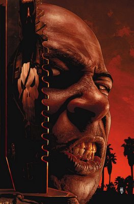
Forcing Tim Bradstreet to DRAW!!
An OUTRAGE!
But wow...worth the outrage.
Excellent cover by Bradstreet.
___________________________________________________
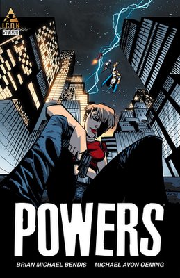
I like that each cover of Powers would make a cool movie poster.
___________________________________________________
It's like Ryan just threw a bunch of characters up on the cover.
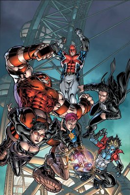
Not that impressive.
___________________________________________________
Paolo Rivera continues to come up with interesting cover designs.
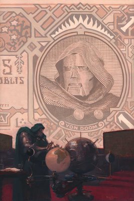
I do not necessarily LIKE them, but they are interesting.
___________________________________________________
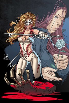
Definitely not winning over any fans swayed by Mssr. Burgas' comments about the art in #1.
___________________________________________________
That's a pretty boring cover.
___________________________________________________
I like covers that require us to have read Future Imperfect to get the cover.
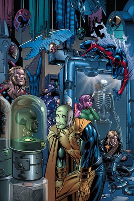
Or do I not?
___________________________________________________
I like Weston's work a lot.
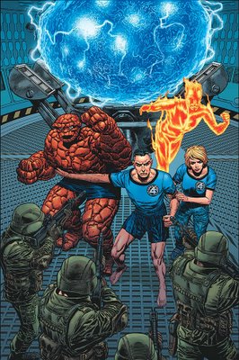
I don't know if I can get over the whole "Moe Howard as Thing" thing, though.
___________________________________________________
The Cap covers ALSO work a lot like movie posters.
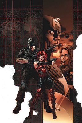
James Bond posters, in particular.
___________________________________________________
Oh mannnnnnnnn....
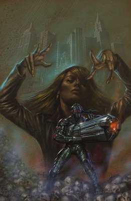
The new Death's Head is suuuuuuuuuch an ugly design.
___________________________________________________
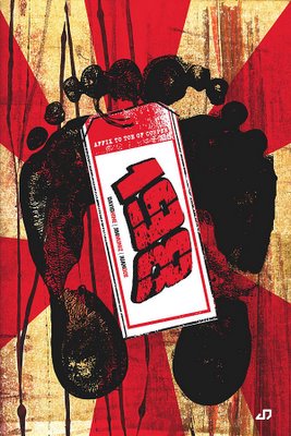
Juan Doe comes up with some cooool cover designs.
___________________________________________________
I guess I'm glad that she is getting mainstream work, but man...
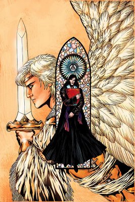
This book is like "Colleen Doran beautifully draws some boring ass stuff."
___________________________________________________
Just you wait...
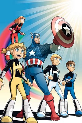
Next it will be "Power Pack and Pornstars."
Anything to keep Power Pack in print.
And I will applaud it!
Because I love me some Power Pack.
___________________________________________________
TOP FIVE COVERS THIS MONTH!!!
5.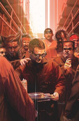
Tommy Lee Edwards is cool.
By the way, I bet you could get a lot of cool stories if you killed off Lois Lane to see how Superman deals with it.
But you wouldn't DO that, because the balancing test doesn't weigh out the stories you get from her death versus the stories you get from her life.
We have not seen Brubaker's story about Foggy Nelson's death, but they have got to be pretty darn good for it to pass the balancing test.
___________________________________________________
4. John Watson is on a ROLL!
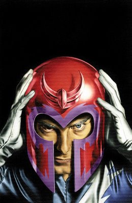
___________________________________________________
3. This is hilarious!
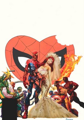
What a hilarious idea!
Does Arthur Suydum pick these covers to homage himself?
___________________________________________________
2. When all a cover is is of a head, you have to be VERY impressive for the cover to still work.

Ladronn is very impressive here.
Wow, what a good job.
___________________________________________________
1. How classic.
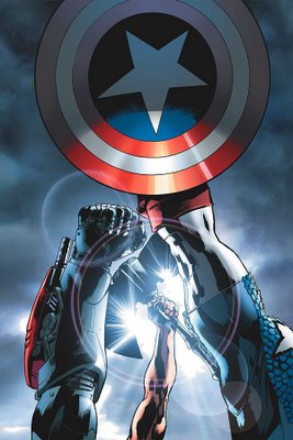
Great job by Bryan Hitch.
___________________________________________________
Well, that's it for me! Feel free to share your thoughts and your top five covers!
A surprisingly large amount of cool covers this month from Marvel!!
Let's begin!
___________________________________________________
Yikes.

PLEASE tell me that this is not the Orgasmatron!
___________________________________________________
I'll cop to not paying THAT much attention to the last cover. However...

...this cover IS pretty darn similar to the last issue's cover, right?
___________________________________________________
For what it's worth, that is a fine drawing of Deadpool.

I doubt that that is worth that much, but your mileage will vary.
___________________________________________________
Here's my question...

how, exactly, did Yu research what the shadows of the blades would look like?
___________________________________________________
Isn't Ultimate Wolverine supposed to be six feet tall?

Please note that I do not really care, but I am just checking.
___________________________________________________
Mike Wieringo is a fine artist with many string talents.

However, dramatic covers are not one of them.
Strong, fundamentally sound covers?
Sure, definitely.
Covers detailing a range of emotions?
You got it.
Dramatic?
Not so much.
___________________________________________________
I realize that this is probably just me...

but I can't help but get a nice kick out of Tom DeFalco writing Roderick Kingsley as Hobgoblin, when DeFalco was the writer who took over from Roger Stern and changed the reveal of Hobgoblin FROM Kingsley.
And nice to see Frenz draw Hobgoblin again. He certainly has an affinity for the character.
___________________________________________________
Not a bad cover, but not all that engaging, either.

___________________________________________________
A fine drawing by Yu.

I don't know how effective it is as a cover, though.
Storm sure does love to not wear a lot of clothes, doesn't she?
___________________________________________________
This is a very ominous cover from Travel Foreman...

and I think it works even BETTER when you know the plot of the comic book.
Who wrote Thor: Blood Oath? Was that Oeming? If so, it would explain a LOT.
___________________________________________________
Well, we already know that a BEAR shits in the woods...

___________________________________________________
Gulacy's covers show a nice style that I have not seen from him in awhile.

I like it.
___________________________________________________
Where do you think Crain got the fire from?

Also, did you notice that Marvel officially renamed the title Marvel Knights FANTASTIC FOUR instead of Marvel Knights 4?
It reminds me of when they changed the name of The Madness of King George III to The Madness of King George, because people would think that they missed the first two.
___________________________________________________
Did I miss the time warp that brought us back to 1991?

Just checking.
___________________________________________________
And then Kirkman actually HAS a book about 1991!! HAHAHAHA!

Although, I think it is VERY telling that, even when the assignment is TO DRAW like the 90s comics, Hester is too good of an artist to do it.
Nice.
___________________________________________________

........................Huh?!!? Wha?! What?
Sorry, the cover put me to sleep.
___________________________________________________
Do not fret.
It is okay to laugh at a story named "The Bottom."

Okay, in a rendering contest, who would win?
This renderer

or David Finch?
I wouldn't bet against Finch!
___________________________________________________
Was their Wolverine story THAT big?

I liked Stuart Moore and C.P. Smith's story.
___________________________________________________
This is a fine cover and all...

..but, I dunno.
Here, I'll show you my concern.
Here is the Nova one, check out the Ronan one...

Okay.
Now check out the Super Skrull one...

It's, like, the same freakin' cover!!!!!
___________________________________________________
Luckily, this Dell'Otto Surfer deviates from the pattern a bit.

___________________________________________________
I am not some big Black Cat fan, but I like the idea of doing something other than just Ditko stories in this title.

___________________________________________________

I think Juan Roman Cano Santacruz has the longest name in comics. Anyone I'm missing?
___________________________________________________
IT'S MARVEL MAKE OUT MONTH IN APRIL!!!


I think the Thunderbolts cover works the best, actually, which is surprising, as Grummett's covers have not been that strong during this run.
___________________________________________________
Nice drawing by Yu, but I think he seems to go for the "nice drawing" instead of actually designing a COVER.

___________________________________________________
This is a strong cover image.

Too bad I don't care about the characters on the cover.
___________________________________________________
Please.
Stop.

Just stop.
___________________________________________________

Wouldn't it be cool if they did an issue of superheroes just shooting heroin?
___________________________________________________
Nice cover by Frank Cho.

I am particularly impressed at how he made it so it doesn't even look like his normal style.
Impressive range.
___________________________________________________
The covers on this series are getting progressively LESS impressive.

Next week we will learn how impressive the comic itself is!!
___________________________________________________
Di Vito is doing a strong job on the covers of this title.

___________________________________________________
I wish to thank the person who came up with the idea of spicing up the boring Luna covers by adding an explosion in the background.

It probably SHOULDN'T, but I think it really helped.
___________________________________________________
When did Deadpool's mask start having that backpart to it?

I've noticed it recently.
___________________________________________________
How weird is this "Every other cover drawn by Gabrielle Dell'Otto" thing?

And two issues in a row not drawn by Sook?
Weak.
___________________________________________________
What do you think?

Muscle magazine or gay porn?
Either way, Mike Mayhew's mailbox must be an interesting place.
___________________________________________________
Ahhhh....

A nice glass of suck.
___________________________________________________
I am glad that Granov is still on covers for this book. Very strong cover.

I just hope Zircher's uses his old style, and not his "Draw like Mark Brooks" style.
___________________________________________________
Speaking of Mark Brooks...

Is THIS the cover he is homaging here?

If so...isn't it a bit of a stretch to call this an homage? Have you seen an homage more different than the book it is "homaging?"
Unless there's another BWS cover that Brooks is homaging that I do not know of.
___________________________________________________
Man, the Seven Soldiers artists are good.

A good deal better than some of the other artists Morrison has collaborated with...

{whistles innocently}
___________________________________________________
That's a heckuva cool design there!

Although I wonder if it is not expecting a level of effort that most readers are not willing to exert.
___________________________________________________
Of course, even Seven Soldiers artists cannot save a dorky concept.

Case in point.
___________________________________________________
When will Marvel give Martin a COMIC to draw, instead of just sweet looking covers?

___________________________________________________
Man, the NERVE!!!

Forcing Tim Bradstreet to DRAW!!
An OUTRAGE!
But wow...worth the outrage.
Excellent cover by Bradstreet.
___________________________________________________
I like that each cover of Powers would make a cool movie poster.

___________________________________________________
It's like Ryan just threw a bunch of characters up on the cover.

Not that impressive.
___________________________________________________
Paolo Rivera continues to come up with interesting cover designs.

I do not necessarily LIKE them, but they are interesting.
___________________________________________________
Definitely not winning over any fans swayed by Mssr. Burgas' comments about the art in #1.

___________________________________________________

That's a pretty boring cover.
___________________________________________________
I like covers that require us to have read Future Imperfect to get the cover.

Or do I not?
___________________________________________________
I like Weston's work a lot.

I don't know if I can get over the whole "Moe Howard as Thing" thing, though.
___________________________________________________
The Cap covers ALSO work a lot like movie posters.

James Bond posters, in particular.
___________________________________________________
Oh mannnnnnnnn....

The new Death's Head is suuuuuuuuuch an ugly design.
___________________________________________________
Juan Doe comes up with some cooool cover designs.

___________________________________________________
I guess I'm glad that she is getting mainstream work, but man...

This book is like "Colleen Doran beautifully draws some boring ass stuff."
___________________________________________________
Just you wait...

Next it will be "Power Pack and Pornstars."
Anything to keep Power Pack in print.
And I will applaud it!
Because I love me some Power Pack.
___________________________________________________
TOP FIVE COVERS THIS MONTH!!!
5.

Tommy Lee Edwards is cool.
By the way, I bet you could get a lot of cool stories if you killed off Lois Lane to see how Superman deals with it.
But you wouldn't DO that, because the balancing test doesn't weigh out the stories you get from her death versus the stories you get from her life.
We have not seen Brubaker's story about Foggy Nelson's death, but they have got to be pretty darn good for it to pass the balancing test.
___________________________________________________
4. John Watson is on a ROLL!

___________________________________________________
3. This is hilarious!

What a hilarious idea!
Does Arthur Suydum pick these covers to homage himself?
___________________________________________________
2. When all a cover is is of a head, you have to be VERY impressive for the cover to still work.

Ladronn is very impressive here.
Wow, what a good job.
___________________________________________________
1. How classic.

Great job by Bryan Hitch.
___________________________________________________
Well, that's it for me! Feel free to share your thoughts and your top five covers!
A surprisingly large amount of cool covers this month from Marvel!!


23 Comments:
I like the Marvel Zombie covers, they are smart assed homages in a great sense. Kinda Night of the Living Dead and Mad Magazine meet Classic Marvel artists.
But that Brooks cover,the copy of Uncanny 210.. It is soooo bad. I would call it a flat out swipe for being so bad, but its not lightboxed at all is it? It just sucks.
"We have not seen Brubaker's story about Foggy Nelson's death, but they have got to be pretty darn good for it to pass the balancing test."
Technically the balancing test doesn't apply, since all the stories that follow are Brubaker's follow-ups to Bendis's killing off of Foggy Nelson. So on Bendis's end, there wasn't even the notion of "I'll get some great stories out of this." It was "I'll get to end my run by bumping off Foggy Nelson."
How much of Daredevil's supporting cast is left at this point, anyway? Ben Urich? That cipher Matt Murdock married out of nowhere? That's the trouble with rubbing out long-term supporting characters - do it too often and you run out of long-term supporting characters.
Dude. That Apocalypse vs. Dracula cover is drawn by Jaw Lee. It can't suck. QED. There's a law on the books that says so.
Some of us didn't know that Foggy Nelson was toast. Maybe I should have, but I didn't. I'm just saying. Now I will cry.
Couple things I wanted to comment on:
Did they retcon Moon Knight's neck away?
How old is Silver Sable supposed to be that she can be hanging out with young Dominic Fortune?
Lame Warren Ellis stand-in character #215 is still in Excalibur this long after he stopped working on it? Why?
Judging from the way she's being treated on that cover, I really hope Emma totally fries Wolverine's brain. Look at her expression. She's pissed. Maybe she'll make him think he has boobs for a day or something.
"Some of us didn't know that Foggy Nelson was toast. Maybe I should have, but I didn't. I'm just saying. Now I will cry."
I thought about that, Greg, but then I saw the solicit for Daredevil #84:
"Cover by TOMMY LEE EDWARDS
We've all seen Daredevil pushed too far, seen what happens when he pushes back, and we know it always ends in tears. Now, with the death of Foggy Nelson plaguing his every waking moment, Matt, blaming himself, runs wild in Rykers, determined to find out who put his best friend at the end of a knife. This is Daredevil as you've never seen him before, unplugged from his own sense of right and wrong, alone in the cold walls of the system he's spent his life defending, and the only thing on his mind is vengeance! From award-winning creators Ed Brubaker and Michael Lark. "
Couple that with the fact that last issue's cover (which I featured here) has a grave with Foggy Nelson's name on the tombstone, I guess I figured it was known enough.
Sorry, though, for spoiling it for you.
"Dude. That Apocalypse vs. Dracula cover is drawn by Jaw Lee. It can't suck. QED. There's a law on the books that says so."
No, I meant the blood from Apocalypse was the suck part.
Anderson Cooper is Magneto?
Who knew?
Is it wrong of me to be enjoying Marvel Zombies as much as I do?
I picked up issue #2 today and I just kept cackling to myself the entire time.
The characterization is really quite well done, including a Zombie Spider-Man who is still a complete loser and a Giant-Man and Wasp relationship that quickly moves to its natural conclusion.
Anyone who tries to take this book even slightly seriously is going to end up looking like the perfect example of the bad fan we’ve been talking about.
It’s just good silly fun and the Wedding cover looks to me like the fun times are just going to keep on rolling.
A really great little comic.
- rick
"When did Deadpool's mask start having that backpart to it? I've noticed it recently."
He's just about always had it. I think it might not have existed in the first New Mutants appearances and maybe not in some of the limited series, but he's at least had it since the ongoing started with Ed McGuinness.
"
He's just about always had it. I think it might not have existed in the first New Mutants appearances and maybe not in some of the limited series, but he's at least had it since the ongoing started with Ed McGuinness."
Yeah, now that you mention it, I think I do recall McGuiness drawing it.
However, I think McGuiness was the first one to do it.
In his first mini-series, his mask was like Spider-Man.
http://www.comics.org/coverview.lasso?id=53965&zoom=4
Same with his second mini-series
http://www.comics.org/coverview.lasso?id=55525&zoom=4
I think it's just something McGuiness added and was kept by later artists, similar to the Cap chainmail redesign by Cassaday.
I love the 198 covers. Love, love, love. Love enough that I might consider gettting the comic. (Which, really, I have nada interest in) and getting it slabbed so those beautiful covers are preserved forever.
And, geez, that X-men cover is beautiful. I'm sure the logo and all will be more obvious full size.
"Technically the balancing test doesn't apply, since all the stories that follow are Brubaker's follow-ups to Bendis's killing off of Foggy Nelson. So on Bendis's end, there wasn't even the notion of "I'll get some great stories out of this." It was "I'll get to end my run by bumping off Foggy Nelson.""
Well, to be honest, I am almost relieved by that news, as it at least means Brubaker isn't to blame.
But yeah, that is silly of Bendis.
"How much of Daredevil's supporting cast is left at this point, anyway? Ben Urich? That cipher Matt Murdock married out of nowhere? That's the trouble with rubbing out long-term supporting characters - do it too often and you run out of long-term supporting characters."
Yeah.
The Spider-titles ended up like that, too.
They killed off practically the entire supporting cast.
Just totally lacking in imagination.
That's okay, Brian. I forgot about the cover with Foggy's tombstone. Stupid publishers - some of us like to be surprised occasionally.
"I think it's just something McGuiness added and was kept by later artists, similar to the Cap chainmail redesign by Cassaday."
Probably. I just didn't have the time to dig my old Deadpool minis out of the longboxes. =)
"How much of Daredevil's supporting cast is left at this point, anyway? Ben Urich? That cipher Matt Murdock married out of nowhere? That's the trouble with rubbing out long-term supporting characters - do it too often and you run out of long-term supporting characters."
Funny you should mention that. That's what I'm thinking about Nightwing after reading Infinite Crisis and #116 this week. Now that Coast City's being rebuilt, we have to annihilate another city to make things fun? Who's left is everyone in the city dies of radiation poisoning? Is this Grayson's last ditch effort to bring back Tarantula, since no one else is left?
Seems like all the characters whining about the good old days are just as, if not more, sadistic than the "modern" versions.
If killing off all of Bludhaven doesn't actually help Nightwing's character, I'll have to "kill off" all Crisis related titles in retaliation (I'm amazed I haven't done so already).
Hold on, Brian...
Am I to understand that you *don't* like covers with giant robots fighting T-Rexes?
I know I'm the X-Statix fanboy and all, but goddamn does Mike Allred deserve some praise for that near-kiss cover. The expression on Guy's face is so heartwrenching and powerful, especially considering how simplistic Allred's art is.
That Powers cover is crotch-tastic!
I'm less irritated about Bludhaven getting destroyed, because Devin Grayson has *already* pointlessly killed off so many great Bludhaven characters....
Another pretty "meh" bunch of covers from Marvel, and DC continues to kick Marvel's ass in this department (even though I thought DC's covers this month weren't all that hot.) My favorites are probably those "movie poster" type covers - Cap, Gulacy's cover, and Powers.
Uh...
That Uncanny 210 cover is by John Romita Jr. (one of his best covers on the his first X-Men run along with 207 and 211)... it's not by BWS.
heh heh... 3 things:
#1) to Dan Jacobson:
Emma's eyes are closed in that pic.
She looks into it.
On a quick glance it looks like they're open and she's pissed (due to "eyebrow posture"), but no...wolvie's just after more 'SSS" (Summers' Sloppy Seconds).
# 2) Moon Knight...sigh... now I LOVED the original series by Seinkewictz (yeah, I know I butchered the man's name... sorry).
And I REALLY LOVED it when it was Kevin Nowlan's 1st series (after that great DOC STRANGE one ish)...but THIS cover (and...I MUST state that I DO like Finch's NEW AVENGERS - TRULY, I do!)..but THIS cover looks an AWFUL LOT like the CRAP that was put on Moon Knight's '90's title towards the end by shot-in-the-pan "fan-fave", Scott PLATT.
Oddly enough, it was easy to tell what kind of quality to expect when the artists signed name (SPLATT) was an onomatopoeia of $#!T hitting the wall.
#3) Brooks gave an homage to B.W.S. and it was a JRjr drawn cover!
Bwa-ha-ha!!!
Man! Otherwise...some very pretty looking covers being produced (and, yes..some crap-tastic ones as well).
Hehe...so it must be ANOTHER BWS cover then, right?
But what cover matches the homage?!?!
Moon Knight: The Bottom. Oh dearie, dearie me.
Love that Hobgoblin cover. Frenz really does draw a great Hobby.
Next week we will learn how impressive [Nextwave] itself is!!
I have read it, and the answer is "mightily".
Of course, even Seven Soldiers artists cannot save a dorky concept.
Giant robot versus dinosaur! What's not to like? :)
Forcing Tim Bradstreet to DRAW!!
An OUTRAGE!
You'll notice that he Photoshopped one of his old Punishers onto the knife...
I like that each cover of Powers would make a cool movie poster.
Haven't they all been deliberate homages to movie posters of late anyway?
The new Death's Head is suuuuuuuuuch an ugly design.
Yeah well, he's better than DHII. Put a big green armoured jacket on him and he'll look almost like the original. :)
Next it will be "Power Pack and Pornstars."
The question is will Power Pack do what every other group has done to the guest-starring Not Avengers and kick the crap out of them in a highly embarrassing fashion?
By the way, I bet you could get a lot of cool stories if you killed off Lois Lane to see how Superman deals with it.
Definitely. By the way, the killer isn't Luthor, as Batman deduces just in time to stop Supes killing old Lexy. It's someone who set Luthor up as a big joke.
In my version of the story, that is. ;)
Great job by Bryan Hitch.
Reminds me of the joke Millar made about Avengers covers over in MK Spider-Man. Still any cover that implies the return of Ultimate Thor is fine by me.
Oh, and Iagorune, I'm really enjoying Marvel Zombies too, and I never thought I would.
Post a Comment
<< Home