Judging (DC's April) Books By Their Covers
DC's April Solicitations are up, so now is as good a time as any for us to make prejudgements based just on the covers (as we all love to make prejudgements, don't we? And DC's covers are at least detailed enough that we CAN make prejudgements based on them!).
Let's begin!
___________________________________________________
I get the appeal, but I am soooooo tired of covers that use Two-Face's duality in them.
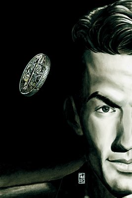
Still, Simone Bianchi does a marvelous job of depicting it, even though I disagree with the cover idea in the first place.
___________________________________________________
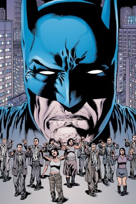
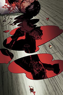
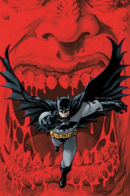
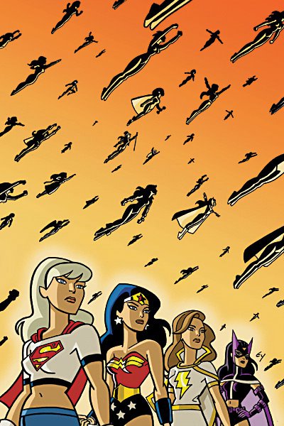
See!!!
People ARE just like ants to Batman!!
___________________________________________________
Neat cover idea.
Reminds me of 'Ringo's run on the title.
That was a good run.
Wonder if it will suffer any dropoff in appearance once covered.
___________________________________________________
This one of the few super-rendered computer images that I have no problem with, from the style perspective.

However, it's not that great of an idea FOR a cover.
___________________________________________________
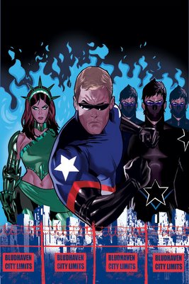
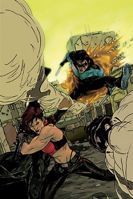
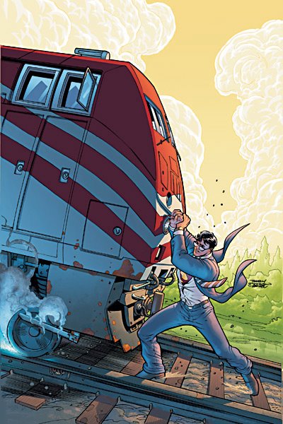
Nightwing has been so lame recently that he even makes Jock covers seem kinda lame.
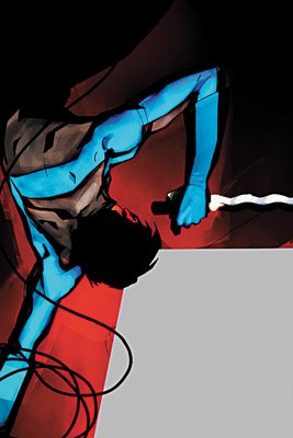
NAH!!!
I still love Jock.
___________________________________________________
When he gets away from the cheesecake, it never ceases to amaze me of how talented of an artist Adam Hughes can be.
I love the teeth.
___________________________________________________
BIG dropoff from #1's stunning cover.
Still, not that bad.
___________________________________________________
Good job by Pat Lee.
Feels weird saying that.
___________________________________________________
Cool cover idea.

Like something that would be used as a "challenge cover."
I'd love to see a story written around THIS cover.
___________________________________________________
This cover, though...
...not so much.
___________________________________________________
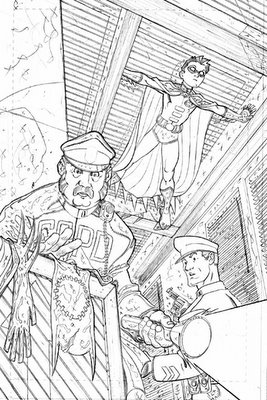
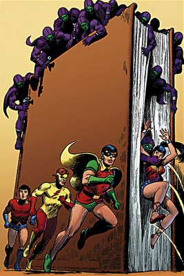
Man...I miss this Robin costume.
And the new costume hasn't even technically APPEARED yet!!
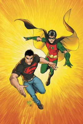
Odd cover for Superman/Batman, unless this is a variant?
___________________________________________________
I hate the promos for these covers...
because there's undoutably going to be a lot of images added in later, so why bother commenting?
___________________________________________________
You know what this Villains United Special reminds me of?

One of those 1970's DC oversized comics.
Those were awesome.
___________________________________________________
This is an odd style for Jesus Saiz.
It looks a LOT like the interior artist, Javier Pina.
I do not know why that is.
___________________________________________________
Ahhhh.....comics sure have come far, haven't they?
Artists had to defend severed head covers in front of Congress. But now they've finally returned!!!
(Cool points for those who can remember WHICH artist drew the infamous severed head cover that was brought in front of Congress back in the 50s)
___________________________________________________
Yet another Perez cover that, while not stunning, gets the job done.
I wonder how this JSA arc will be, with Levitz writing again.
___________________________________________________
You know who's good?
Jose Garcia-Lopez.
Just in case you forgot.
This JLA Classified arc should be fun.
___________________________________________________
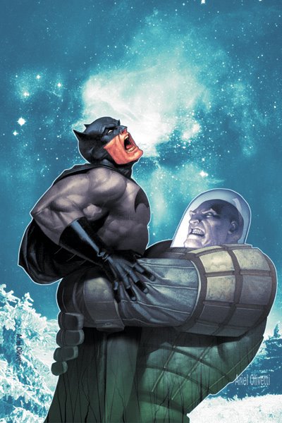
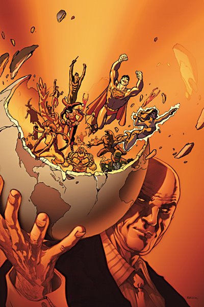
This promotional tie-in demonstrates why I think Manhke was a poor choice for JLA.
It is not a bad drawing, but also not very traditionally appealing.
___________________________________________________
I thought of the following scenario...
"Oh crap! I cannot believe I let my cat ruin Alex's piece! Wait a sec...let's work with it! Work with me, here!!"
___________________________________________________
Now THAT is a "draw you in" kind of cover!!!

What's he looking at?! Why is this little kid a ghost?
All sorts of questions I would be asking if I saw this cover and had not read the book before.
___________________________________________________
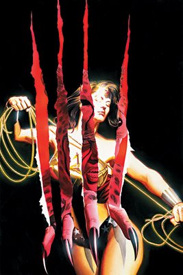
Did Chaykin give Hawkgirl a boob job?
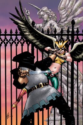
Other than that, strong cover.
___________________________________________________
I will tell you this...
...I sure hope that this costume comes with matching coverings for his eyes whenever he nears reflective surfaces.
___________________________________________________
You folks know I loves me some Bianchi...
...but this cover just seems a tad too stiff for my tastes.
___________________________________________________
Did Scott McDaniel's future self come visit him to teach him how to come up with appealing cover designs?
Because this is the second cover in a row that McDaniel has had a coherent, appealing cover layout, after months of avoiding this type of layout for the covers of Robin, Richard Dragon and Superman (note that I am not begrudgin McDaniel's art, just his cover layouts).
___________________________________________________
This is a nice enough cover design by Brian Stelfreeze...

...but not all that inspired, either, is it?
___________________________________________________
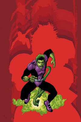
I think we have seen variations of this cover design MANY times. Still, he drew it well.
I have been loving Daniel Acuna's covers.
This, however, is just tooooooo dorky looking
___________________________________________________
This cover for Checkmate #1 ALMOST made it to my top five.

By the by, I would have preferred if Lee Bermejo had tried to draw Fire as though she was on fire, rather than drawing a normal woman with fire behind here.
___________________________________________________
This cover is different, but not very engaging.
And I dislike the new costume.
___________________________________________________
Strong drawing by Byrne.

But I wonder if the image is captivating enough.
___________________________________________________
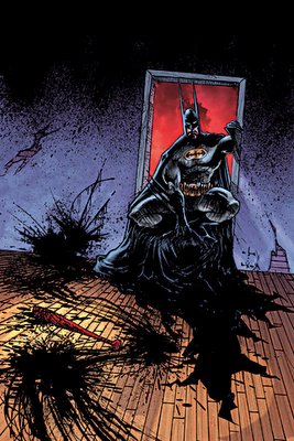
This is a perfect example of how cool computers can be. Imagine this cover withOUT computers!!!

By the way, I am pleased that Gypsy is apparently on the Birds of Prey now.
___________________________________________________
I bet Amy Grant has her lawyers on speed dial whenever a new Butch Guice cover comes out.
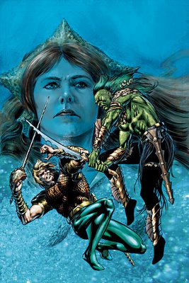
The drawing of the new Aquaman on this cover reminds me a bit of Phil Hester.
Not bad at all.
___________________________________________________
What issue of Teen Titans did this cover come from?
Cardy ruled all.
__________________________________________
Crap.
Grace is still on the team.
I hope that missle kills her.
That would be a great tagline, "Buy this comic and we will let the missle kill her"
I bet sales would go up.
___________________________________________________
A Damion Scott Solo.
Wow.
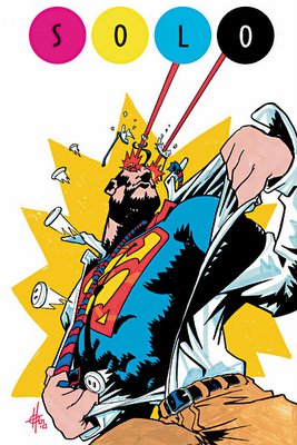
Just.
Wow.
Way to totally degrade the line in one fell swoop, DC.
It'd be like having a "Great Authors" series, and having Hemingway, Hawthorne, Fitzgerald, Wharton, Melville and the guy who writes the Bazooka Joe comic strips.
Not only does it not FIT, but it is almost comical in the absoluteness of the mismatch.
HOWEVER, in defense of Mark Chiarello, I DO understand why one MIGHT be interested in somone like Damion Scott, in that Scott at least is willing to try new styles. The styles are all generally poor, but at least he's TRYING!!
___________________________________________________
Kitson seems to be pinning all of our hopes on Supergirl holding our attention.
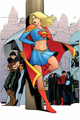
I think he pulls it off, but it is close.
By the way, I am LOVING the muted colors used for these covers!
___________________________________________________
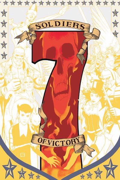
A very nice cover.

But for the last issue of Seven Soldiers, I expected a bit more.
___________________________________________________
How weird is this?
Isn't the Teen Titans cartoon show ENDING?
A bit late to be trying to tie the comic to the show.
___________________________________________________
Good picture of a character's head?
Duh, it's Joe Kubert, so yes.
Good COVER?
I say no.
__________________________________________________
This is the least dynamic "people being chased by a dinosaur" cover that I can recall.
Still, I'm liking the style Bart Sears is using for Warlord.
___________________________________________________
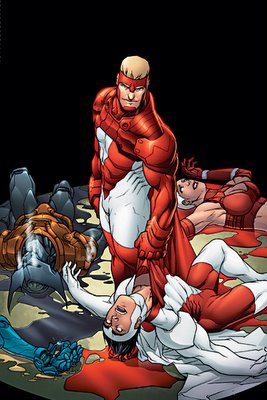
Very strong visual.
I like it.
Maybe they can fight some new female super villains while they're at it...hehe.
___________________________________________________
Wooooah!
What a trippy Sean Galloway cover for this Teen Titans Go! I like it!
___________________________________________________
This could just be me, so feel free to ignore it...
but are Tony Harris' covers for this book starting to look like Colorforms?
You know, just attach one cut-out to a colorful background, and ta da!!
The cut-outs are nicely drawn, though!!
___________________________________________________
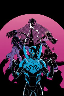
I will give Keown this much credit.
And only this much credit.
This Captain Atom cover IS dynamic.
___________________________________________________
Gotta give Del'Otto credit, his Red Sonja really looks like a painted Buscema drawing. Well done!
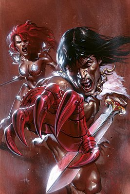
The Claw?
Let's move on to the next cover.
___________________________________________________
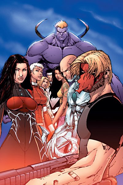
This cover is all sorts of wrong.

And that's withOUT counting the fact that it features Nemesis on the cover.
Grrr....hate Nemesis.
Except the DC Nemesis.
He ruled.
___________________________________________________
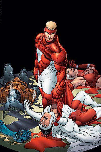
Ouch.
The first bad Team Zero cover.
Ah well...I guess all good runs come to an end.
___________________________________________________
The winner of the new costume contest for April....
....1992.
___________________________________________________
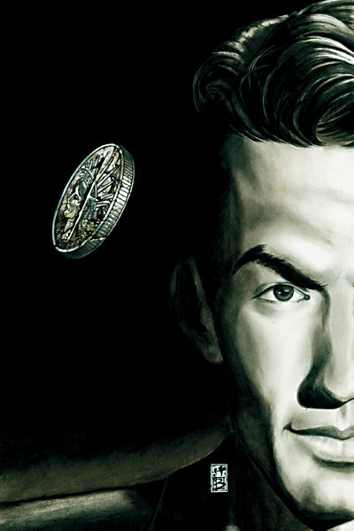
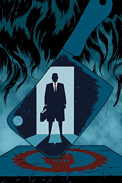
I do not know if this would get a new reader to give 100 Bullets a look see...

...but damn, this would make a helluva movie poster, no?
___________________________________________________
I love the idea. I really do.

But I think, as a cover, it requires too much effort on the part of the viewer to really get the visceral appeal of the image. A good cover cannot ask the reader to first closely look at the cover before they can appreciate it. It has to draw them in right away. The size of the picture really hurts in this regard, as the logo overshadows the rest of the drawing.
Still, strong image.
__________________________________________________
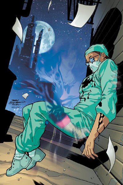
Phillip Bond makes everything creepy, yet engaging.
Sorta like Exterminators the comic!!
___________________________________________________
I enjoy that Jean is going back to his diverse cover designs...

I just do not think that he hit on a winner here. But I would like to see him keep trying this tact!!
___________________________________________________
This is the second month in a row that Fruson has knocked a Loveless cover out of the park.

Simple, yet soooo powerful of an image. Great cover.
___________________________________________________
Month three of Greg Lauren's seminar on "Illegible Hellblazer covers."
I'd love to see his signature. It must make doctors everywhere green with envy.
___________________________________________________
Well, I will give Swamp Thing THIS much credit...
this month's issue has interior art by Jock, so maybe the interiors can, for once, be worthy of the amazing Eric Powell covers.
___________________________________________________
I have not seen a comic try this, that I can recall, and I think it is a pretty neat idea.
Incorporating all the previous covers of the comic into the latest cover (well, except for anniversary editions, and the like).
___________________________________________________
This is a fairly strong cover, and I am impressed at how Massimo Carnevale continues to give the Y covers set in Japan a real sense of geographic belonging.
Good stuff.
___________________________________________________
TOP FIVE COVERS OF THE MONTH!!
___________________________________________________
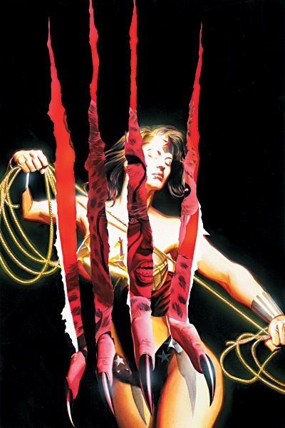
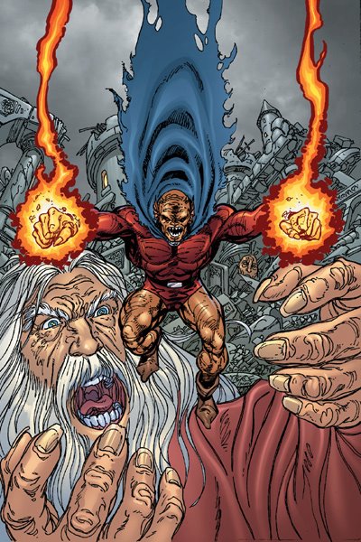
5. Really strong Bianchi cover image.
Points taken off for it looing too photoreaistic.
___________________________________________________
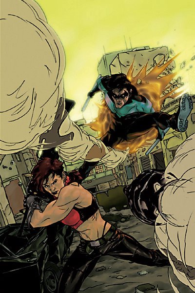
4. Very clever, sexy cover by Quitely.
I just wonder how they will write a series with the remaining non-killed character.
________________________________________________
3. I have yet to see Mike Huddleston draw a bad comic.

He does not start now.
___________________________________________________
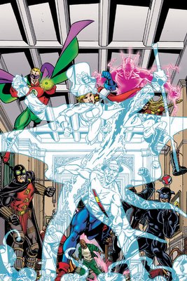
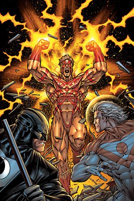
2. Woah! Talk about a creative layout!!
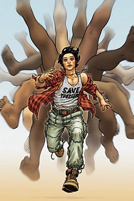
That's one crazyass stampede.
___________________________________________________
1. Matt Wagner finishes this mini-series with a very strong cover.
The basic Batman drawing is excellent.
The background ties into the storyline perfectly.
And the cover scheme was brilliant, causing the Bat-figure at the forefront to practically explode off the page, sort of like 3-D!!!
___________________________________________________
Okay, that's it for me, folks!
Feel free to share YOUR prejudices (and YOUR top five)!!
Let's begin!
___________________________________________________
I get the appeal, but I am soooooo tired of covers that use Two-Face's duality in them.
Still, Simone Bianchi does a marvelous job of depicting it, even though I disagree with the cover idea in the first place.
___________________________________________________
See!!!
People ARE just like ants to Batman!!

___________________________________________________
Neat cover idea.
Reminds me of 'Ringo's run on the title.
That was a good run.

Wonder if it will suffer any dropoff in appearance once covered.
___________________________________________________
This one of the few super-rendered computer images that I have no problem with, from the style perspective.
However, it's not that great of an idea FOR a cover.
___________________________________________________
Nightwing has been so lame recently that he even makes Jock covers seem kinda lame.

NAH!!!
I still love Jock.
___________________________________________________
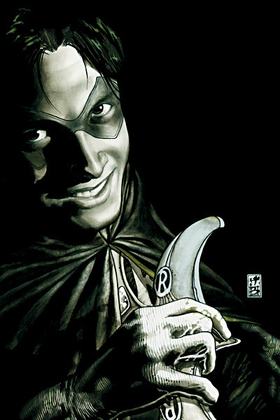
When he gets away from the cheesecake, it never ceases to amaze me of how talented of an artist Adam Hughes can be.

I love the teeth.
___________________________________________________
BIG dropoff from #1's stunning cover.

Still, not that bad.
___________________________________________________
Good job by Pat Lee.

Feels weird saying that.
___________________________________________________
Cool cover idea.
Like something that would be used as a "challenge cover."
I'd love to see a story written around THIS cover.
___________________________________________________
This cover, though...

...not so much.
___________________________________________________
Man...I miss this Robin costume.
And the new costume hasn't even technically APPEARED yet!!

Odd cover for Superman/Batman, unless this is a variant?
___________________________________________________
I hate the promos for these covers...
because there's undoutably going to be a lot of images added in later, so why bother commenting?
___________________________________________________
You know what this Villains United Special reminds me of?
One of those 1970's DC oversized comics.
Those were awesome.
___________________________________________________
This is an odd style for Jesus Saiz.

It looks a LOT like the interior artist, Javier Pina.
I do not know why that is.
___________________________________________________
Ahhhh.....comics sure have come far, haven't they?

Artists had to defend severed head covers in front of Congress. But now they've finally returned!!!
(Cool points for those who can remember WHICH artist drew the infamous severed head cover that was brought in front of Congress back in the 50s)
___________________________________________________
Yet another Perez cover that, while not stunning, gets the job done.
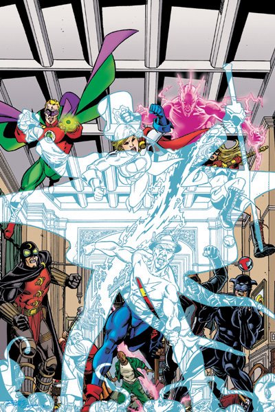
I wonder how this JSA arc will be, with Levitz writing again.
___________________________________________________
You know who's good?

Jose Garcia-Lopez.
Just in case you forgot.
This JLA Classified arc should be fun.
___________________________________________________
This promotional tie-in demonstrates why I think Manhke was a poor choice for JLA.

It is not a bad drawing, but also not very traditionally appealing.
___________________________________________________
I thought of the following scenario...
"Oh crap! I cannot believe I let my cat ruin Alex's piece! Wait a sec...let's work with it! Work with me, here!!"
___________________________________________________
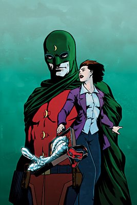
Now THAT is a "draw you in" kind of cover!!!
What's he looking at?! Why is this little kid a ghost?
All sorts of questions I would be asking if I saw this cover and had not read the book before.
___________________________________________________
Did Chaykin give Hawkgirl a boob job?

Other than that, strong cover.
___________________________________________________
I will tell you this...

...I sure hope that this costume comes with matching coverings for his eyes whenever he nears reflective surfaces.
___________________________________________________
You folks know I loves me some Bianchi...

...but this cover just seems a tad too stiff for my tastes.
___________________________________________________
Did Scott McDaniel's future self come visit him to teach him how to come up with appealing cover designs?

Because this is the second cover in a row that McDaniel has had a coherent, appealing cover layout, after months of avoiding this type of layout for the covers of Robin, Richard Dragon and Superman (note that I am not begrudgin McDaniel's art, just his cover layouts).
___________________________________________________
This is a nice enough cover design by Brian Stelfreeze...

...but not all that inspired, either, is it?
___________________________________________________
I think we have seen variations of this cover design MANY times. Still, he drew it well.
I have been loving Daniel Acuna's covers.

This, however, is just tooooooo dorky looking
___________________________________________________
This cover for Checkmate #1 ALMOST made it to my top five.
By the by, I would have preferred if Lee Bermejo had tried to draw Fire as though she was on fire, rather than drawing a normal woman with fire behind here.
___________________________________________________
This cover is different, but not very engaging.
And I dislike the new costume.
___________________________________________________
Strong drawing by Byrne.
But I wonder if the image is captivating enough.
___________________________________________________
This is a perfect example of how cool computers can be. Imagine this cover withOUT computers!!!
By the way, I am pleased that Gypsy is apparently on the Birds of Prey now.
___________________________________________________
I bet Amy Grant has her lawyers on speed dial whenever a new Butch Guice cover comes out.

The drawing of the new Aquaman on this cover reminds me a bit of Phil Hester.
Not bad at all.
___________________________________________________
What issue of Teen Titans did this cover come from?

Cardy ruled all.
__________________________________________
Crap.
Grace is still on the team.
I hope that missle kills her.
That would be a great tagline, "Buy this comic and we will let the missle kill her"
I bet sales would go up.
___________________________________________________
A Damion Scott Solo.
Wow.

Just.
Wow.
Way to totally degrade the line in one fell swoop, DC.
It'd be like having a "Great Authors" series, and having Hemingway, Hawthorne, Fitzgerald, Wharton, Melville and the guy who writes the Bazooka Joe comic strips.
Not only does it not FIT, but it is almost comical in the absoluteness of the mismatch.
HOWEVER, in defense of Mark Chiarello, I DO understand why one MIGHT be interested in somone like Damion Scott, in that Scott at least is willing to try new styles. The styles are all generally poor, but at least he's TRYING!!
___________________________________________________
Kitson seems to be pinning all of our hopes on Supergirl holding our attention.

I think he pulls it off, but it is close.
By the way, I am LOVING the muted colors used for these covers!
___________________________________________________
A very nice cover.
But for the last issue of Seven Soldiers, I expected a bit more.
___________________________________________________
How weird is this?
Isn't the Teen Titans cartoon show ENDING?

A bit late to be trying to tie the comic to the show.
___________________________________________________
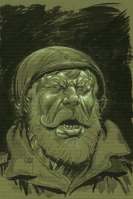
Good picture of a character's head?
Duh, it's Joe Kubert, so yes.

Good COVER?
I say no.
__________________________________________________
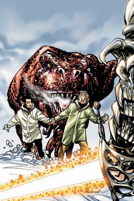
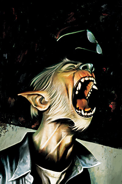
This is the least dynamic "people being chased by a dinosaur" cover that I can recall.

Still, I'm liking the style Bart Sears is using for Warlord.
___________________________________________________
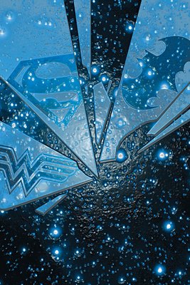
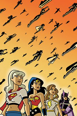
Very strong visual.
I like it.
Maybe they can fight some new female super villains while they're at it...hehe.
___________________________________________________
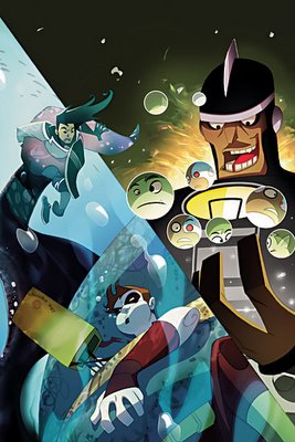
Wooooah!

What a trippy Sean Galloway cover for this Teen Titans Go! I like it!
___________________________________________________
This could just be me, so feel free to ignore it...

but are Tony Harris' covers for this book starting to look like Colorforms?
You know, just attach one cut-out to a colorful background, and ta da!!
The cut-outs are nicely drawn, though!!
___________________________________________________
I will give Keown this much credit.
And only this much credit.

This Captain Atom cover IS dynamic.
___________________________________________________
Gotta give Del'Otto credit, his Red Sonja really looks like a painted Buscema drawing. Well done!

The Claw?
Let's move on to the next cover.
___________________________________________________
This cover is all sorts of wrong.
And that's withOUT counting the fact that it features Nemesis on the cover.
Grrr....hate Nemesis.
Except the DC Nemesis.
He ruled.
___________________________________________________
Ouch.

The first bad Team Zero cover.
Ah well...I guess all good runs come to an end.
___________________________________________________
The winner of the new costume contest for April....
....1992.
___________________________________________________
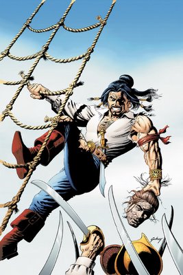
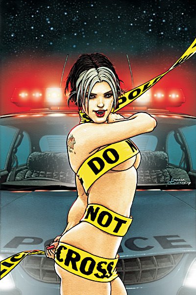
I do not know if this would get a new reader to give 100 Bullets a look see...
...but damn, this would make a helluva movie poster, no?
___________________________________________________
I love the idea. I really do.
But I think, as a cover, it requires too much effort on the part of the viewer to really get the visceral appeal of the image. A good cover cannot ask the reader to first closely look at the cover before they can appreciate it. It has to draw them in right away. The size of the picture really hurts in this regard, as the logo overshadows the rest of the drawing.
Still, strong image.
__________________________________________________
Phillip Bond makes everything creepy, yet engaging.

Sorta like Exterminators the comic!!
___________________________________________________
I enjoy that Jean is going back to his diverse cover designs...
I just do not think that he hit on a winner here. But I would like to see him keep trying this tact!!
___________________________________________________
This is the second month in a row that Fruson has knocked a Loveless cover out of the park.
Simple, yet soooo powerful of an image. Great cover.
___________________________________________________
Month three of Greg Lauren's seminar on "Illegible Hellblazer covers."

I'd love to see his signature. It must make doctors everywhere green with envy.
___________________________________________________
Well, I will give Swamp Thing THIS much credit...
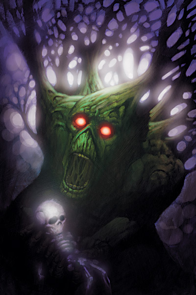
this month's issue has interior art by Jock, so maybe the interiors can, for once, be worthy of the amazing Eric Powell covers.
___________________________________________________
I have not seen a comic try this, that I can recall, and I think it is a pretty neat idea.

Incorporating all the previous covers of the comic into the latest cover (well, except for anniversary editions, and the like).
___________________________________________________
This is a fairly strong cover, and I am impressed at how Massimo Carnevale continues to give the Y covers set in Japan a real sense of geographic belonging.

Good stuff.
___________________________________________________
TOP FIVE COVERS OF THE MONTH!!
___________________________________________________
5. Really strong Bianchi cover image.
Points taken off for it looing too photoreaistic.
___________________________________________________
4. Very clever, sexy cover by Quitely.
I just wonder how they will write a series with the remaining non-killed character.
________________________________________________
3. I have yet to see Mike Huddleston draw a bad comic.
He does not start now.
___________________________________________________
2. Woah! Talk about a creative layout!!

That's one crazyass stampede.
___________________________________________________
1. Matt Wagner finishes this mini-series with a very strong cover.
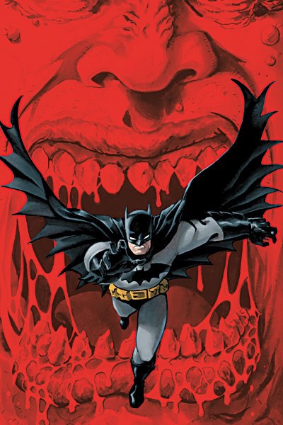
The basic Batman drawing is excellent.
The background ties into the storyline perfectly.
And the cover scheme was brilliant, causing the Bat-figure at the forefront to practically explode off the page, sort of like 3-D!!!
___________________________________________________
Okay, that's it for me, folks!
Feel free to share YOUR prejudices (and YOUR top five)!!
posted by Brian Cronin at 1/17/2006 03:51:00 AM
![]()


18 Comments:
Well, these are the April solicitations, so maybe the Damion Scott Solo is just a prank?
"People ARE just like ants to Batman!!"
NO! Batman hates people doing the Macarana (sp?) en masse!
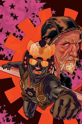
When did Santa join Easy Company?
""Cool points for those who can remember WHICH artist drew the infamous severed head cover that was brought in front of Congress back in the 50s)""
Johnny Craig¡¡¡
Must. not. make. joke. about. Dr. Light and his balls on the Teen Titans Go! cover.
Crap. Too late.
I'm glad there's a Killer Frost/Firehawk fight, because FH just STANDING THERE while the inexperienced Jason went up against KF, who slaughtered 12 people, one of whom was pregnant, was one of the most utterly repulsive post-Brad Meltzer developments of last year.
I like Damion Scott's art.
What issue of Teen Titans did this cover come from?
#16
Bill Angus
Do Marvel!
damn! I got beat to the Johnny Craig thing! But I don't need the bonus points cause I actually had a copy of Crime SuspenStories 22. It's not bragging if you sold it already
I don't know Damion Scott; his Solo cover is genuinely the first piece of art of his that I recall seeing. Anyone want to fill me in on why I'm supposed to think he sucks?
Ditto.
Looks like a pretty cool cover to me.
Top Five for me:
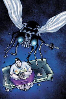
Fat Lady w/ bugs
100 Bullet.
The one with Pirates (Duh)
The one with Joe Kubert (Duh)
The crazy Frank Quietly (?) race leg thing.
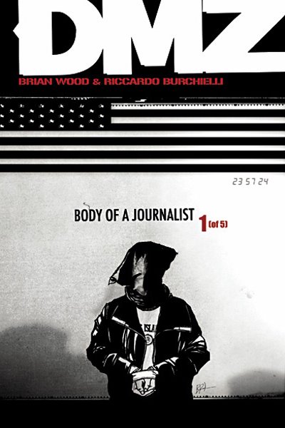
I think that DMZ cover is one of the most affecting things ever.
But maybe not to other people. I don't pretend to understand general public opinion.
"I think that DMZ cover is one of the most affecting things ever.
But maybe not to other people. I don't pretend to understand general public opinion."
Definitely the image itself, but I think the way that the cover is cropped results in the image's power being dulled dramatically.
Is that claw on the Red Sonja cover the same one ripping through Wonder Woman?
Planetary had a cover that incorporated every single page of the story to that point, including the covers. Number 12-ish.
I'm not sure that the Sgt. Rock solicitation images are the covers for the series. Definitely wasn't for Sgt. Rock #1, unless all the on-line previews are showing one of the variant covers by one of the younger Kuberts.
I believe that's the case, Edward (that they are showing the variant cover by his kids).
Post a Comment
<< Home