Covers Should Be Good - Which One Is Better?
The variant cover for All-Star Superman is out. Now it is time to decide which cover is better.
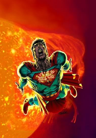
I pick the Neal Adams one.
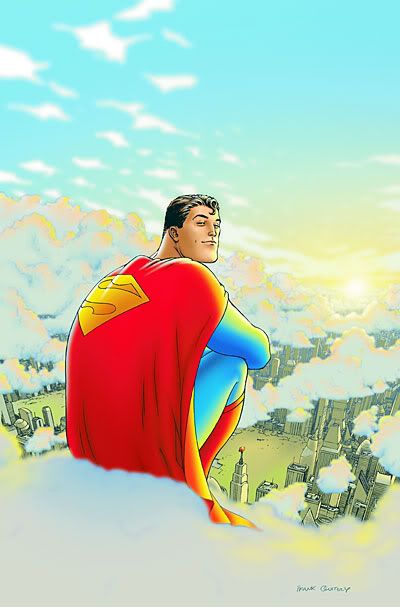
I think it is more vibrant. I think the Quitely cover is a better DRAWING, but I do not believe that it pulls the reader in as well. And yes, the Quitely cover depicts EXACTLY what Morrison says he is trying to do with Superman (someone who is so powerful, he can just chill out on a cloud), but for a number one, I do not think it is dynamic enough.
The Adams cover is dynamic...to the EXTREME!
I pick the Adams one.
I pick the Neal Adams one.
I think it is more vibrant. I think the Quitely cover is a better DRAWING, but I do not believe that it pulls the reader in as well. And yes, the Quitely cover depicts EXACTLY what Morrison says he is trying to do with Superman (someone who is so powerful, he can just chill out on a cloud), but for a number one, I do not think it is dynamic enough.
The Adams cover is dynamic...to the EXTREME!
I pick the Adams one.
posted by Brian Cronin at 10/21/2005 09:36:00 PM
![]()


25 Comments:
When I was a lad, Neal Adams was the god of DC covers and well deserved that status. His covers made many thousands of potential readers say, "Wow -- what's going on in this story to produce that cover scene? I've got to read this!" And we'd happily slap down our 15/20/25¢ just to find out.
What's utterly heartbreaking for me is how this piece displays none of the narrative or aesthetic qualities which made those covers so effective.
The Quitely cover, by contrast, makes me like this Superman; it makes me want to look over his shoulder, like he's a big super-powered pal I'm chilling with. So I'm already drawn into the world Grant and Frank are creating.
Disclaimer first: I don't like Frank Quitely much (his faces creep me out), and I've always been blown away by Adams, for the usual reasons.
That said, I'm going with the Quitely cover on this one. I can't even believe these are covers to the same book. The Quitely cover makes me think, "OK, what's up with this, then? Where's the story that comes out of this pose?" The Adams cover just makes me think, "Oh, this again?"
The Quitely cover is actually the only Quitely Superman drawing I've seen that I've liked that much.
The Neal Adams cover is a better drawing, and it's a better cover for, say, a #2 or some other middle-of-the-run comic, but to introduce us to the character - as the very first thing we see of this Superman - I like the laid-back Superman looking over Metropolis better.
That said, none of the Supermen actually inside Quitely's book appear to look much like the one he's drawn on the cover - one of my bigger problems with him as an artist.
I don't like Neal Adams much to begin with, but that cover is especially awful. I wouldn't be surprised to discover Ian Churchill drew it.
Quitely is the clear winner.
I'm not normally a Quitely but he's the clear winner in this contest.
The Adams cover is fiery, designed to catch the eye. It is a standard design and color scheme. It looks like any number of other covers of heroes in despair. It will be lost easily on the DC Comics shelves.
Quitely's Superman is unique. He's in a good mood, he's relaxing. He's finished with the job and ready to enjoy a beer or twelve Not a care in the world.
This mood is almost never seen on a comic book shelf. It will stick out like the proverbial sore thumb. It is, and I can't beleive I'm admitting this of Frank Quitely's work, beautiful.
I want a poster of Quitely's cover.
I was so psyched when I heard Neal Adams was doing a varient cover for this. I mean, I love Quitely, I love Morrison, and despite coming into comics well after Adams's heyday, I really enjoy his work. I fully expected to be buying two copies of this issue.
After seeing the Adams, cover, however, I'm not so sure. I mean, the Quitely cover is so different from every Superman cover that has been on the shelves for the past several years. I remember reading a letter back when the Superman comics still had letters pages that counted the number of times in the most recent years that Superman had appeared smiling on the cover. It was in the single digits.
Meanwhile, Adams's cover has a Superman screaming in front of the sun. The sun is a frequent guest-star on Superman covers, and it seems like someone's screaming on every other cover nowadays anyway. Plus, Adams's art doesn't mesh real well with the actual photographic image of the sun.
Sorry, clearly Quitely has the more enticing cover in just about every way. I hope Adams does more of the covers, and I hope they end up better than this.
Quitely wins, because apparently Adams has decided to depict Superman as someone with psoriatic dandruff who just spent three hours leaning forward over his logo reading.
Also, the Quitely makes Supes seem like he's just patiently waiting for the dopeness to hit, which is exactly how I feel about this comic.
I freely admit that I have some weird bias against this cover, ever since I first saw it, so I am using the rarely used "Taste Exemption" here.
Doesn't matter; I'm getting both and CGC-slabbing them! variant covers r0x0rs! Booyah!
Wierd bias against which one, Brian?
I just wonder exactly what's going on in the Neal Adams one. Why is he screaming? Is the sun burning his ass? Is he constipated? Is that an explosion in space? Is there a party in his pants and he's having the best orgasm of his life?
I vote Quitely.
"Wierd bias against which one, Brian?"
I have been complaining about the (in my mind) inappropriateness of the Quitely cover for a number one issue since the image was released. Even before we knew that it was definitely FOR the first issue cover, I was saying, "I hope that isn't used as the cover for the first issue!"
So I am nutty when it comes to this cover...hehe.
My one problem with the Quitely cover is how off-model his S-shield is. Lying in the Gutters showed some before and after images of the interior's shield, and I really have to wonder what made Quitely decide to initially draw such an awful-looking insignia.
Adams: 3/10 (it's just awful and generic)
Quitely: 7/10
Quitely wins. The Adams cover is shit, and possibly ghosted by Marc Silvestri.
Goooo Frank. His cover isn't *supposed* to dynamic. It is, instead, serene, because the entire rack will be covered with angsty "dynamic" covers and no one will care. Instead, we get Superman: The Dude of Cool.
Actually, Bill, the Adams cover looks like Phil Winslade ghosted it. Superman's face in particular looks like a Winslade face.
Quitely takes it. It's static, but cool. Adams' cover looks like Superman has radioactive agita, and seems rather generic at that.
"So what IS your problme with the Quitely cover, Brian?"
Not much of a secret. It's right there in the entry --> "I pick the Neal Adams one. I think it is more vibrant. I think the Quitely cover is a better DRAWING, but I do not believe that it pulls the reader in as well. And yes, the Quitely cover depicts EXACTLY what Morrison says he is trying to do with Superman (someone who is so powerful, he can just chill out on a cloud), but for a number one, I do not think it is dynamic enough.
The Adams cover is dynamic...to the EXTREME!"
I'm gonna join the dogpile and say that I like the Quitely cover better. The Adams, while more dynamic, is pedestrian; it could just as easily have been done by Van Sciver, or Turner, or anyone along a long spectrum of artists. Whereas Quitely went with something truly iconic and personal. which, for me, works better for a first issue.
Plus, there aren't enough covers with hereos *smiling* these days.
If Quitely's cover is gay, then consider me a four-color fag hag.
It is one of this year's best, heck, I consider on par with this, as far as iconic images go. Who'da thunk that tranquility would be the best cover gimmick ever?(Sorry lenticular/holographic/gatefold fans)
I have never wanted to-nay, had to buy a comic because of the cover.
Ever.
But I will buy this.
I prefer the Quitely cover. Still, I'll take a Neal Adams anyday over most of the modern comic book covers.
Heck, on this book, I'll take a Michael Turner cover inked by Rob Liefeld as long as it doesn't have Lois in her underwear on page two and Superman uttering the words "Are you retarded?"
Quitely cover=AIRWOLF.
Adams cover=SeaQuest.
Advantage: Quitely!
I like the way you analogize, Chris.
I'm sure it comes as no surprise that I vote for the Quitely cover. The Adams one just seems completely UN-vibrant to me. The colors are dark and murky, the pose is stale, and the cover doesn't seem to have any idea behind it. Supes strikes an extreme pose in front of the sun. Great. I'd much rather see a cover that tells me "Supes just finished his patrol for the afternoon and there was no crime in Metropolis today. Now he gets to relax on a cloud and gaze upon the land he loves. God Bless Motherfucking America."
The Quitely piece is amazing. The Adams piece is dklsaj;lkas;fdlkj sorry I fell asleep at the keyboard just thinking about it.
Oh, and just a point: Morrison said that he was redesigning the S-shield. So if Quitely is "off point" then it's on purpose.
Post a Comment
<< Home