Judging (DC's October) Books By Their Covers
DC's October Solicitations are up, so now is as good a time as any for us to make prejudgements based just on the covers (as we all love to make prejudgements, don't we?).
Let's begin!
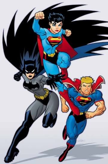
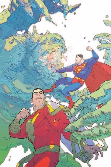
When the worst I can come up with to criticize this Jim Lee cover is that it looks like he just cut out pictures of Superman, Wonder Woman and Batman from other drawings he did, slapped them on a cover together and put shrapnel on the bottom to cover up the cut jobs....
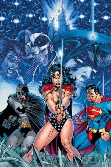
...then I think you've got yourself a successful cover.
That's not to say that I LIKE the cover.
Just that it is not, like, well, a Michael Turner cover...hehe.
________________________________________________________
I enjoy seeing Lapham tackle the covers himself...
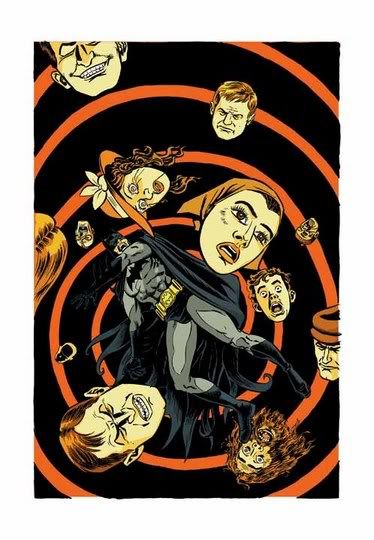
Reminds me of Spider-Man Annual #1.
________________________________________________________
Like I always say, you can always count on Jock for a striking cover.
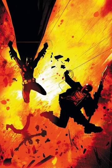
I guess that's why he does so many of them, eh?
________________________________________________________
Seth Fisher draws such striking covers.
He really has a way of drawing you into the cover...
________________________________________________________
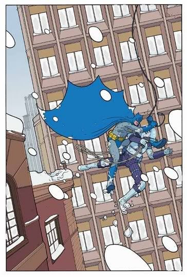
I'm not the biggest Tim Sale fan, but I will give him this...
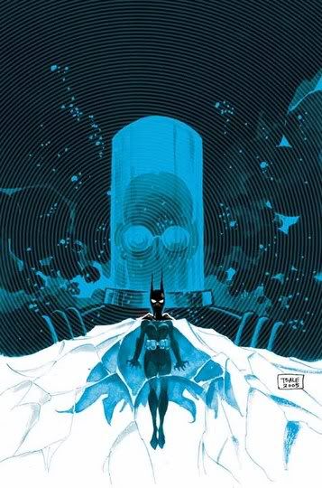
His covers, when used sparingly, can also add that same striking effect that I was just talking about.
________________________________________________________
Pat Lee seems to be alternating good covers and bad covers on this series.
This was a bad one.
________________________________________________________
Here's a brain teaser...
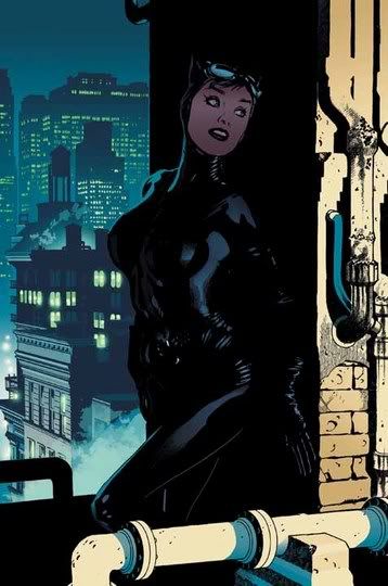
Do you think Adam Hughes MEANT for Selina's breasts to be covered in shadow? Or was that someone else's decision?
If it was his call, I gotta give him credit for the out-of-nowhere subtlety.
________________________________________________________
Pretty dorky costume...
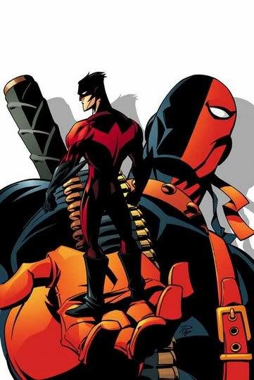
...and yet ten times better than his first Nightwing costume...hehe.
________________________________________________________
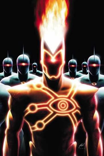
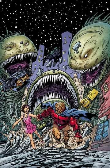
ATTACK OF THE ROBO-MR. T's!!!!!!!
C'mon, you know they want to use that tagline.
________________________________________________________
DUDE!!!
You got to WARN people before you explain how many titles tie into the the whole Infinite Crisis storyline!!!
________________________________________________________
Another cover of Action without Byrne drawing it...
...I hope it doesn't give Byrne, like, a complex or something.
I think I would understand it if they put, like, a "hot young star" artist on the book.
But Jurgens!?
What fan base is HE appealing to that Byrne wouldn't?!?
________________________________________________________
The Lex Luthor armor is one of the things that annoys me about the whole Johnuckanick writing team...
They liked that plot when they were younger, so Lex Luthor in a battle suit is "okay."
But the Giffen JLI and Guy Gardner are abominations of the past.
So silly.
________________________________________________________
SEE!!
Now THAT is a bad cover!!!
________________________________________________________
You have to give the Superman/Batman crew THIS much credit...
...their covers are often a lot of fun.
________________________________________________________
I thought this was a strong cover.
Very good use of the red.
________________________________________________________
Gleason continues to outshine the book itself.
Something that Marcos Martin knows a lot about (although my pal Justin really loves the book, so don't take my word for it!)...
________________________________________________________
Cool looking comic...
...but is there a LESS commercial title than a Metamporpho collection!?!?
________________________________________________________
Oops...let me add Saiz to that previous Martin/Gleason list!
What a cool cover!
________________________________________________________
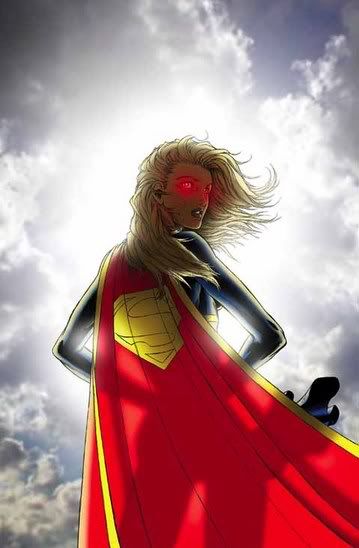
I was not that impressed with this cover...
...except I noticed Ross use a new pose for the cover, and I think that she be rewarded!
________________________________________________________
Seriously, Conner is just drawing the Pro.
But it DOES look cool!
________________________________________________________
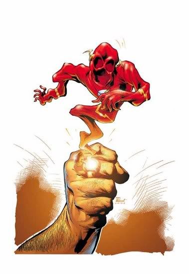
I've always felt that Jay Garrick just never got enough depictions in a dark and foreboding manner.
I think that works well with guys in bright red shirts and metal hats.
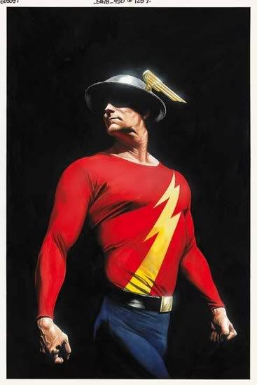
Thank you, Alex Ross.
Thank you, JSA.
________________________________________________________
You could print out a screencap of a City of Heroes game and get a better looking cover than this...
And I was actually wavering over whether the covers would be terrible early on! What a fool I was!!
________________________________________________________
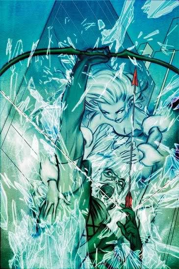
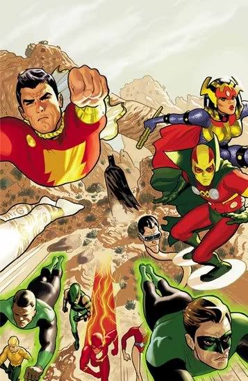
Okay, help me out here...
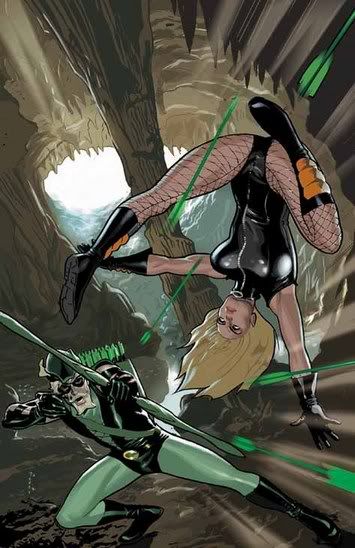
What exactly is happening on this cover?
Is Green Arrow shooting arrows at Black Canary?!?
If he IS, he doesn't seem to be aiming in the right direction.
If he ISN'T, then what the heck is Black Canary DOING in the cover?!?!
________________________________________________________
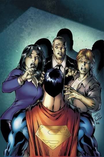
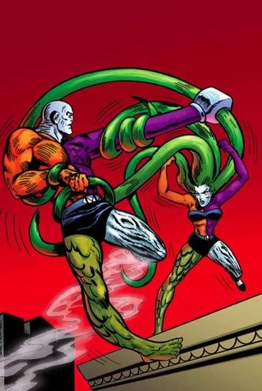
This DOES raise an interesting dilemma.
When the mask is on, if the build is close enough, how CAN you tell who is who?!!?
________________________________________________________
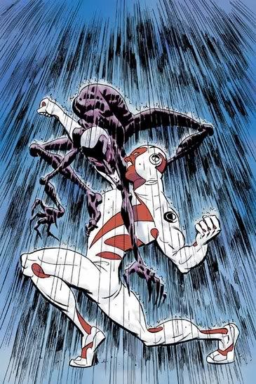
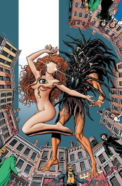
This is like seeing Art Spiegelman draw covers for Fathom.
It is not nice to see, while still being nice to see.
________________________________________________________
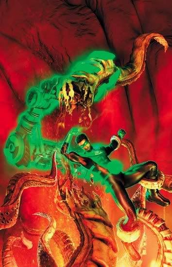
While I presume the full cover will be more defined..
...aren't we supposed to be able to tell what is going on on a cover!?
________________________________________________________
Very cool cover by Art Thibert.
Two questions:
1. Joey Cavalieri and Val Semeiks!?!?
What a weeeeird creative team.
2. Is it just me, or did the solicits just ruin a pretty major plot point in the title?
________________________________________________________
Remember Millenium?
Well, Firestorm became a pawn of the bad guys in THAT crossover.
History appears to be repeating itself.
________________________________________________________
When you have Joe Bennett doing the interiors, why not let him do the covers?!
Seems silly.
________________________________________________________
SEVEN SOLDIERS COVERS!!
Here's a neat Zatanna one...
...but here's an even cooler Klarion cover!
________________________________________________________
Wouldn't it be funny, if the people on these two covers...
...were on the opposite ends of one town, and are running towards each other right now (and right into the OTHER danger)?
Well...I thought so, at least...hehe.
________________________________________________________
This is good news to see...
...they really should collect his entire run.
Nice cover, too.
________________________________________________________
And now...my favorite five covers of the month!
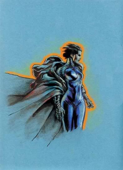
I thought this was a very compelling painted piece...
________________________________________________________
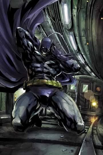
THIS is what Batman is supposed to look like!!!
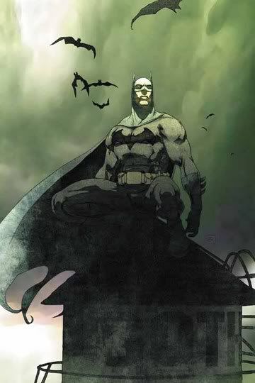
Too bad it is on the Gotham Central covers.
Maybe someone should, oh, I don't know, maybe GIVE SEAN PHILLIPSA BAT-BOOK TO DRAW!!!
________________________________________________________
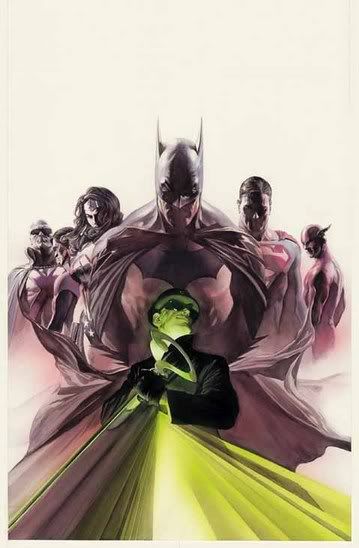
Did I ever mention that James Jean is good?
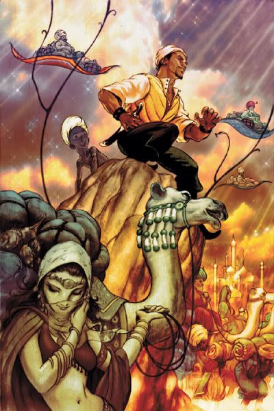
If not, I really should have.
That's the kind of thing I really ought to mention.
________________________________________________________
Look at this super-cool Mike Allred cover!
When a cover like that is only the second-best, you know #1 is a pretty good cover!
________________________________________________________
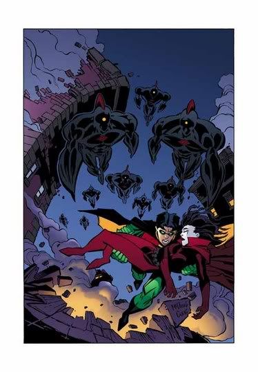
And with that said, for the second month in a row, ladies and gentlemen, let me please introduce you to....a cover by Joshua Middleton.
All I can continue to say is,
"Wow."
________________________________________________________
Okay, that's it for me, folks!
Feel free to share YOUR prejudices!!
Let's begin!
When the worst I can come up with to criticize this Jim Lee cover is that it looks like he just cut out pictures of Superman, Wonder Woman and Batman from other drawings he did, slapped them on a cover together and put shrapnel on the bottom to cover up the cut jobs....
...then I think you've got yourself a successful cover.
That's not to say that I LIKE the cover.
Just that it is not, like, well, a Michael Turner cover...hehe.
________________________________________________________
I enjoy seeing Lapham tackle the covers himself...
Reminds me of Spider-Man Annual #1.
________________________________________________________
Like I always say, you can always count on Jock for a striking cover.
I guess that's why he does so many of them, eh?
________________________________________________________
Seth Fisher draws such striking covers.
He really has a way of drawing you into the cover...
________________________________________________________
I'm not the biggest Tim Sale fan, but I will give him this...
His covers, when used sparingly, can also add that same striking effect that I was just talking about.
________________________________________________________
Pat Lee seems to be alternating good covers and bad covers on this series.
This was a bad one.
________________________________________________________
Here's a brain teaser...
Do you think Adam Hughes MEANT for Selina's breasts to be covered in shadow? Or was that someone else's decision?
If it was his call, I gotta give him credit for the out-of-nowhere subtlety.
________________________________________________________
Pretty dorky costume...
...and yet ten times better than his first Nightwing costume...hehe.
________________________________________________________
ATTACK OF THE ROBO-MR. T's!!!!!!!
C'mon, you know they want to use that tagline.
________________________________________________________
DUDE!!!
You got to WARN people before you explain how many titles tie into the the whole Infinite Crisis storyline!!!
________________________________________________________
Another cover of Action without Byrne drawing it...
...I hope it doesn't give Byrne, like, a complex or something.
I think I would understand it if they put, like, a "hot young star" artist on the book.
But Jurgens!?
What fan base is HE appealing to that Byrne wouldn't?!?
________________________________________________________
The Lex Luthor armor is one of the things that annoys me about the whole Johnuckanick writing team...
They liked that plot when they were younger, so Lex Luthor in a battle suit is "okay."
But the Giffen JLI and Guy Gardner are abominations of the past.
So silly.
________________________________________________________
SEE!!
Now THAT is a bad cover!!!
________________________________________________________
You have to give the Superman/Batman crew THIS much credit...
...their covers are often a lot of fun.
________________________________________________________
I thought this was a strong cover.
Very good use of the red.
________________________________________________________
Gleason continues to outshine the book itself.
Something that Marcos Martin knows a lot about (although my pal Justin really loves the book, so don't take my word for it!)...
________________________________________________________
Cool looking comic...
...but is there a LESS commercial title than a Metamporpho collection!?!?
________________________________________________________
Oops...let me add Saiz to that previous Martin/Gleason list!
What a cool cover!
________________________________________________________
I was not that impressed with this cover...
...except I noticed Ross use a new pose for the cover, and I think that she be rewarded!
________________________________________________________
Seriously, Conner is just drawing the Pro.
But it DOES look cool!
________________________________________________________
I've always felt that Jay Garrick just never got enough depictions in a dark and foreboding manner.
I think that works well with guys in bright red shirts and metal hats.
Thank you, Alex Ross.
Thank you, JSA.
________________________________________________________
You could print out a screencap of a City of Heroes game and get a better looking cover than this...
And I was actually wavering over whether the covers would be terrible early on! What a fool I was!!
________________________________________________________
Okay, help me out here...
What exactly is happening on this cover?
Is Green Arrow shooting arrows at Black Canary?!?
If he IS, he doesn't seem to be aiming in the right direction.
If he ISN'T, then what the heck is Black Canary DOING in the cover?!?!
________________________________________________________
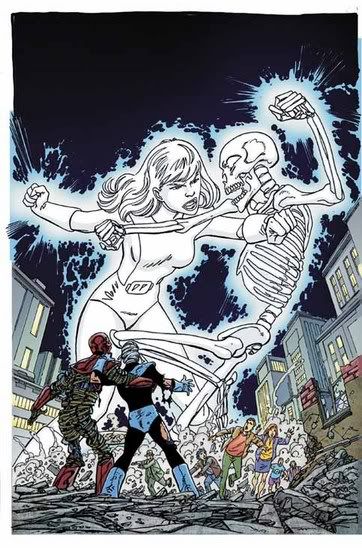
This DOES raise an interesting dilemma.
When the mask is on, if the build is close enough, how CAN you tell who is who?!!?
________________________________________________________
This is like seeing Art Spiegelman draw covers for Fathom.
It is not nice to see, while still being nice to see.
________________________________________________________
While I presume the full cover will be more defined..
...aren't we supposed to be able to tell what is going on on a cover!?
________________________________________________________
Very cool cover by Art Thibert.
Two questions:
1. Joey Cavalieri and Val Semeiks!?!?
What a weeeeird creative team.
2. Is it just me, or did the solicits just ruin a pretty major plot point in the title?
________________________________________________________
Remember Millenium?
Well, Firestorm became a pawn of the bad guys in THAT crossover.
History appears to be repeating itself.
________________________________________________________
When you have Joe Bennett doing the interiors, why not let him do the covers?!
Seems silly.
________________________________________________________
SEVEN SOLDIERS COVERS!!
Here's a neat Zatanna one...
...but here's an even cooler Klarion cover!
________________________________________________________
Wouldn't it be funny, if the people on these two covers...
...were on the opposite ends of one town, and are running towards each other right now (and right into the OTHER danger)?
Well...I thought so, at least...hehe.
________________________________________________________
This is good news to see...
...they really should collect his entire run.
Nice cover, too.
________________________________________________________
And now...my favorite five covers of the month!
I thought this was a very compelling painted piece...
________________________________________________________
THIS is what Batman is supposed to look like!!!
Too bad it is on the Gotham Central covers.
Maybe someone should, oh, I don't know, maybe GIVE SEAN PHILLIPSA BAT-BOOK TO DRAW!!!
________________________________________________________
Did I ever mention that James Jean is good?
If not, I really should have.
That's the kind of thing I really ought to mention.
________________________________________________________
Look at this super-cool Mike Allred cover!
When a cover like that is only the second-best, you know #1 is a pretty good cover!
________________________________________________________
And with that said, for the second month in a row, ladies and gentlemen, let me please introduce you to....a cover by Joshua Middleton.
All I can continue to say is,
"Wow."
________________________________________________________
Okay, that's it for me, folks!
Feel free to share YOUR prejudices!!
posted by Brian Cronin at 7/18/2005 03:27:00 AM
![]()


19 Comments:
Numerous comments:
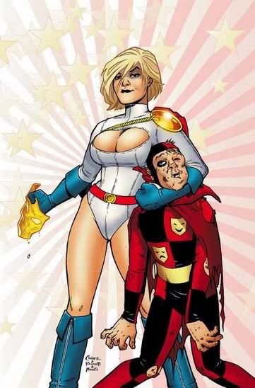
1. Power Girl's cleavage window keeps getting bigger.
2. Difference between Hawkmen? Chest hair.
3. That Supergirl cover isn't so bad, actually. Not as bad as the one you liked last time around.
4. Methinks you meant Spider-Man Annual 5.
5. Seth Fisher and Jock? Very good artists.
6. Lex Luthor should stop wearing the green refrigerator, dammit.
7. Cavalieri? Uhhh... What happened to Darwyn Cooke?
8. I just might put that Metamorpho collection on The List (And I hope they do an Elongated Man collection... that'd be awesome). Definite additions are the Arkham Asylum Anniversary SC and Doom Patrol vol. 3.
Tsk, tsk, Lex.
"Cool looking comic..." was what I said about it.
Whether it will be a commercial success does not impact whether I like it or not.
Numerous responses...hehe.
1. Power Girl's cleavage window keeps getting bigger. - Yeah, that is weird.
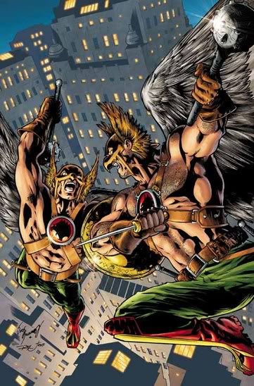
2. Difference between Hawkmen? Chest hair. - No wonder Golden Eagle has a complex.
3. That Supergirl cover isn't so bad, actually. Not as bad as the one you liked last time around. - No way! What is that cover even trying to accomplish?! All it does for me is highlight the anorexic look that Turner and Churchill have decided to use for Supergirl.
4. Methinks you meant Spider-Man Annual 5. - Methinks you are correct.
5. Seth Fisher and Jock? Very good artists. - Darn skippy.
6. Lex Luthor should stop wearing the green refrigerator, dammit. - Agreed.
7. Cavalieri? Uhhh... What happened to Darwyn Cooke? I guess the Spirit ongoing. Which, really, is better for everyone, I think.
8. I just might put that Metamorpho collection on The List (And I hope they do an Elongated Man collection... that'd be awesome). Definite additions are the Arkham Asylum Anniversary SC and Doom Patrol vol. 3. - Yeah, the SC is a great idea.
Let's see
1) Jim Lee cover: Fugly, saying it isn't as bad as a Michael Turner cover... yeah, I can think of a few like that as well.
2) Love that Lapham cover. Reminds me of X-statix
3) Well, it's Hughes. what do you expect?
4) I like the Lex Luthor-armour. Whether it should be Lex Luthor in it is a whole other story, but I like the design, always liked it (it being in the first Superman story I read ever may have been of some influence.)
I don't like this cover though. Have inkers become unclean or something that hardly anybody hires them anymore?
5) Metamorpho looks cool, but I can understand your comment that it is commercially an odd decision to say the least.
6) Saiz cover.. no, sorry, not a good cover.
7) Yes, Black Canary seems to be jumping over those arrows. That's all I have to say about this cover.
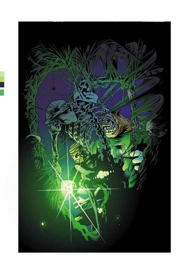
8) I think it's pretty obvious what is going on on the GL cover: GLs discover skeleton. Include a storytitle in the bottom right corner that has some sense of forboding (something with Dread, Pit, Evil, Despair or something like that) and you have just about any other cover ever made.
9) I don't like that Sean Phillips Batman cover. Batman looks very uncomfortable on top of that sharp .. watertower, I guess?
10) I do agree that that Middleton cover is one of the best among these covers.
I do agree, the Luthor suit is a fine design for a bad guy battle suit.
I like the Luthor armor but hated it when McGuiness did it. It really did look like a fridge.
Can images be posted in the comments field using HTML tags?
Probably not, T.
But then again, I've never tried...hehe.
That Supergirl cover is the least bad one I've seen.
The Metamorpho collection is kind of odd, but considering they also have a Jonah Hex volume in the pipeline, I'm guessing they're going to reprint a lot of older material that there that wouldn't justify an archive. I wish they'd do that with stuff like Thunder Agents and Challengers of the Unknown, too. And it's not like it's any less weird than Essential Iron Fist or Essential Super Villain Team-Up.
It is worth to note that essential Iron Fist and Team-Up only came out after the success of Essential Spider-Man, X-men and Avengers. You could argue that the success of Marvel's Essentials bolsters DC's confidence enough to start out with the more obscure characters (Yes, I know they also do Green Lantern and Superman collections), but still.
Then again I heard of an upcoming Jonah Hex series, so it may tie in raising awareness on both characters to launch new series
I wanted to post the image using an html tag, but don't know if it'll work so I'll just post a link instead:
http://www.comics.org/graphics/covers/116/200/116_2_349.jpg
That's the inspiration for the (RECYCLED) fun SM/BM cover. Jeph Loeb, "chow mein" writer: grab whatever leftovers from the fridge that were once fresh and tasty, slap them together, reheat them and serve them to people who don't realize that the subpar dish isn't authentic chinese.
Link didn't work. Paste these 3 sentence fragments together for the full web address:
http://www.comics.org/
graphics/covers/116/200/
116_2_349.jpg
Haha, T, I remember that issue of Superman!!!
Funny issue!
Yeah, it was good fun!
Re: Metamorpho.
Us Ramona Fradon fans are LEGION! There's at least... crap... 7 of us now.
I don't think Cooke was ever meant to have the run directly following Johns on Flash. There was always a buffer arc planned, IIRC.
Here's what DC had to say at the time, Tom.
"DC has confirmed for Newsarama that current FLASH penciler Howard Porter will remain as the series' regular penciler indefinitely, returning to the series to pencil writer Darwyn Cooke's four-issue story arc (issues #227-230) after a one issue break. Writer Stuart Immonen and artist Steve Lightle handle FLASH #226."
My problem with the Supergirl cover is the skirt. Its long wnough that it billows out quite far past the cape (in a really odd shape for a skirt) but doesn't obscure the shape of her backside in the silhouette at all. It doesn't make sense to my eye.
The see-through cape and stick-thin arms are kinda tacky too.
Happy New Year!
ray ban sunglasses outlet
cheap ray bans
ed hardy clothing
cheap ray ban sunglasses
nike air jordan
christian louboutin shoes
mbt shoes
kate spade sale
asics shoes
san antonio spurs
Post a Comment
<< Home