X-Factor #6 Review

It’s interesting to see a comic whose look is so wrapped up in the work of an artist that is no longer on the book. This is not exactly uncommon, as even today, Frank Miller’s visual mark on Daredevil is still being felt, and heck, over thirty years since he last drew the book regularly, Jack Kirby’s presence is still felt on the way artists draw the Fantastic Four. I guess it just surprises me a bit more on this book, because Ryan Sook only did, what, two and a half issues of X-Factor? Yet his view of the characters it the dominant one in the artwork of Dennis Calero, and I really wonder if that will be the case for future issues of X-Factor.
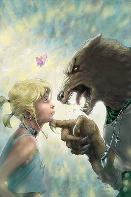
Speaking of the art, Ryan Sook is a really remarkable artist. What Sook managed to do was to create these shadowy figures that still maintained a deep resonance in humanity, but never allowed the realistic artwork to interfere with his storytelling. Calero manages to duplicate the first aspect of Sook’s work, but it really is Sook’s ability to do BOTH that causes him to become such a great artist, and that’s where Calero has a problem. He is quite good at drawing his characters, making them appear comic book-y AND human, but he is not very good at then making these characters DO things. It comes off sorta like stiff – herky jerky movements, not natural ones (this is especially evident with the Madrox scene in the park – Calero clearly spent a lot of time on all of Madrox’s faces, but doesn’t appear to make the faces all work with the body movements). However, I still enjoyed his artwork. It’s no Ryan Sook, but that is not an insult by any stretch of the imagination. I really don’t like how huge Wolfsbane’s head is, but that’s not Calero’s call, I believe Sook drew it like that, too. It’s really creepy. This skinny body and this HUGE wolf head. I don’t get it.
Peter David is an old hand at writing ongoing titles, at the trick of making an issue continue a story while still standing on its own merits. In fact, he is so good at it, it really makes the “recap” page superfluous, especially as David does not appear to write the book any differently than a book without a recap page, which was, if I recall, one of the reasons for HAVING a recap page (According to Mark Waid, he would often use up about a page’s worth of panels just catching the reader up). Not a big deal, though, as the exposition does not get in the way of the issue’s story, which is a good one.
The X-Factor team is worried about their team member, Layla Miller, especially her weird “chaos theory” power (something David has used already with a super villain in the past – one cool point for the character David did the “chaos theory” power with before). Meanwhile, we learn some more about Layla, and her messed up problems, but, like a good writer, David makes sure that even as one aspect of her story is resolved, a separate aspect of her character is left UNresolved.
The key to this book is the interactions between the characters, and the dialogue is strong and believable. Whether it is an orphanage director cutting through red tape, or if it’s the team threatening a rival – it all works well. All combined, this is enough that I would recommend this issue without reservation (unless “Wolfsbane’s head is too big” counts as a reservation).


15 Comments:
Heh. David (and later Waid in Flash) did a great job with that character (Not gonna name him). I especially liked the idea that, because he knew at any given time what action to take to cause the most horrible outcome imaginable ("make a phone call and the President dies of illness") that it had drastically affected his worldview and emotional stability. I was sad to see later writers revert him to his original powers when he switched sides.
Naming him gets you cool points!!
It was Major Disaster in the Underworld Unleashed issue of Aquaman.
I get KEWL POINTS!
i think its a severe understatement when you say this guy is having problems living up to more than half of what sook gave us.
the wolf head was annoying. mostly for me because it really just looked like he took a picture from national geographic and traced it on wolfsbanes body. and more frustrating because i was feeling that way with every single face before she wolfed out. so when i saw her it just 100% confirmed it for me.
it was utterly aggrivating, and i felt exactly like i was watching Tom Goes to the Mayor (which i had no taste for either). but taking it a step beyond complaining about the absolutely stupid faces he picked to be models for his pencils is the preposterous emotion choices for some of them.
when madrox gets a complement on is paramedic skills- his reaction smacks of either being on drugs, or having absolutely no social skills. the man almost jumped out of his clothes. and i jumped out of the story for a moment.
and when the orphanage director "hints" to them that they can just take her? i really couldnt tell where she was coming from. at first i thought it was just because she felt for layla. but then, i had another thought, one brought on by the constant discrimination and hate talk post HoM- was she saying it because she just wanted layla gone? she brought her back and all probably hoping things would be better now, but nobody seemed to like her even still. so was the director just wanting to see the back of what was surely to be a massive headache for her? i cant tell, because at no point was ANYONES character or emotions displayed efficiently.
they all had SO much emotion in their faces over every little happenstance, that i just had to assume that the artist has no idea what he was doing. thus making whatever he intended to convey pretty much moot. i could only ignore all that and hope to find the truth in the dialogue alone.
i love this x factor. i like the guys art as a decent replacement for sook. but his expressions have GOT to go. he almost made me put this book down halfway thru, and i dont know if i should be laughing at the stuff he puts on paper this much. if this is an "off" issue for him, fine, but if he keeps this up for multiple issues i may have to just drop the book out of frustration.
Fear not, Kyle! I do not believe Calero is the regular artist. And yes, the scene with the orphanage head lady was a good example of "When photo realism goes wrong."
I agree with all the comments on Calero's photoreferencing and inappropriate faces. But for the wolf head, I place the blame on Sook for that one. It looked bad even by him, and I love Sook's work. I think they should go for Larry Stroman's Wolfsbane visual, which was the best take on the character in my opinion.
Yeah, I am pretty sure Sook drew the head that way as well.
It is sooo lame.
I, too, liked the Stroman take the best.
Are you guys listening to yourselves, it's not enough to judge the current artist's work completely on thebasis of the previous artist, but then you go on to judge THAT artist by Larry Stroman from a decade ago! If something about this doesn't strike you as odd, then you guys need to get a lobotomoy and then come back when you're ready to judge things on their own merits. GAWD!
The current artist draws Wolfsbane's head lame.
The current artist is basing this depiction on the way the last artist drew her head, which was similarly lame.
Awhile back, there was an artist who did a design that looked cool, and said design was the design that was used for the next 10 years or so. That design is not lame.
Therefore, it would be cooler if the depiction of Wolfsbane was, instead of being the lame one, was the one that was not lame.
Is that really difficult to follow/understand?
So you expect every artist on the title to follow that exact design on a thrid tier character (at bst) for a decade because another artist said so. No, I don't get that. And it wasn;t just one characters head you guys were talking about. You guys are what's lame.
Our exact complaint is that Calero FOLLOWED the design of the previous artist.
Which was a lame design.
Artists should feel free to make design changes.
They just shouldn't make lame ones, like giant wolf heads on skinny girls.
Now you guys aren;t even reading each others posts so you don;t even know what I'm talking about and can't see the pattern I'm pointing out. Dorks.
If you are going to troll, you shouldn't be so damn obvious about it. You should start more subtly and build your way toward it. You tip your hand too quickly. Here's a guide to recreation trolling that should help you along.
How is it troling to simply point out that a) you guys are being dorks and nitpicking a great book and b) you're not even reading the posts I'm reffering to when you talk about my reference to those posts?!?! All I'm saying is disagree if you must, but actually read what I'm referring to and THINK about what I'm sayng and don;t just rip apart my post in order to push your point of view.
I will certainly allow that perhaps we somehow missed your point.
After all, it might have been lost among the insults.
But please, feel free to try to explain your point again, sans insults, which would, you know, keep anyone from considering you a troll.
Post a Comment
<< Home